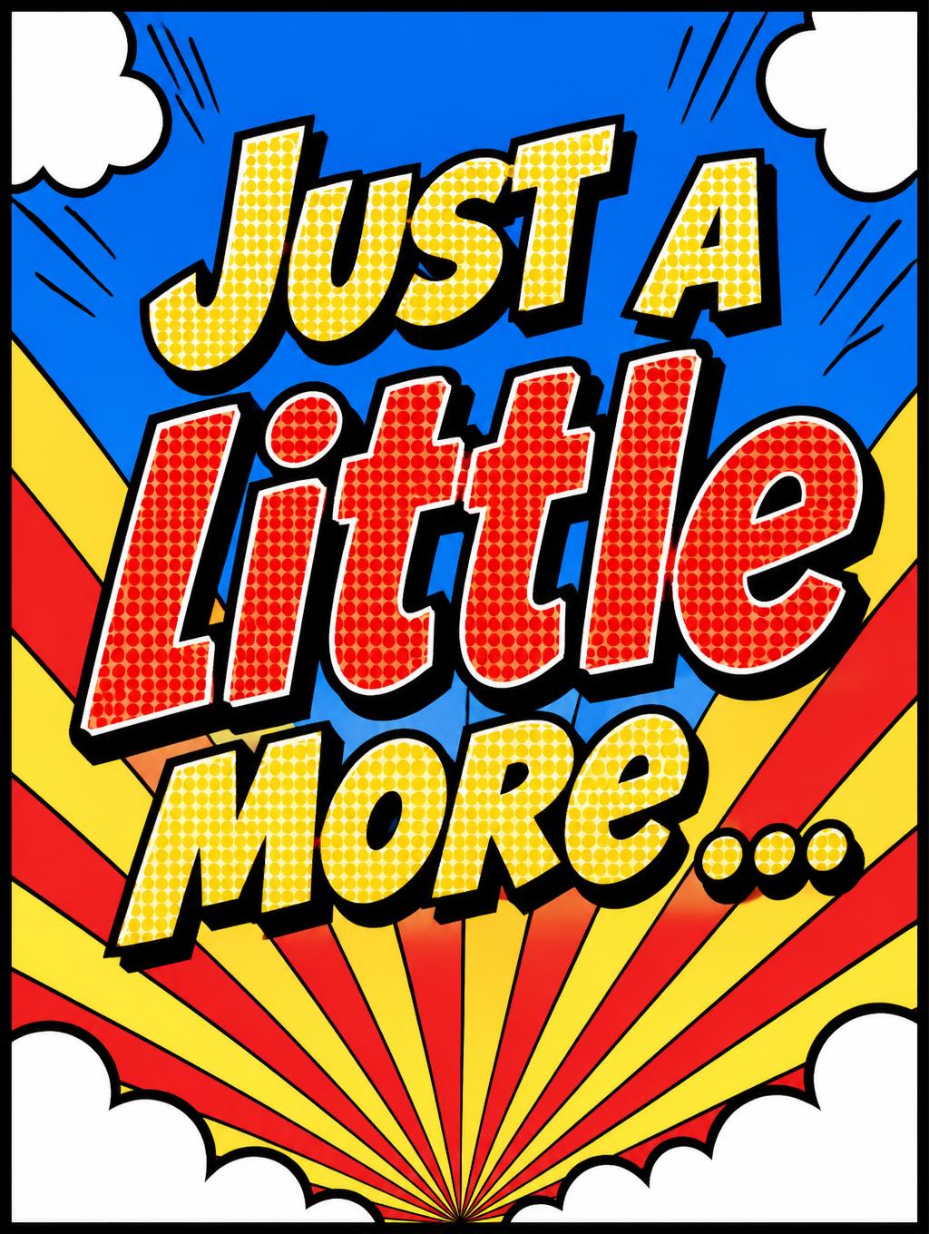
Just a little more ... - ポップアート Text Effect


この作品と同じ OpenAI GPT-Image-2.5 Sunburst を使用 · 15 クレジット




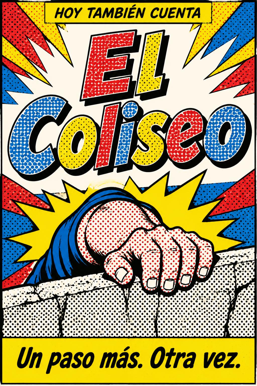


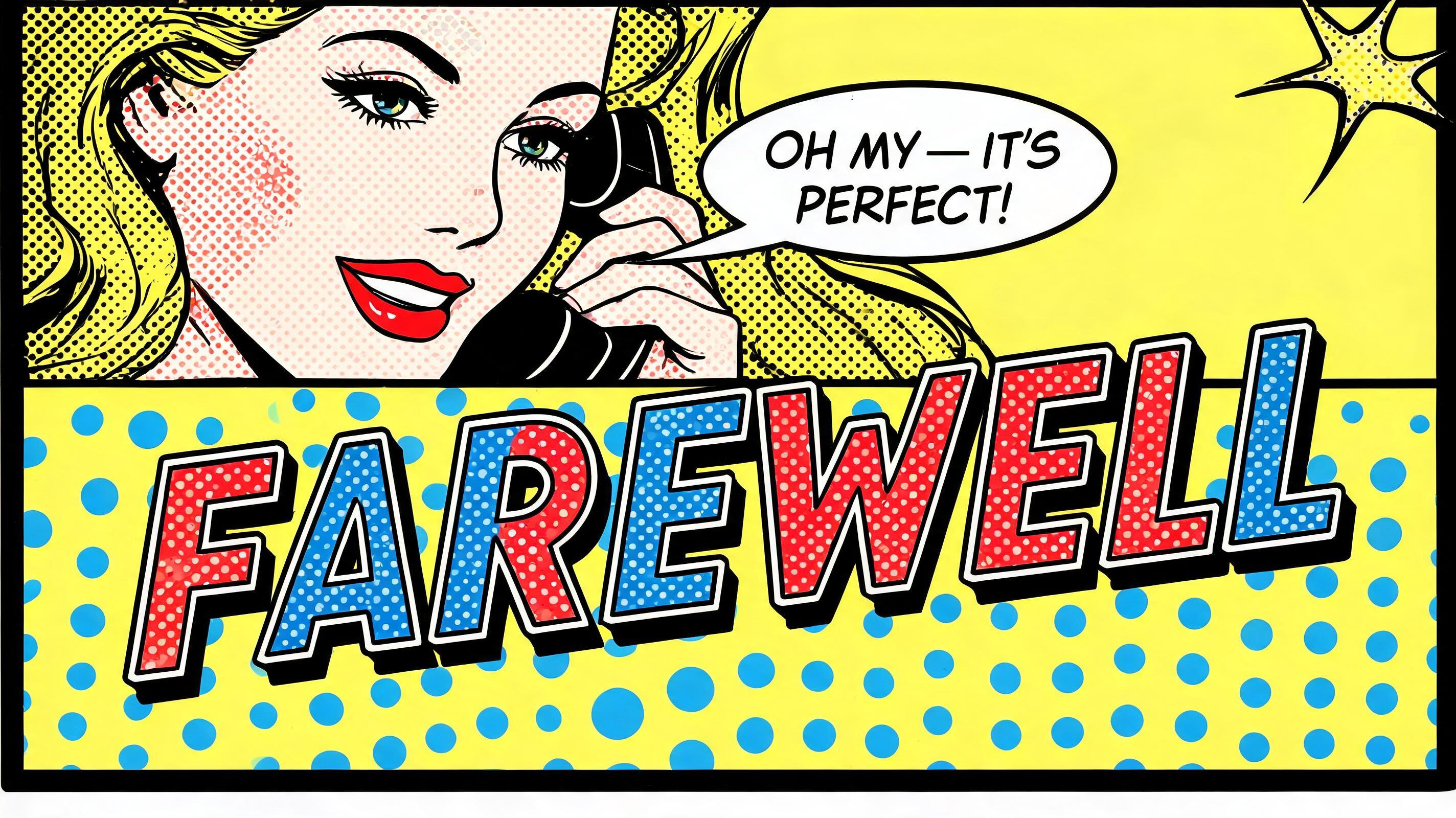
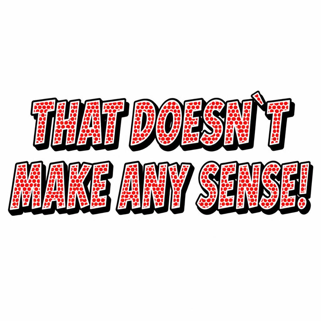

「Just a little more ...」は FontVibe AI で作成したポップアートの文字エフェクトです。赤と黄のベタにベンデイドットを詰めたリキテンスタイン風コミック大文字。太い黒フチと硬いドロップシャドウ、青い水玉地の爆発形から飛び出します。
rendered in Roy Lichtenstein pop art style. Thick uniform black outline traces every letter contour and inner stroke — consistent weight, hard edge, zero softness. Letter fills use large Ben-Day halftone dots: dots individually visible, primary colors only (flat red, flat yellow, flat blue, flat white — no gradients, no metallics, no pastels). Graphic drop shadow offset 45° lower-right, solid black, hard edge. Entire image: zero blending, zero photographic realism, flat silk-screen aesthetic. High contrast, comic book energy. Ben-Day dots never touch the outline — always a bare white gap between dot fill and outline inner edge. No CMYK color mixing. LETTERFORM PRIORITY: when the chosen font carries its own treatment, that font's letterform shapes take priority and own the letters; this style governs the thick black outline, the Ben-Day halftone fill and the graphic drop shadow. FALLBACK MATERIAL: if the font carries no material of its own, render the letters with a thick uniform black outline, flat Ben-Day dot fills in primary colors and a hard 45-degree black drop shadow. COLOR PRIORITY: keep the font's own colors if specified; otherwise flat primary red, yellow, blue and white only. Create a finished, portrait-oriented comic-book encouragement poster. Render the exact words “Just a little more ...” as the sole text, arranged on three centered lines: “Just a” above “little” above “more ...”. Make “little” the largest line, with the other words clearly readable and subordinate; keep the ellipsis intact. Let the phrase occupy most of the central area, with generous clear space around it and no lettering obscured by decoration. Behind the words, build a bold, upward-driving burst: broad, flat red and yellow rays radiate from a small point near the lower center, while a solid blue field anchors the upper background. Add a few crisp white comic-book cloud shapes and simple outlined motion marks near the edges to suggest a final push, without competing with the message. Keep every background shape sharply bounded, outlined in consistent black, and strictly flat; use only red, yellow, blue, white, and black. Frame the composition with a strong black comic-panel border. Preserve clear separation between text and burst shapes so the phrase reads instantly at thumbnail size. The overall image should feel like a classic hand-printed comic panel: energetic, optimistic, uncluttered, and visually decisive, with no extra words, dates, logos, gradients, or photographic detail.
用途: コミック文字ジェネレーター
2026年11月4日に生成 · 1024 × 1360 · JPEG · OpenAI GPT-Image-2.5 Sunburst · 制作者がシェア · 商用利用無料(CC BY 4.0)



