GYM GIRL - 日本の墨筆 Text Effect


この作品と同じ BytePlus Seedream 5.0 を使用 · 15 クレジット











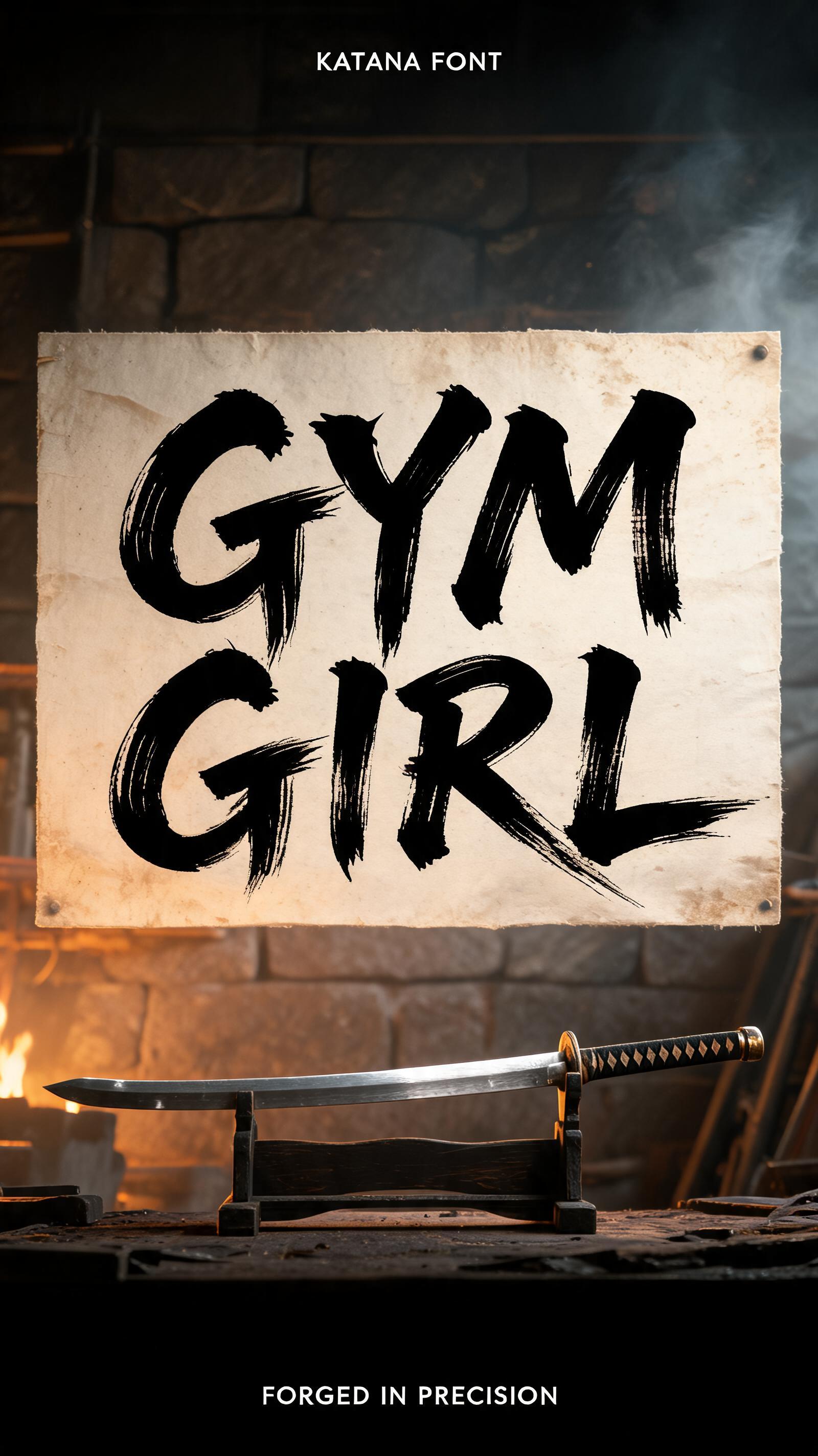
“GYM GIRL” is a Brush Japanese Ink text effect FontVibe AIで作成した文字エフェクト. 日本の書道の墨筆による筆致をラテン文字に応用したスタイルです。深い墨黒のインクに本格的な筆のエネルギー、一方向に制御された筆運び、そして和紙の雰囲気が宿ります。日本食レストランのブランディング、タトゥーデザイン、アニメ、武道、文化系プロジェクトに最適です.
Japanese Shodo ink brush style with katana sword precision. Each stroke executed in a single decisive motion — no hesitation, no correction, like drawing a blade. Letterforms have sword-like sharpness: thin at the entry point, powerful through the middle, clean at the finish. Ink: pure sumi black, maximum density. Background: pale washi with faint sword-path texture. The philosophy of kendo applied to typography — the perfect stroke requires the perfect mind. Ancient Japanese sword workshop (katana forge) — a vertical 9:16 master swordsmith composition. Background: low amber forge light, weathered stone walls, faint smoke haze. A katana blade resting on a wooden stand in the foreground, steel catching the forge glow. The wall behind shows the "GYM GIRL" calligraphy mounted on aged washi, illuminated by forge light. Top tier: "KATANA FONT" — tiny refined caps at 40% canvas width, upper-center, hairline ink strokes, as precise as a sword-edge. Middle tier: "GYM GIRL" — massive dominant Shodo brush letters at 65% canvas width, centered — each stroke executed in a single decisive motion, no hesitation, no correction, thin at entry, powerful through the body, clean at the finish, like drawing a blade from its saya. Bottom tier: "FORGED IN PRECISION" — small refined caps at 30% canvas width. Vertical spacing ratio approximately 1:5:1.5. The composition reads as a master swordsmith's signature poster — precision, commitment, permanent craft.
用途: 刀フォントジェネレーター
2026年7月23日に生成 · 1600 × 2848 · JPEG · BytePlus Seedream 5.0 · 制作者がシェア · 商用利用無料(CC BY 4.0)


