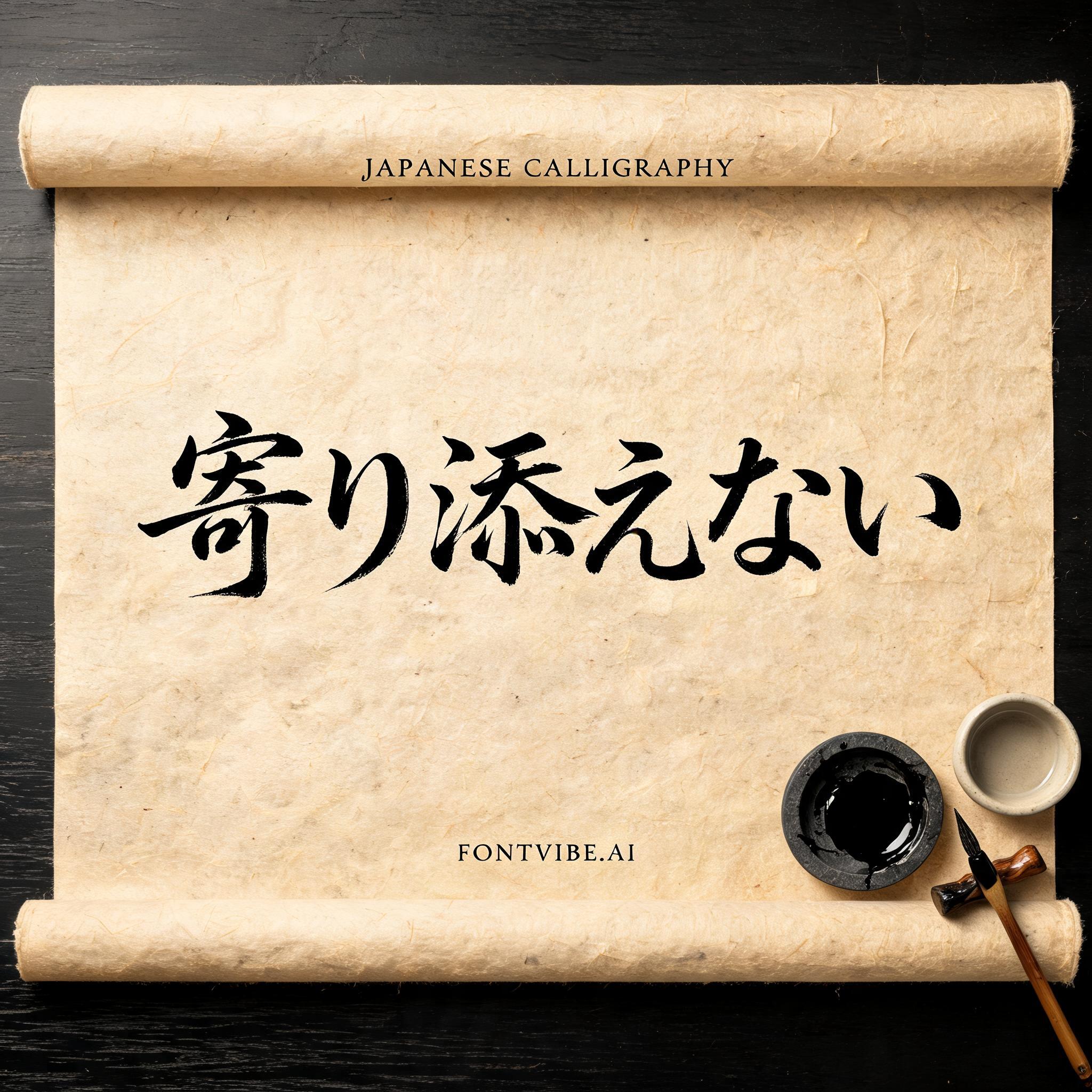
寄り添えない - 日本の墨筆 Text Effect


この作品と同じ BytePlus Seedream 5.0 を使用 · 15 クレジット











“寄り添えない” is a Brush Japanese Ink text effect FontVibe AIで作成した文字エフェクト. 日本の書道の墨筆による筆致をラテン文字に応用したスタイルです。深い墨黒のインクに本格的な筆のエネルギー、一方向に制御された筆運び、そして和紙の雰囲気が宿ります。日本食レストランのブランディング、タトゥーデザイン、アニメ、武道、文化系プロジェクトに最適です.
Rendered in formal Japanese Shodo calligraphy style. Letterforms executed with maximum brush discipline — controlled powerful strokes following classical calligraphy principles. Deep sumi ink, densest at stroke origin, feathering dry at endings. Washi paper background with subtle fiber texture. Ceremonial quality: the kind of brushwork seen on a hanging scroll or official document. Each letter carries weight and intentionality. Formal, dignified, deeply rooted in the Japanese calligraphy tradition. Aged yellowed washi scroll laid flat on a dark lacquered wooden surface, edges slightly curled from age. Quiet calligraphy ceremony atmosphere — the scroll is the focal point on the table. A polished ink stone with residual sumi ink, a fine-tipped fude brush resting in a bamboo brush holder, and a small ceramic water bowl arranged beside it. Overhead soft diffused studio light, warm and even, showing every fiber of the washi paper. Top-center: tiny ceremonial label "JAPANESE CALLIGRAPHY" at 45% canvas width, hairline ink strokes, formal and restrained. Center: "寄り添えない" as massive dominant Shodo brush letters at 65% canvas width, perfectly centered — each stroke executed with maximum discipline, thick wet-black entry, controlled pressure through the body, clean precise endings that carry the ceremonial weight of classical Japanese calligraphy. Bottom-center: small refined seal-style tagline "FONTVIBE.AI" at 20% canvas width. Vertical spacing ratio approximately 1:5:1.5. The piece reads as a formal Shodo scroll — dignified, ceremonial, spiritually grounded.
用途: 日本語書道フォント
2026年8月24日に生成 · 2048 × 2048 · JPEG · BytePlus Seedream 5.0 · 制作者がシェア · 商用利用無料(CC BY 4.0)


