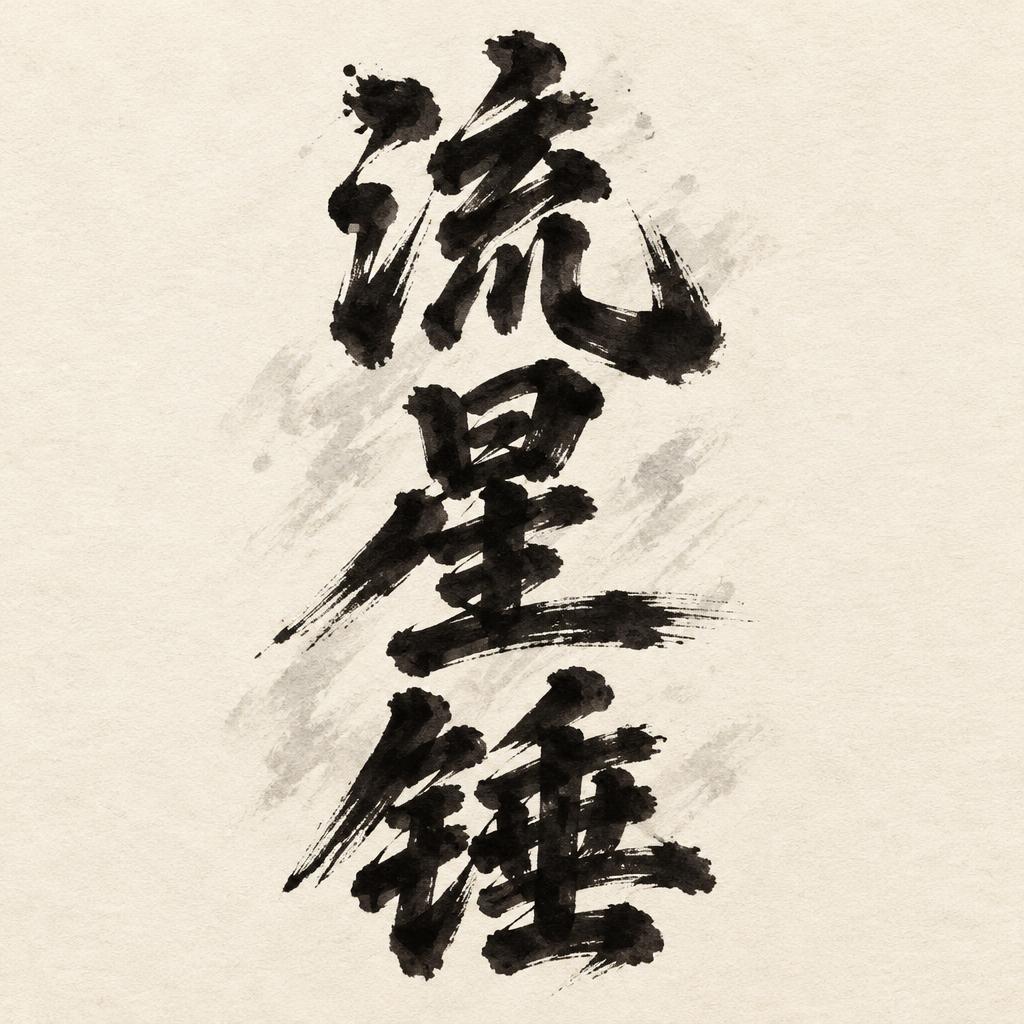
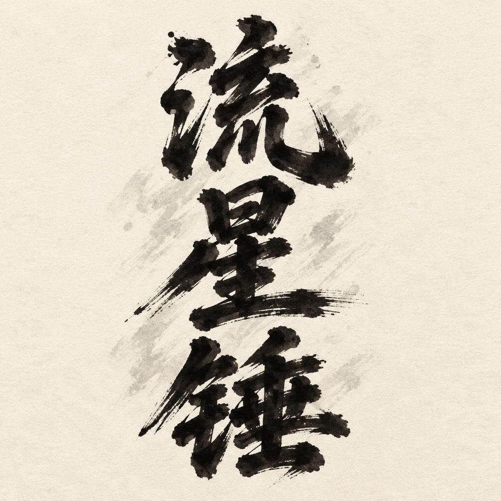
流星锤 - ブラッシュスクリプト Text Effect


この作品と同じ OpenAI GPT-Image-2.5 Sunburst を使用 · 15 クレジット
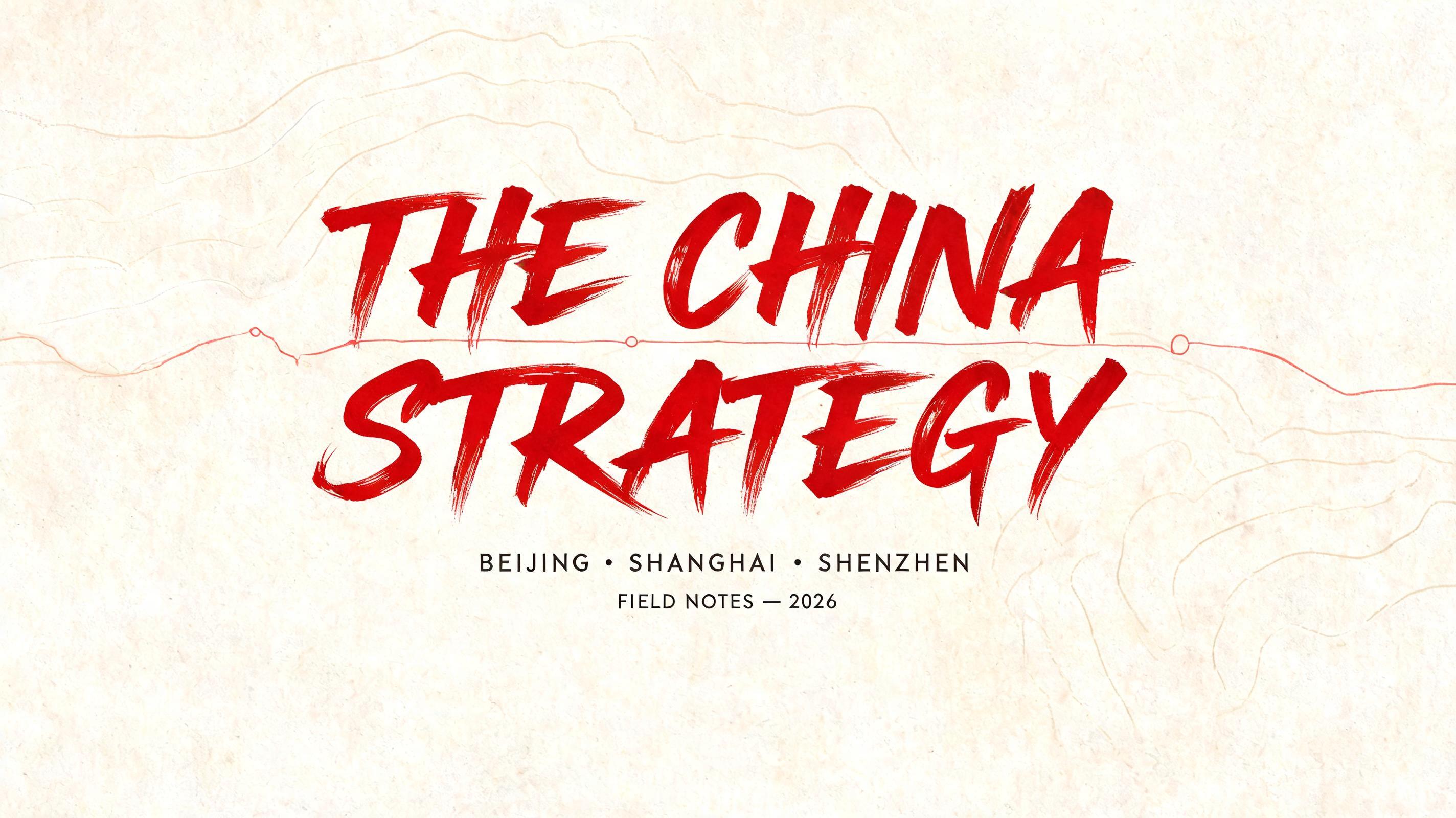


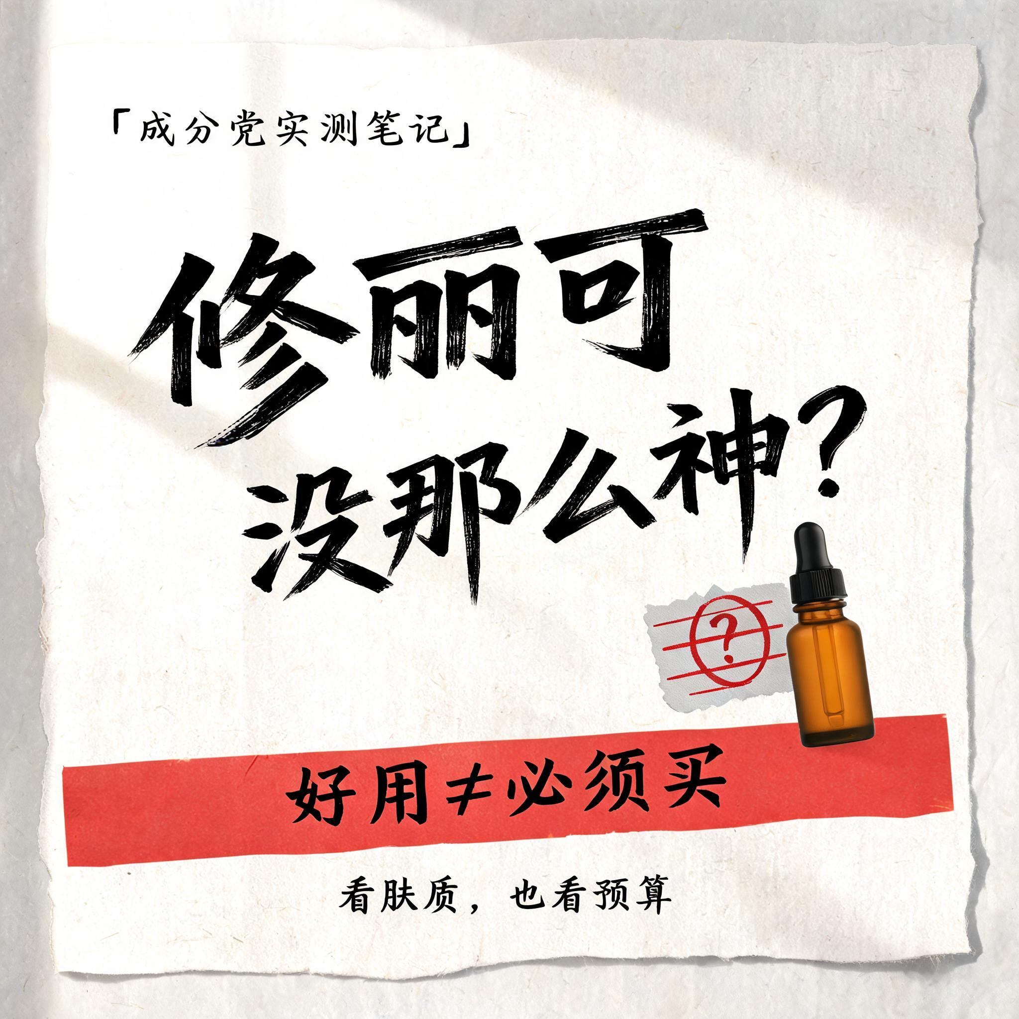
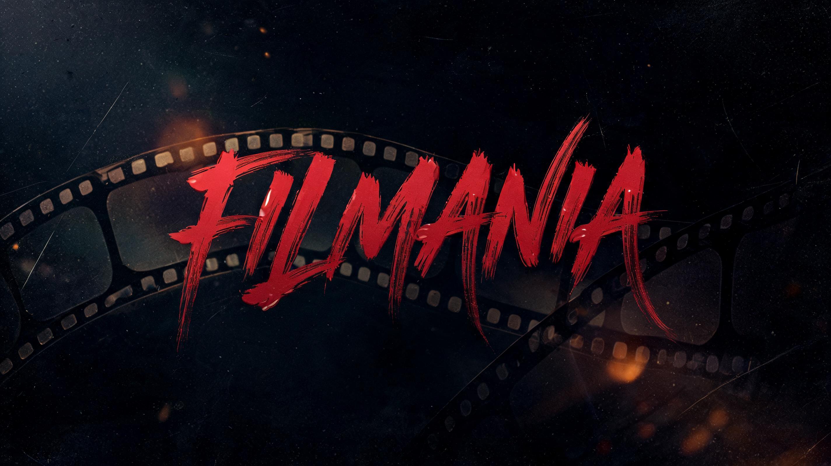




「流星锤」は FontVibe AI で作成したブラッシュスクリプトの文字エフェクトです。文字がつながる西洋の筆記体。筆圧の強い太い下ろし、髪の毛ほど細い上げ、筆の毛の筋とかすれを、温かみのある黒インクで質感のある紙に。
rendered as expressive Western brush script lettering with fluid connected strokes. Visible bristle texture with authentic thick-to-thin pressure variation — thick downstrokes, thin upstrokes, just like a loaded calligraphy brush. Ink slightly wet and glistening. Natural ink pooling at stroke starts, feathered dry-brush ending trails. Warm off-black ink on visible surface texture. Hand-crafted artisan energy with real brush imperfection. LETTERFORM PRIORITY: when the chosen font carries its own treatment, that font's letterform shapes take priority and own the letters; this style governs the brush-script medium, the thick-to-thin pressure variation and the ink wetness. FALLBACK MATERIAL: if the font carries no material of its own, render the letters as fluid connected brush-script strokes with thick downstrokes, thin upstrokes, wet pooling at starts and feathered dry-brush trails in warm off-black ink. COLOR PRIORITY: keep the font's own colors if specified; otherwise warm off-black ink on a textured surface. Create a finished, square-format brush-lettered artwork featuring exactly the Chinese characters “流星锤,” preserving their order and rendering them clearly and accurately. Arrange the three characters as a bold, closely unified vertical stack, centered with generous breathing room around the composition. Let the lettering dominate while keeping each character distinct and fully legible. Set it on warm, lightly textured ivory paper, with subtle grain visible across the open background. Use expressive Western brush-script ink character: warm off-black, freshly wet and faintly glistening, with pronounced thick-to-thin pressure variation, natural pooling at stroke starts and joins, slight feathering, and dry-brush trails at selected ends. Preserve the characters’ correct Chinese forms; do not turn them into Latin letters or add decorative marks that obscure their structure. Add only a restrained, pale warm-gray brush haze behind the stack, kept soft and sparse so the ink remains the clear focal point. Light gently from above, allowing a quiet sheen on the heavier ink and a delicate paper shadow at the edges of the strokes. Keep the finish handcrafted, balanced, and spacious, with no border, extra lettering, objects, or ornament.
2026年11月7日に生成 · 1024 × 1024 · JPEG · OpenAI GPT-Image-2.5 Sunburst · 制作者がシェア · 商用利用無料(CC BY 4.0)



