SAKURA CHERRY BLOSSOM SEASON - 日本の墨筆 Text Effect


この作品と同じ BytePlus Seedream 5.0 を使用 · 15 クレジット
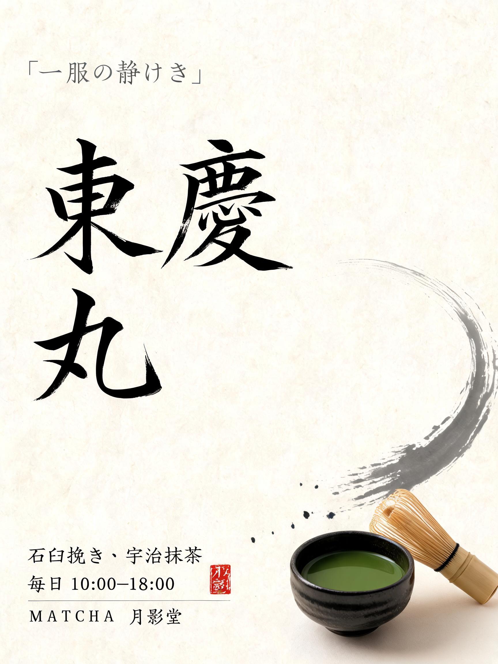
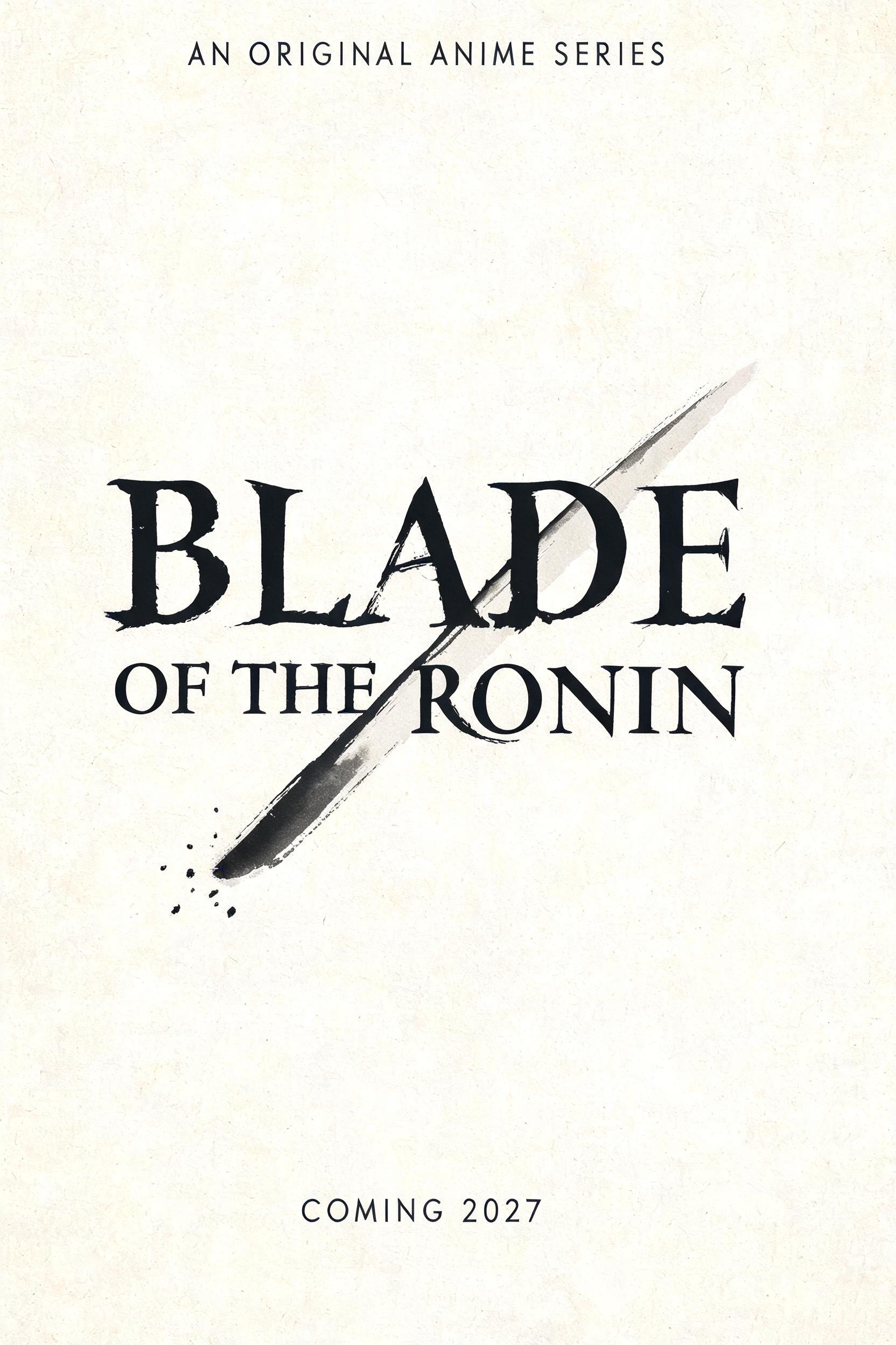


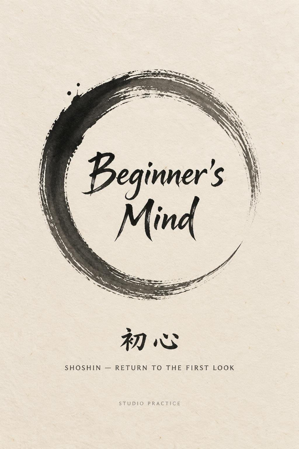




「SAKURA CHERRY BLOSSOM SEASON」は FontVibe AI で作成した日本の墨筆の文字エフェクトです。日本の書道の墨筆による筆致をラテン文字に応用したスタイルです。深い墨黒のインクに本格的な筆のエネルギー、一方向に制御された筆運び、そして和紙の雰囲気が宿ります。日本食レストランのブランディング、タトゥーデザイン、アニメ、武道、文化系プロジェクトに最適です。
Japanese Shodo ink brush style with cherry blossom (sakura) aesthetic. Letterforms painted with a softer, more lyrical fude brush — less forceful, more flowing and graceful. Ink in deep sumi black but with lighter brush pressure, strokes that breathe and lift. Background: warm cream washi paper with faint translucent pink sakura petal shadows, barely visible like petals caught mid-fall. The mood: spring in Kyoto, a poet writing by an open window. Captures the Japanese concept of mono no aware — beauty in transience. Graceful, ephemeral, unmistakably Japanese. Cherry blossom grove at peak bloom — Kyoto spring, late afternoon golden hour light filtering through the sakura canopy. Soft pink and white petals drifting in slow motion. Background is deep blurred pink-white bokeh of blossom branches. Warm amber light from the low sun suffuses everything with gentle gold. Fallen petals on the path below. The atmosphere breathes with mono no aware — the beautiful transience of spring. Top tier: "CHERRY BLOSSOM SEASON" — tiny refined lyrical caps at 40% canvas width, upper-center, ink strokes as delicate and fleeting as the petals themselves. Middle tier: "SAKURA" — massive dominant brush letters at 65% canvas width, centered, graceful — each stroke painted with a softer fude brush, lyrical and flowing, ink lifting gently at stroke endings. Bottom tier: "KYOTO · SPRING" — small refined caps at 30% canvas width, below the main title. Vertical spacing ratio approximately 1:5:1.5. The composition reads as a Japanese spring poetry poster — ephemeral, beautiful, unmistakably Japanese.
用途: 桜フォントジェネレーター
2026年5月18日に生成 · 1600 × 2848 · JPEG · BytePlus Seedream 5.0 · 制作者がシェア · 商用利用無料(CC BY 4.0)