
🧪 Design something with Vaporwave Aesthetic
Transparent Effect
✦ Transparent Effect
Generates a PNG with the background removed — only the text and its visual effects remain. The AI automatically selects the optimal background color for clean removal based on your style.
Output is always PNG for lossless transparency.


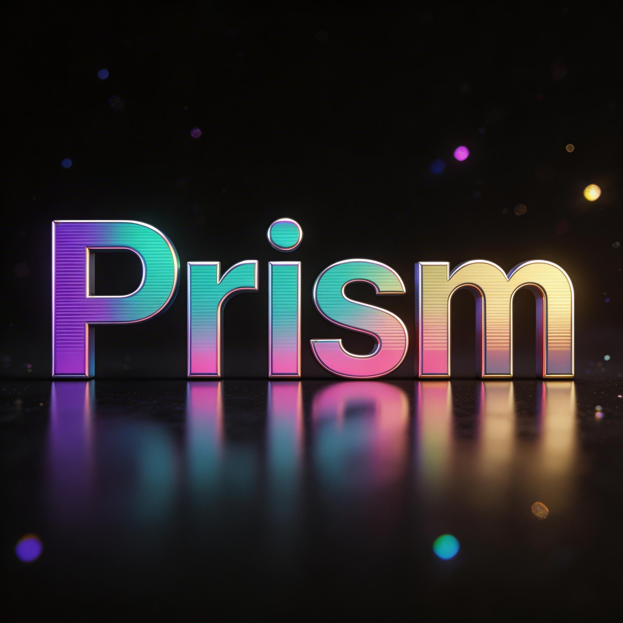
!["[eevn]" — Vaporwave | AI Text Effect Generator](/gallery/28030?aspect=1%3A1&thumb=https%3A%2F%2Fcos.fontvibe.ai%2Fgenerations%2Fuser%2F0%2F6facb725-cefb-4b99-a5c6-9b0f3e363611.jpeg%3FimageMogr2%2Fthumbnail%2F480x%2Fformat%2Fwebp%2Fresolution%2F80)




More fonts like Vaporwave Aesthetic


Looking for copy-paste fancy text? Try our free Font Generator Tools — cursive, gothic, bubble & 30+ styles.
About Vaporwave Aesthetic Font
A vaporwave aesthetic display typeface with extra-wide letter proportions, generous uniform spacing, and clean geometric strokes evoking early digital terminal typography. Captures the dreamy, spacious visual language of aesthetic internet culture, lo-fi music covers, and nostalgic CRT screen displays.
Emotions
dreamynostalgicmelancholicspaciousetherealdetached
Best For
vaporwave album coverlo-fi channel artaesthetic instagramdigital art titleretro internet aestheticsynthwave visualcrt aestheticjapanese aesthetic
Vibes
neonretrofuturistic
Visual Traits
vaporwaveaestheticfullwidthwide-proportionsdigitalcrtlo-fidreamyspaciousjapanese-aestheticterminalinternet-culturenostalgic
FAQ
What is the Vaporwave Aesthetic font?
Vaporwave Aesthetic is an extra-wide display letter with generous uniform spacing and clean geometric strokes, echoing early digital-terminal typography. It captures the dreamy, spacious look of aesthetic internet culture, lo-fi covers and nostalgic CRT screens — calm, detached and retro-digital.
Can I download Vaporwave Aesthetic?
There is no installable file. You type your text and the generator sets the wide-spaced letters fitted to your actual shapes, and returns a high-resolution image.
Where does this style work best?
Vaporwave and aesthetic branding, lo-fi and music covers, retro-tech and internet-culture graphics, dreamy social posts, poster and title work, streaming visuals. Set it large with the wide spacing intact.
Can I use it for commercial work?
Yes. Generated images may be used commercially, including album art, video and merch. No licence or attribution is required.
Why is the text spaced out so wide and airy?
Because it imitates the full-width spacing of early East-Asian computing, and that generous space also reads as calm. On old Japanese computer systems, Latin letters were often displayed in 'full-width' form — set in the same large square cell as a Chinese or Japanese character, which doubled the space each letter took up. So mixing English into those systems produced text that looked strangely stretched out and evenly spaced, a specific technical quirk of that hardware. Vaporwave, which is built on nostalgia for early Japanese computing, CRT screens and the aesthetic of that era, adopted that wide full-width spacing on purpose as a visual quotation of it. It works emotionally too: the eye reads generous, even space as slow, quiet and unhurried, giving the text a detached, dreamy calm rather than urgency. So the wide spacing is both a deliberate nod to a real computing artifact and a mood cue, which is exactly why it feels so unmistakably 'aesthetic.'
What fonts look similar?
For a glitch-corrupted vaporwave treatment, see Vaporwave Glitch. For a VHS scan-line look, try VHS Scan Display.