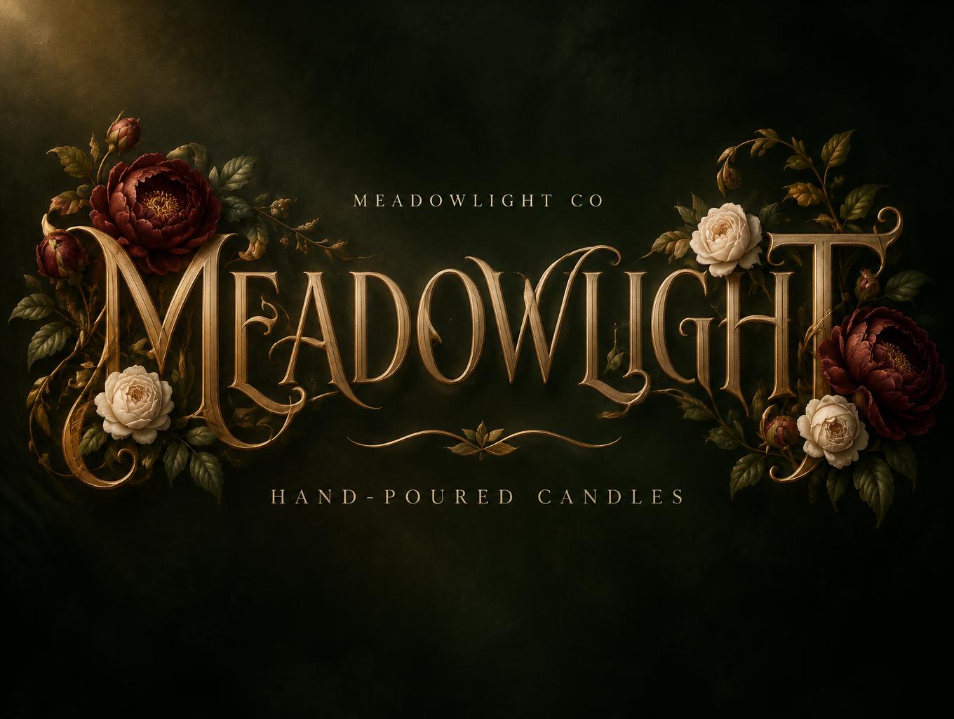
MEADOWLIGHT MEADOWLIGHT CO HAND-POURED CANDLES - Floral Text Effect


Uses OpenAI GPT-Image-2.5 Sunburst, the model behind this artwork · 15 credits
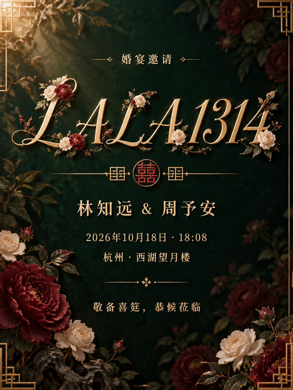


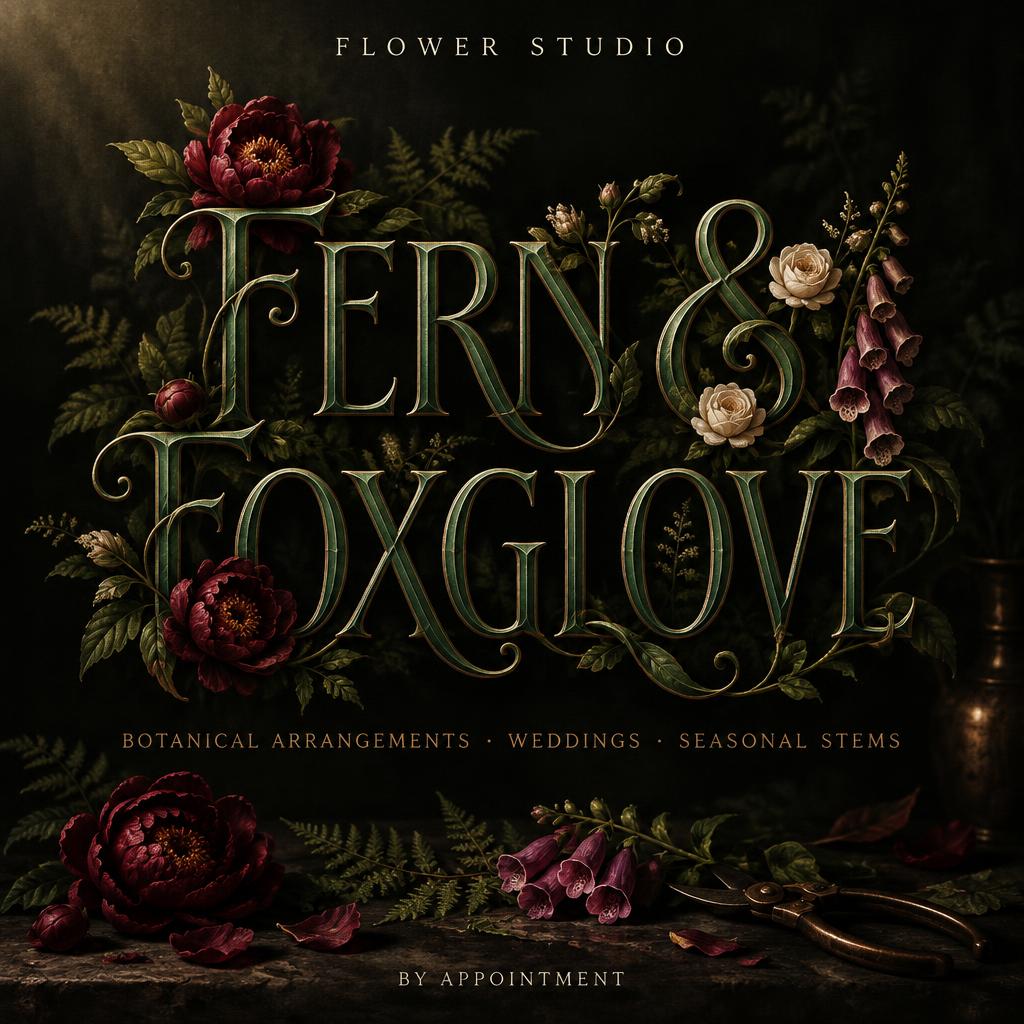
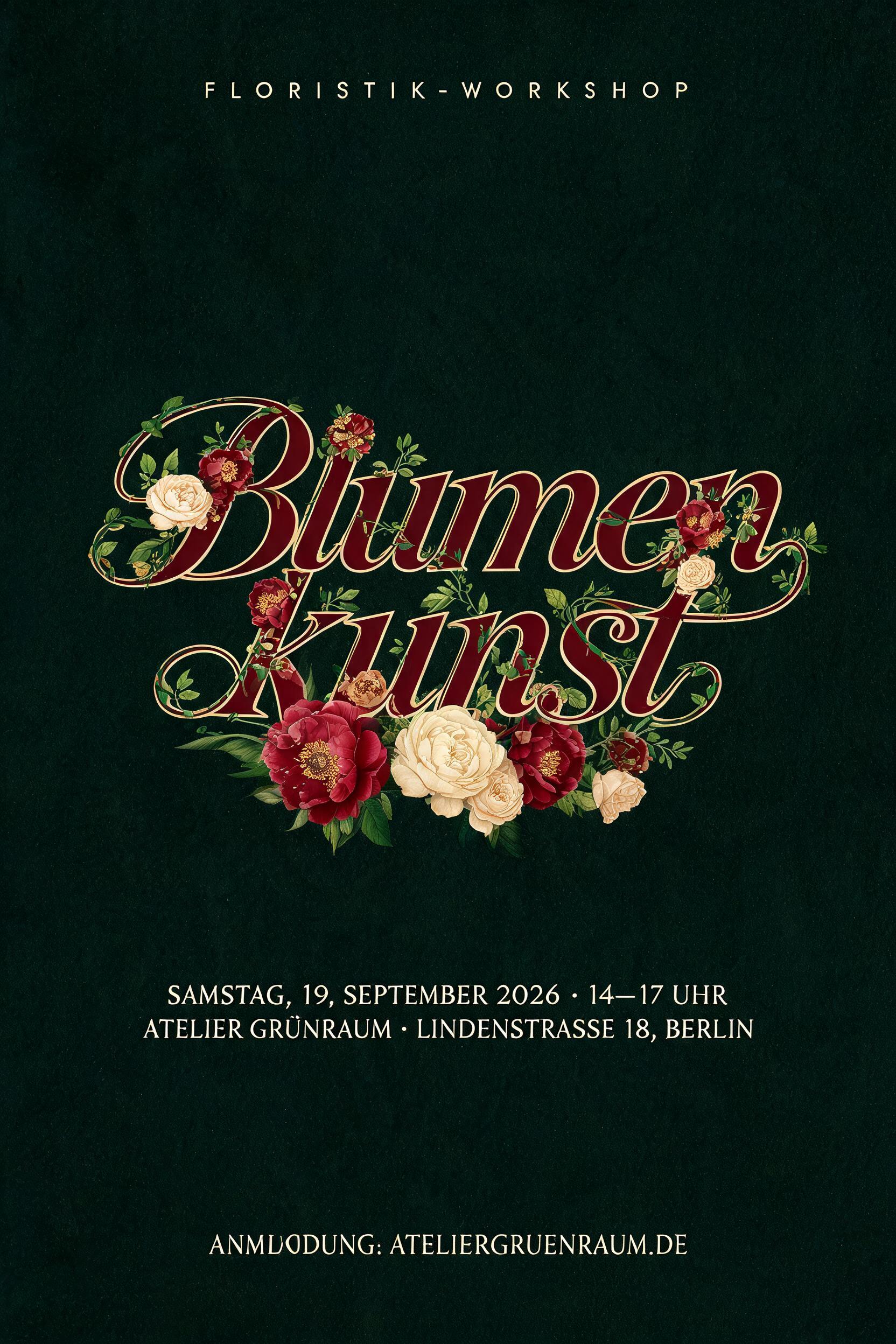
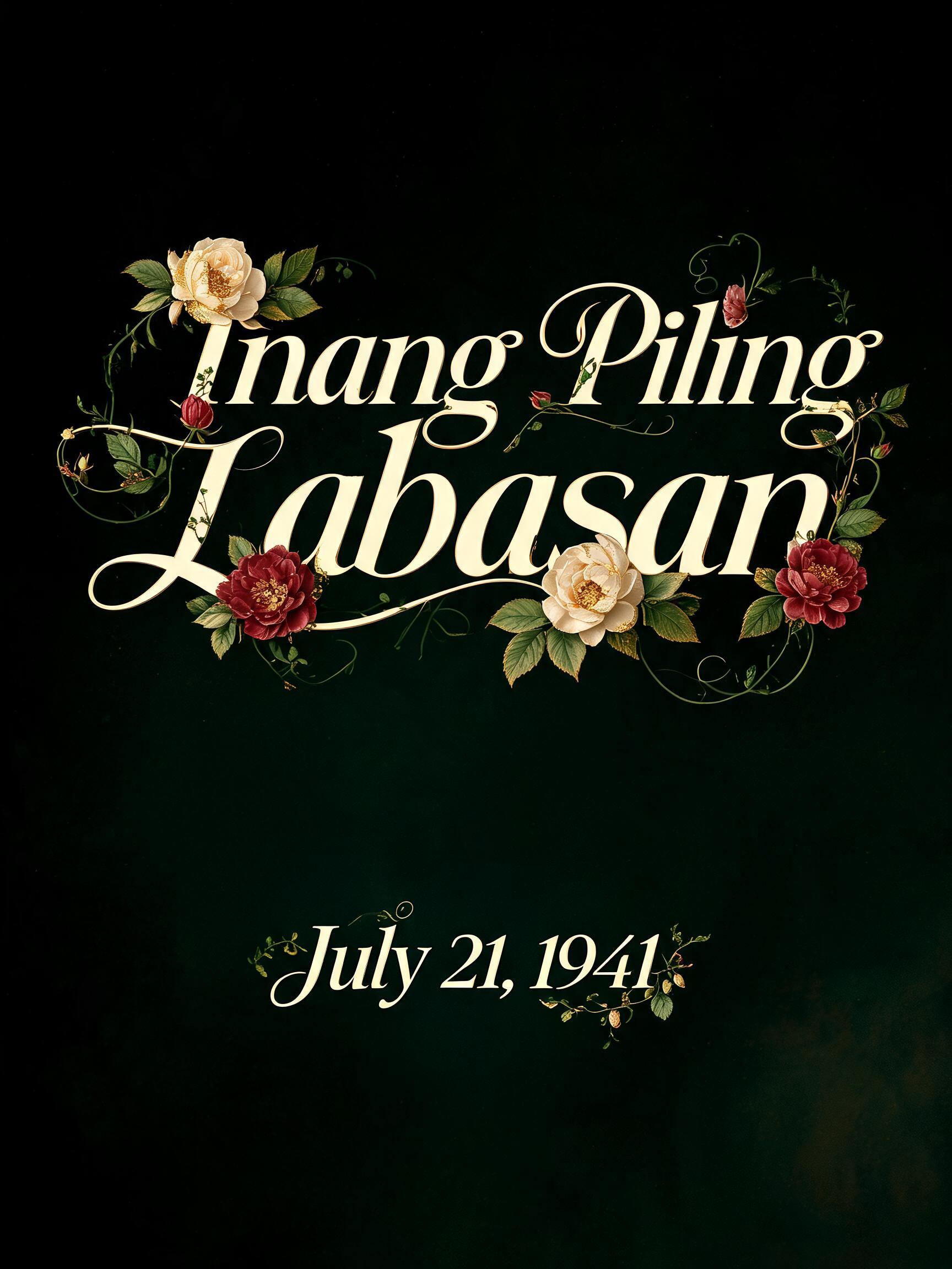







“MEADOWLIGHT MEADOWLIGHT CO HAND-POURED CANDLES” was created with FontVibe AI — explore more Floral text effect. Cream serif capitals entwined with burgundy peonies, cream roses and green vines that bloom from the letter ends, on a dark green ground.
A finished brand lettering piece for a candle company. The word "MEADOWLIGHT" in Art Nouveau display capitals sits centered, filling about 70% of the frame width. The letters have a flowing whiplash construction. Strokes swell at the curves like living plant stems, joints are organic and slightly asymmetric, and terminals curl into fine tendril flourishes. The letterforms are polished antique gold with warm raking highlights that change angle along every curve, over deep amber shadow. Every counter and outline stays clearly readable. Botanical ornament grows from the letters, covering no more than a third of any stroke face. Burgundy peonies with visible petal detail and gold-dusted stamens cluster at the first M and the final T. Cream roses sit at the junctions and the apex of the H. Forest-green veined leaves emerge at stroke corners, and thin vines trail along the stroke edges only, never crossing into counters. Foreground blooms are fully rendered, mid-ground sprigs are half lit, and background foliage dissolves into shadow. Below, a small line reads "HAND-POURED CANDLES" in refined spaced capitals with Art Nouveau proportions, in soft cream-gold, about 28% of the frame width. Below the main word and above that line, a short wavy gold tendril flourish with one tiny leaf acts as a divider. Above the main word, a tiny line reads "MEADOWLIGHT CO" in small cream capitals, about 10% of the frame width. The background is deep velvet near-black forest green with a faint chiaroscuro glow. A single key light from the upper left at 45 degrees gives Dutch Golden Age painterly depth. A soft warm candle-flame glow gently lights the lower edge of the letters. Vertical spacing between the three tiers is roughly 1:5:1.5. The look is luxurious, botanical and warm.
Made for Floral Text Generator
Generated on November 8, 2026 · 1360 × 1024 · JPEG · OpenAI GPT-Image-2.5 Sunburst · Layout: Poster · Shared by the creator · Free for commercial use (CC BY 4.0)



