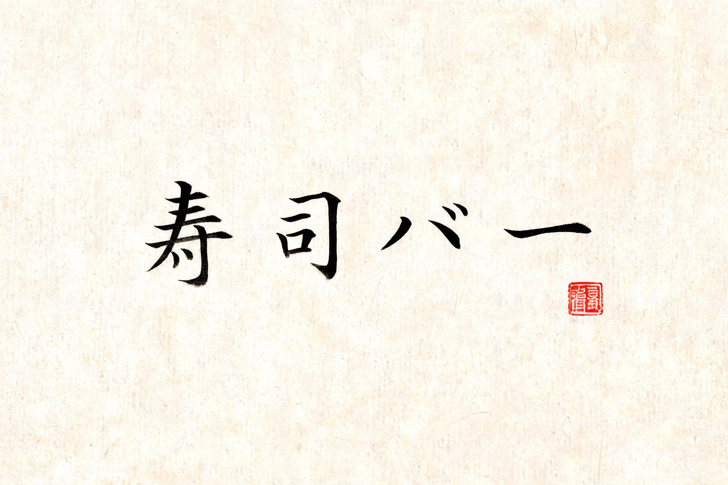
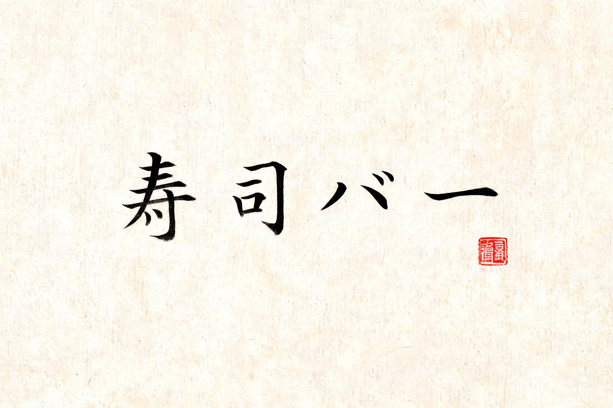
寿司バー - Japanese Ink Brush Text Effect

Japanese ink brush aesthetic — the visual language of sumi calligraphy on washi paper. INK MEDIUM: sumi pigment in deep...


“寿司バー” is a Brush Japanese Ink text effect text effect created with FontVibe AI. Japanese Shodo ink brush calligraphy style applied to Latin letterforms. Deep sumi black ink with authentic fude brush energy, controlled single-direction strokes, and washi paper atmosphere. Perfect for Japanese restaurant branding, tattoo design, anime, martial arts, and cultural projects. Japanese ink brush aesthetic — the visual language of sumi calligraphy on washi paper. INK MEDIUM: sumi pigment in deep black to charcoal range — richest density at mark centers, naturally transitioning outward as ink supply depletes. Fully matte, absorbed into paper surface, producing a tonal range from dense opaque black to transparent grey depending on dilution and brush load. PAPER SURFACE: natural washi — warm cream-white base with visible paper fiber structure giving slight texture. The absorbent surface creates the characteristic soft border quality of East Asian brush work at all mark edges. LIGHT ATMOSPHERE: soft diffuse north-facing studio light — the traditional calligrapher's light source. Even, shadowless, allowing the full tonal range of ink marks to read clearly. Warm cream paper tone contrasts against deep sumi black. AESTHETIC REGISTER: the ma principle — the space between and around marks is as considered as the marks themselves. Compositions have breathing room and deliberate quietness. When no specific material is defined by the font: default environment — deep sumi black marks on warm cream washi paper, soft diffuse overhead light, meditative studio atmosphere. Four characters 寿司バー rendered in expressive shodo brushwork on warm washi paper with visible fiber grain running through the cream-white surface. Ink loads heaviest at each stroke entry — dense opaque sumi black — then releases through the sweep of each mark, thinning to soft charcoal gray and finally to a near-translucent whisper at the pull-away tails. The katakana characters バー carry a bolder, broader stroke weight that anchors the composition with rhythmic contrast against the finer, more intricate kanji preceding them. Soft diffuse north-light falls evenly across the surface, reading every tonal nuance from jet-black to pale smoke without cast shadow. Controlled ink bleed follows the paper fibers outward from stroke edges, giving each mark a living, absorbed quality inseparable from the washi ground. A single small vermilion hanko seal pressed with quiet authority near the lower margin introduces the only warm accent color — a traditional signal of authenticity and craft. Generous negative space breathes around the characters, honoring the ma principle. The overall atmosphere evokes a high-craft Japanese culinary identity — serene yet appetizing, rooted in tradition, carrying the focused energy of a skilled itamae at the cutting board.
Generated on Jun 7 · 2496 × 1664 · JPG · Shared by the creator


