I'D STILL CHOOSE - Embossed Text Effect

Uses BytePlus Seedream 5.0, the model behind this artwork · 15 credits


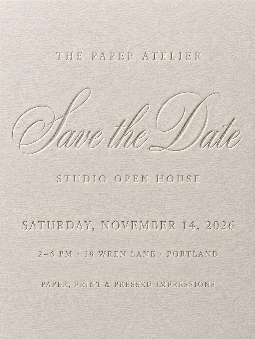
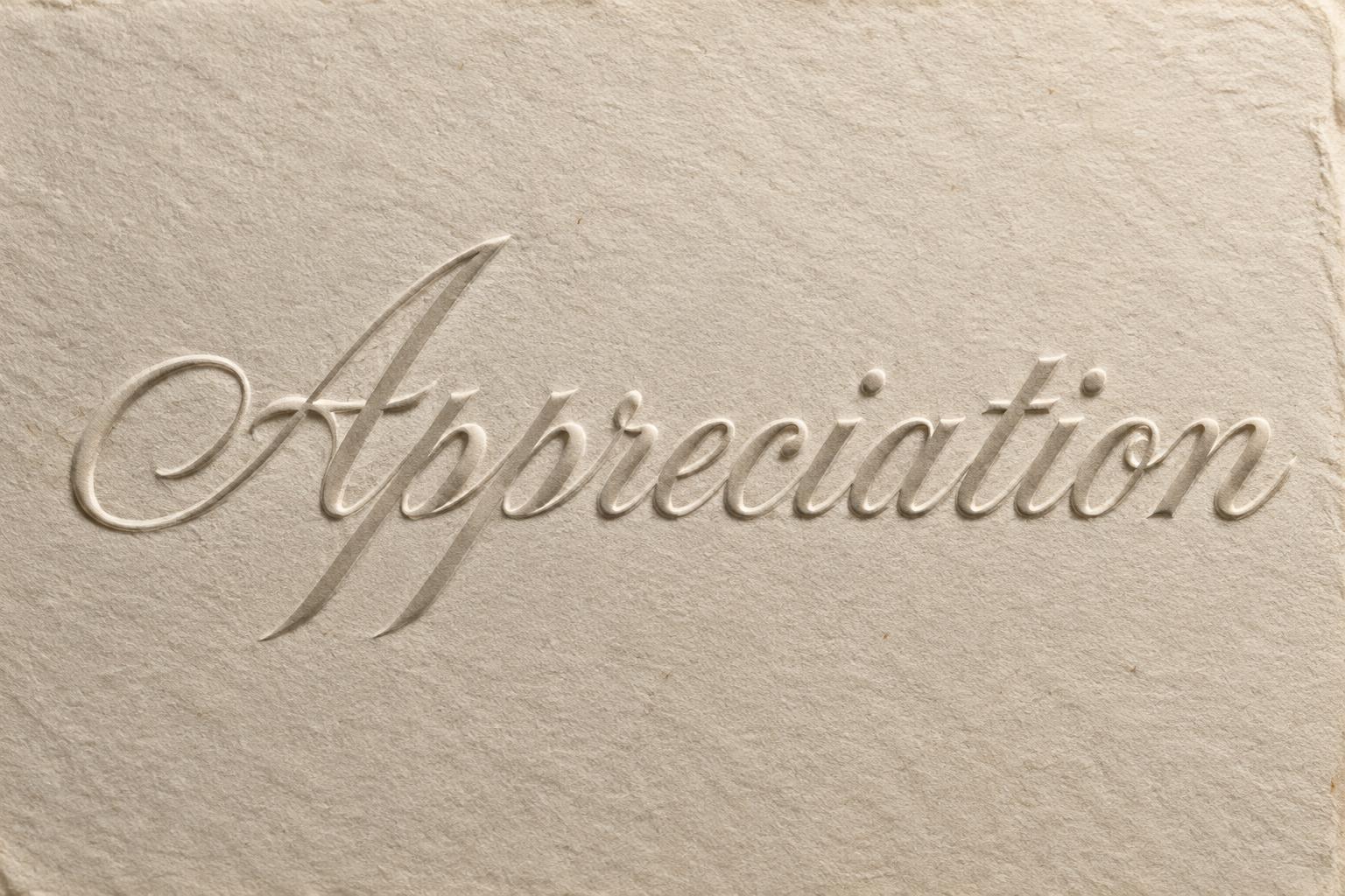
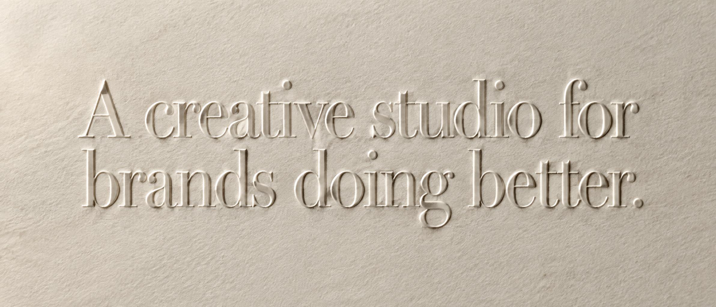
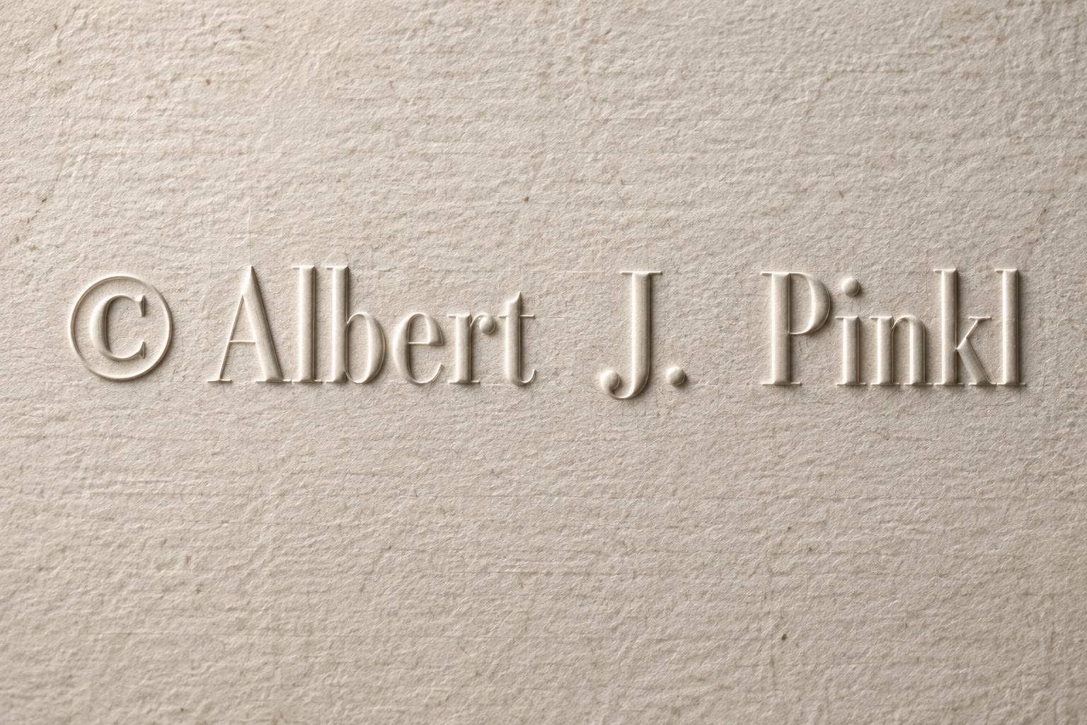


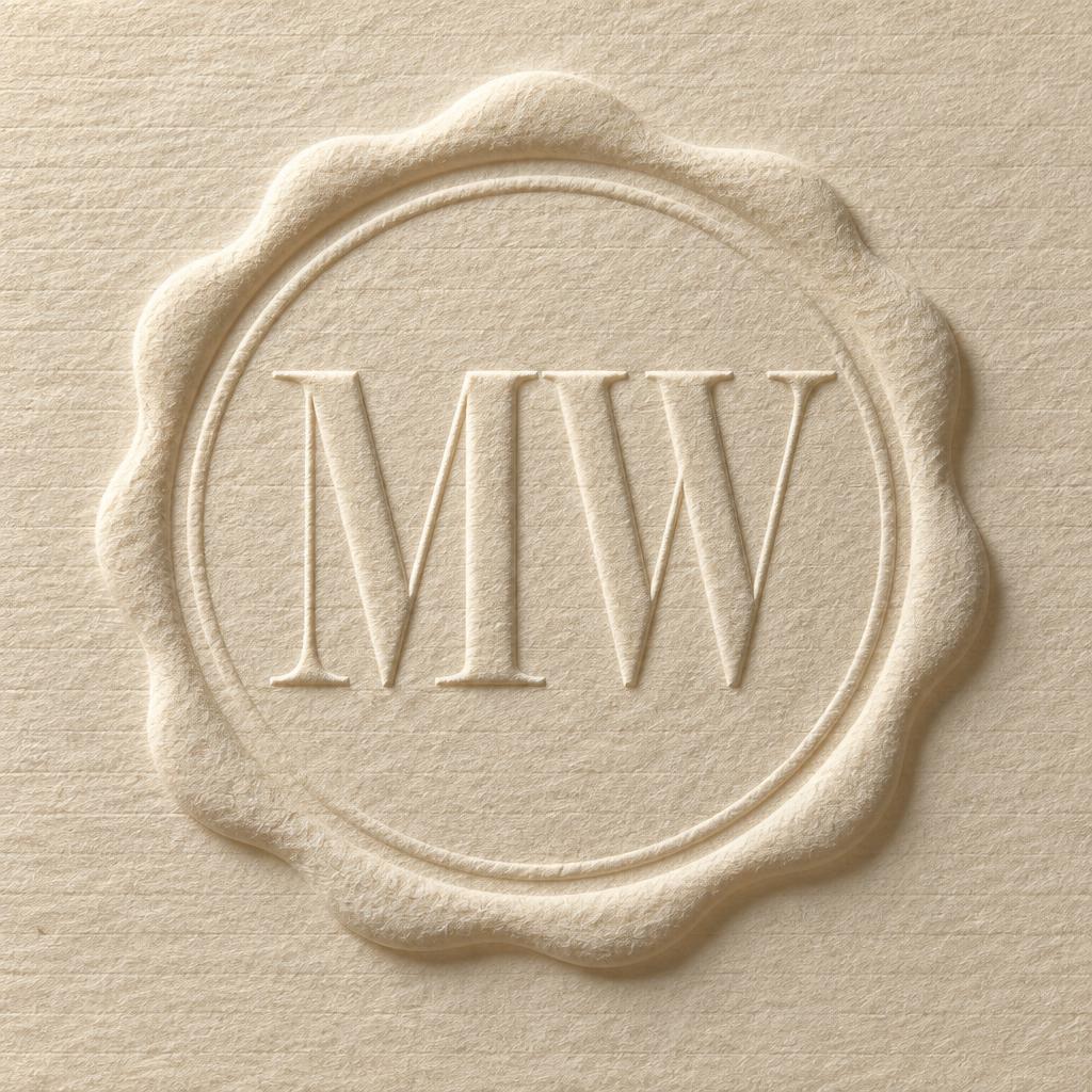
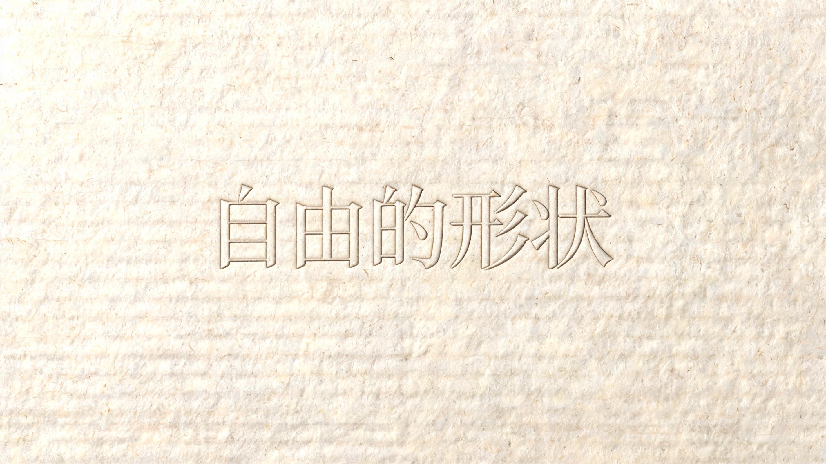
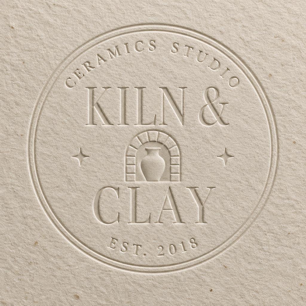
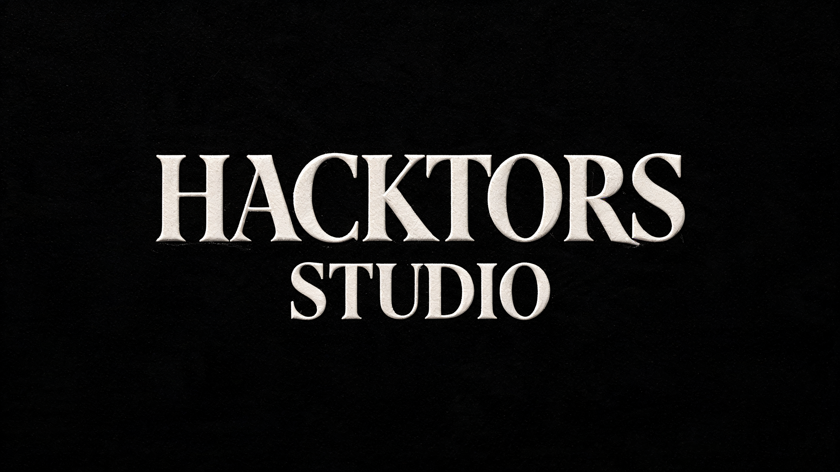



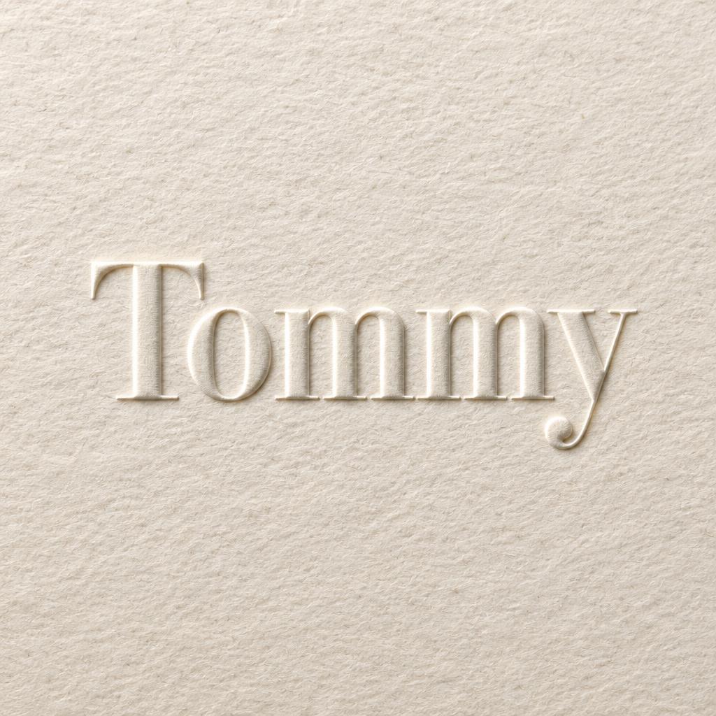
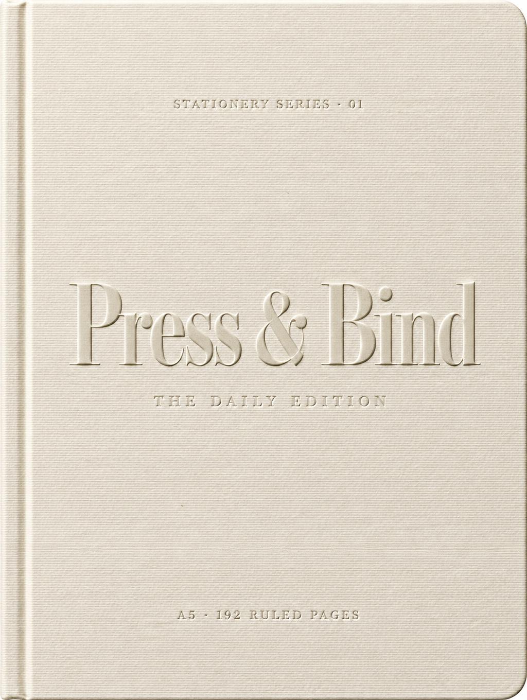
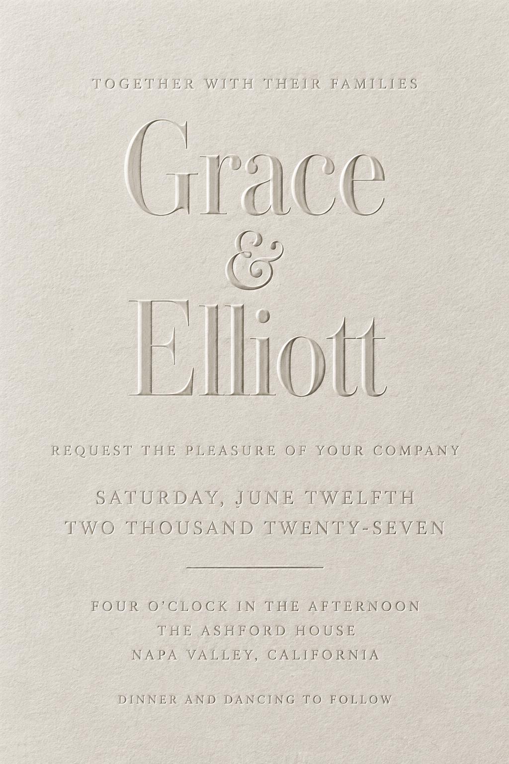
“I'D STILL CHOOSE” is a Emboss text effect text effect created with FontVibe AI. Serif capitals blind-embossed into ivory cotton paper: no ink, only a raised relief with a crisp highlight ridge and soft shadow from low raking light.
Fine paper fibers visible around letter edges where the relief meets the flat surface. Raking light from upper-left at a low angle reveals the raised topology: crisp highlight ridge along the top edge of each letter, soft shadow on the opposite side. No color added — tonal contrast is the only visual language. No gradients on letter faces, no glow, no outline strokes. LETTERFORM PRIORITY: when the chosen font carries its own treatment, that font's letterform shapes take priority and own the letters, rendered as raised relief; this style governs the embossed topology and the raking light. FALLBACK MATERIAL: if the font carries no material of its own, render the letters as a clean blind-embossed relief raised from premium paper, read only through raking-light highlight and shadow. COLOR PRIORITY: emboss adds no color of its own — keep the surface tonal; if the font specifies a color render it as a subtle tinted relief, otherwise natural paper tone. Heavy cream cotton rag paper fills the entire frame — surface grain visible with fine laid-line fiber weave and subtle natural variation across the sheet. 'I'D STILL CHOOSE' in raised blind-emboss relief, letters filling generous frame width with rhythmic spacing between each word. Upper-left raking light at a low oblique angle: crisp bright highlight ridges run along the top and left edges of each raised letterform, clean soft shadow pools on the opposing lower-right flanks, revealing every millimeter of relief topology. The paper tone is warm aged ivory with faint cool undertone, no pigment applied — tonal contrast alone defines each letter. No glow, no outline, no color fill. The raised surface catches ambient scatter from the studio, giving the cotton fibers a soft luminosity between the letterforms. Three words carry equal visual weight yet read as a single flowing declaration, the negative paper surface breathing around them. Premium stationery quality, macro studio conditions, 8k detail, octane render.
Generated on June 21, 2026 · 2848 × 1600 · JPEG · BytePlus Seedream 5.0 · Shared by the creator · Free for commercial use (CC BY 4.0)