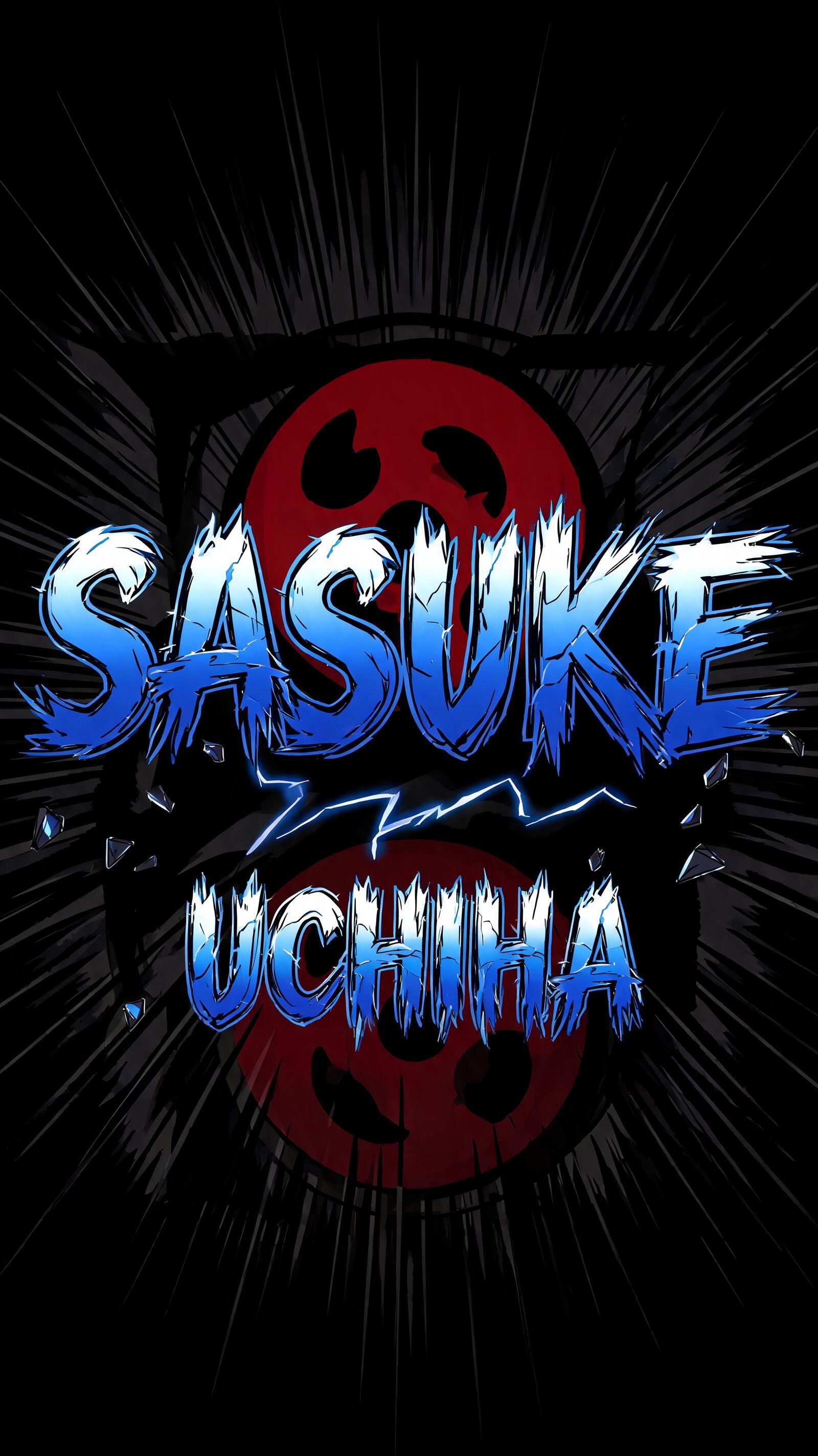
Sasuke Uchiha - Anime Text Effect


Uses BytePlus Seedream 5.0, the model behind this artwork · 15 credits
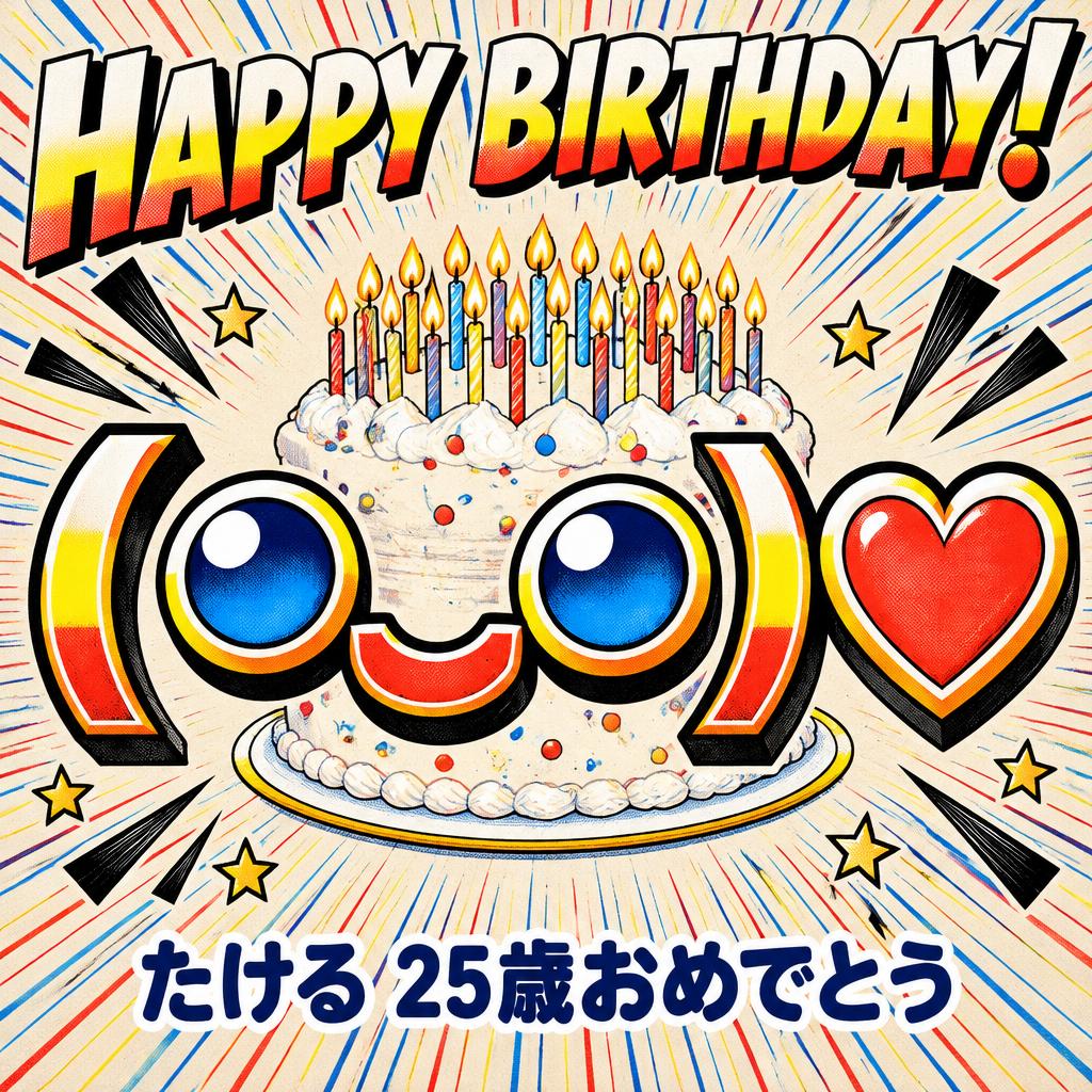
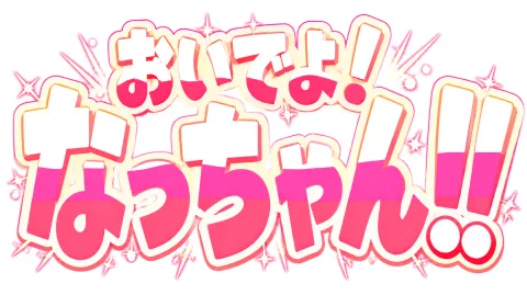
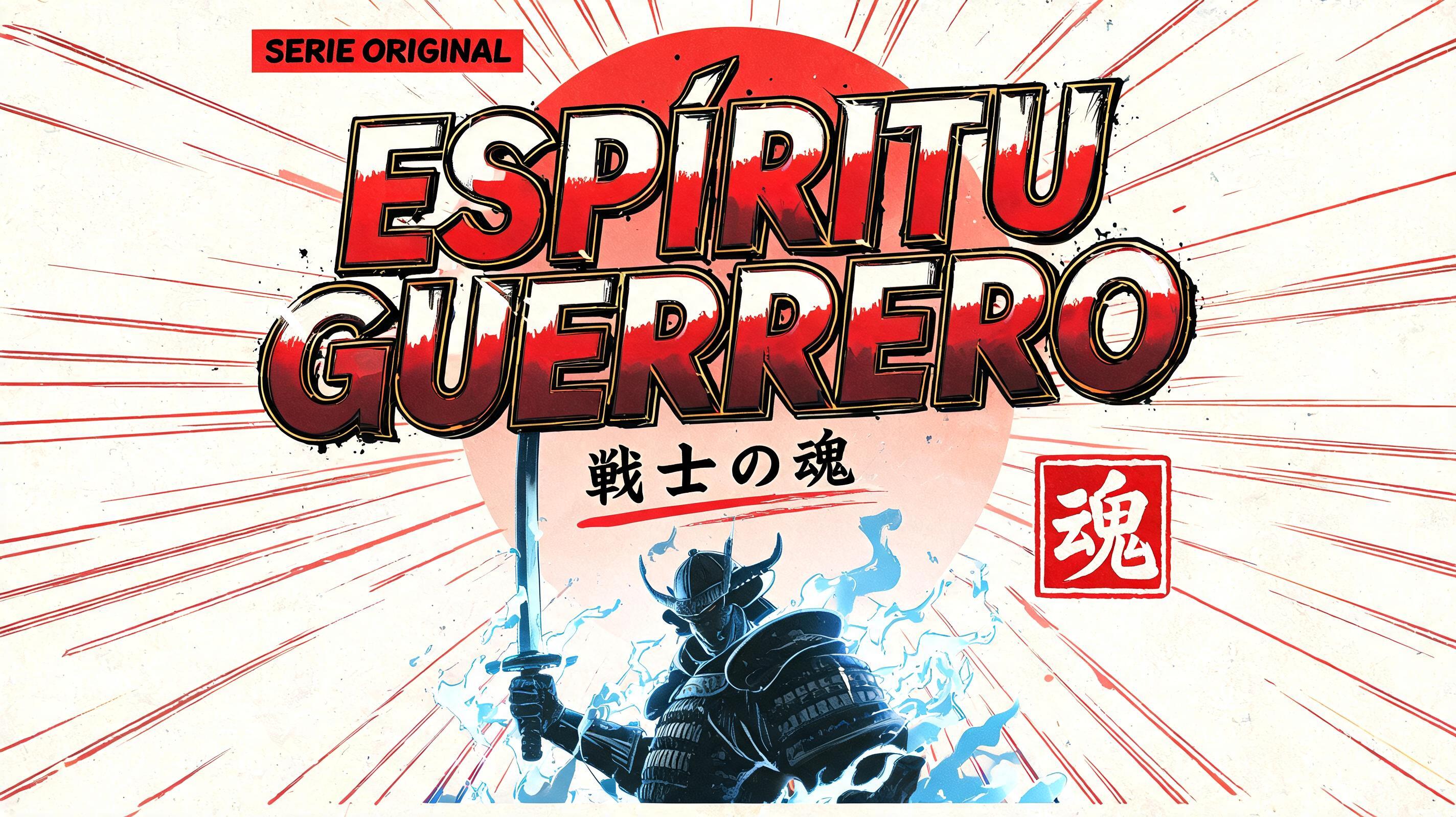

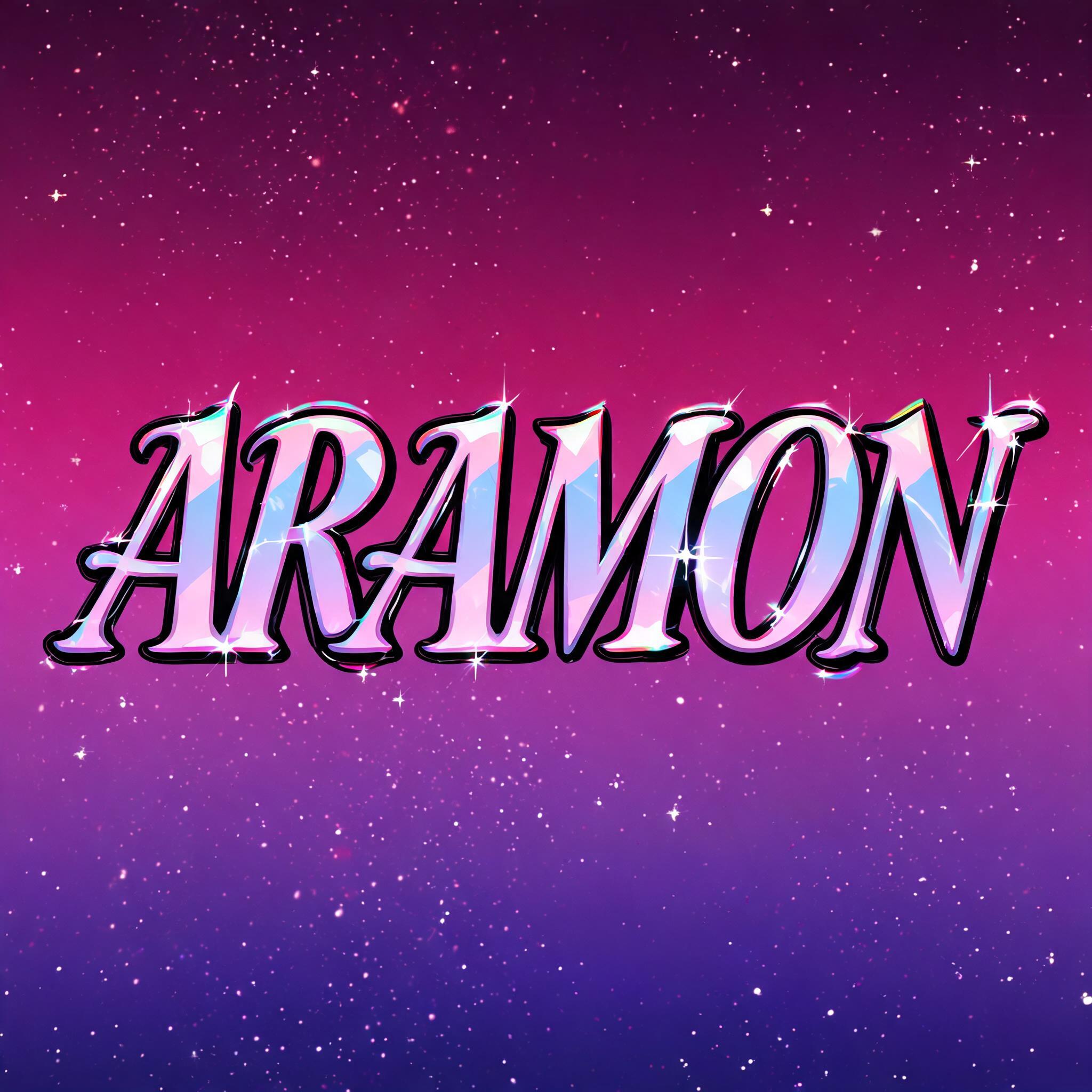

“Sasuke Uchiha” was created with FontVibe AI — explore more Anime text effect. Shounen manga title lettering: heavy hand-inked black outlines, flat cel shading split into hard highlight and shadow bands, slanted dynamic letters on white with radiating speed lines.
rendered as Japanese shounen anime title treatment — bold hand-inked manga lettering with authentic cel-shaded visual energy. Letter construction follows classic Shonen Jump title card standards: thick black ink outline with natural brush-weight variation defining each letter boundary; flat cel-shading fill with three hard-edge zones — bright highlight zone on upper letter face, highly saturated primary color zone at center, deep shadow zone at lower edge; all zone boundaries knife-edge hard, zero gradient blur, pure flat offset-print ink physics. Energy signature: high-contrast color + thick ink outline = letters that look physically printed on manga paper. The typographic language of Dragon Ball, Naruto, One Piece, Demon Slayer, Jujutsu Kaisen title cards — maximum manga kinetic energy, iconic and immediately recognizable as Japanese anime title typography. LETTERFORM PRIORITY: when the chosen font carries its own treatment, that font's letterform shapes take priority and own the letters; this style governs the inked manga outline, the three-zone cel-shading and the kinetic energy. FALLBACK MATERIAL: if the font carries no material of its own, render the letters as bold hand-inked shounen title lettering with a thick black brush outline and hard three-zone cel-shading. COLOR PRIORITY: keep the font's own colors if specified; otherwise a high-saturation primary fill with hard highlight and shadow zones. Sasuke Uchiha as a dual-line shounen anime title card — 'Sasuke' as large hero name with 'Uchiha' as the clan name subtitle beneath it, scaled to fill a bold vertical portrait frame. Background: pure black with a Sharingan eye motif radiating outward in ghosted ink wash — three tomoe rotating around a crimson iris, dissolving into dense radial speed lines that burst from behind the letterforms. Each letter: thick black ink outline with natural hand-inked brush-weight variation at corners and stroke terminals; flat cel-shaded three-zone fill — ice-cold blue-white highlight zone across the upper letter faces, vivid electric midnight-blue primary fill at center mass, near-black navy shadow zone at lower edges; all zone boundaries knife-edge hard, zero gradient blur, pure flat offset-print ink physics. Scattered impact marks and jagged shard fragments orbit the letters like shattered curse seal energy. A cold lightning bolt crack splits the negative space between the two name lines — electric blue, ultra-thin, jagged. The overall material language reads as an authentic Shonen Jump character introduction title card: maximum ink contrast, flat cel energy, and the visual tension of a rival character reveal panel from Naruto's defining arc.
Generated on July 18, 2026 · 1600 × 2848 · JPEG · BytePlus Seedream 5.0 · Shared by the creator · Free for commercial use (CC BY 4.0)


