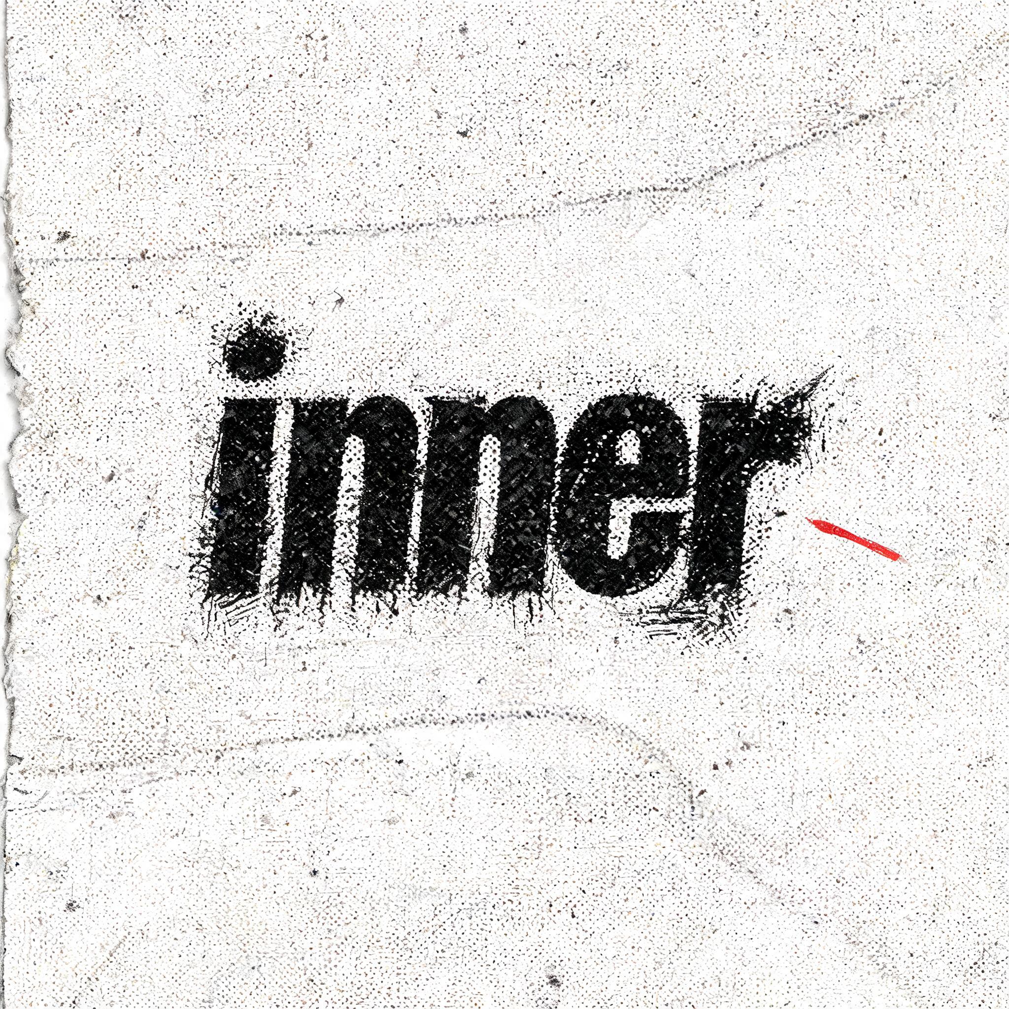
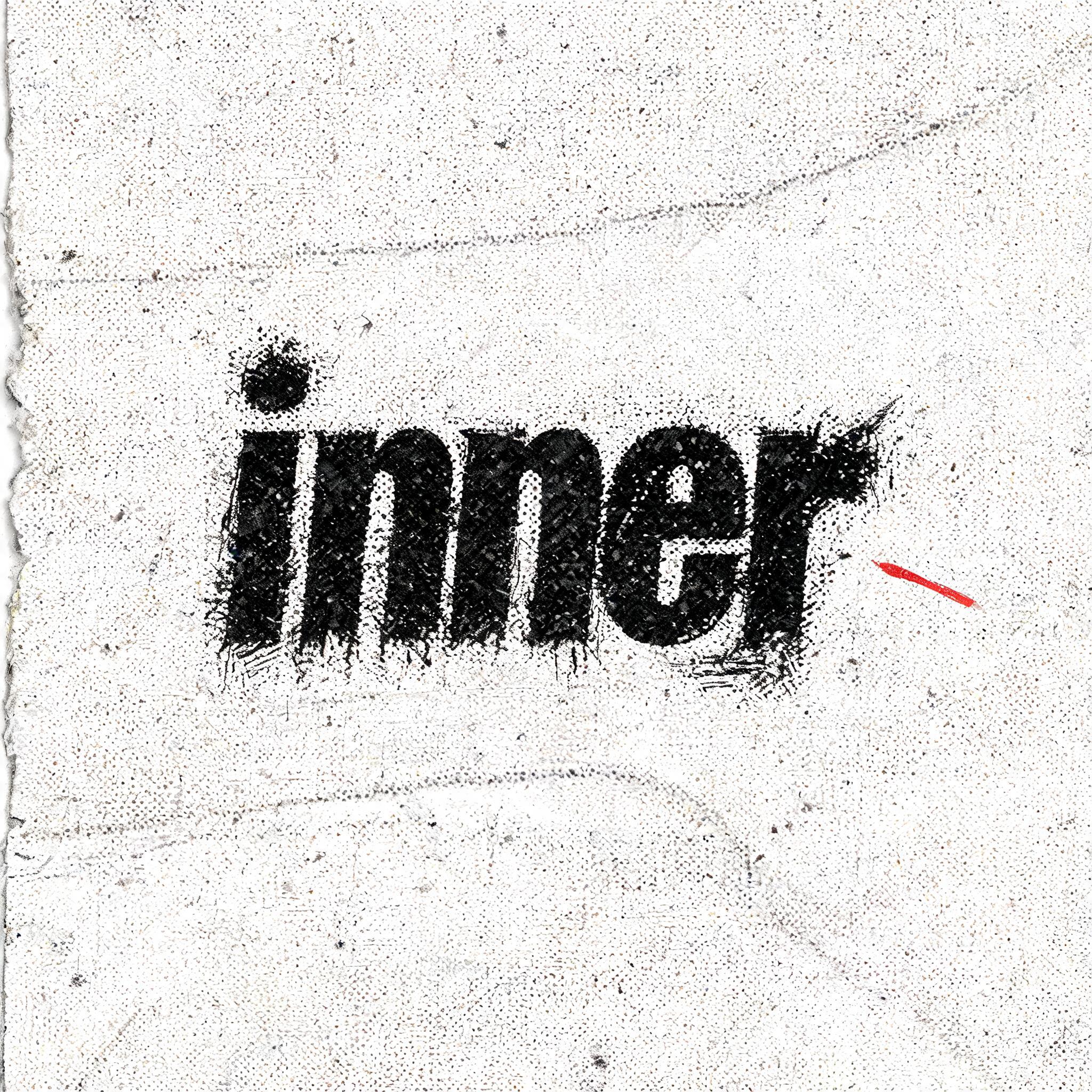
inner - Grunge Text Effect


Uses BytePlus Seedream 5.0, the model behind this artwork · 15 credits

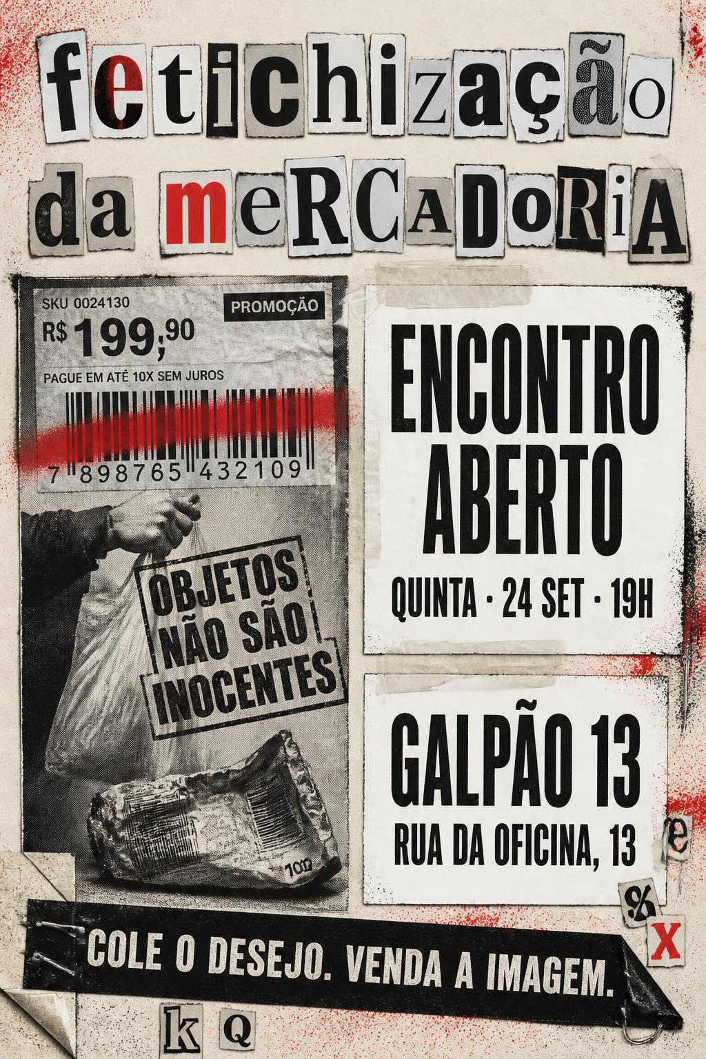
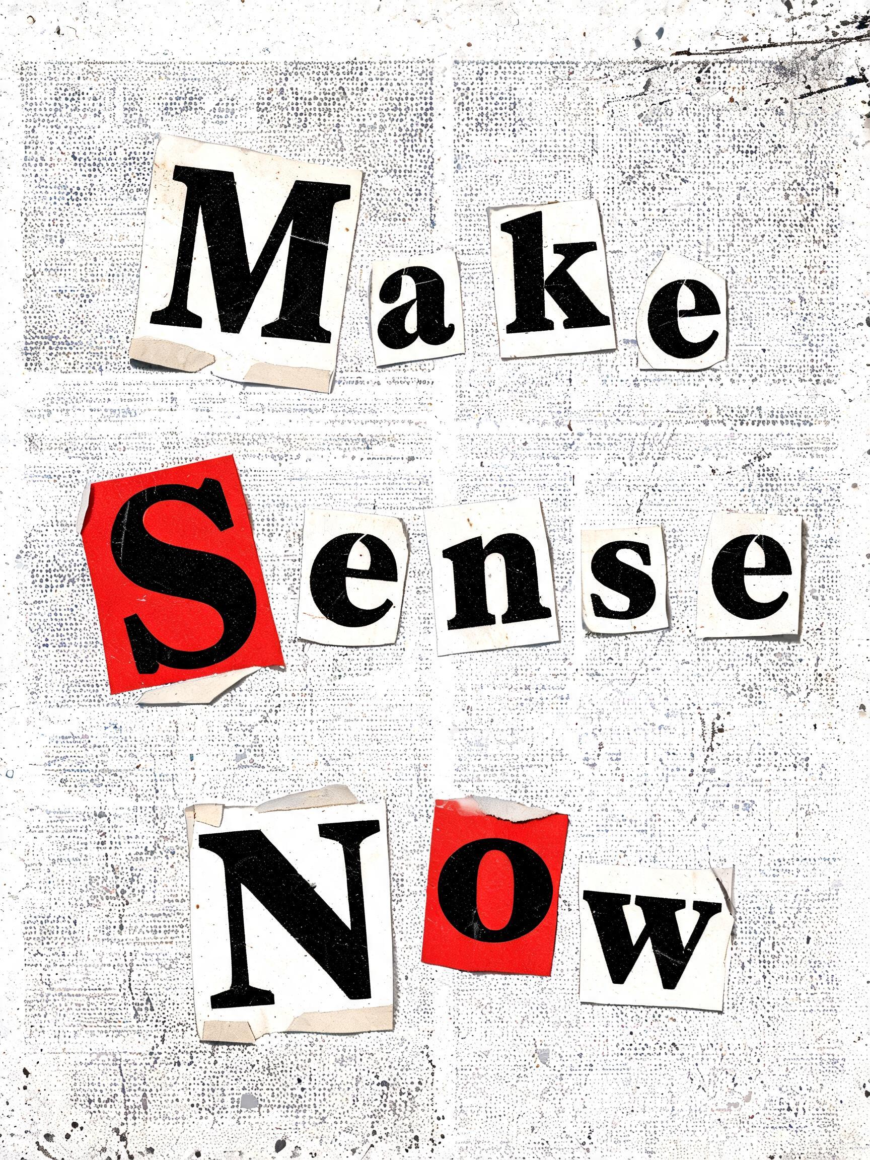
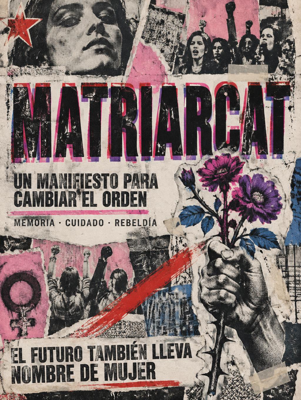
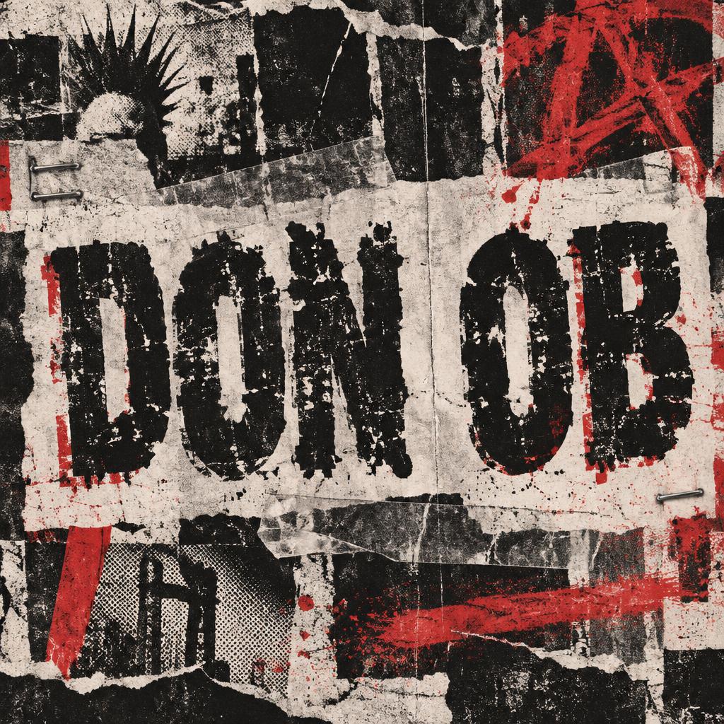


“inner” is a Grunge text effect text effect created with FontVibe AI. Ransom-note letters cut from mixed newspaper type, taped onto raw photocopied paper with halftone speckle, torn edges and a single punk-red accent.
a photocopied punk-zine world. PRINT: everything looks run through a cheap copier and pasted up by hand — coarse halftone dot screens, heavy black ink that bleeds and clogs, low-ink dropout and roller streaks, Xerox speckle and nth-generation blur on raw off-white newsprint and photocopy paper. TEXTURE: torn and scissor-cut paper edges, strips of tape, lifted corners, creases, scratches, smears and spray-paint overspray — the evidence of a hand working under pressure. LIMITED PALETTE: the cheap two-color reproduction palette — high-contrast black ink and raw off-white paper, with one punchy punk RED as the accent (occasionally a hit of acid yellow), printed slightly off-register. ENERGY: a layered cut-and-paste collage grammar, asymmetric and disrupted like a stapled zine. LETTERFORM PRIORITY: when the chosen font carries its own material or treatment (ransom-note collage, riso halftone, distressed, spray, stamp, ink-bleed), that font treatment takes absolute priority and owns the letters; this style governs the paper, print degradation, palette and surrounding collage. FALLBACK MATERIAL: if the font carries no material of its own, print the letters in heavy high-contrast black ink on raw off-white paper with photocopy grain, ink bleed and torn edges, so the grunge zine feel always reads. A square raw off-white photocopied zine field, 'inner' rendered with deliberate restraint — the single word sitting with quiet weight, its letterforms soaked in heavy black ink with visible bleed into the coarse paper grain, halftone dot screen breaking up the ink density unevenly, low-ink dropout causing patches of faint near-disappearance as if the word is retreating into itself. Xerox speckle and nth-generation photocopy blur dust the surrounding negative space. A muted slash of punk red — narrow, accidental-looking, slightly off-register — cuts somewhere near the text like a wound barely visible. Torn paper edge along one border, a crease running through the field, faint roller streak from a cheap drum. The overall surface feels compressed and introspective — the copier pressed too hard, the ink pushed too deep — cut-and-paste zine grammar stripped down to almost nothing, anti-grid and asymmetric, as if someone folded and unfolded the page twice before printing.
Generated on August 1, 2026 · 2048 × 2048 · JPEG · BytePlus Seedream 5.0 · Shared by the creator · Free for commercial use (CC BY 4.0)


