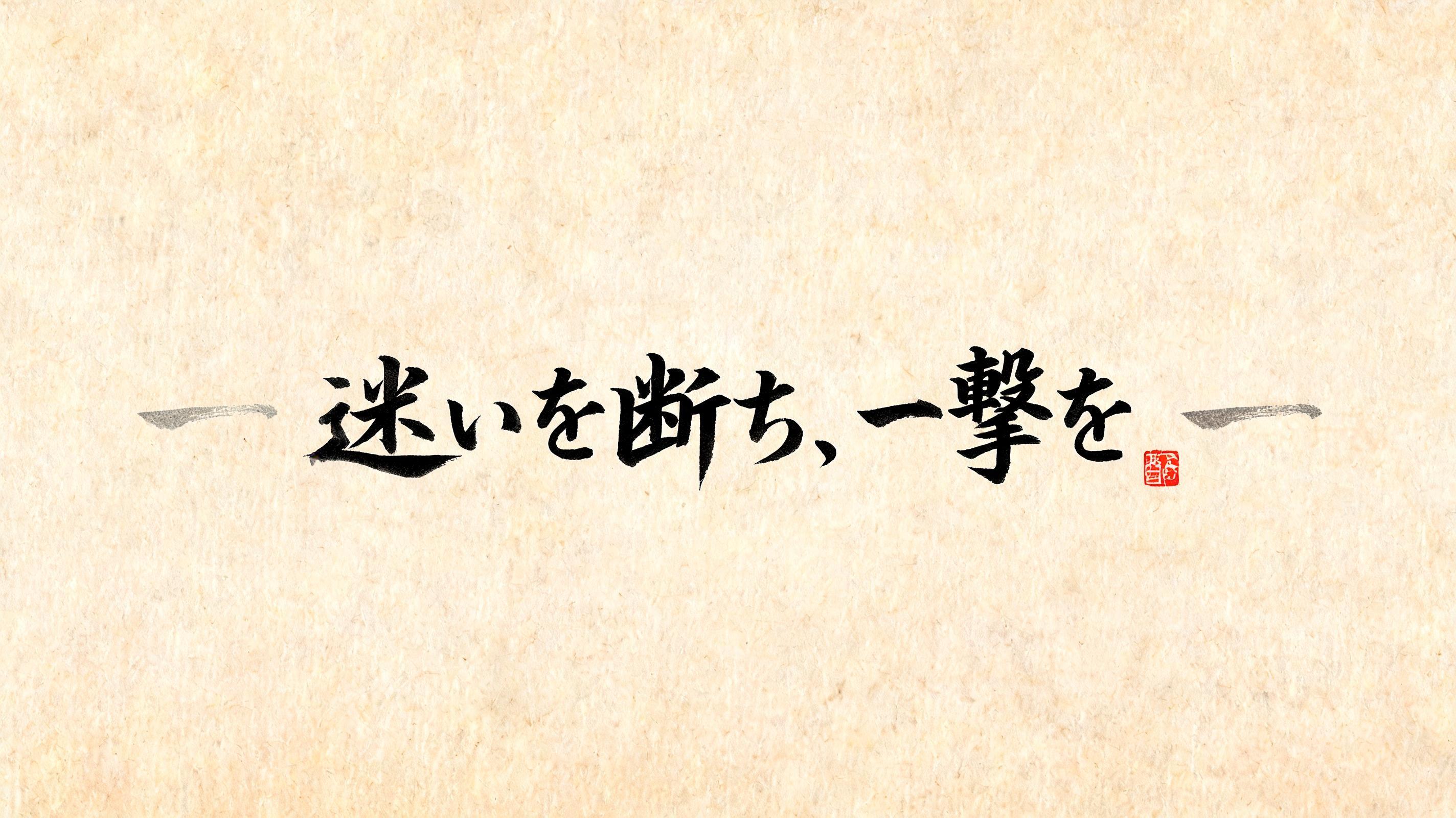
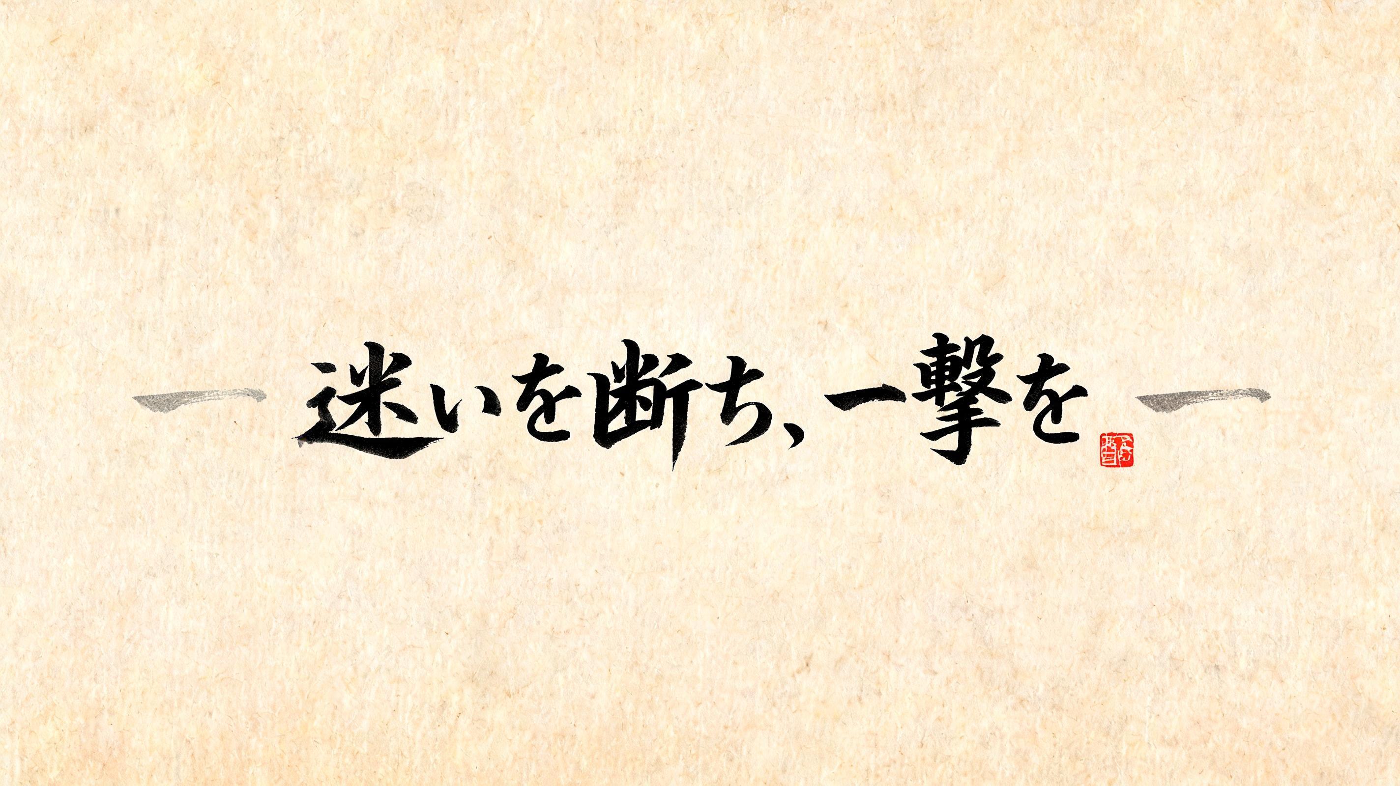
ー 迷いを断ち、一撃を。ー - Japanese Ink Brush Text Effect

Japanese ink brush aesthetic — the visual language of sumi calligraphy on washi paper. INK MEDIUM: sumi pigment in deep...


“ー 迷いを断ち、一撃を。ー” is a Brush Japanese Ink text effect text effect created with FontVibe AI. Japanese Shodo ink brush calligraphy style applied to Latin letterforms. Deep sumi black ink with authentic fude brush energy, controlled single-direction strokes, and washi paper atmosphere. Perfect for Japanese restaurant branding, tattoo design, anime, martial arts, and cultural projects. Japanese ink brush aesthetic — the visual language of sumi calligraphy on washi paper. INK MEDIUM: sumi pigment in deep black to charcoal range — richest density at mark centers, naturally transitioning outward as ink supply depletes. Fully matte, absorbed into paper surface, producing a tonal range from dense opaque black to transparent grey depending on dilution and brush load. PAPER SURFACE: natural washi — warm cream-white base with visible paper fiber structure giving slight texture. The absorbent surface creates the characteristic soft border quality of East Asian brush work at all mark edges. LIGHT ATMOSPHERE: soft diffuse north-facing studio light — the traditional calligrapher's light source. Even, shadowless, allowing the full tonal range of ink marks to read clearly. Warm cream paper tone contrasts against deep sumi black. AESTHETIC REGISTER: the ma principle — the space between and around marks is as considered as the marks themselves. Compositions have breathing room and deliberate quietness. When no specific material is defined by the font: default environment — deep sumi black marks on warm cream washi paper, soft diffuse overhead light, meditative studio atmosphere. Horizontal composition for a contemplative martial phrase. Warm aged washi paper with visible long-fiber texture, slight cream-amber tone suggesting ink-aged scroll surface. The phrase ー 迷いを断ち、一撃を。ー rendered in master shodo — calligraphic rhythm moving with controlled urgency, not decoration. Entry strokes carry full brush load: near-black sumi density at each stroke origin, ink thinning with decisive pull-through speed along horizontal sweeps and diagonal cuts. The character 断 receives the heaviest ink weight — a deliberate anchor in the phrase, stroke geometry conveying severance. The 一撃 pairing follows with concentrated force, slightly reduced scale suggesting focused precision after release. The flanking ー dashes carry minimal ink, dry-brush ghost quality — breath marks framing the statement. Overall ink tonal range spans opaque charcoal black at stroke cores to translucent smoke-gray at trailing edges, with micro-fiber bleed along washi surface. Soft diffuse north-studio light, fully shadowless, revealing every fiber impression and ink absorption gradient. A single small vermilion hanko seal impression appears near the phrase's trailing edge — dry-stamped, slightly uneven ink pressure, traditional format. Generous ma — open field of warm cream paper surrounds the brushwork, silence given equal weight to the marks. No embellishment beyond the brushwork and seal.
Generated on Aug 19 · 2848 × 1600 · JPG · Shared by the creator


