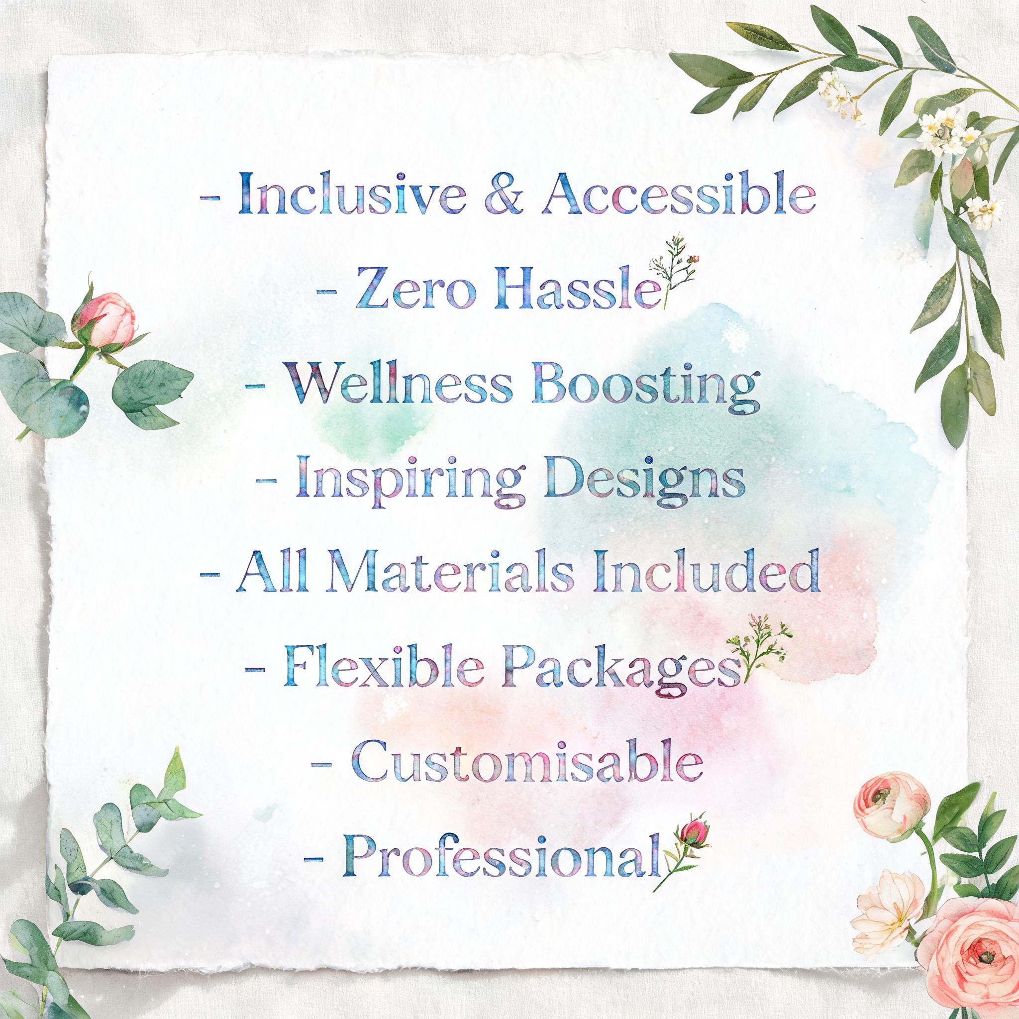
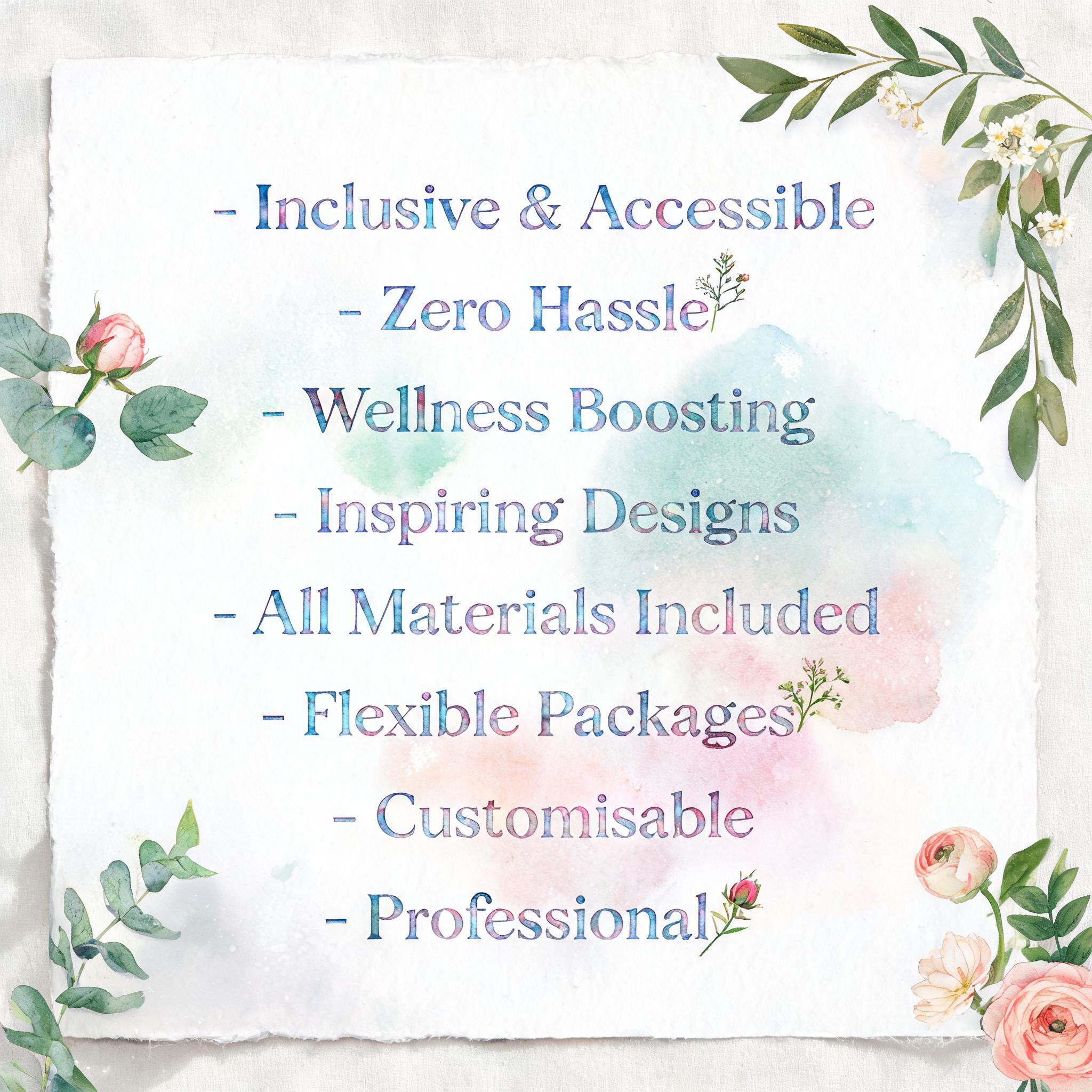
- Inclusive & Accessible - Zero Hassle - Wellness Boosting - Inspiring Designs - All Materials Included - Flexible Packages - Customisable - Professional - Watercolor Text Effect

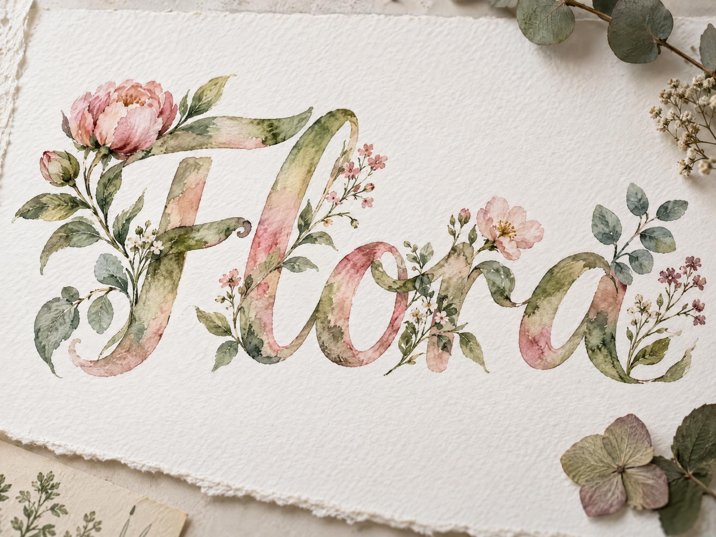

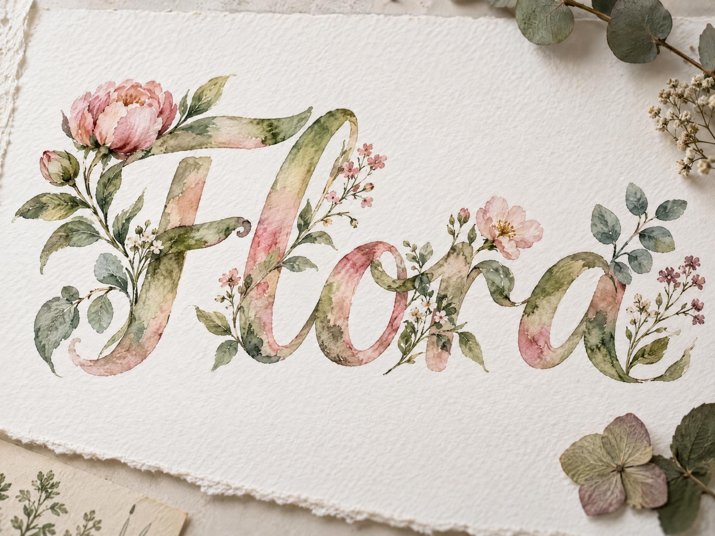
Uses ByteDance Seedream 5.0, the model behind this artwork · 15 credits


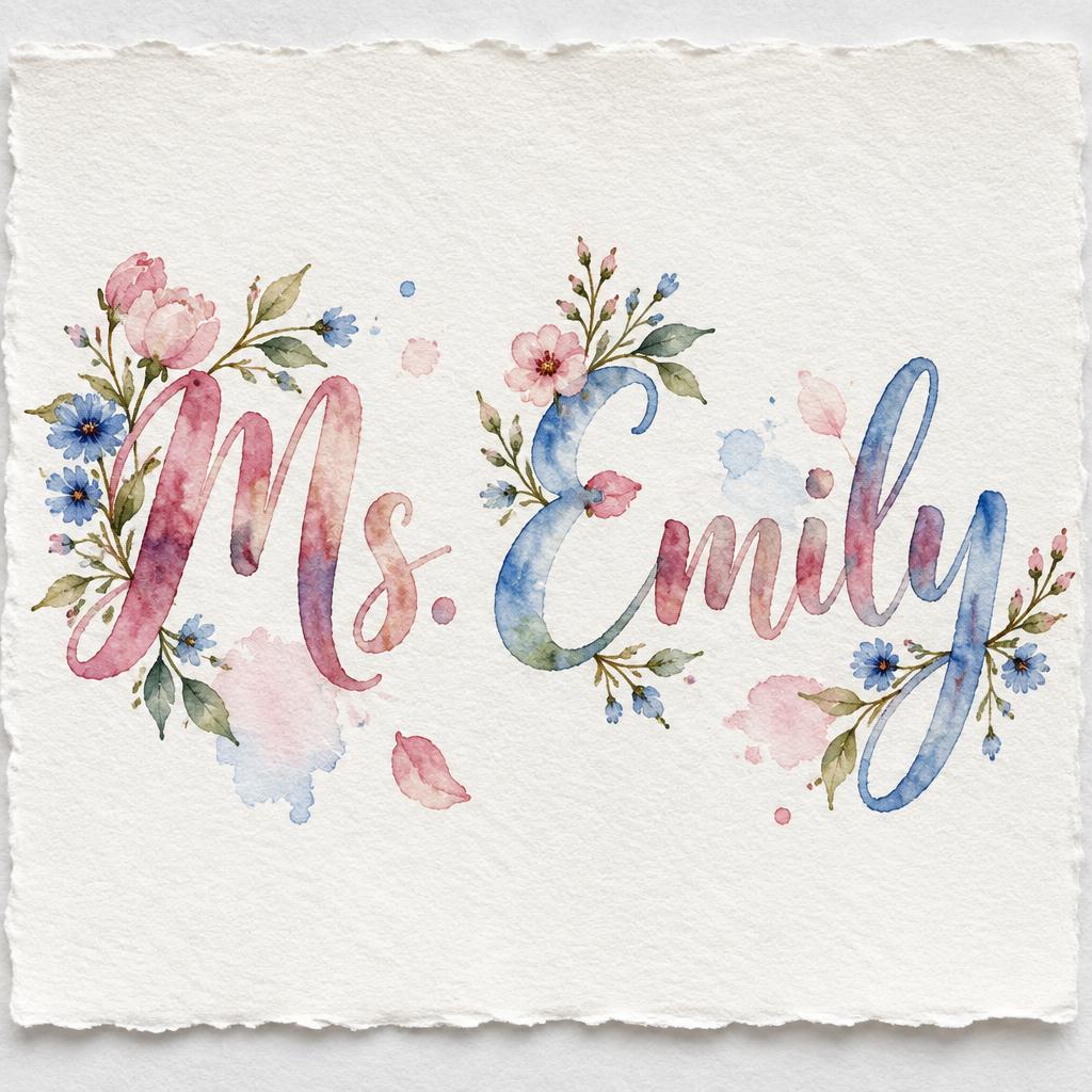
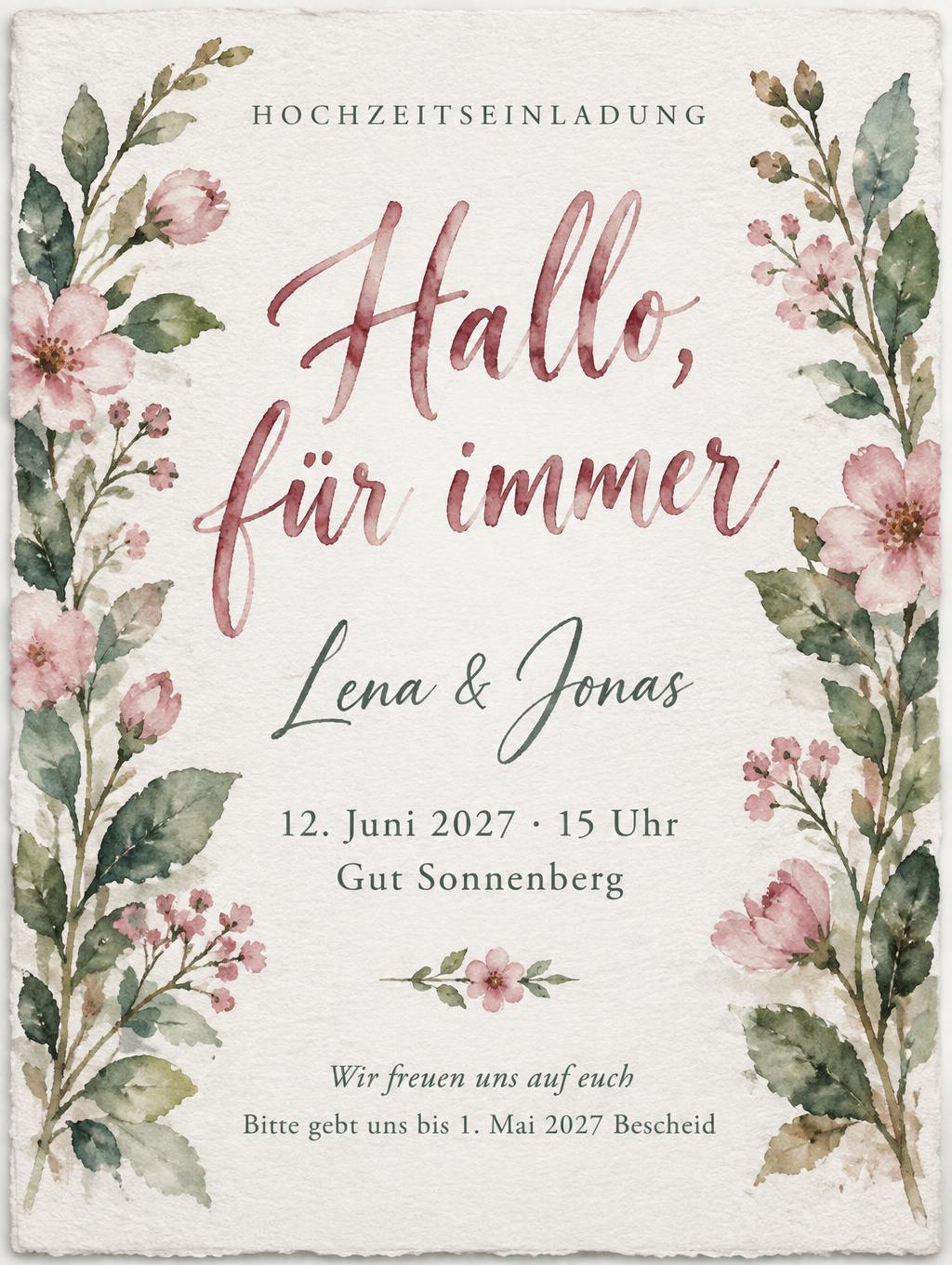
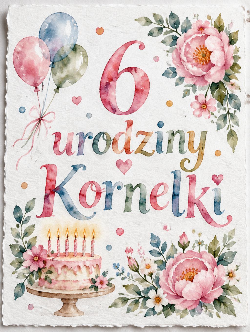


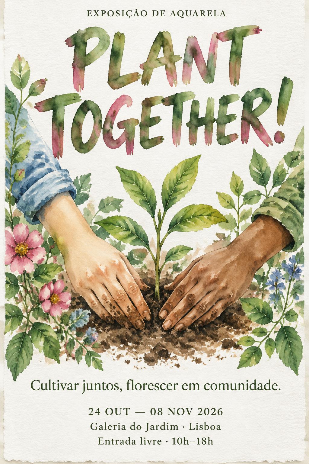

“- Inclusive & Accessible - Zero Hassle - Wellness Boosting - Inspiring Designs - All Materials Included - Flexible Packages - Customisable - Professional” is a Watercolor text effect text effect created with FontVibe AI. Serif capitals filled with transparent watercolor washes and small floral sprigs, white paper glowing through, on deckled cold-press paper beside a paint palette.
a luminous transparent watercolor world painted on paper. LIGHT & GROUND: soft even north-light falls on cold-press watercolor paper whose bright unpainted white is the lightest value in the frame — highlights are the bare paper itself, never painted white. SURFACE: transparent washes let the paper glow through; pigment disperses unevenly, pooling darker along edges while centers stay pale, with soft wet-on-wet cauliflower blooms where wet meets wet and crisp hard edges where paint dried on dry paper — the signature soft/hard tension. TEXTURE: cold-press paper tooth flecks the washes with tiny bare-white gaps and heavier pigment granulates into the grain. PALETTE: a transparent fine-art aquarelle palette — sap and olive green, rose madder and blush, cobalt and cerulean blue, indigo, raw sienna — always luminous and layered, never opaque. LETTERFORM PRIORITY: when the chosen font carries its own material or color (botanical floral sprigs, ink-in-water diffusion, expressive splatter, line-and-wash ink, etc.), that font treatment takes absolute priority and owns the letter surface; this style then governs only the paper, light and surrounding color atmosphere. FALLBACK MATERIAL: if the font carries no material of its own, paint the letters as transparent wet-on-wet watercolor washes — pale luminous centers, pigment pooling and blooming at the edges, the white paper breathing through — so the watercolor identity always reads. A tall 9:16 sheet of cold-press watercolor paper, bright unpainted white surface as the dominant ground, generous open negative space around the text block. The eight bullet lines — '- Inclusive & Accessible', '- Zero Hassle', '- Wellness Boosting', '- Inspiring Designs', '- All Materials Included', '- Flexible Packages', '- Customisable', '- Professional' — rendered as a clean vertical list, each line carrying the same measured weight and spatial rhythm, the leading dashes acting as soft typographic anchors. Letterforms receive transparent wet-on-wet watercolor washes: pale luminous centers of cerulean blue and soft rose madder, pigment pooling and darkening along stroke edges, cobalt indigo granulating into the cold-press paper tooth, tiny bare-white flecks of paper breathing through each wash. Soft even north-light falls across the sheet, a faint deckled paper edge visible on two sides, gentle cool cast shadow grounding the paper on a pale linen surface. Loose pressed botanical sprigs — fine eucalyptus stems, tiny ivory ranunculus florets, a trailing sprig of olive foliage — rest delicately at the upper and lower corners without overlapping the text, adding a botanical-studio wellness-brand atmosphere. Raw sienna and sap green transparent washes drift softly in the background, wet-on-wet cauliflower blooms dispersing where wet pigment met wet paper, crisp dry-brush edges forming elsewhere — the signature hard-soft tension of fine aquarelle. Gallery-quality cold-press watercolor paper texture throughout, pigment granulation visible in every wash layer.
Generated on August 20, 2026 · 2048 × 2048 · JPEG · ByteDance Seedream 5.0 · Shared by the creator · Free for commercial use (CC BY 4.0)