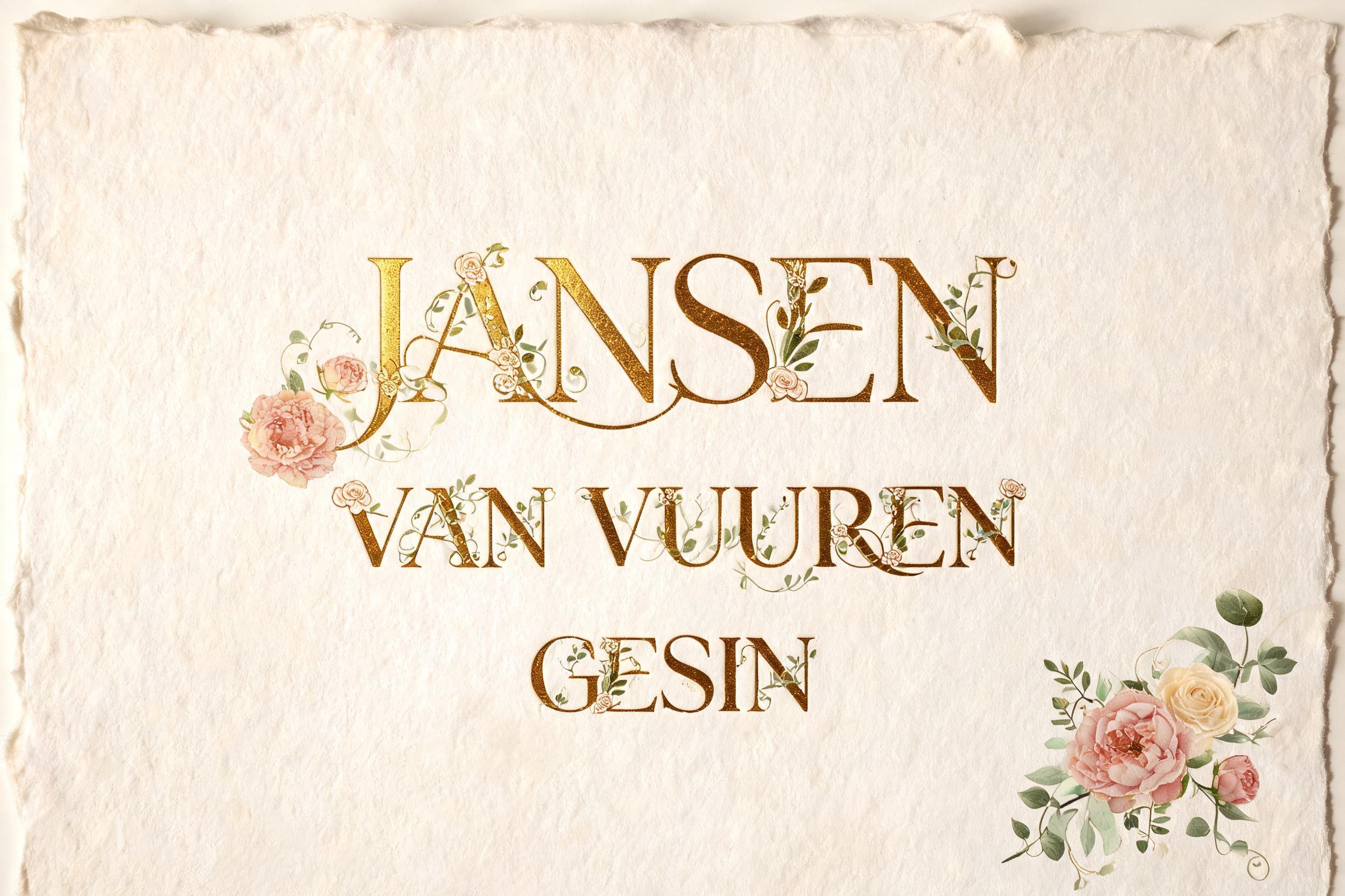
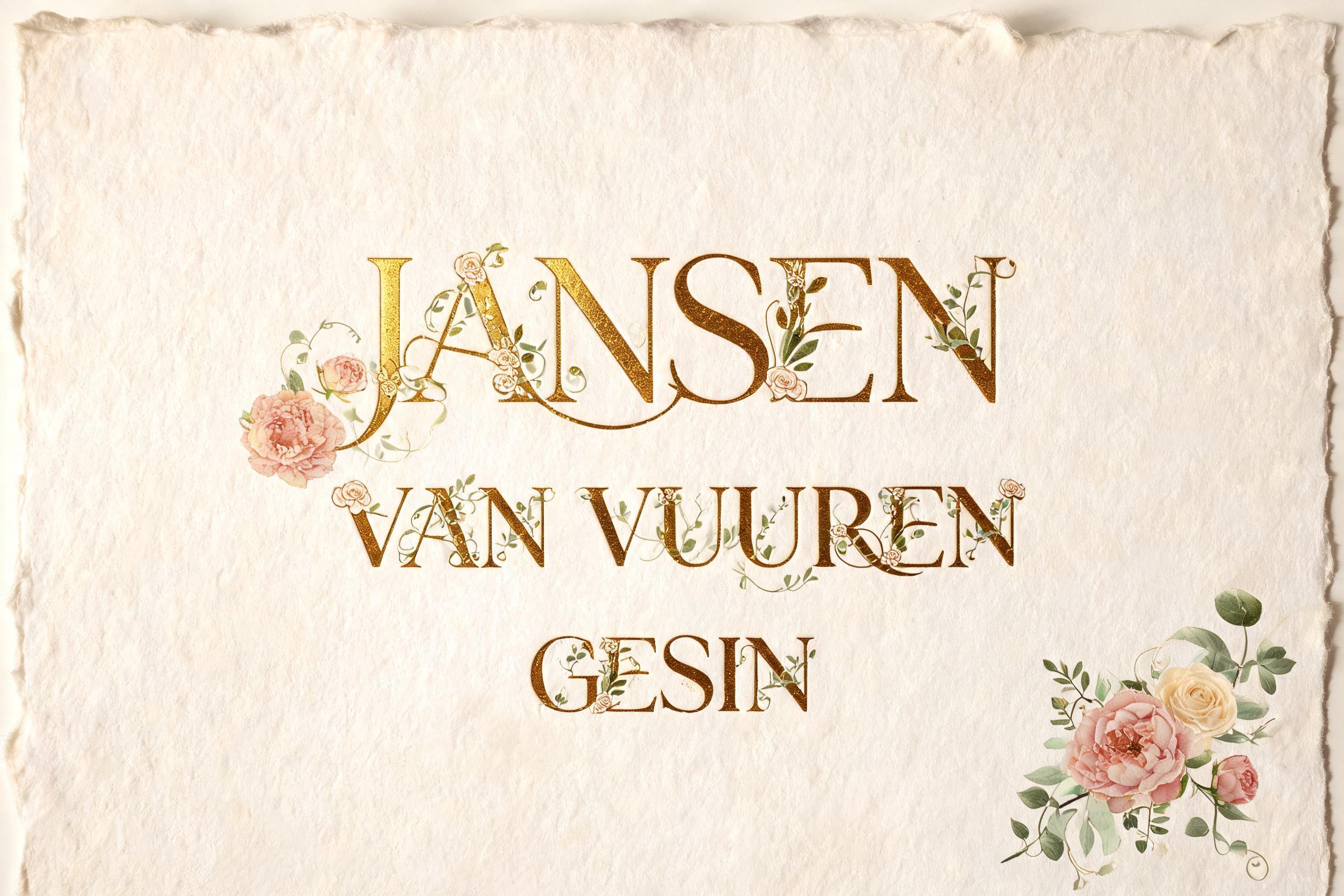
Jansen Van Vuuren Gesin - Wedding Text Effect

the hushed luxury of a fine wedding suite. GROUND: warm ivory, cream and champagne cotton paper with a soft deckled edge...


“Jansen Van Vuuren Gesin” is a Wedding text effect text effect created with FontVibe AI. Wedding font generator — turn any name or date into gold-foil, letterpress wedding type on warm ivory paper. Fine calligraphy and classic serif, blind-emboss depth, sparing eucalyptus and blush florals, old-money elegance. Instant PNG download. the hushed luxury of a fine wedding suite. GROUND: warm ivory, cream and champagne cotton paper with a soft deckled edge, or a tone-on-tone neutral stock. LIGHT: soft daylight with a gentle directional rake across the surface — enough to strike a bright specular flash along the gilded strokes so the metal reads rich, not flat. FINISH: where the lettering catches light it reads as rich gold-leaf foil and warm metallic gold ink — deep saturated antique gold and warm yellow-gold with a bright specular highlight on one edge and a darker gold shadow on the other for real metallic depth (champagne only as a soft secondary tone, never the whole gold); elsewhere it reads as letterpress and blind-emboss, pressed crisply into the paper so the strokes sit slightly below the surface with a soft debossed shadow. ORNAMENT: delicate botanical accents — eucalyptus, roses, peonies in fine line or soft watercolor — kept sparing, framing not flooding. PALETTE: ivory and cream base, rich warm antique gold and gold-leaf (saturated, not pale), with champagne, sage and eucalyptus green, dusty blue, and forest-green or navy as a deep old-money accent; generous negative space and lightness throughout. LETTERFORM PRIORITY: when the chosen font carries its own material or color (gold foil, rose-gold, letterpress emboss, watercolor, velvet), that font treatment takes absolute priority and owns the letter surface; this style governs only the paper, light, ornament and surrounding palette. FALLBACK MATERIAL: if the font carries no material of its own, render the letters in rich warm gold-leaf metallic ink on ivory paper with a bright specular highlight and a whisper of letterpress impression, so the premium wedding feel always reads. A fine wedding-stationery composition on warm ivory cotton paper with a soft deckled edge, the surface carrying the hushed texture of handmade cotton laid stock. 'Jansen' rendered with commanding typographic dominance, 'Van Vuuren' carrying secondary weight beneath, and 'Gesin' finishing the suite in a quieter tertiary rhythm — three names forming a single considered hierarchy that reads as family, occasion, and belonging at once. Soft warm daylight rakes gently from the upper left across the paper surface, catching a bright specular flash along the gilded letterforms so the gold reads as deep saturated antique gold-leaf with a warm yellow-gold highlight on the upper stroke edge and a richer shadow-gold on the underside — genuine metallic depth, never flat. Elsewhere the letterforms press crisply into the cotton stock as letterpress impression, the strokes sitting fractionally below the surface with a soft debossed shadow that whispers of fine-press craftsmanship. A sparing cluster of blush peonies and ivory roses with fine eucalyptus tendrils and sage-green foliage drifts at one corner — delicate botanical line-work kept to a quiet frame, never flooding the composition. Deep forest-green and dusty champagne as secondary palette accents, with a whisper of navy anchoring the old-money tone. Generous negative space breathes around the three-line arrangement, letting the ivory ground and gilded strokes carry the full ceremonial weight. Soft deckled paper edge visible at the border. 8k detail, shallow depth of field, warm diffuse fill light with a single directional rake for metallic gleam.
Generated on Aug 22 · 2496 × 1664 · JPG · Shared by the creator


