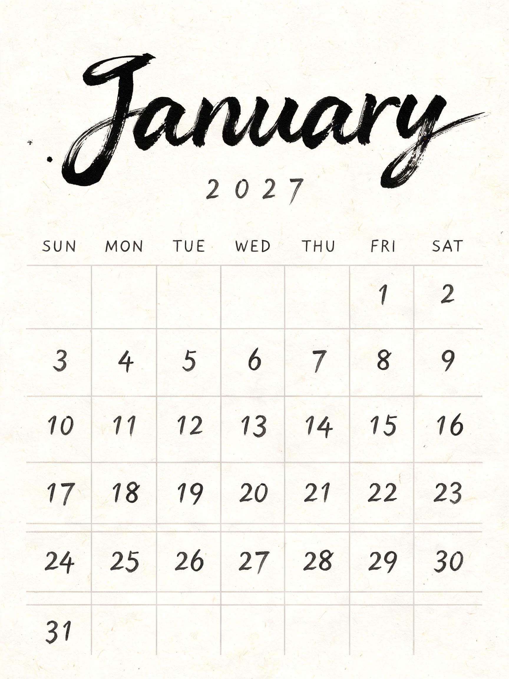
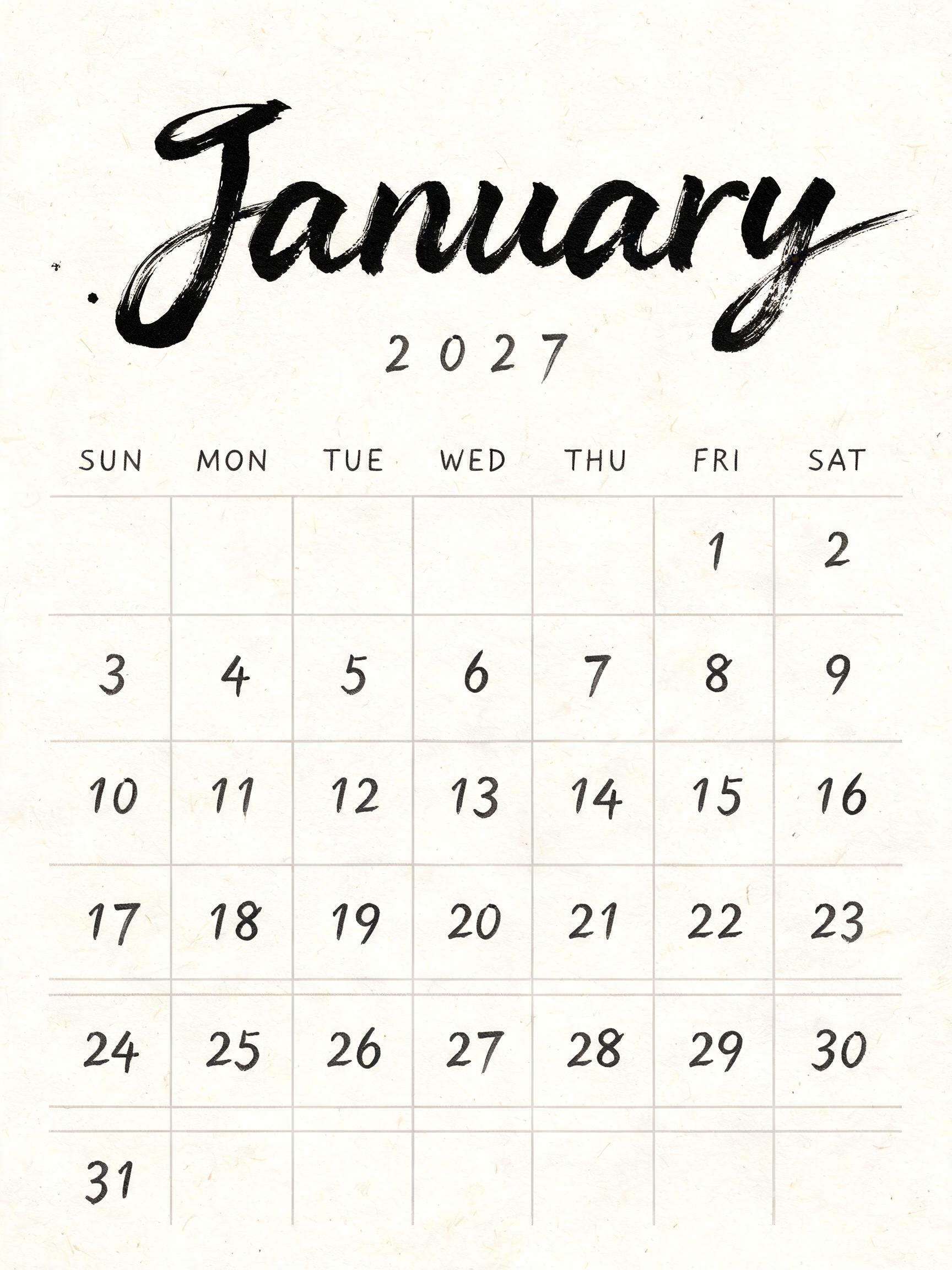
January 2027 SUN MON TUE WED THU FRI SAT 1 2 3 4 5 6 7 8 9 10 11 12 13 14 15 16 17 18 19 20 21 22 23 24 25 26 27 28 29 30 31 - Japanese Ink Brush Text Effect

Create a finished vertical monthly calendar page, 3:4 ratio, on warm cream-white natural washi paper with clearly visibl...


“January 2027 SUN MON TUE WED THU FRI SAT 1 2 3 4 5 6 7 8 9 10 11 12 13 14 15 16 17 18 19 20 21 22 23 24 25 26 27 28 29 30 31” is a Brush Japanese Ink text effect text effect created with FontVibe AI. Japanese Shodo ink brush calligraphy style applied to Latin letterforms. Deep sumi black ink with authentic fude brush energy, controlled single-direction strokes, and washi paper atmosphere. Perfect for Japanese restaurant branding, tattoo design, anime, martial arts, and cultural projects. Create a finished vertical monthly calendar page, 3:4 ratio, on warm cream-white natural washi paper with clearly visible fibers. Soft diffuse north-facing studio light, no cast shadows, no decorative objects, no border, expansive deliberate negative space. At the upper center, render the exact headline “January” in very large bespoke Western lettering executed as definitive Japanese shodo by a master calligrapher. Upright harmonious letterforms, bold 5:1 thick-to-thin brush contrast, one committed stroke per form, dense near-black sumi cores, slight dry-brush texture only along the extreme outer edges, gradual loaded-brush entries, exact fine harai pull-away tapers and small upward hane hooks. Ink is fully matte and absorbed into the washi; each stroke softly feathers at its edge and shifts from black to charcoal gray as brush load thins. The headline occupies the upper 32% of the page, centered, with no overlap. Directly below in small widely tracked hand-brushed charcoal lettering, set the exact text “2027”. In the lower half, construct a clean seven-column calendar grid using thin pale-gray sumi ruling, airy cells, and generous margins. Along the top, set exact weekday labels “SUN MON TUE WED THU FRI SAT” in compact controlled charcoal brush capitals. Set the dates in crisp dark-charcoal hand-brushed numerals, centered in their cells: first row “ 1 2”; second row “3 4 5 6 7 8 9”; third row “10 11 12 13 14 15 16”; fourth row “17 18 19 20 21 22 23”; fifth row “24 25 26 27 28 29 30”; final row “31”. Keep every numeral clearly readable and restrained, never competing with “January”. A single small, dense black ink entry mark sits beside the first stroke of the headline; no splatter elsewhere. Strict palette: sumi black, charcoal gray, warm paper cream. Flat overhead composition, print-ready editorial calendar design. Create a finished vertical monthly calendar page, 3:4 ratio, on warm cream-white natural washi paper with clearly visible fibers. Soft diffuse north-facing studio light, no cast shadows, no decorative objects, no border, expansive deliberate negative space. At the upper center, render the exact headline “January” in very large bespoke Western lettering executed as definitive Japanese shodo by a master calligrapher. Upright harmonious letterforms, bold 5:1 thick-to-thin brush contrast, one committed stroke per form, dense near-black sumi cores, slight dry-brush texture only along the extreme outer edges, gradual loaded-brush entries, exact fine harai pull-away tapers and small upward hane hooks. Ink is fully matte and absorbed into the washi; each stroke softly feathers at its edge and shifts from black to charcoal gray as brush load thins. The headline occupies the upper 32% of the page, centered, with no overlap. Directly below in small widely tracked hand-brushed charcoal lettering, set the exact text “2027”. In the lower half, construct a clean seven-column calendar grid using thin pale-gray sumi ruling, airy cells, and generous margins. Along the top, set exact weekday labels “SUN MON TUE WED THU FRI SAT” in compact controlled charcoal brush capitals. Set the dates in crisp dark-charcoal hand-brushed numerals, centered in their cells: first row “ 1 2”; second row “3 4 5 6 7 8 9”; third row “10 11 12 13 14 15 16”; fourth row “17 18 19 20 21 22 23”; fifth row “24 25 26 27 28 29 30”; final row “31”. Keep every numeral clearly readable and restrained, never competing with “January”. A single small, dense black ink entry mark sits beside the first stroke of the headline; no splatter elsewhere. Strict palette: sumi black, charcoal gray, warm paper cream. Flat overhead composition, print-ready editorial calendar design.
Generated on yesterday · 1728 × 2304 · JPG · Shared by the creator


