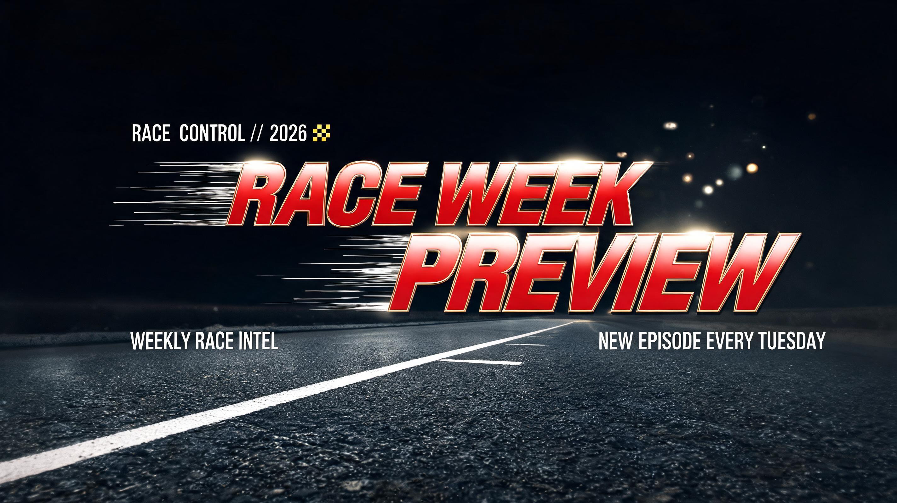
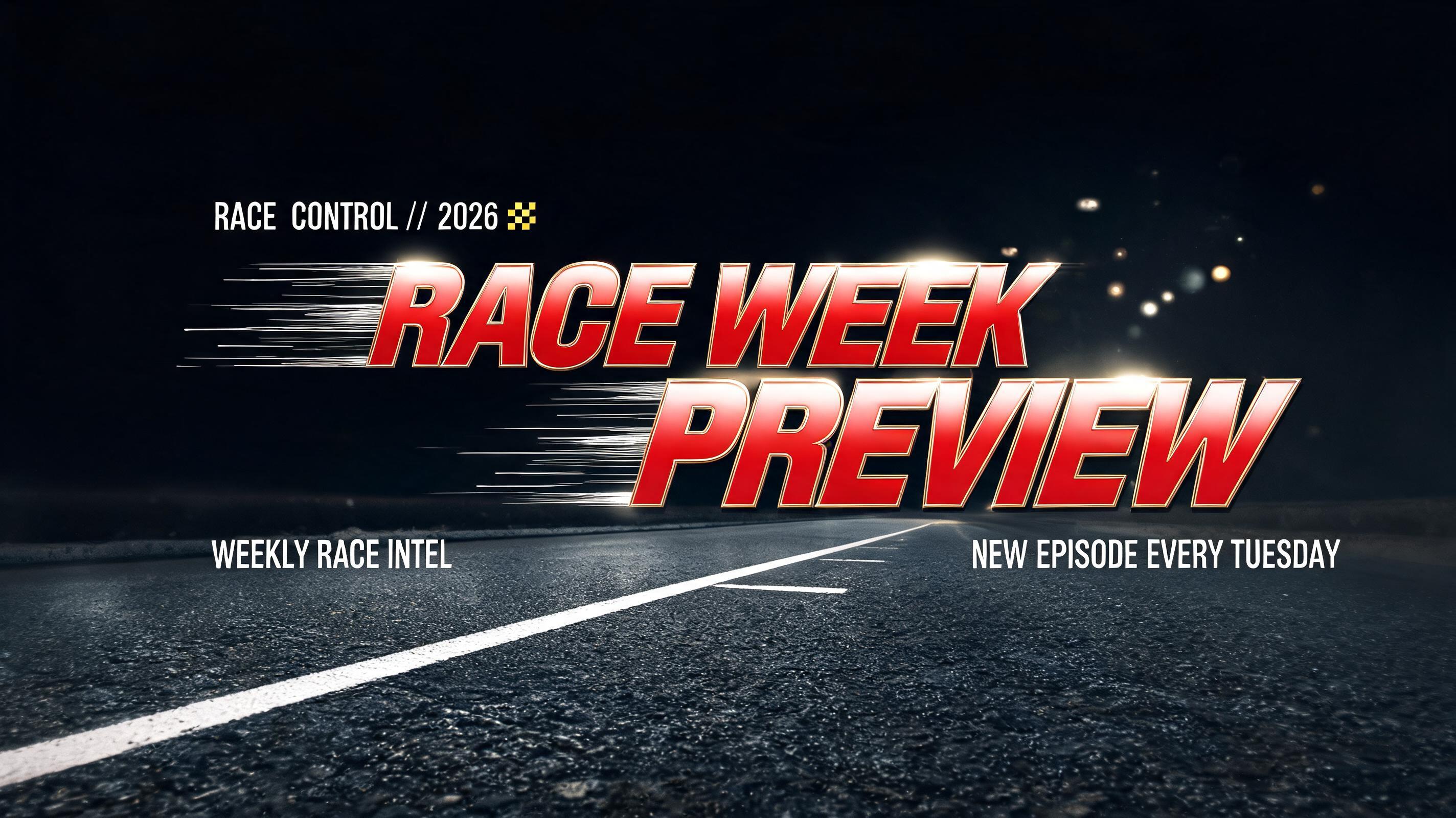
RACE WEEK PREVIEW RACE CONTROL // 2026 WEEKLY RACE INTEL NEW EPISODE EVERY TUESDAY - Racing Text Effect

Create a finished 16:9 YouTube channel race-banner key art, not a logo. Exact rendered text, with hierarchy: 1. Small up...


“RACE WEEK PREVIEW RACE CONTROL // 2026 WEEKLY RACE INTEL NEW EPISODE EVERY TUESDAY” is a Racing text effect text effect created with FontVibe AI. High-speed racing typography with dynamic italic angles, checkered flag patterns, metallic chrome finish and motorsport energy. Create a finished 16:9 YouTube channel race-banner key art, not a logo. Exact rendered text, with hierarchy: 1. Small upper-left label: “RACE CONTROL // 2026” 2. Main headline across the center in two lines: “RACE WEEK” / “PREVIEW” 3. Lower-left support line: “WEEKLY RACE INTEL” 4. Lower-right schedule line: “NEW EPISODE EVERY TUESDAY” Composition: pure carbon-black night circuit background. A low strip of wet charcoal asphalt spans the bottom 22% of frame, with one faint white grid line receding diagonally from lower left. Keep all essential copy inside a central 80% safe area. “RACE WEEK” occupies center x 10–89%, y 25–46%; “PREVIEW” occupies x 12–91%, y 45–70%, slightly larger. Use wide-proportion Eurostile Extended-inspired custom display lettering: extremely heavy monotone strokes, horizontal-dominant proportions, squared corners, exact 90-degree terminals, engineered superelliptical rectangular counters, no rounded humanist curves. Apply a strong forward italic shear to every glyph without narrowing their wide construction. Headline letters are high-gloss racing-red lacquer over dark metallic substrate, with a thin championship-gold bevel visible along upper forward-facing edges. A single hard white pit-lane spotlight from high front-center produces a crisp specular axis across the top planes and deep carbon shadows cast backward in the direction of travel. Fine white horizontal speed lines erupt from the left edges and trail behind the headline into the black field, sharp at the glyphs and dissolving into sparse motion haze. Add restrained distant track-light bokeh at upper right and a tiny gold checkered-grid HUD mark beside the upper label. Supporting copy is compact squared white technical lettering with gold separators. High contrast, clean legibility at banner scale, no cars, no people, no extra words, no logos, no watermark. Create a finished 16:9 YouTube channel race-banner key art, not a logo. Exact rendered text, with hierarchy: 1. Small upper-left label: “RACE CONTROL // 2026” 2. Main headline across the center in two lines: “RACE WEEK” / “PREVIEW” 3. Lower-left support line: “WEEKLY RACE INTEL” 4. Lower-right schedule line: “NEW EPISODE EVERY TUESDAY” Composition: pure carbon-black night circuit background. A low strip of wet charcoal asphalt spans the bottom 22% of frame, with one faint white grid line receding diagonally from lower left. Keep all essential copy inside a central 80% safe area. “RACE WEEK” occupies center x 10–89%, y 25–46%; “PREVIEW” occupies x 12–91%, y 45–70%, slightly larger. Use wide-proportion Eurostile Extended-inspired custom display lettering: extremely heavy monotone strokes, horizontal-dominant proportions, squared corners, exact 90-degree terminals, engineered superelliptical rectangular counters, no rounded humanist curves. Apply a strong forward italic shear to every glyph without narrowing their wide construction. Headline letters are high-gloss racing-red lacquer over dark metallic substrate, with a thin championship-gold bevel visible along upper forward-facing edges. A single hard white pit-lane spotlight from high front-center produces a crisp specular axis across the top planes and deep carbon shadows cast backward in the direction of travel. Fine white horizontal speed lines erupt from the left edges and trail behind the headline into the black field, sharp at the glyphs and dissolving into sparse motion haze. Add restrained distant track-light bokeh at upper right and a tiny gold checkered-grid HUD mark beside the upper label. Supporting copy is compact squared white technical lettering with gold separators. High contrast, clean legibility at banner scale, no cars, no people, no extra words, no logos, no watermark.
Generated on yesterday · 2848 × 1600 · JPG · Shared by the creator


