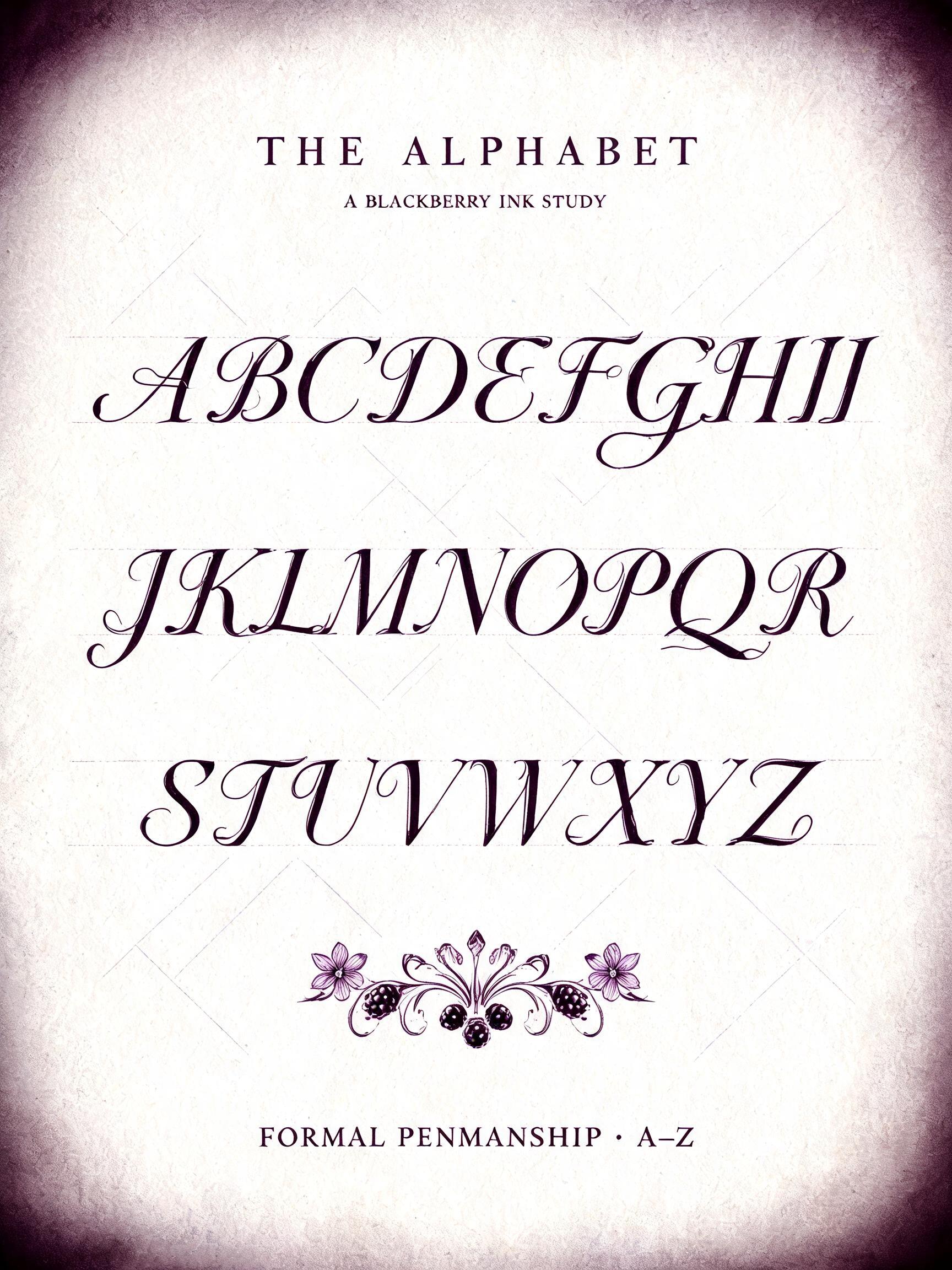
THE ALPHABET A BLACKBERRY INK STUDY A B C D E F G H I J K L M N O P Q R S T U V W X Y Z FORMAL PENMANSHIP · A–Z - Calligraphy Script Text Effect


Uses BytePlus Seedream 5.0, the model behind this artwork · 15 credits

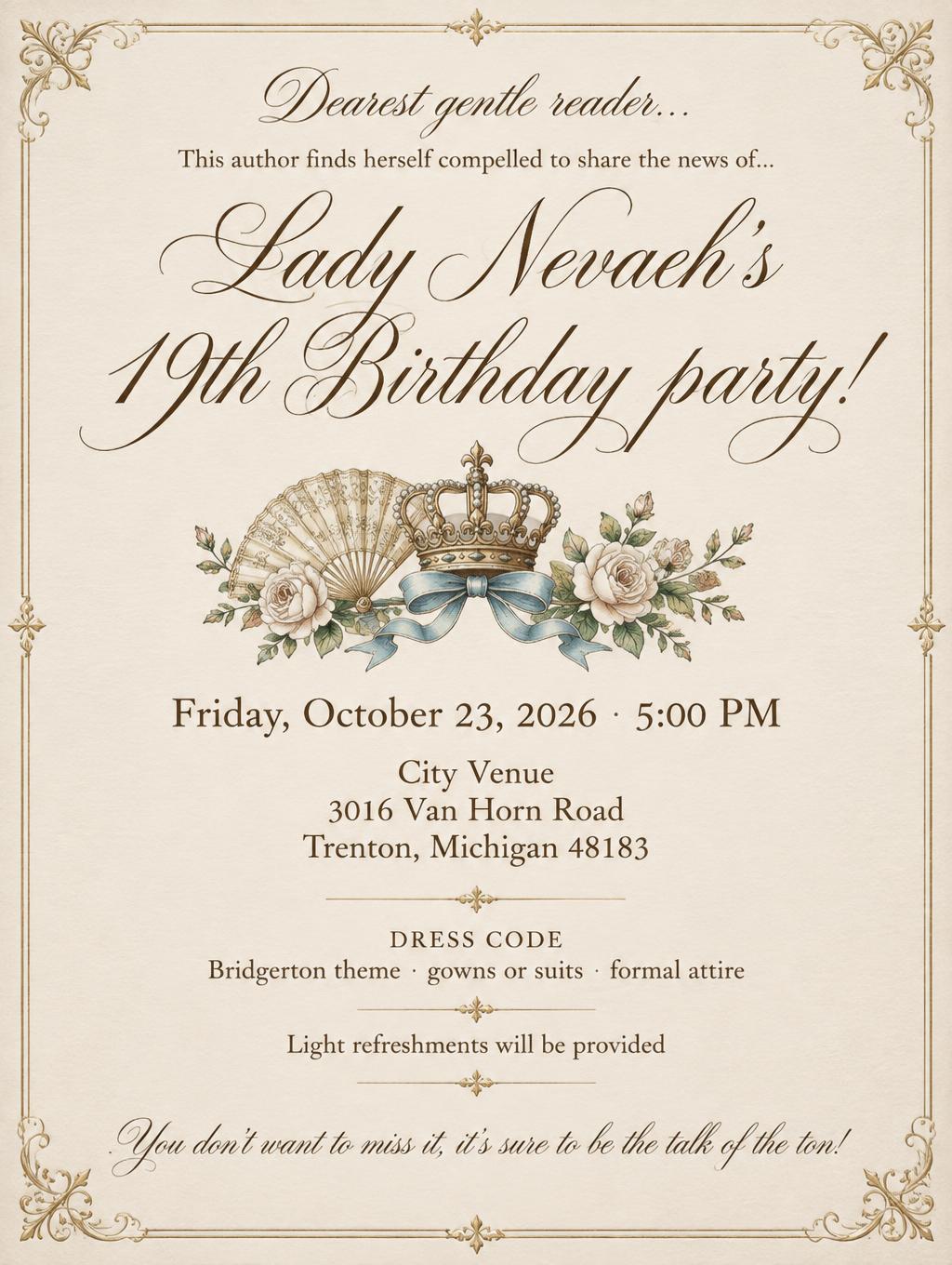
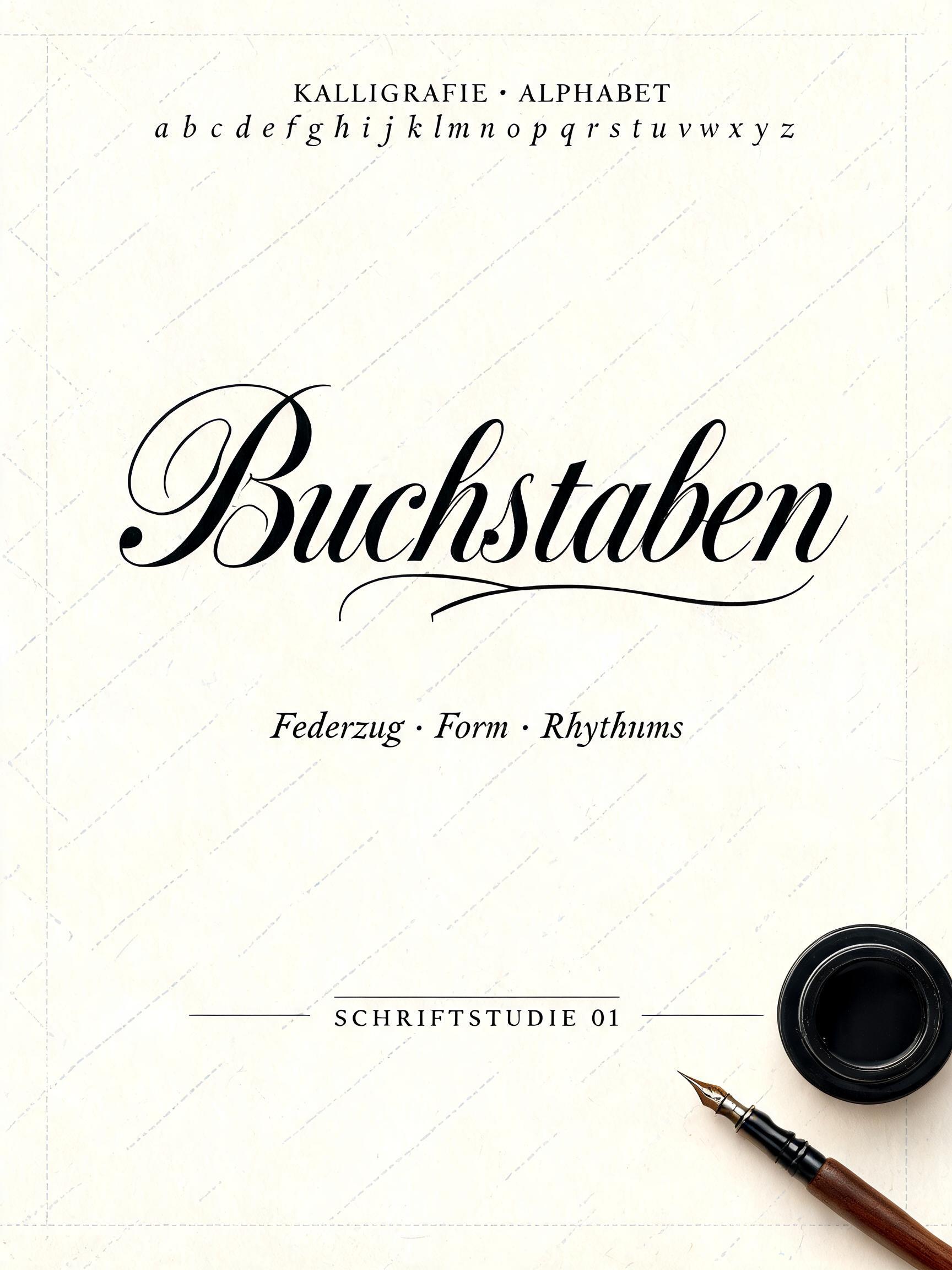
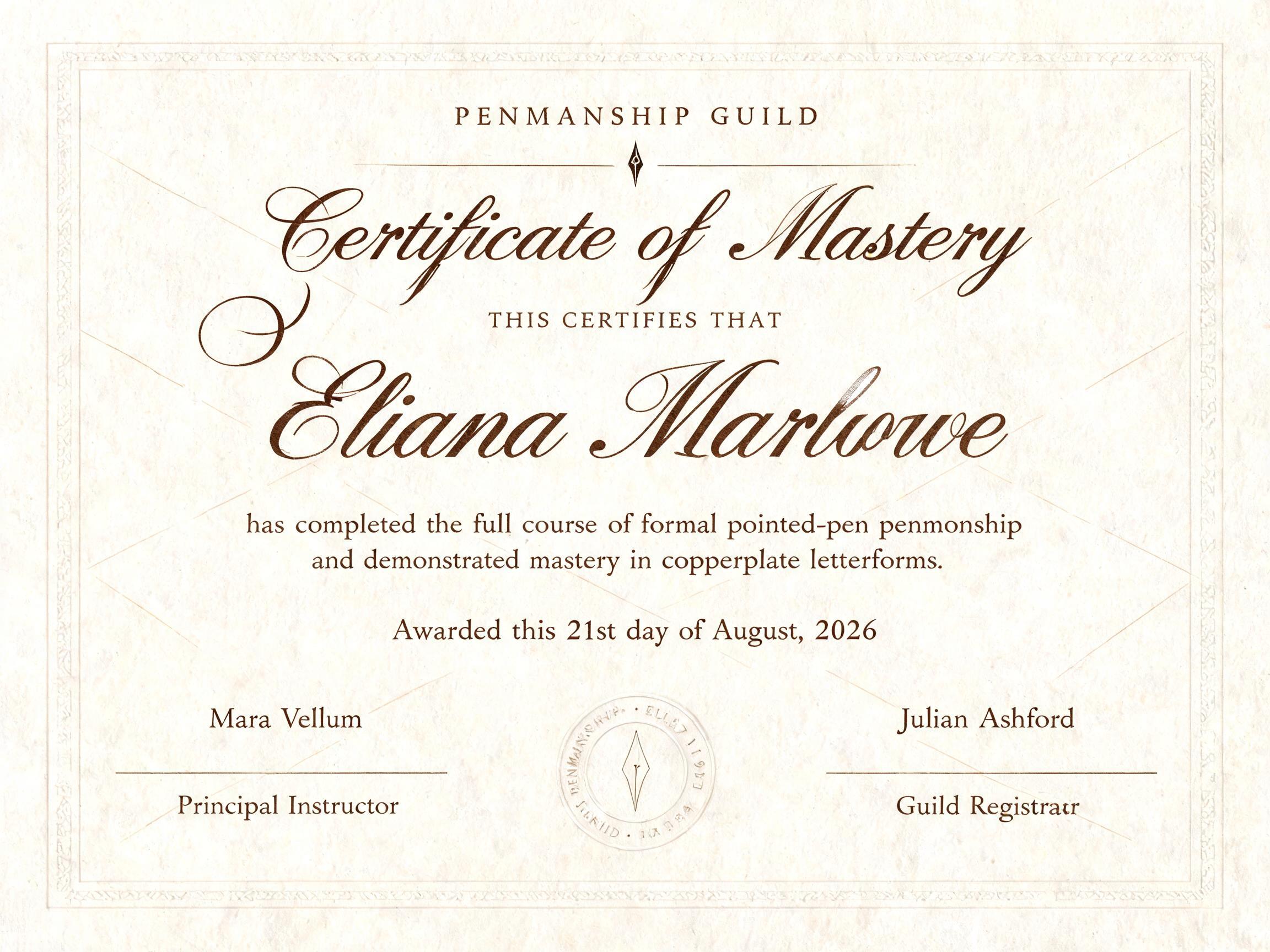
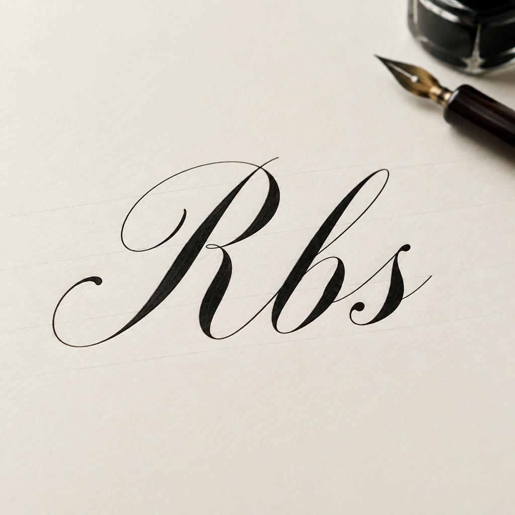

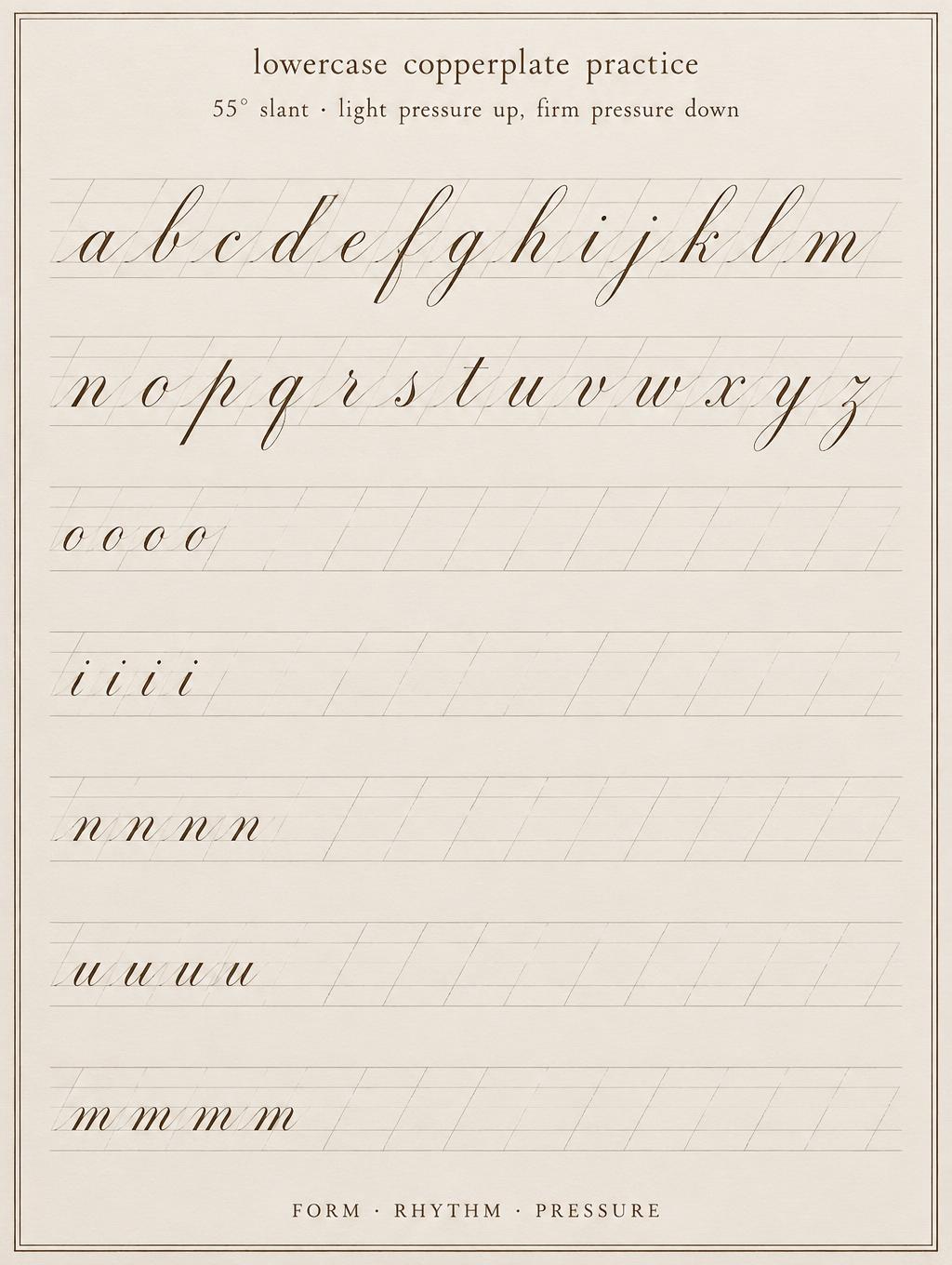
“THE ALPHABET A BLACKBERRY INK STUDY A B C D E F G H I J K L M N O P Q R S T U V W X Y Z FORMAL PENMANSHIP · A–Z” is a Cursive Calligraphy text effect text effect created with FontVibe AI. Formal pointed-pen copperplate: strong thick-thin contrast, slanted oval letters and swash capitals, crisp black ink on cream paper with faint ruled guidelines.
Create a finished 3:4 vertical alphabet art print, designed as a formal calligraphy specimen rather than a simple word graphic. Fine ivory hot-press cotton paper fills the frame, with a nearly black aubergine vignette at the outer edges and faint 55-degree lavender-gray calligraphy guideline slants visible only in open areas. Even, soft, flat studio lighting reveals paper grain and crisp wet-ink edges. At top center, set the small uppercase title “THE ALPHABET” in precise dark black serif small caps, widely tracked. Beneath it, centered in smaller lettering, set “A BLACKBERRY INK STUDY”. The central 62% of the page is a disciplined alphabet specimen in three centered rows, set exactly as: “A B C D E F G H I”, “J K L M N O P Q R”, “S T U V W X Y Z”. Render every letter as bespoke formal copperplate calligraphy: consistent 55-degree slant, narrow oval construction, dramatic thick shaded downstrokes and hairline upstrokes, crisp tapered terminals, controlled entry and exit strokes, rhythmically even spacing. Each capital has a small, restrained flourish that never collides with adjacent letters. Lettering is deep blackberry-purple ink with black core shadows along the thickest strokes; fine glossy wet-ink highlights catch the studio light along the stroke edges. Place a delicate ornamental divider below the alphabet: a symmetrical black ink flourish with two tiny five-petal violet blossoms and three round blackberry berries, all rendered as precise pen-and-ink details. At the bottom center set “FORMAL PENMANSHIP · A–Z” in small black uppercase serif type. Maintain broad clean margins, no clutter, no neon, no metallic foil, no loose cursive. High-resolution editorial stationery photograph, sharply resolved ink edges and paper fibers.
Made for Calligraphy Alphabet
Generated on September 13, 2026 · 1728 × 2304 · JPEG · BytePlus Seedream 5.0 · Layout: Specimen Sheet · Shared by the creator · Free for commercial use (CC BY 4.0)


