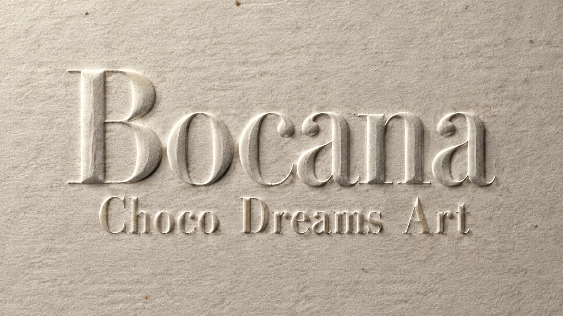
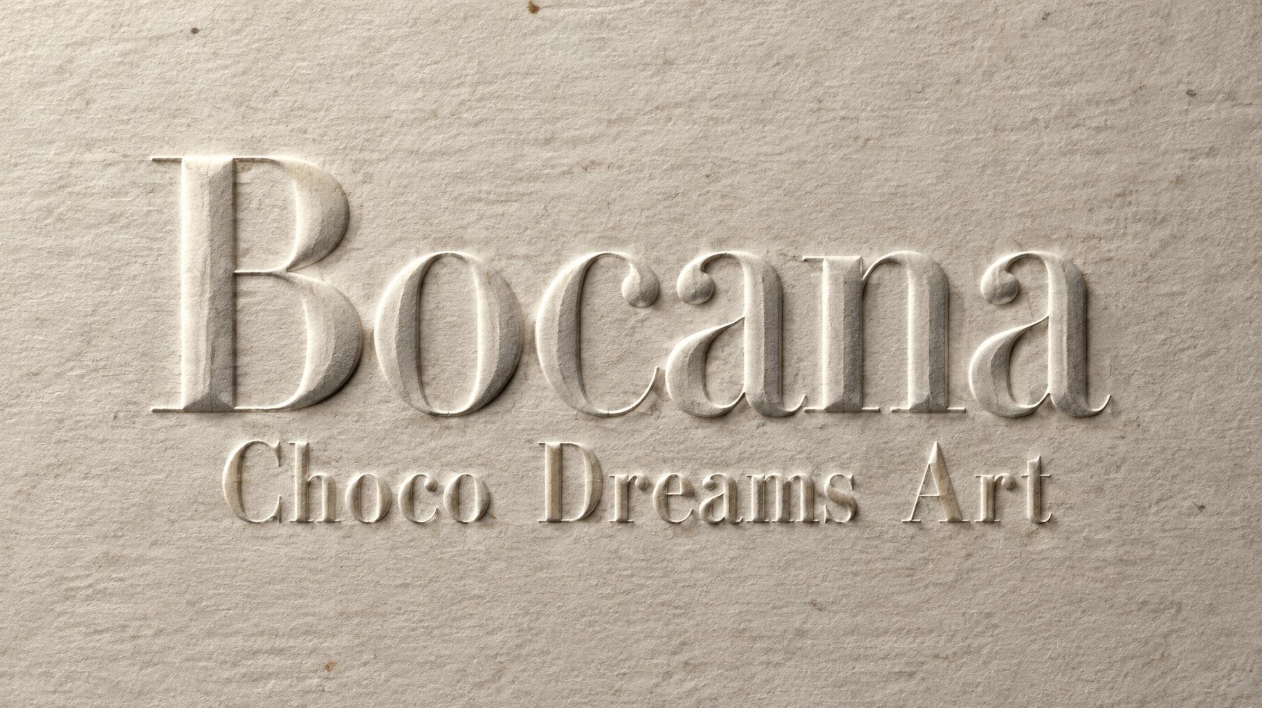
Bocana Choco Dreams Art - Embossed Text Effect


Uses OpenAI GPT-Image-2.5 Sunburst, the model behind this artwork · 15 credits


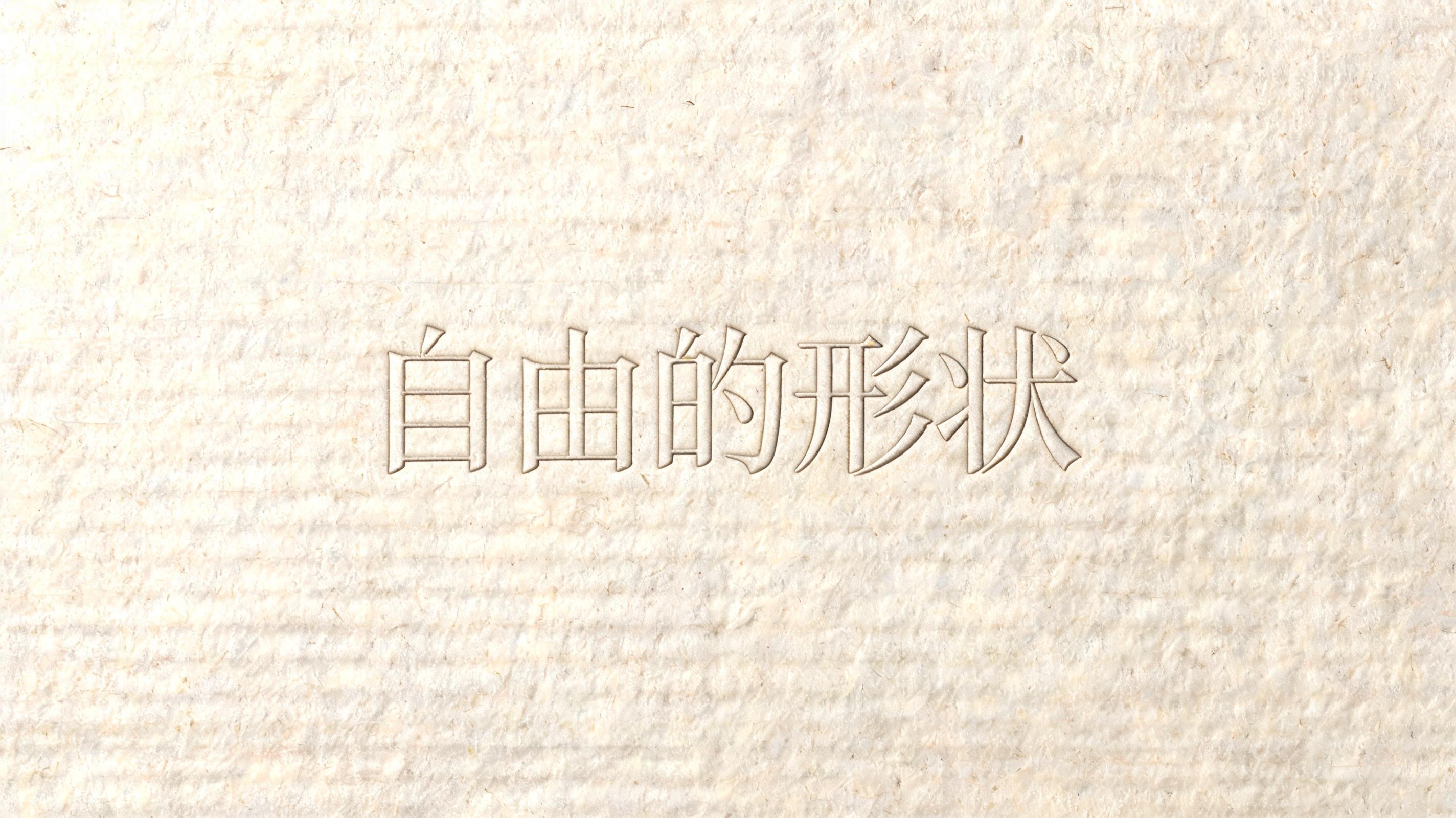
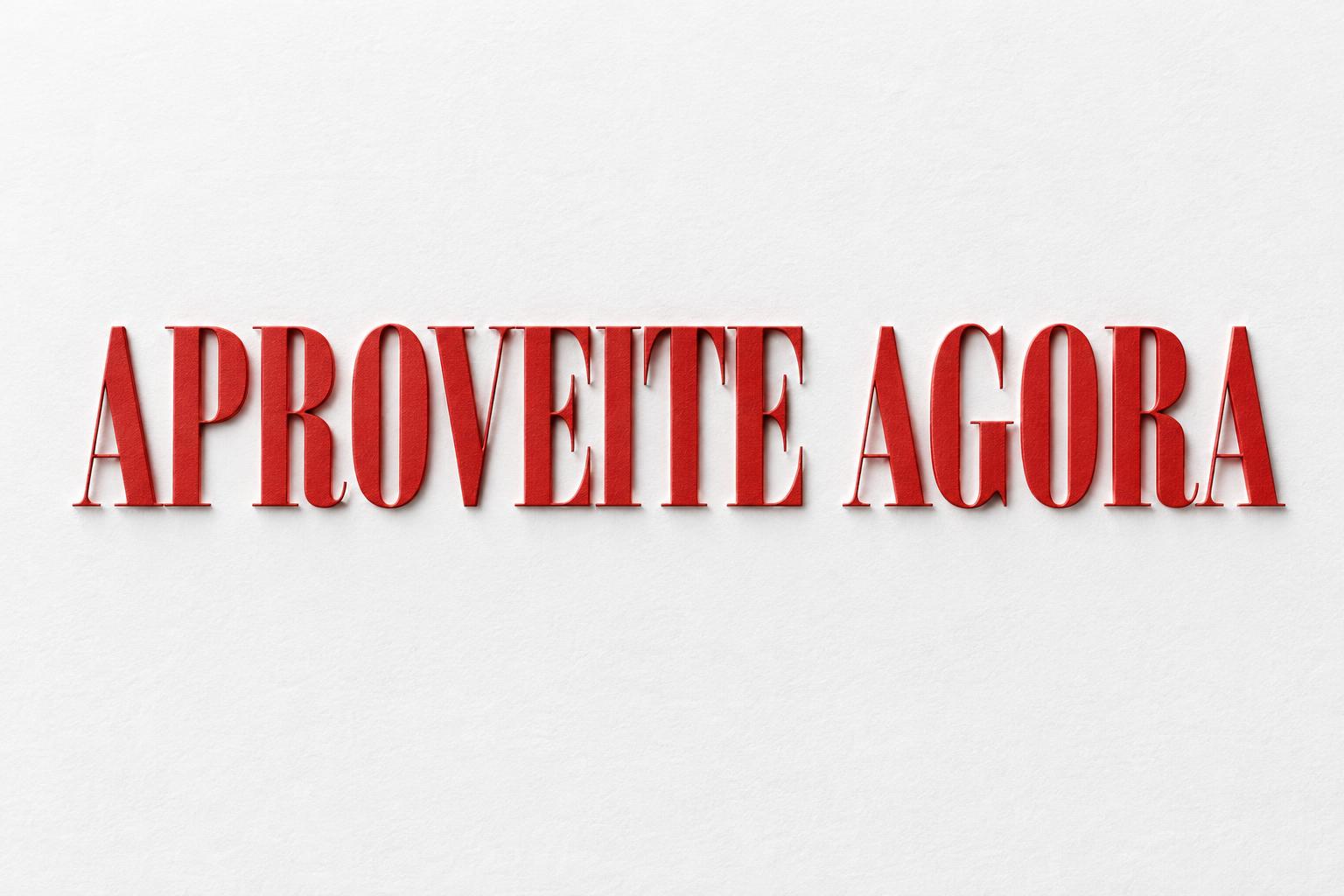


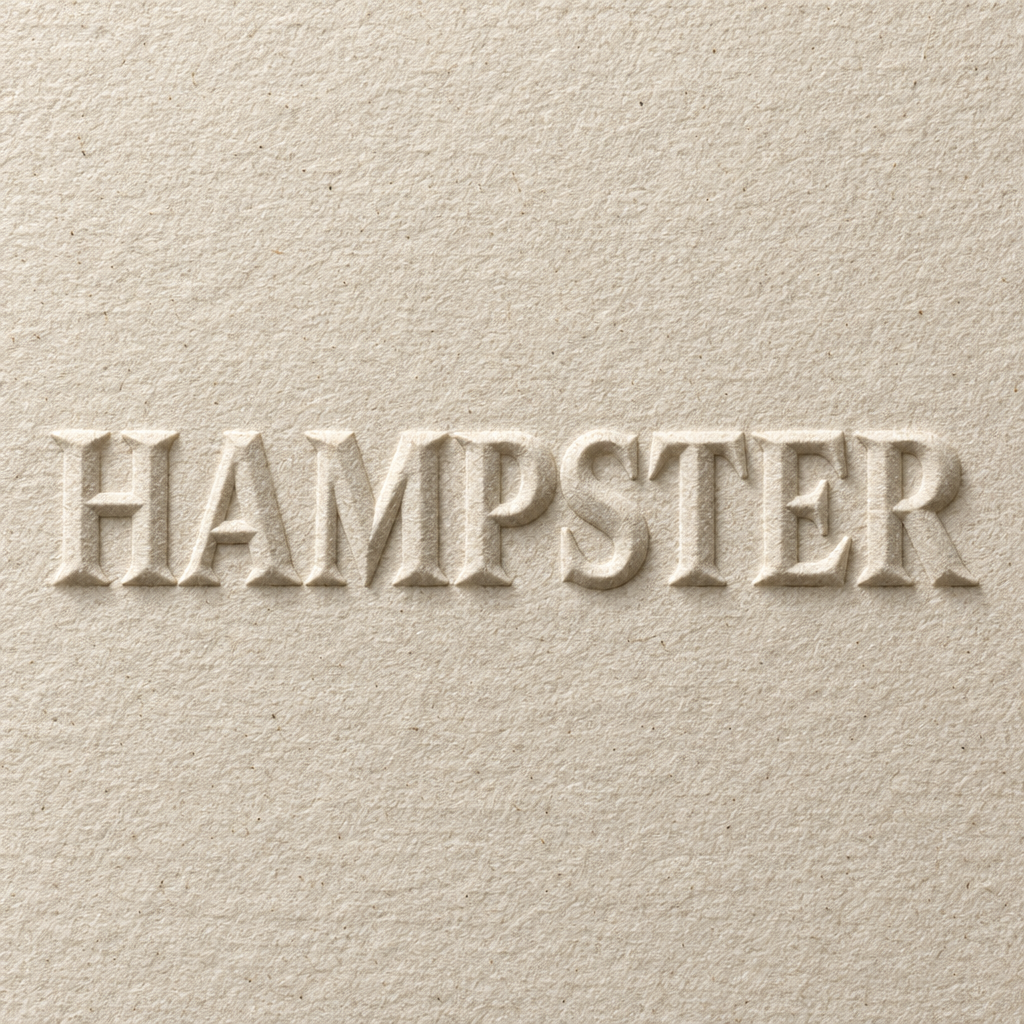
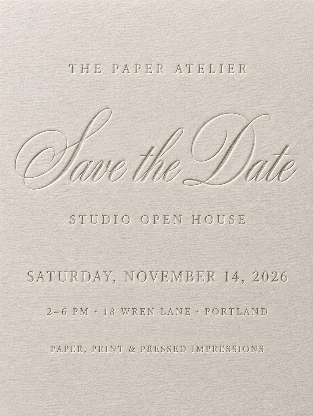


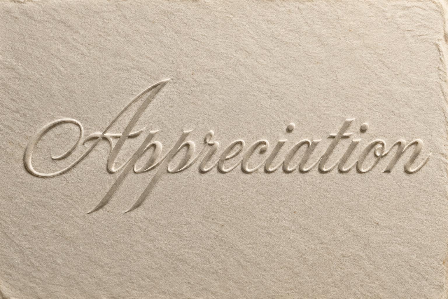
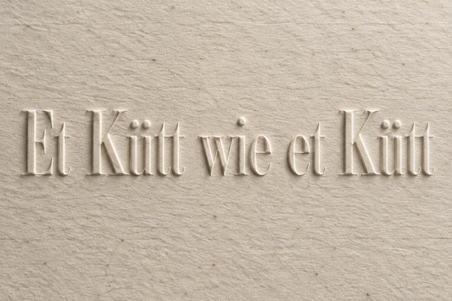
“Bocana Choco Dreams Art” was created with FontVibe AI — explore more Emboss text effect. Serif capitals blind-embossed into ivory cotton paper: no ink, only a raised relief with a crisp highlight ridge and soft shadow from low raking light.
Fine paper fibers visible around letter edges where the relief meets the flat surface. Raking light from upper-left at a low angle reveals the raised topology: crisp highlight ridge along the top edge of each letter, soft shadow on the opposite side. No color added — tonal contrast is the only visual language. No gradients on letter faces, no glow, no outline strokes. LETTERFORM PRIORITY: when the chosen font carries its own treatment, that font's letterform shapes take priority and own the letters, rendered as raised relief; this style governs the embossed topology and the raking light. FALLBACK MATERIAL: if the font carries no material of its own, render the letters as a clean blind-embossed relief raised from premium paper, read only through raking-light highlight and shadow. COLOR PRIORITY: emboss adds no color of its own — keep the surface tonal; if the font specifies a color render it as a subtle tinted relief, otherwise natural paper tone. A thick sheet of aged ivory cotton rag paper fills the frame, with visible laid-line fiber weave, scattered natural pulp flecks, and softly irregular paper tone. The exact rendered words “Bocana Choco Dreams Art” emerge as a raised blind-embossed relief from the same uninked paper surface, with a clear hierarchy between the name and the smaller supporting words. No pigment, foil, ink, outlines, glow, or printed decoration. Low-angle raking light from the upper-left is the sole illumination: every raised edge catches a narrow, crisp pale highlight ridge, while the lower-right edges fall into delicate gray-beige shadow valleys. The relief is clean and precisely pressed, with fine paper fibers compressed and slightly displaced where each letter meets the flat stock. Subtle depth variations make the longer phrase readable through topology alone, while generous untouched paper surface preserves the restrained stationery character. Macro product-photography detail, shallow yet sufficient depth of field across the full wording, natural matte finish, tactile letterpress workshop realism, controlled studio environment, tonal monochrome palette limited to warm ivory, soft taupe shadows, and paper-white highlights.
Generated on October 13, 2026 · 1824 × 1024 · JPEG · OpenAI GPT-Image-2.5 Sunburst · Shared by the creator · Free for commercial use (CC BY 4.0)


