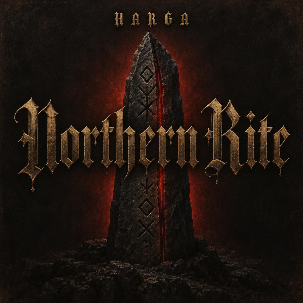
Northern Rite HARGA - Gothic Font Text Effect


Uses OpenAI GPT-Image-2.5 Sunburst, the model behind this artwork · 15 credits
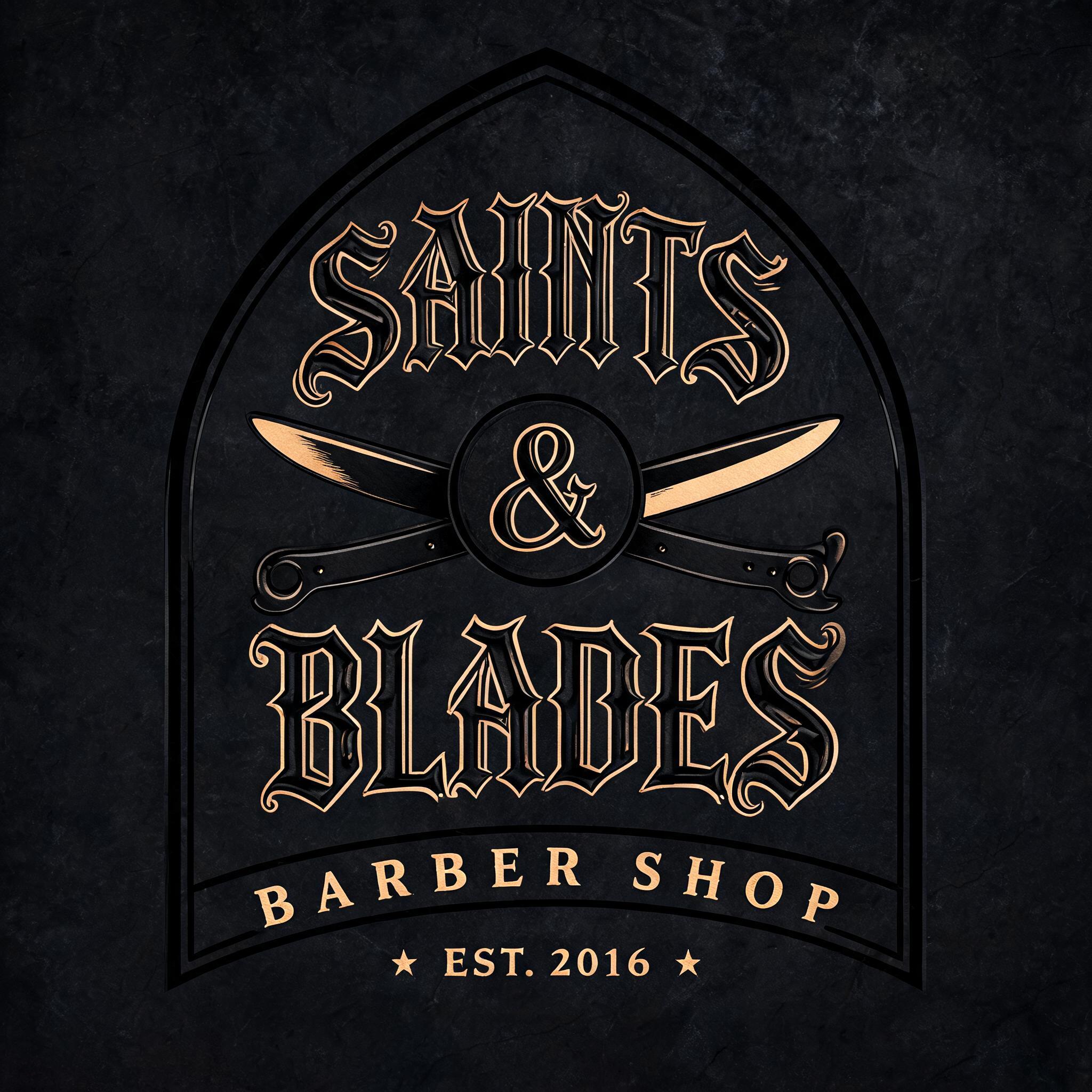


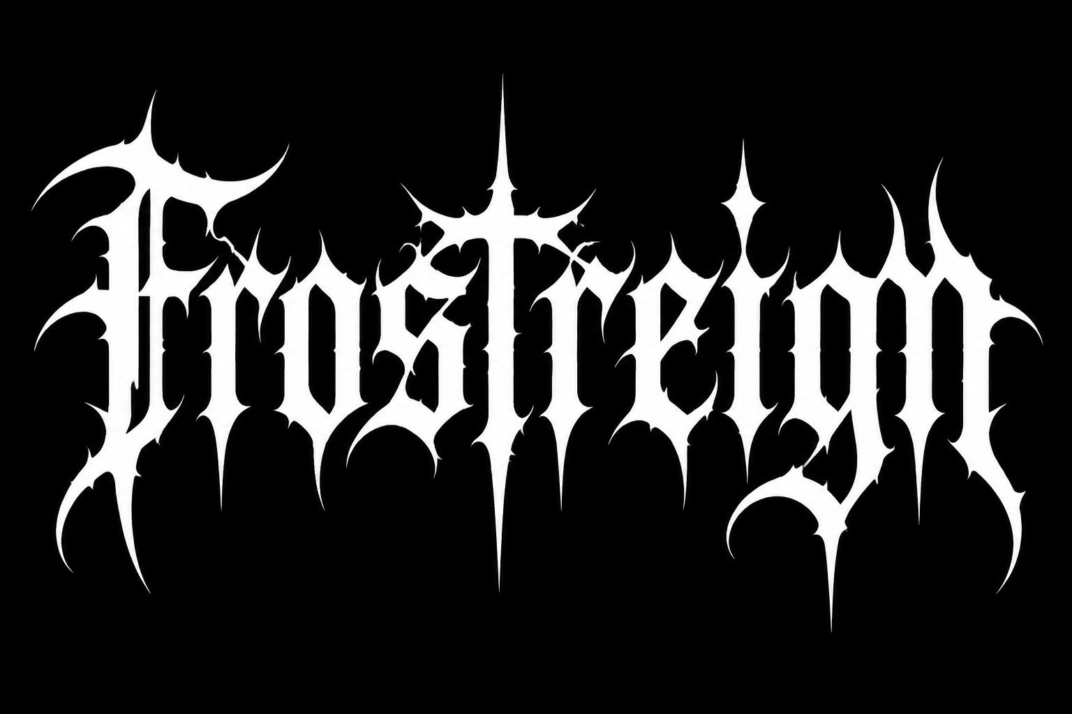
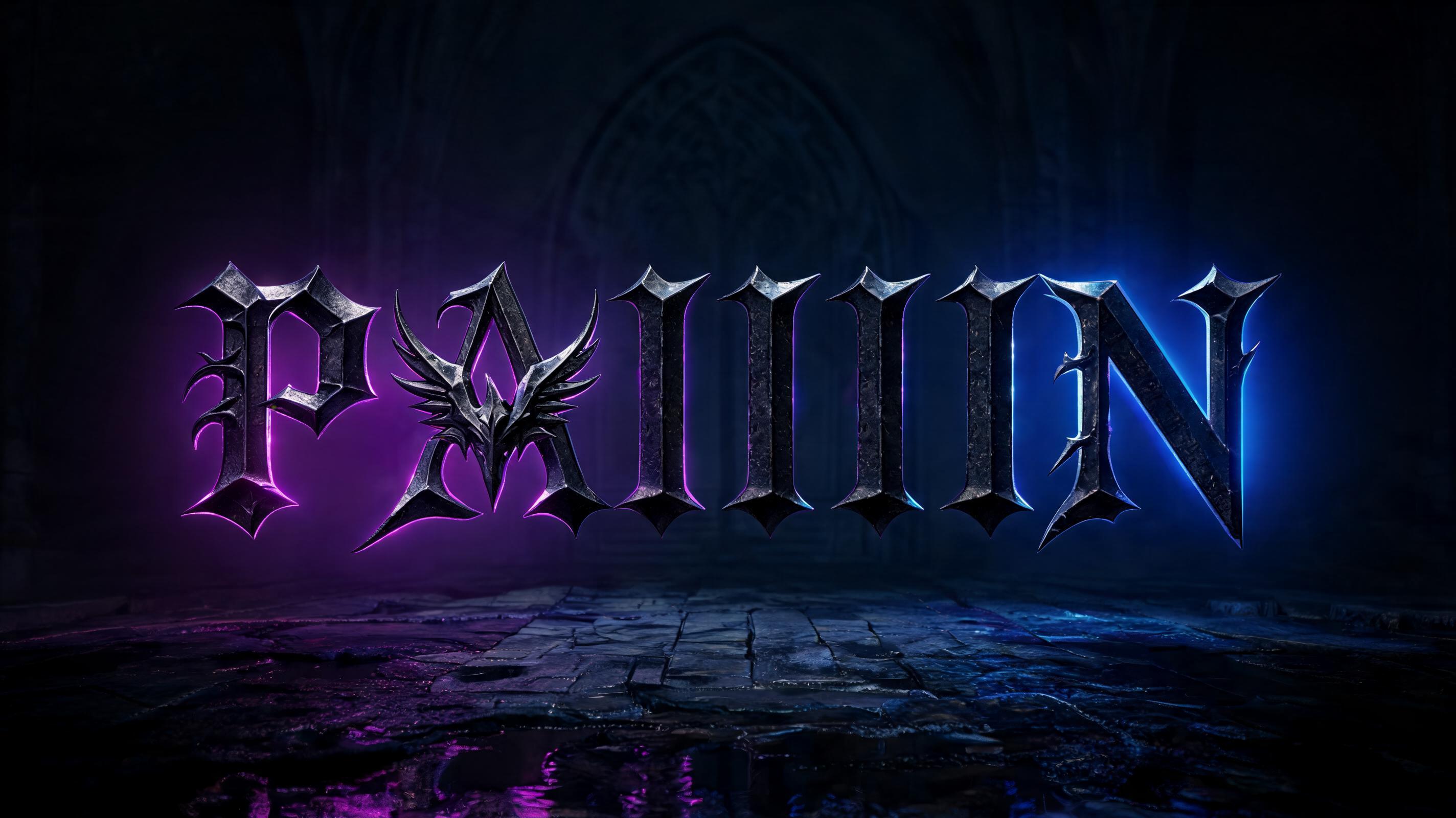
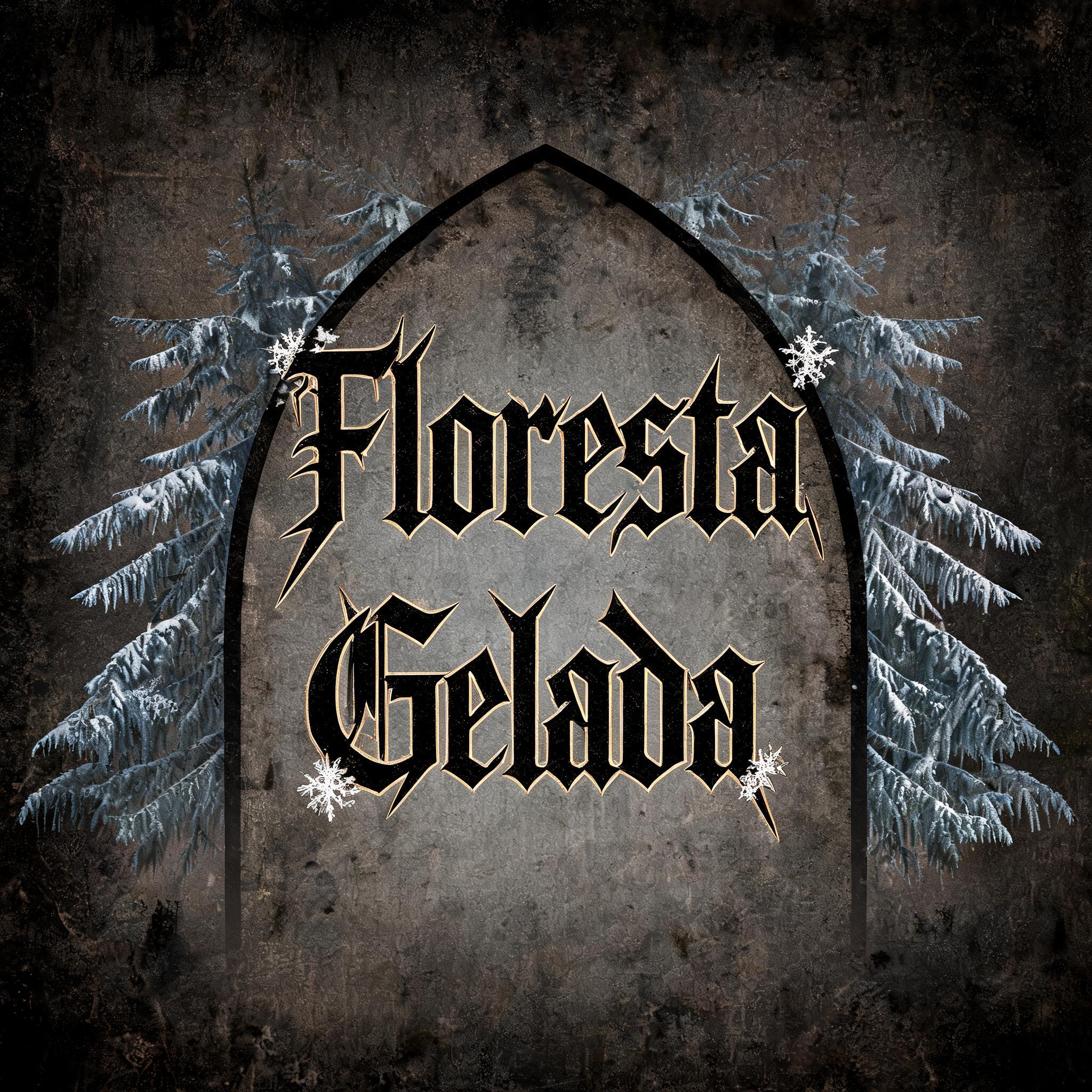
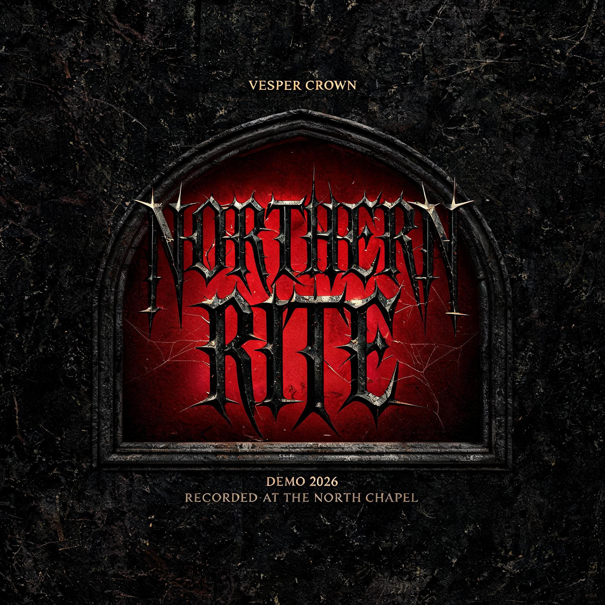


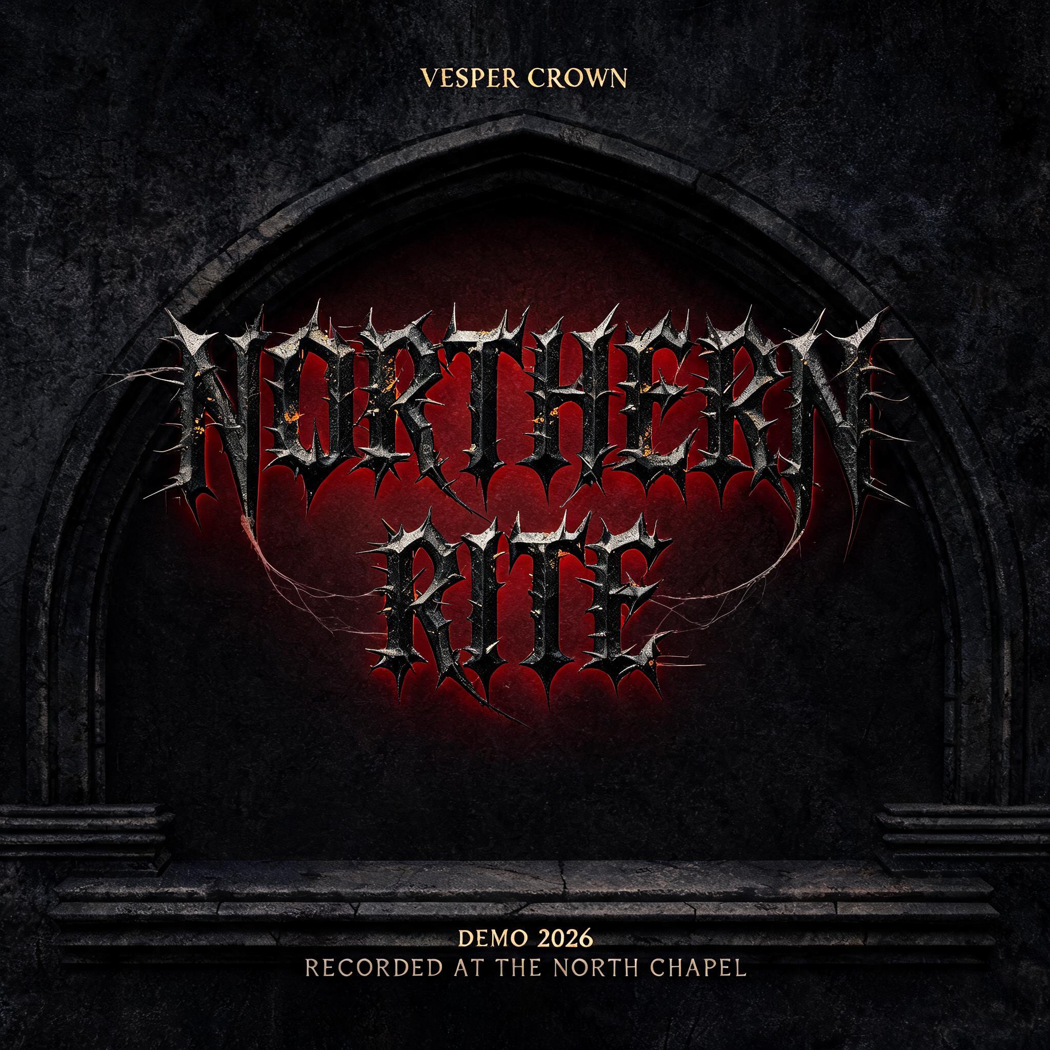
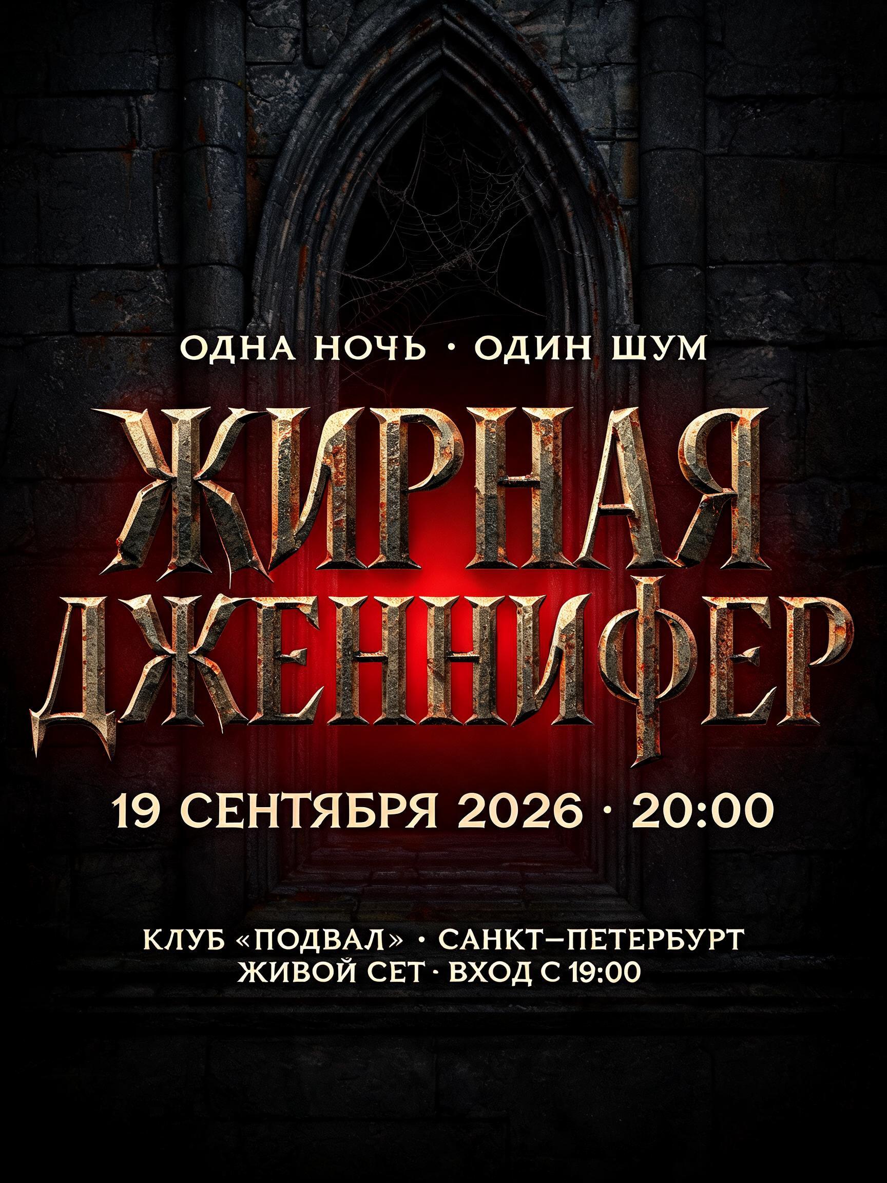
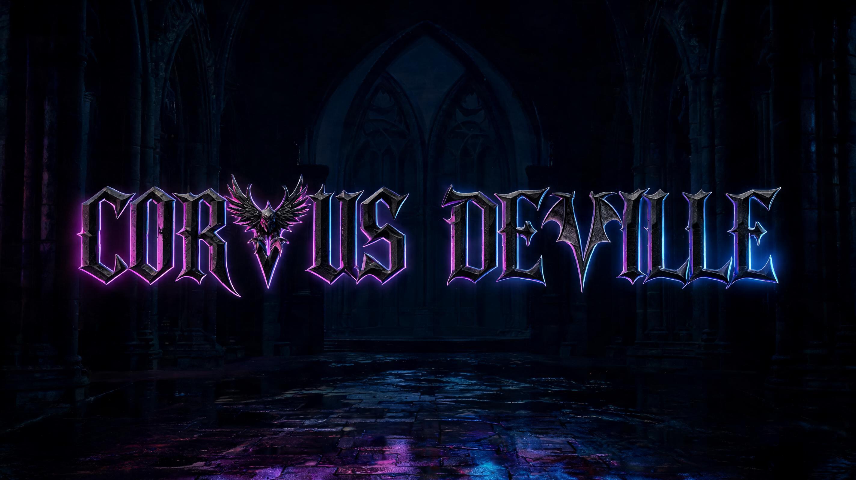


“Northern Rite HARGA” was created with FontVibe AI — explore more Gothic Font text effect. Precise Textura blackletter: narrow broken strokes, diamond terminals and strong thick-thin contrast, in black ink with gold-touched edges on dark aged parchment.
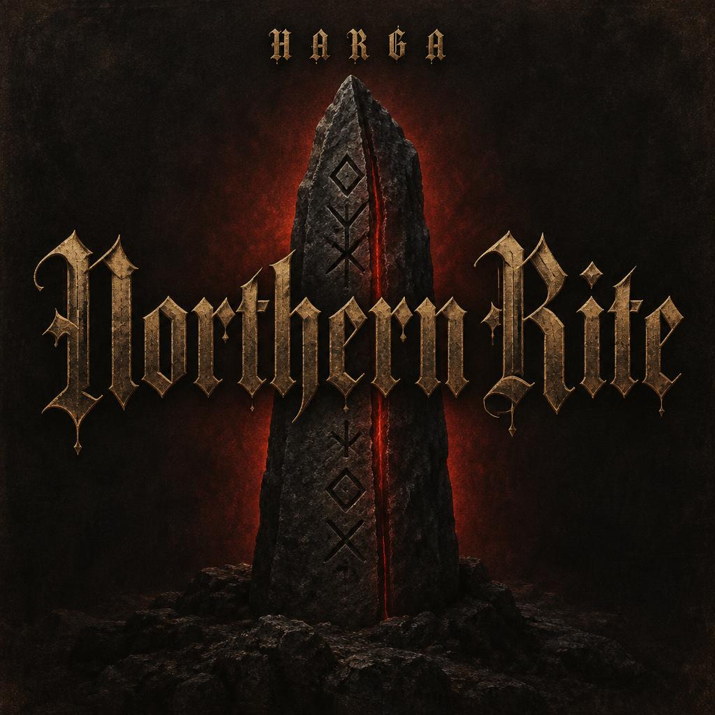
Create a finished square demo-cover design. Render only these two text strings, exactly: the dominant title “Northern Rite” and the smaller artist name “HARGA”. Keep the spelling and capitalization exact; no other lettering, symbols that resemble letters, or illegible pseudo-text. Make “Northern Rite” the commanding center of the cover, spanning about 78% of the width in two tightly set words. Draw it in historically grounded Textura Quadrata blackletter: dense vertical stems, angular faceted curves, sharp diamond-shaped terminals, pointed arch counters, hairline diagonal foot serifs and strong thick-thin contrast. Give the letterforms rich near-black ink with warm depth; subtle antique-gold highlights catch the serifs and selected capital edges. Keep each letter distinct and the title easy to read. Set “HARGA” as a small, carefully spaced blackletter artist name near the top, accented with muted gold. Behind and below the title, show a single tall, weathered dark-stone rune monolith, its simple carved marks clearly non-alphabetic. A restrained crimson light shines from behind the stone and through a narrow central fissure, creating a defined red halo around the silhouette without washing out the lettering. Set the cover in deep charcoal with a faint dark-parchment grain and restrained warm undertones. The lighting stays low and directional; the stone is matte, the ink is dense, and gold glints remain fine and selective. Keep the atmosphere austere and deliberate: no literal cobwebs, no rust, no fog, no polished metal, no bright overall lighting, no extra props. Composition: square cover with generous dark margins. Place “HARGA” centered in the upper 12%; place the oversized two-line “Northern Rite” centrally, occupying roughly 78% of the width; let the rune monolith rise behind and continue beneath the title into the lower third. Preserve clear separation between the two text tiers and strong title contrast. Medieval scribal precision meets a severe northern ritual emblem; finished, legible, restrained.
Made for Black Metal Gothic
Generated on October 25, 2026 · 1024 × 1024 · JPEG · OpenAI GPT-Image-2.5 Sunburst · Layout: Monolith Cover · Shared by the creator · Free for commercial use (CC BY 4.0)


