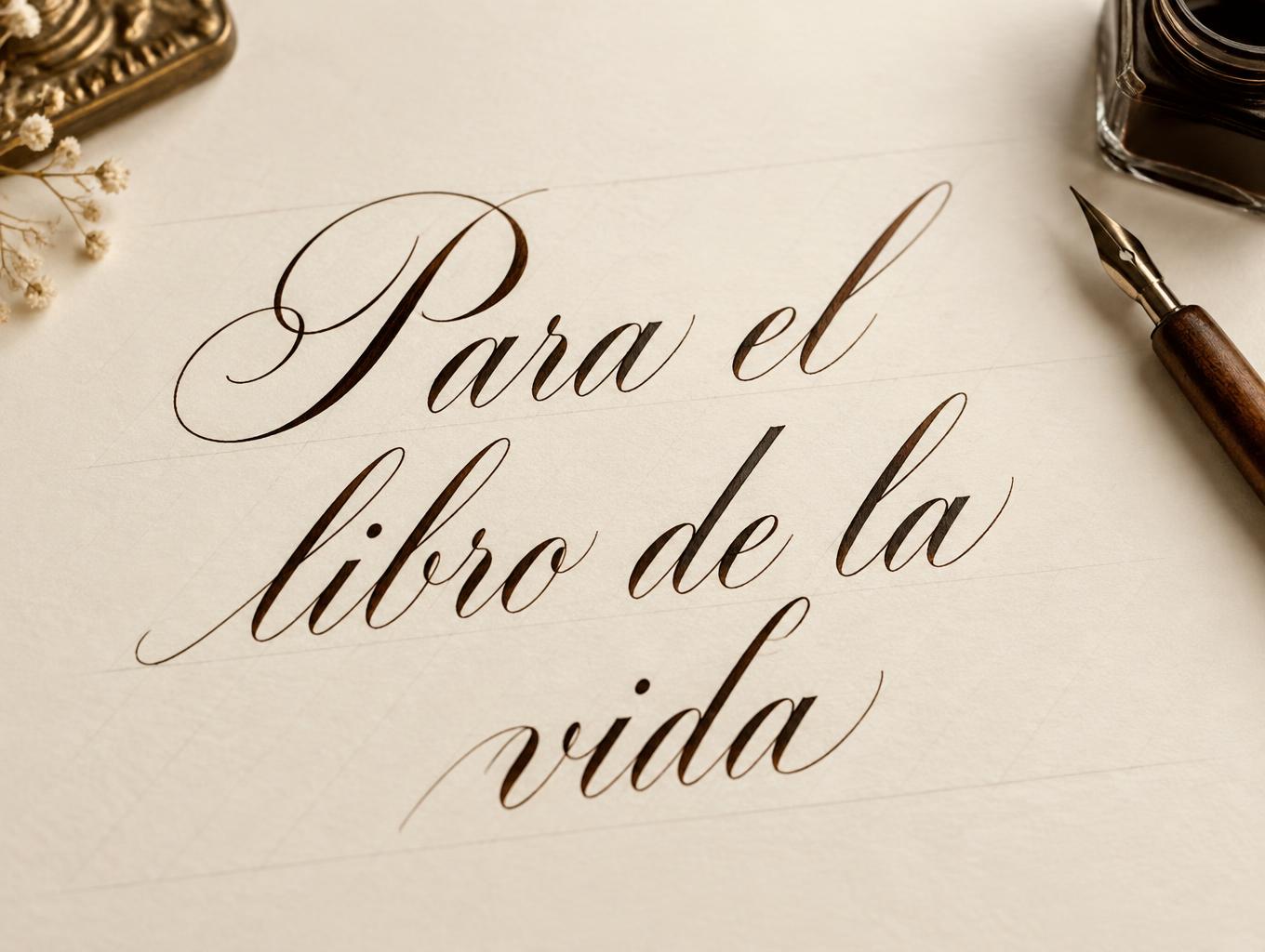
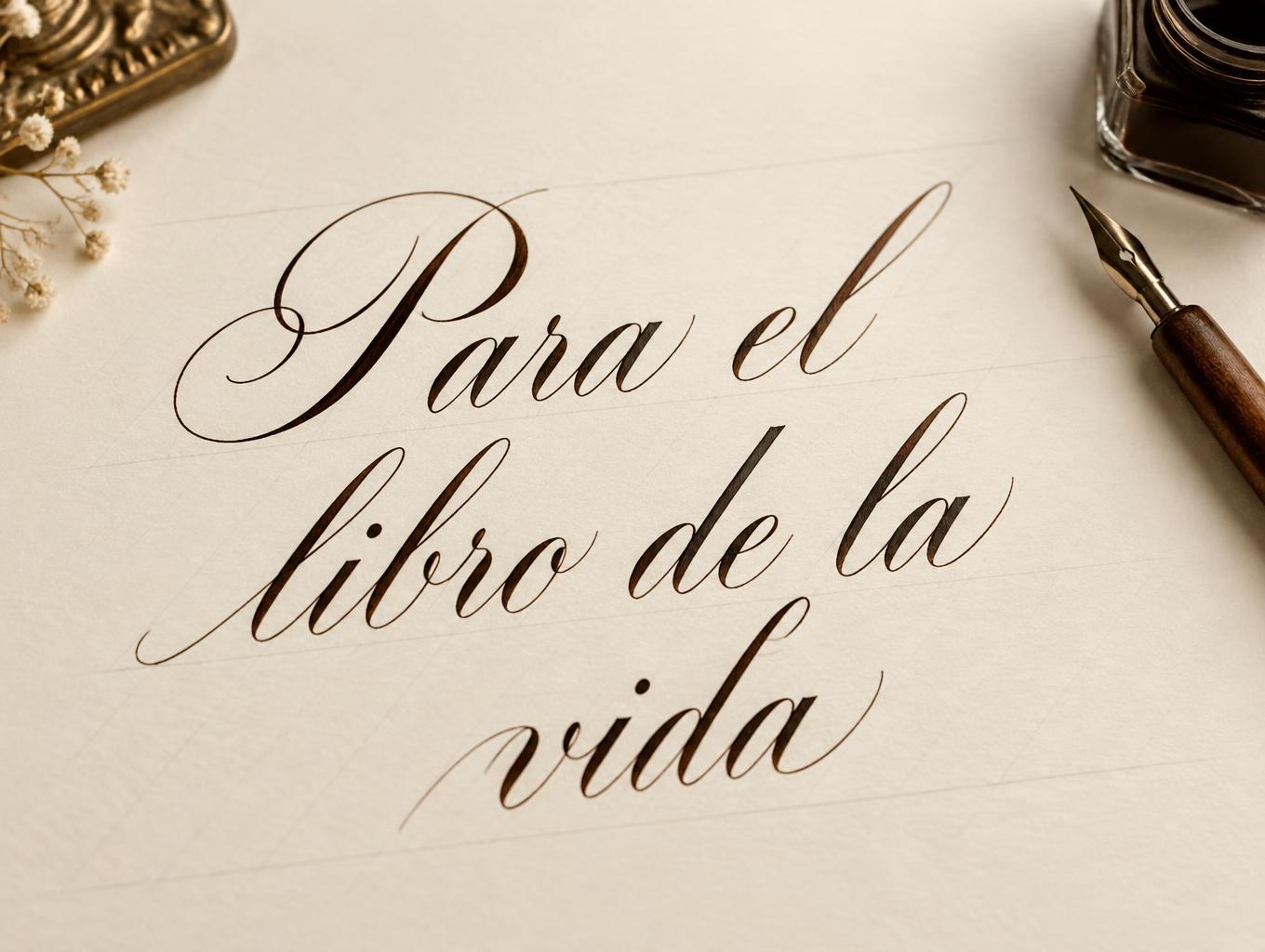
Para el libro de la vida - Calligraphy Script Text Effect


Uses OpenAI GPT-Image-2.5 Sunburst, the model behind this artwork · 15 credits
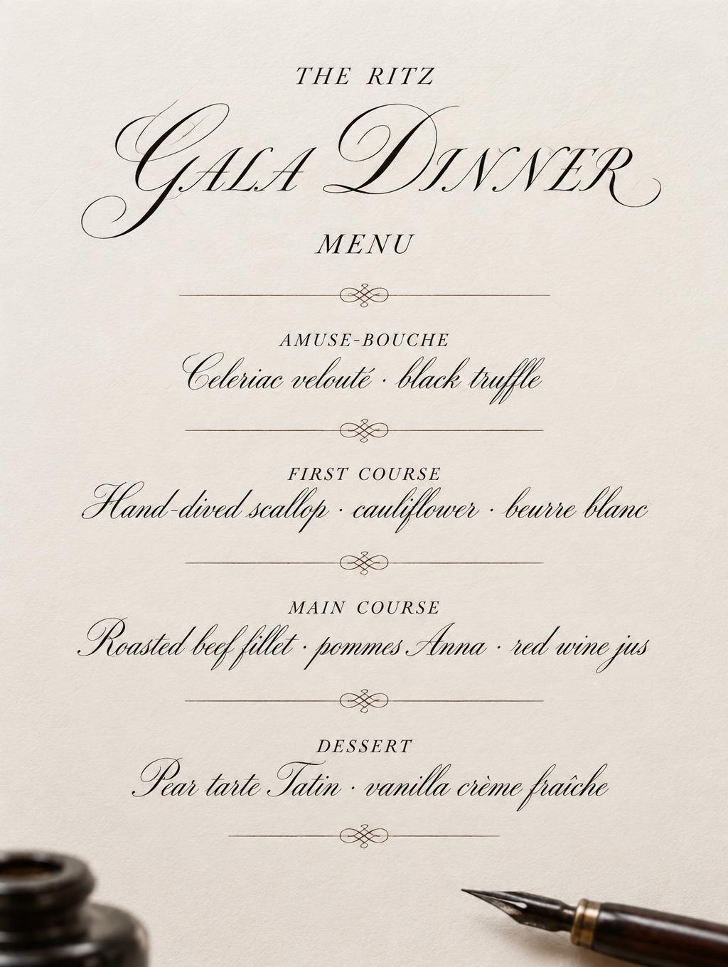
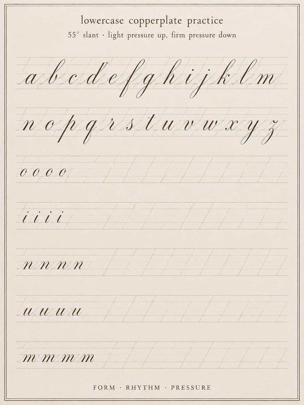
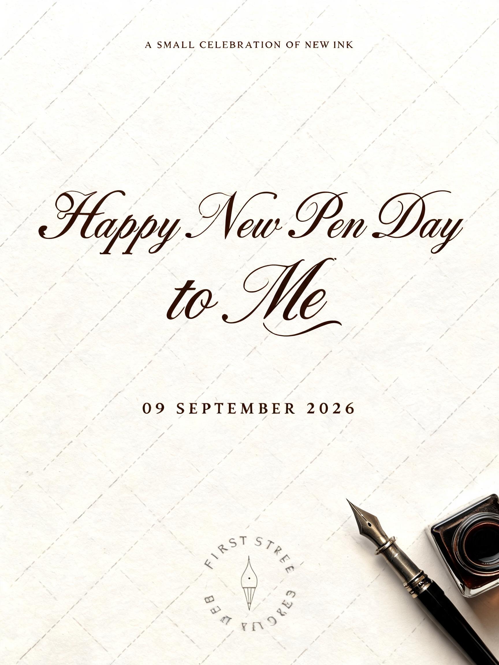
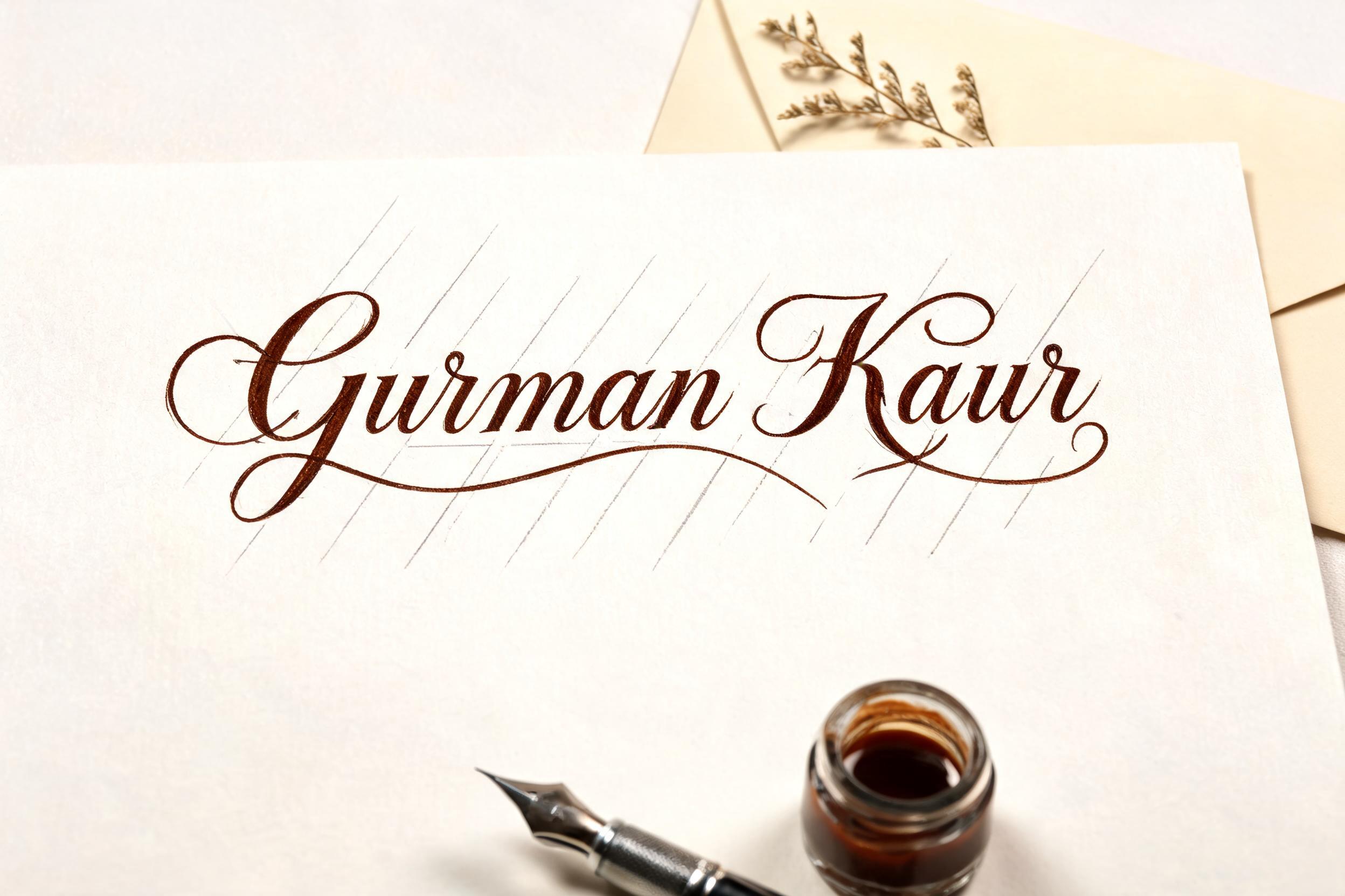
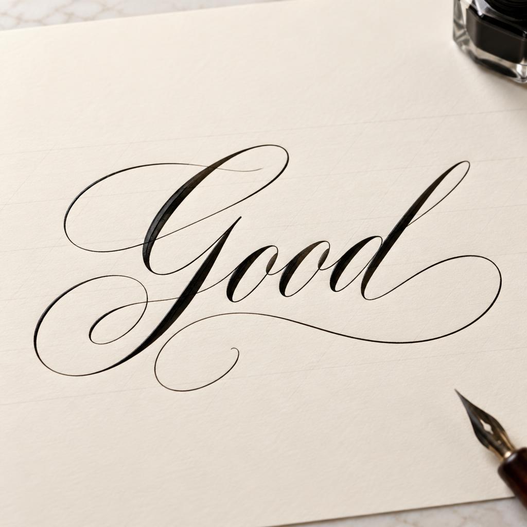
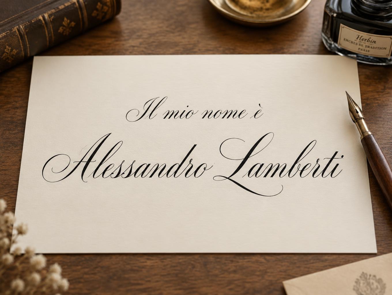
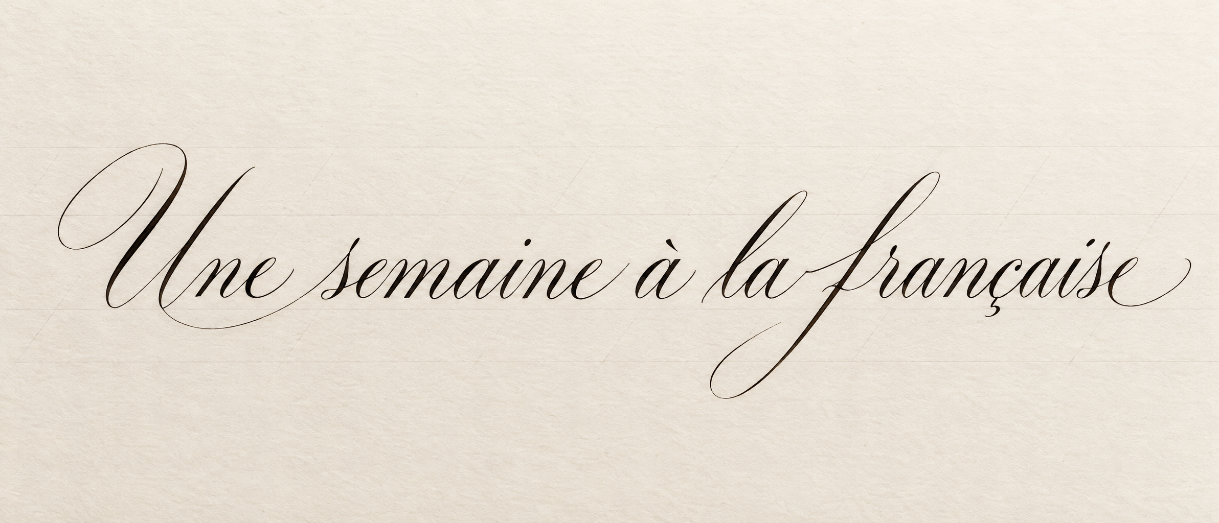
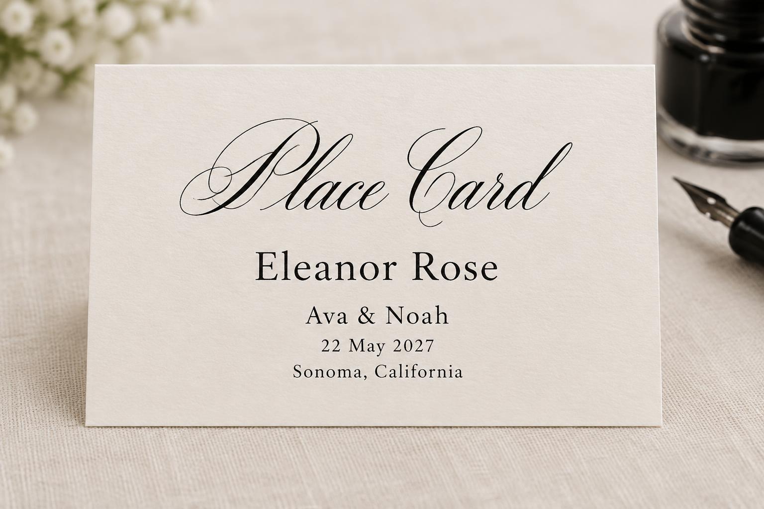
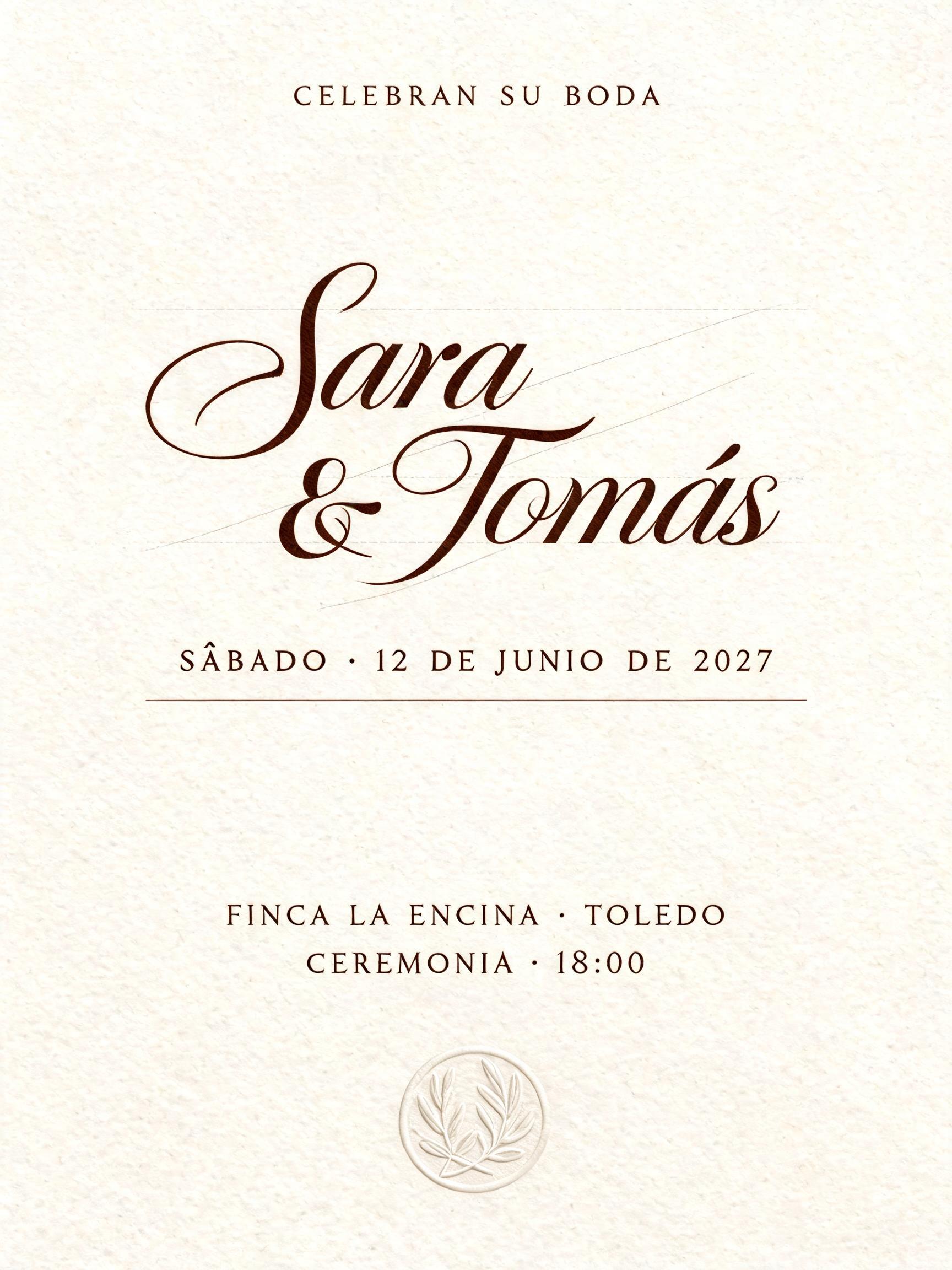
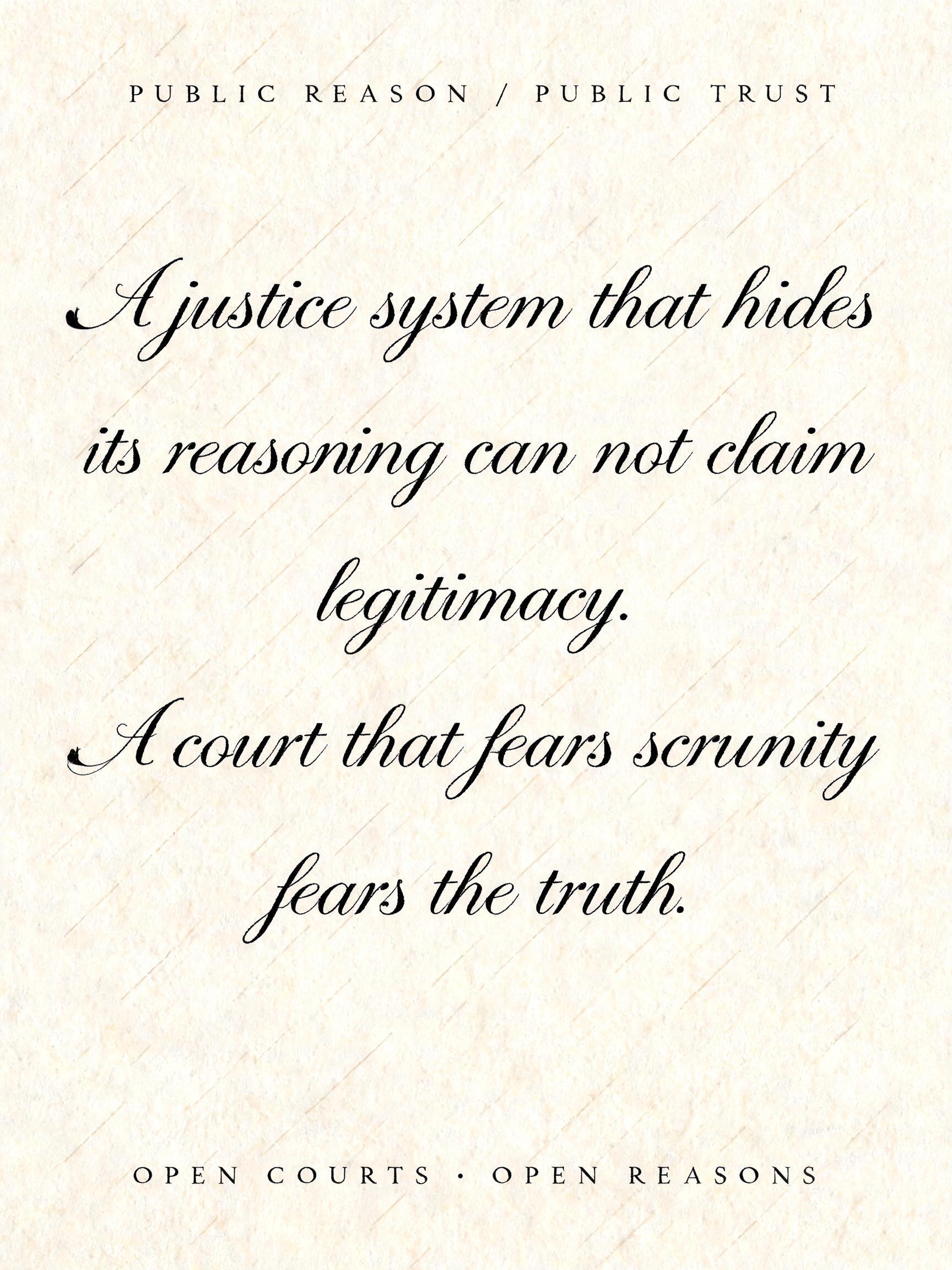
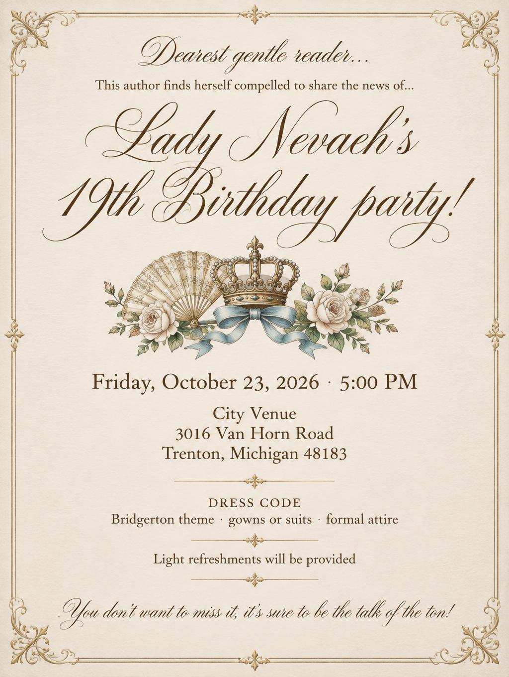
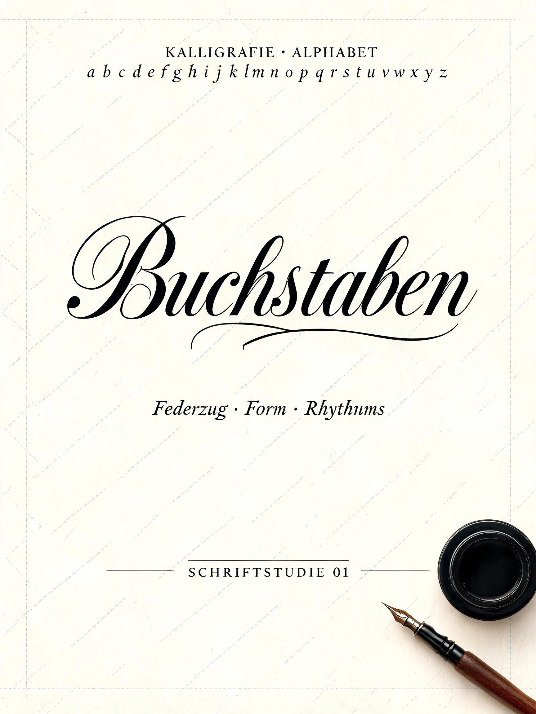
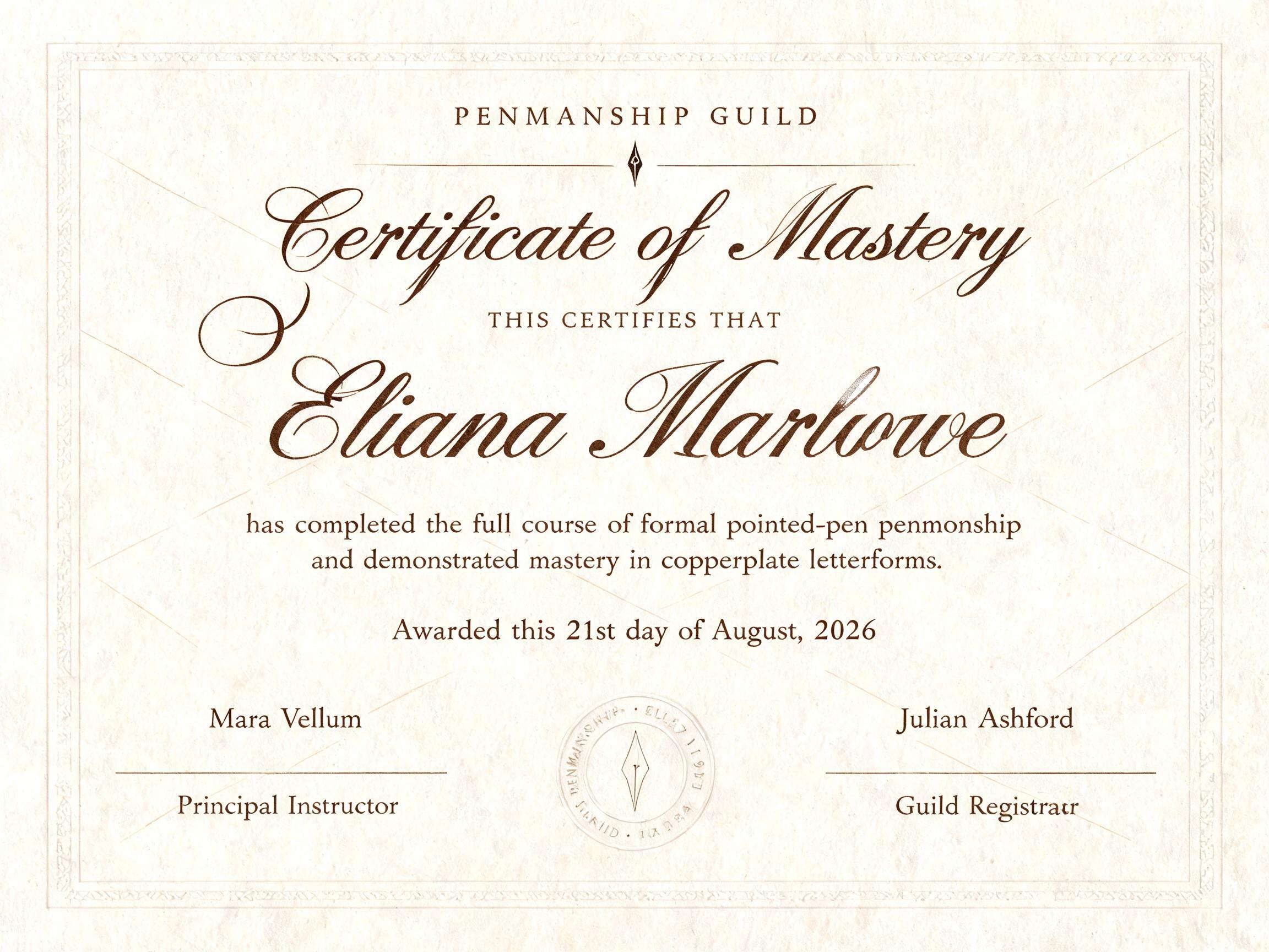
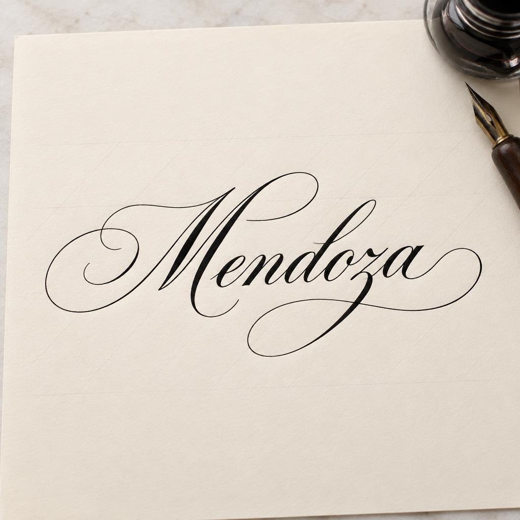
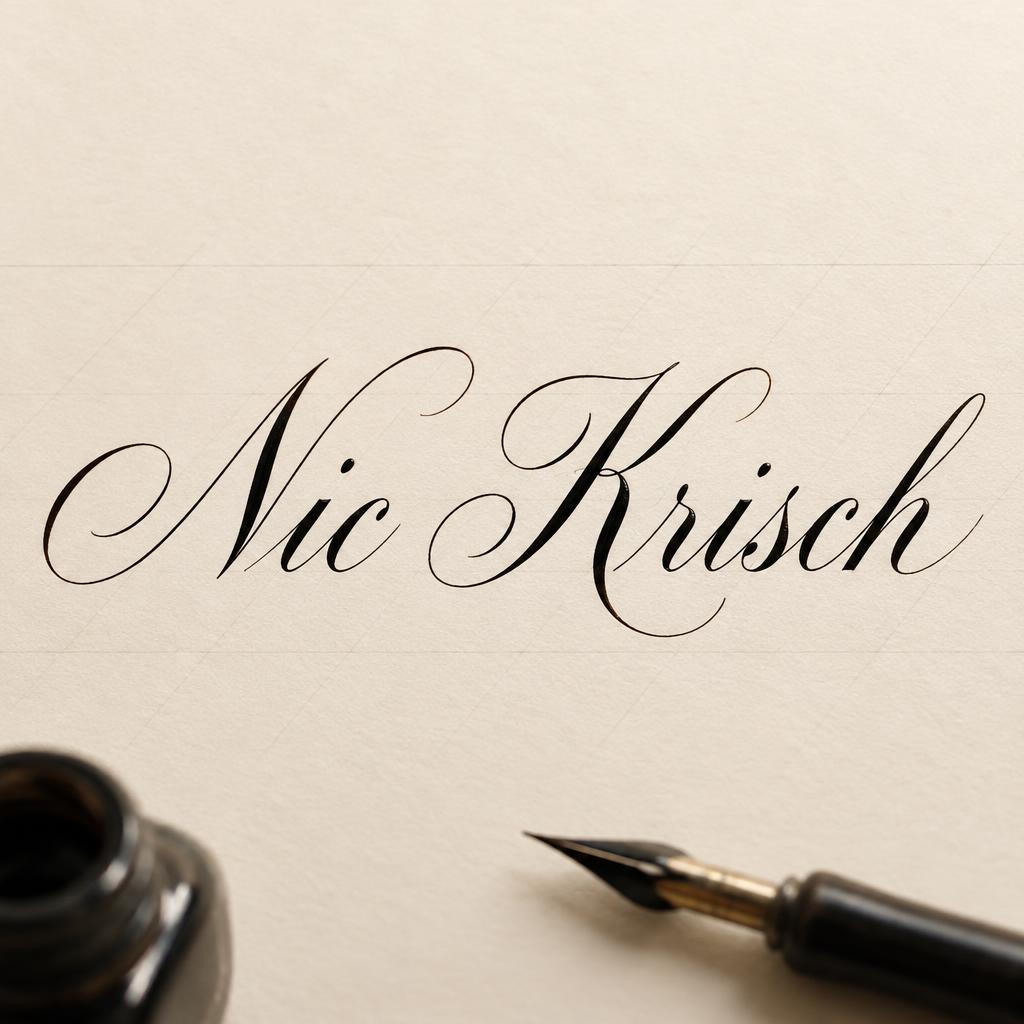
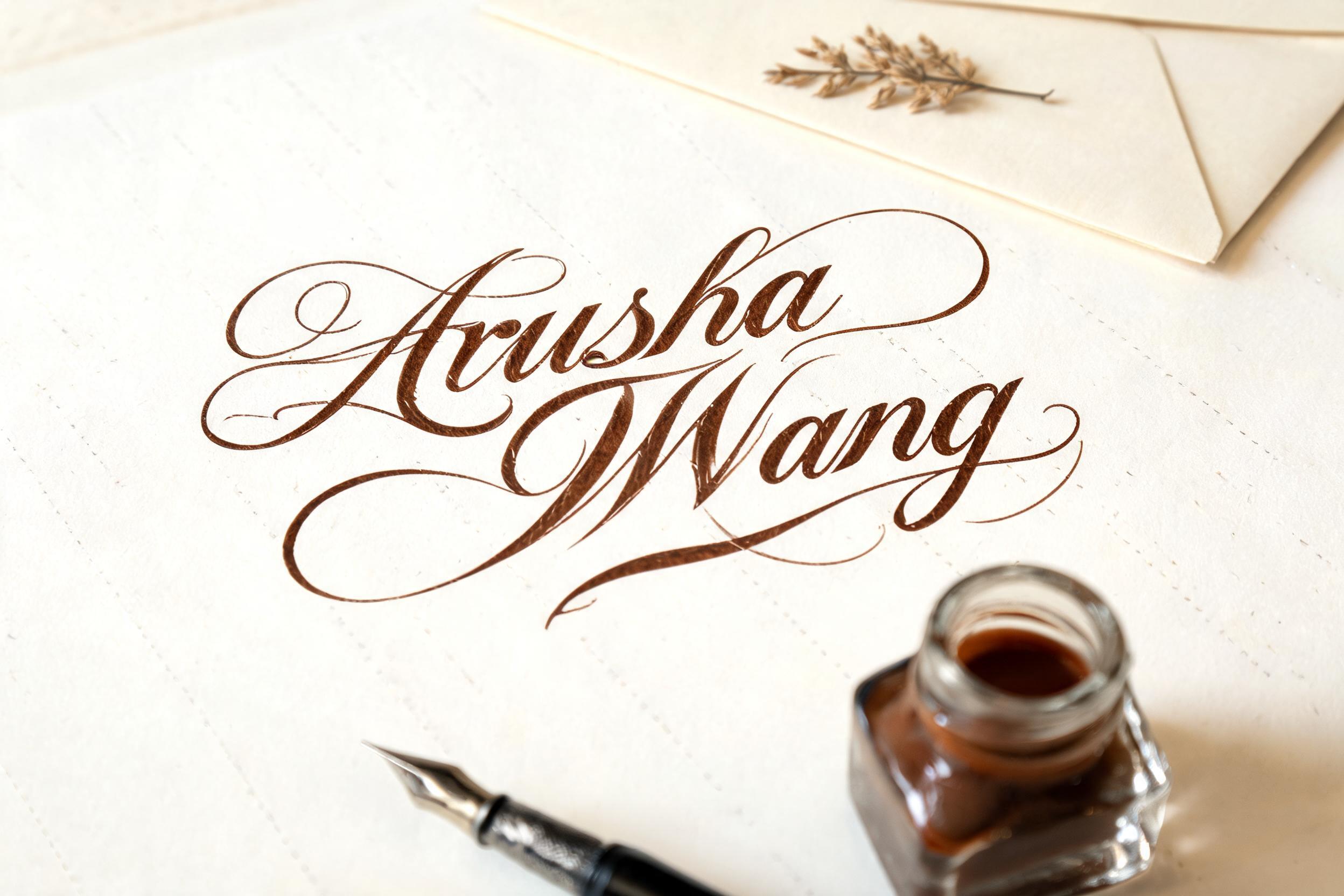
“Para el libro de la vida” was created with FontVibe AI — explore more Cursive Calligraphy text effect. Formal pointed-pen copperplate: strong thick-thin contrast, slanted oval letters and swash capitals, crisp black ink on cream paper with faint ruled guidelines.
laid down as the exacting art of formal pointed-pen calligraphy. SURFACE / INK: crisp, controlled ink — deep black or warm sepia — sitting cleanly on the page with fine wet-ink edges and a faint natural sheen where it catches the light, precise and disciplined rather than loose, the exacting hand of a master penman. GROUND: fine calligraphy paper — smooth hot-press cotton, cream or ivory practice stock, sometimes with faint ruled guideline slants, or a formal certificate or invitation ground — with generous margins so the lettering reads. LIGHT: even, clean studio light — soft and flat — showing the crisp ink edges and fine wet-ink detail, minimal drama. ATMOSPHERE: formal, timeless and disciplined — the tradition of copperplate and Spencerian penmanship, wedding invitations, diplomas and certificates, the poised craft of the calligrapher's desk. LETTERFORM PRIORITY: when the chosen font carries its own treatment, that font's letterform shapes and built-in flourishes take priority and own the letters; this style governs only the ink surface, ground and light, never the letter shapes. When no specific material is defined by the font: crisp controlled pointed-pen ink with fine wet edges and a faint sheen, in a single deep tone, on the calligraphy-paper ground. COLOR: if the font declares its own color keep it; otherwise the ink reads as a classic penmanship tone — deep black or warm sepia — on the pale paper ground. “Para el libro de la vida” arranged on three balanced lines, centered on an elegant ivory certificate-like sheet, filling about 68% of the frame width with generous margins and a clear, poised hierarchy. The exact Spanish words remain fully legible and unchanged. Render the lettering as crisp, controlled deep sepia pointed-pen ink, with fine wet-ink edges and a restrained natural sheen that catches the soft light. The ground is smooth hot-press cotton paper with a subtle warm grain and faint diagonal calligraphy guidelines. A slender dip pen and a small dark ink pot rest near the edge of the sheet, softly out of focus and secondary to the words. Even, clean studio daylight reveals the paper texture and precise ink without harsh shadows. Formal, timeless calligrapher’s-desk atmosphere, composed like a treasured dedication page, with quiet warmth and ample negative space.
Made for Calligraphy Alphabet
Generated on October 31, 2026 · 1360 × 1024 · JPEG · OpenAI GPT-Image-2.5 Sunburst · Shared by the creator · Free for commercial use (CC BY 4.0)


