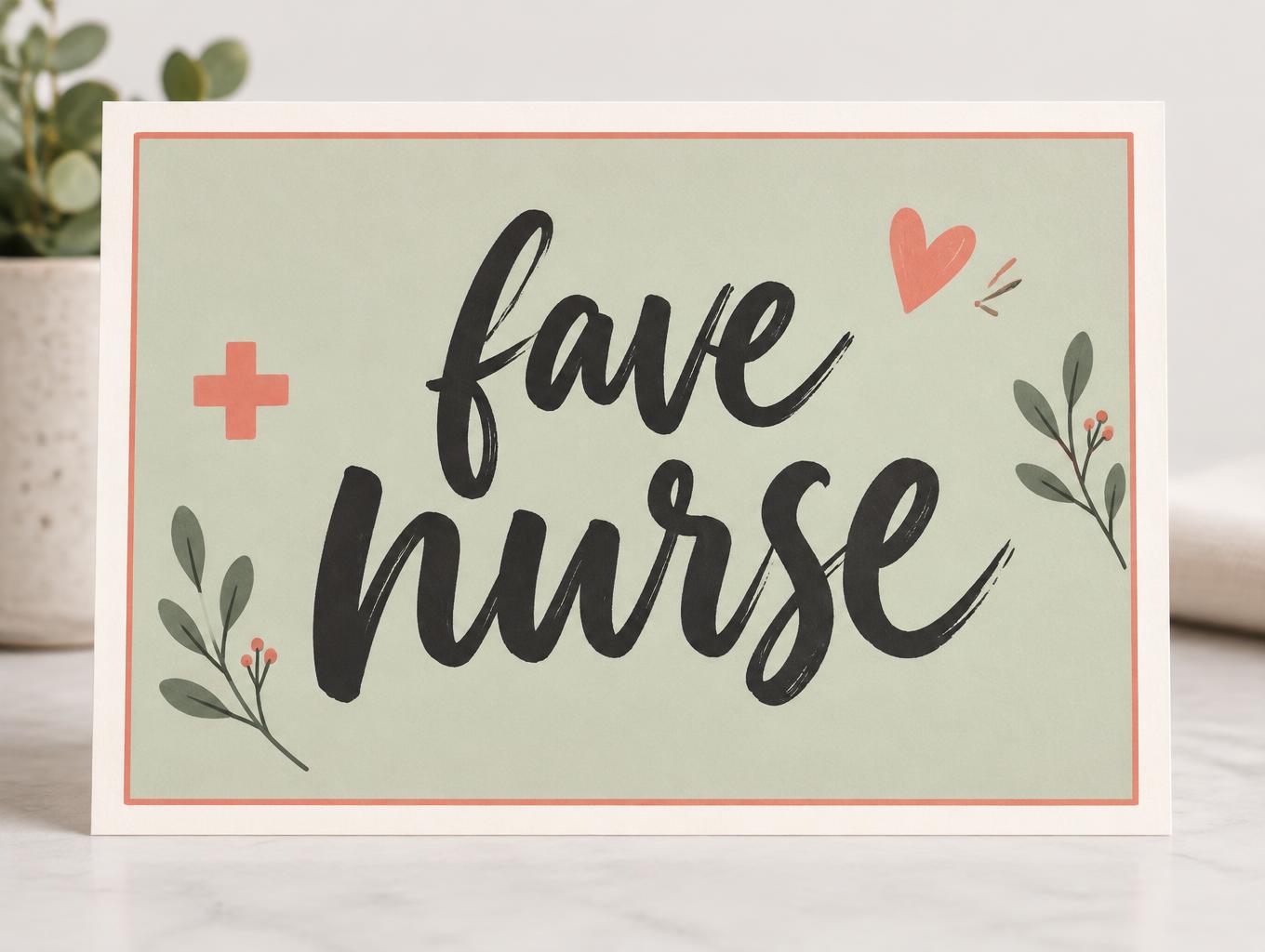
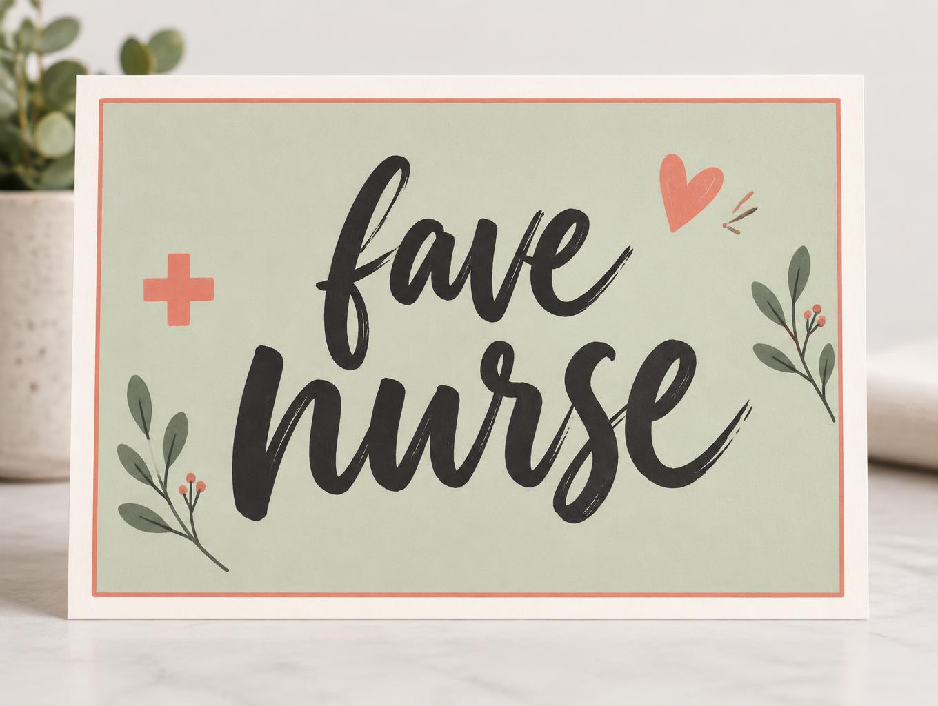
fave nurse - Modern Cursive Text Effect


Uses OpenAI GPT-Image-2.5 Sunburst, the model behind this artwork · 15 credits

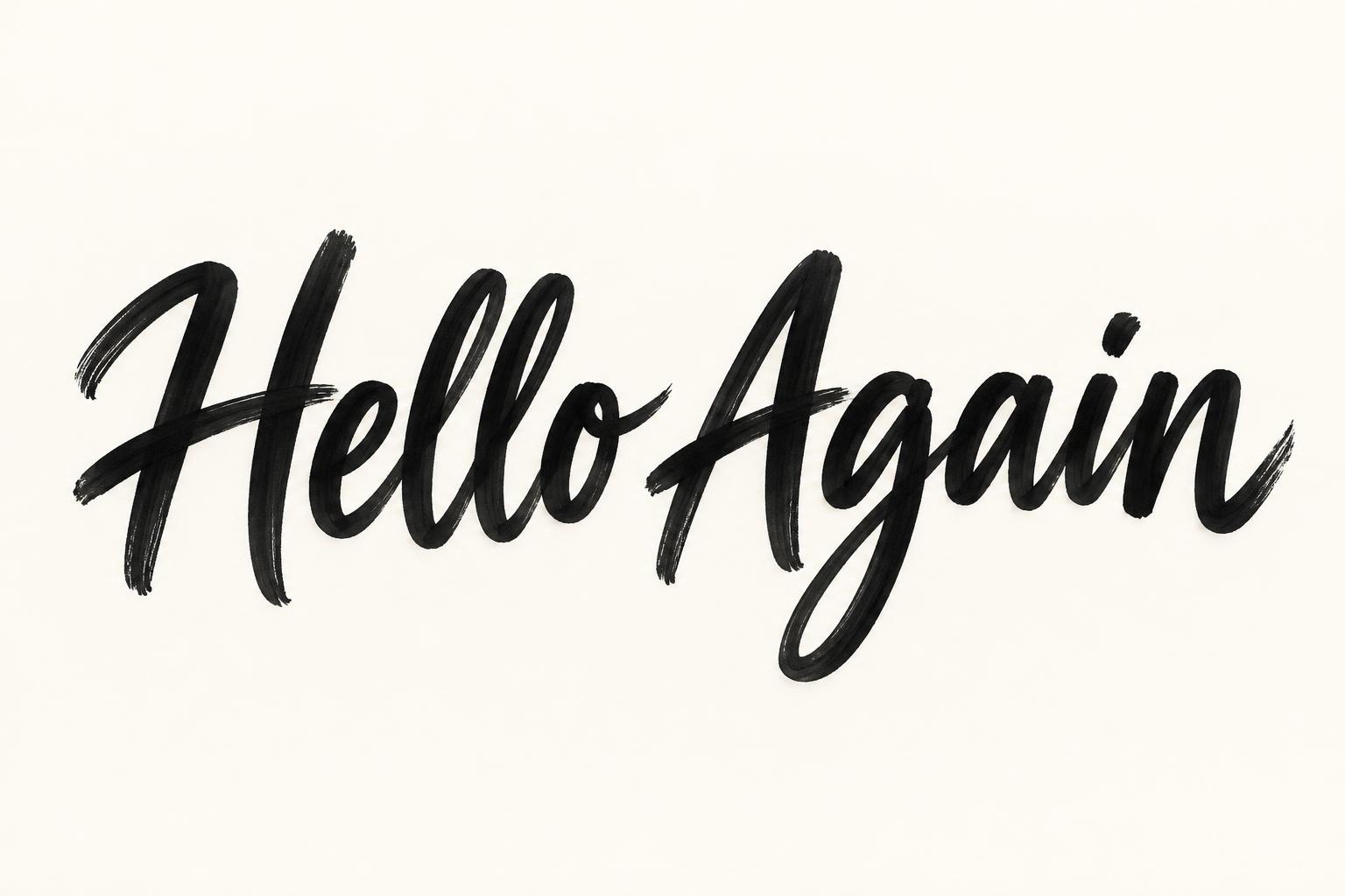

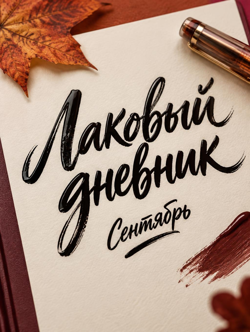
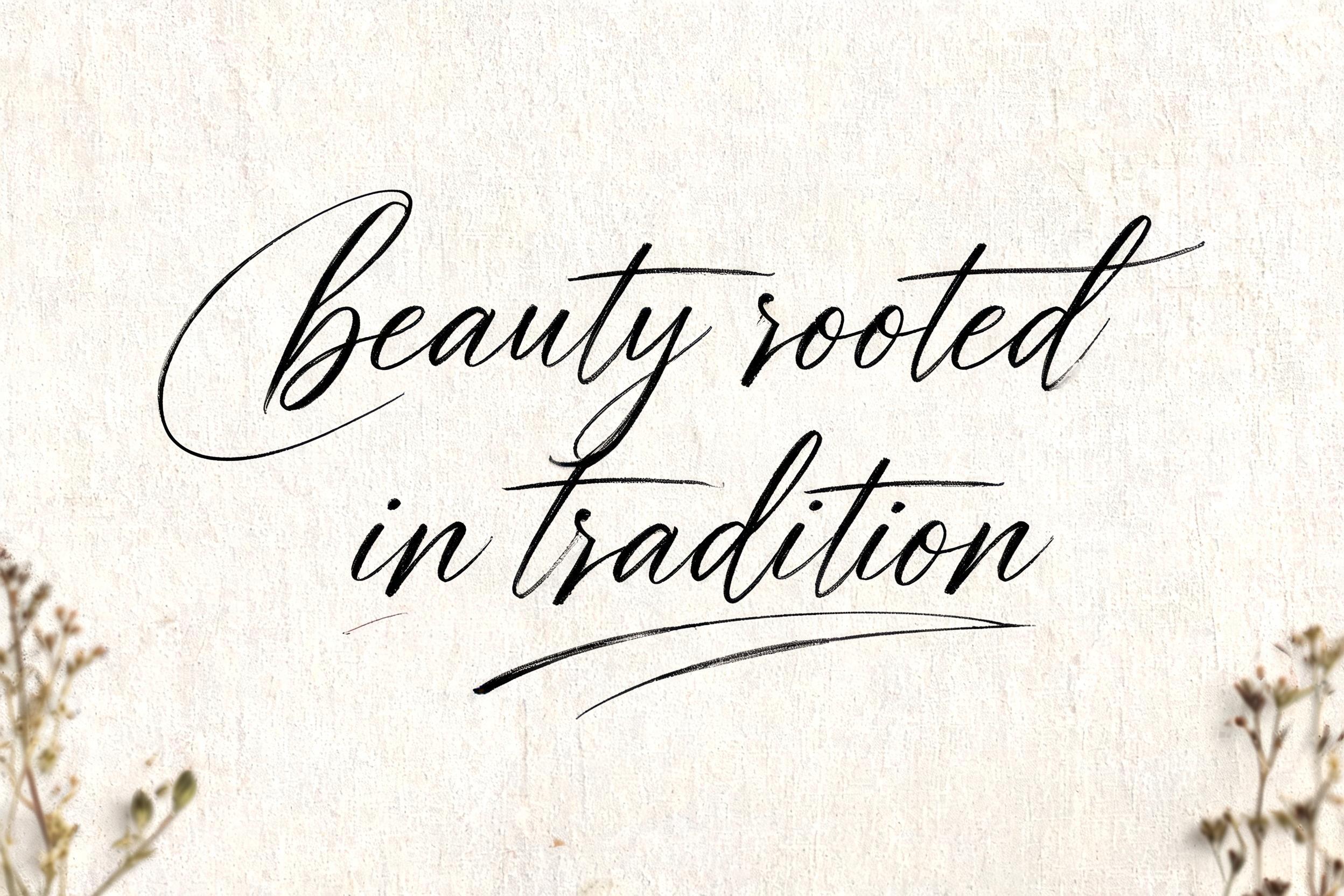
“fave nurse” was created with FontVibe AI — explore more Cursive Modern text effect. Bold modern brush script: heavy loaded-brush strokes, a bouncing baseline and dry-brush drag where the brush lifts, matte black ink on a clean light ground.
grounded in bold, contemporary brush-lettering ink. SURFACE / INK: rich, confident ink laid down with a loaded brush — mostly matte with a faint fresh-ink sheen, a subtle brushed texture in the strokes and a touch of dry-brush grain where they lift, energetic and hand-made. GROUND: a clean, modern surface — a bright studio backdrop, a soft neutral, a bold flat colour block, or a contemporary branding/packaging context — with generous space so the lettering pops. LIGHT: clean, even, contemporary studio light — punchy and bright, minimal drama. ATMOSPHERE: current, confident and commercial — the look of modern brand lettering, apparel graphics, packaging and social content. LETTERFORM PRIORITY: when the chosen font carries its own treatment, that font's letterform shapes take priority and own the letters; this style governs only the ink surface, ground and light, never the letter shapes. When no specific material is defined by the font: rich confident brush ink, mostly matte with a subtle brushed texture, on the clean modern ground. COLOR: if the font declares its own color keep it; otherwise the lettering reads as a bold contemporary tone — deep black or a single confident colour — on the clean ground. Create a polished, contemporary healthcare appreciation graphic with the exact words “fave nurse” as the sole lettering. Set them on two lines, “fave” above “nurse,” with “nurse” larger and leading; center the compact composition and let the lettering fill roughly two-thirds of the canvas width. Keep both words fully visible, clearly spelled, and separated by comfortable breathing room. Place the lettering on a warm ivory card with a broad, muted sage-green panel behind it, edged by a fine coral line. Add a few restrained, graphic accents around the margins: a tiny coral heart, a simple medical cross, and two small leafy sprigs, all secondary and spaced well away from the words. Use a clean, bright studio background and soft, even light, with gentle contact shadows that give the card a finished printed-object presence without adding drama. Keep the palette fresh and reassuring—ivory, sage, coral, and a small touch of charcoal—and leave generous negative space so the bold lettering remains the unmistakable focal point. The overall design should feel warm, modern, thoughtful, and suitable for a nurse appreciation card or social post.
Generated on November 2, 2026 · 1360 × 1024 · JPEG · OpenAI GPT-Image-2.5 Sunburst · Shared by the creator · Free for commercial use (CC BY 4.0)


