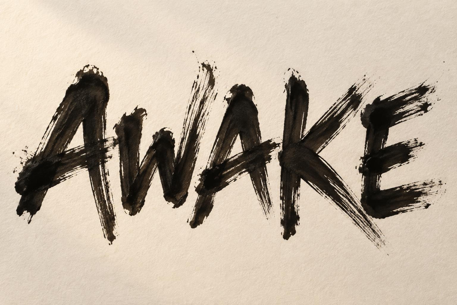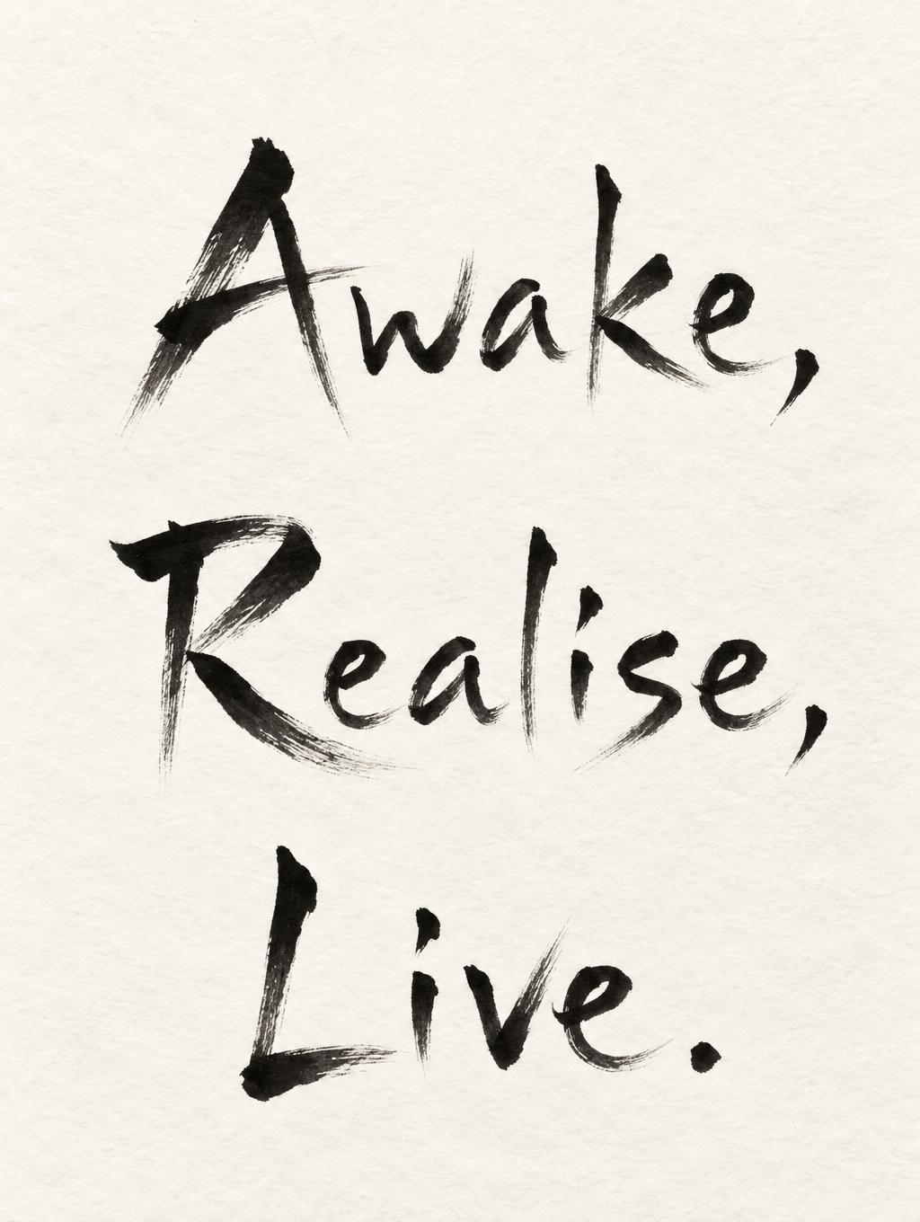
Write Three words: Awake, Realise, Live. Black on white - Japanese Ink Brush Text Effect


Uses OpenAI GPT-Image-2.5 Sunburst, the model behind this artwork · 25 credits











“Write Three words: Awake, Realise, Live. Black on white” was created with FontVibe AI — explore more Brush Japanese Ink text effect. Japanese Shodo ink brush calligraphy style applied to Latin letterforms. Deep sumi black ink with authentic fude brush energy, controlled single-direction strokes, and washi paper atmosphere. Perfect for Japanese restaurant branding, tattoo design, anime, martial arts, and cultural projects.
Japanese ink brush aesthetic — the visual language of sumi calligraphy on washi paper. INK MEDIUM: sumi pigment in deep black to charcoal range — richest density at mark centers, naturally transitioning outward as ink supply depletes. Fully matte, absorbed into paper surface, producing a tonal range from dense opaque black to transparent grey depending on dilution and brush load. PAPER SURFACE: natural washi — warm cream-white base with visible paper fiber structure giving slight texture. The absorbent surface creates the characteristic soft border quality of East Asian brush work at all mark edges. LIGHT ATMOSPHERE: soft diffuse north-facing studio light — the traditional calligrapher's light source. Even, shadowless, allowing the full tonal range of ink marks to read clearly. Warm cream paper tone contrasts against deep sumi black. AESTHETIC REGISTER: the ma principle — the space between and around marks is as considered as the marks themselves. Compositions have breathing room and deliberate quietness. When no specific material is defined by the font: default environment — deep sumi black marks on warm cream washi paper, soft diffuse overhead light, meditative studio atmosphere. Create a finished, contemplative calligraphy art print on a tall sheet of warm cream-white washi, with ample unmarked paper surrounding the lettering. Set the exact client words, “Awake, Realise, Live.”, as three distinct lines, in that order, with Awake leading at the top, Realise beneath it, and Live anchoring the lower third. Preserve the spelling, capitalization, commas, and final period exactly. Make the words the unmistakable focus, large and easy to read, with generous vertical breathing room and balanced margins. The composition should feel like a sequence of deliberate breaths: each word has its own quiet space, while the three lines hold together as one considered whole. Let the marks carry decisive entry and controlled pull-away energy, with rich black centers easing into charcoal and translucent gray at their edges and ends. Keep the black-on-white contrast clear; use no colored accents, extra lettering, symbols, illustrations, borders, or ornamental flourishes. Soft, even studio light reveals the paper’s subtle fibers without casting distracting shadows. The result is spare, assured, and meditative, where every mark and every open area feels intentional.
Generated on November 7, 2026 · 1024 × 1360 · JPEG · OpenAI GPT-Image-2.5 Sunburst · Shared by the creator · Free for commercial use (CC BY 4.0)