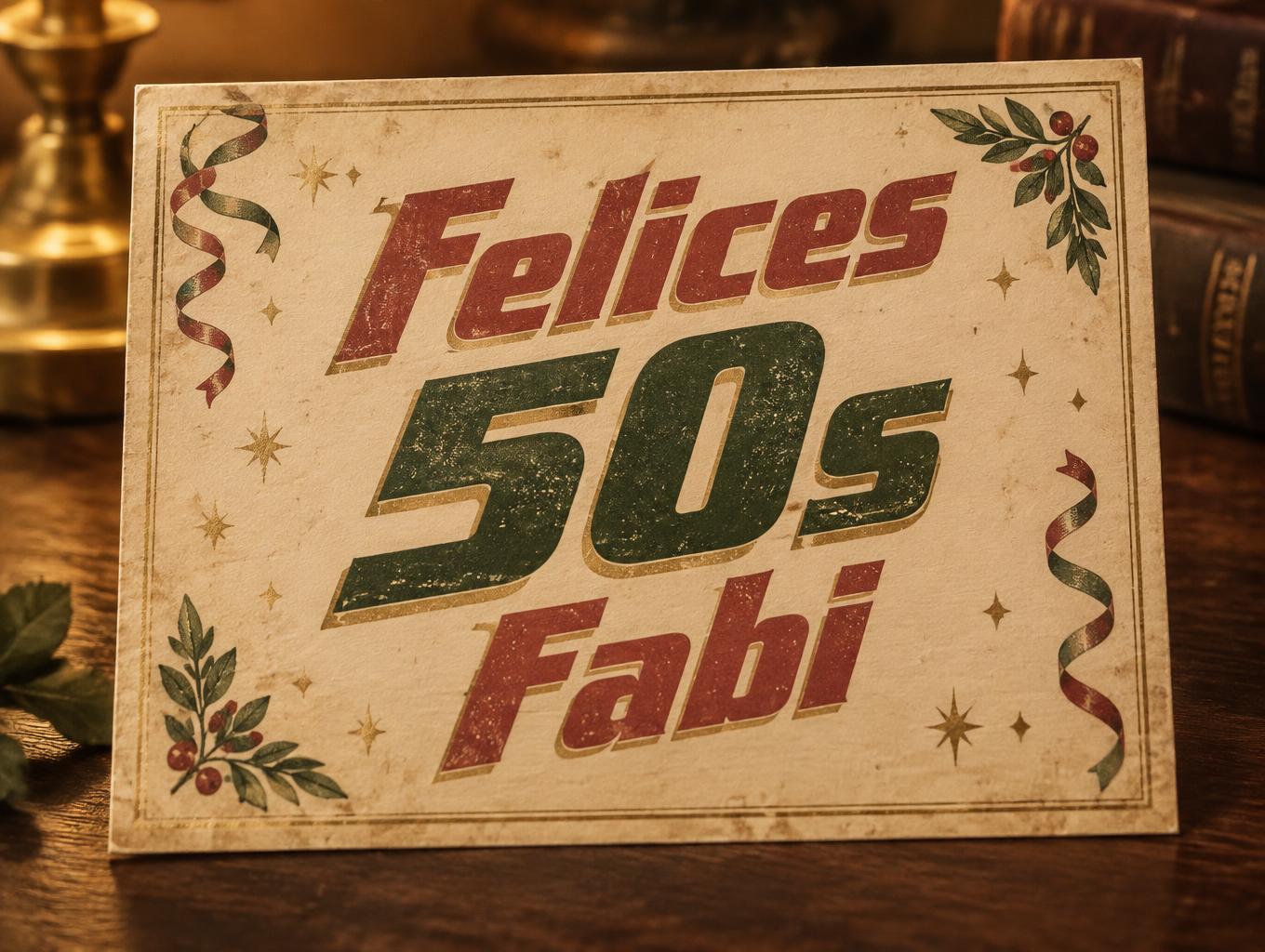
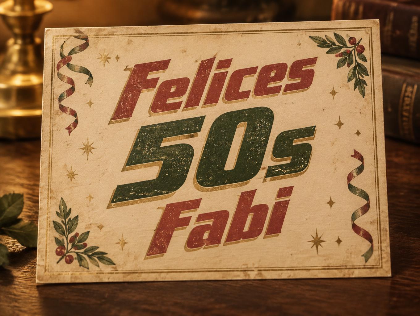
Felices 50s Fabi - Vintage Text Effect


Uses OpenAI GPT-Image-2.5 Sunburst, the model behind this artwork · 15 credits

“Felices 50s Fabi” was created with FontVibe AI — explore more Vintage text effect. Serif capitals letterpress-bitten into cream cotton card with slightly broken ink, set on an old press bed among scattered metal type.
a timeless vintage piece carrying the physical evidence of an older making — warm, aged and classic. SURFACE / STYLE: the lettering looks produced by a heritage craft and softened by time — a letterpress impression bitten into cotton paper with ink slightly broken up, weathered paint on aged metal or wood, a worn rubber-stamp or postal imprint, or warm gold leaf — carrying patina, foxing, grain and gentle wear. SCENE ATMOSPHERE: a warm nostalgic setting — aged cream or kraft paper, dark wood, soft amber light, faint dust and a faded heritage feel. PALETTE: warm aged tones — cream, kraft, sepia, faded red, forest green, navy, tan and antique gold — muted and time-softened, never neon-bright. LETTERFORM PRIORITY: when the chosen font carries its own treatment (western slab, art deco, art nouveau, letterpress, postal or rubber stamp, gold leaf, typewriter, hand-lettered script, grunge chalk), that font treatment takes absolute priority and owns the letters; this style supplies the warm aged tone, the time-worn surface and the nostalgic heritage scene. FALLBACK MATERIAL: if the font carries no material of its own, render the letters as a classic serif printed in warm faded ink on aged cream paper with a soft letterpress impression and gentle wear, so the timeless vintage feel always reads. Create a celebratory vintage birthday keepsake for “Felices 50s Fabi,” arranged on three clear lines: “Felices” above, “50s” as the largest and most prominent line, and “Fabi” beneath it. Set the lettering on a softly aged cream paper card, with a gentle letterpress impression, warm faded ink, subtle paper grain, faint foxing, and small traces of wear that feel cherished rather than damaged. Frame the card with a fine antique-gold border and restrained festive details: a few muted faded-red and forest-green paper streamers, tiny gold confetti marks, and delicate sprigs of greenery tucked into opposite corners. Keep all decorations secondary and leave generous clear space around every word so the exact Spanish text remains legible and central. Use warm amber lamplight grazing across the paper, with soft shadows falling onto a dark walnut tabletop; let the background recede into a quiet, nostalgic blur. The composition should feel personal, joyful, and timeless, like a lovingly printed birthday card kept as a family memento. Avoid extra lettering, numbers, or dates.
Made for 80s Font Generator
Generated on November 9, 2026 · 1360 × 1024 · JPEG · OpenAI GPT-Image-2.5 Sunburst · Shared by the creator · Free for commercial use (CC BY 4.0)



