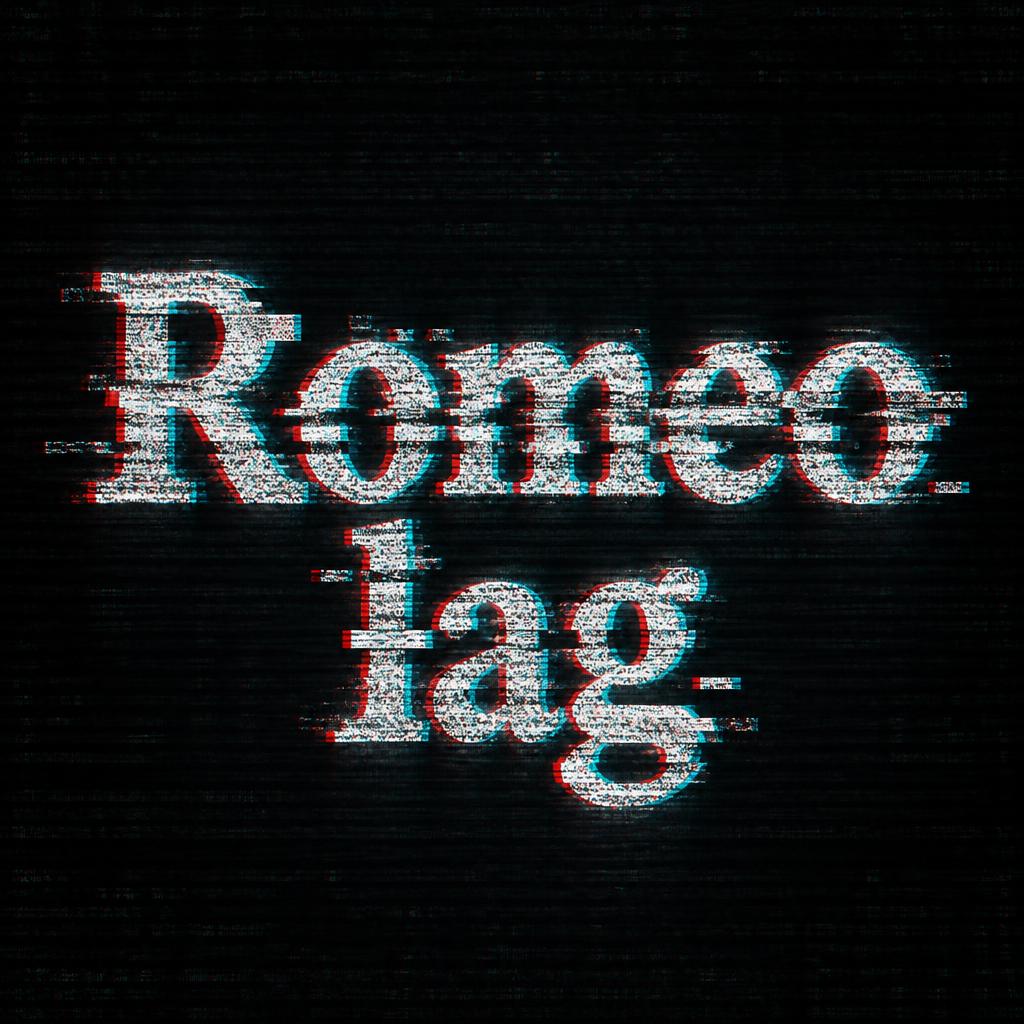
Romeo lag - Glitch Text Effect


Uses OpenAI GPT-Image-2.5 Sunburst, the model behind this artwork · 15 credits
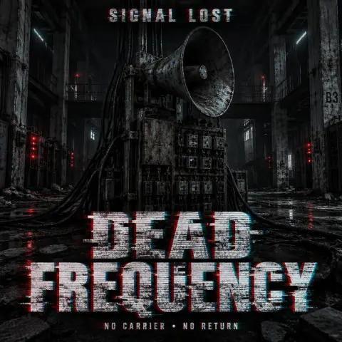
“Romeo lag” was created with FontVibe AI — explore more Glitch text effect. White sans capitals split by red and cyan channel offsets, sliced by horizontal displacement bands and scanlines, reflected on a wet neon street at night.
Core glitch effect: authentic RGB chromatic aberration — red channel shifted 5–8px to the left, cyan channel shifted 5–8px to the right, creating the classic double-vision color split on every letter edge. CRT scan lines: dense horizontal parallel lines across the entire text surface, spacing 3–4px, semi-transparent, rhythmic — simulating a real CRT phosphor screen. Pixel block artifacts: 3–5 sharp-edged rectangular chunks of letter pixels displaced horizontally by 10–25px at random vertical positions along the text. Edge glow: subtle cyan-white phosphor bloom emanating from letter boundaries. The glitch distortion is controlled and deliberate — text remains clearly readable. No random noise flood. No cartoon effects. Professional digital corruption aesthetic. LETTERFORM PRIORITY: when the chosen font carries its own treatment, that font's letterform shapes take priority and own the letters; this style governs the RGB chromatic aberration, the scan lines and the pixel-displacement corruption. FALLBACK MATERIAL: if the font carries no material of its own, render the letters with a red/cyan channel split, dense CRT scan lines and displaced pixel blocks, kept clearly readable. COLOR PRIORITY: keep the font's own colors if specified; otherwise the red-and-cyan split with cyan-white phosphor glow on a dark digital void. Create a polished digital-culture poster with the exact words “Romeo lag” as the sole text. Set “Romeo” on the first line and “lag” directly beneath it, centered as one compact, commanding title; make “Romeo” the dominant line and keep “lag” large enough to read instantly. Give the lettering generous breathing room against a deep near-black digital void, with a faint, abstract monitor glow behind it and no identifiable device, interface, icons, or extra symbols. Keep the composition crisp and deliberate, with clean negative space and a slight sense of suspended signal failure. The title should remain the unmistakable focal point: sharply readable at a glance, with deliberate digital corruption confined to its edges and a few distinct rectangular pixel fragments slipping sideways from the letter shapes. Subtle horizontal screen rhythm may extend into the surrounding darkness, but the background stays restrained and uncluttered. Use the chosen glitch treatment consistently across both lines, preserving the exact spelling and capitalization. The result should feel like a finished, contemporary glitch-art title graphic: controlled, high-contrast, visually striking, and never so distorted that the words become difficult to recognize.
Generated on November 11, 2026 · 1024 × 1024 · JPEG · OpenAI GPT-Image-2.5 Sunburst · Shared by the creator · Free for commercial use (CC BY 4.0)



