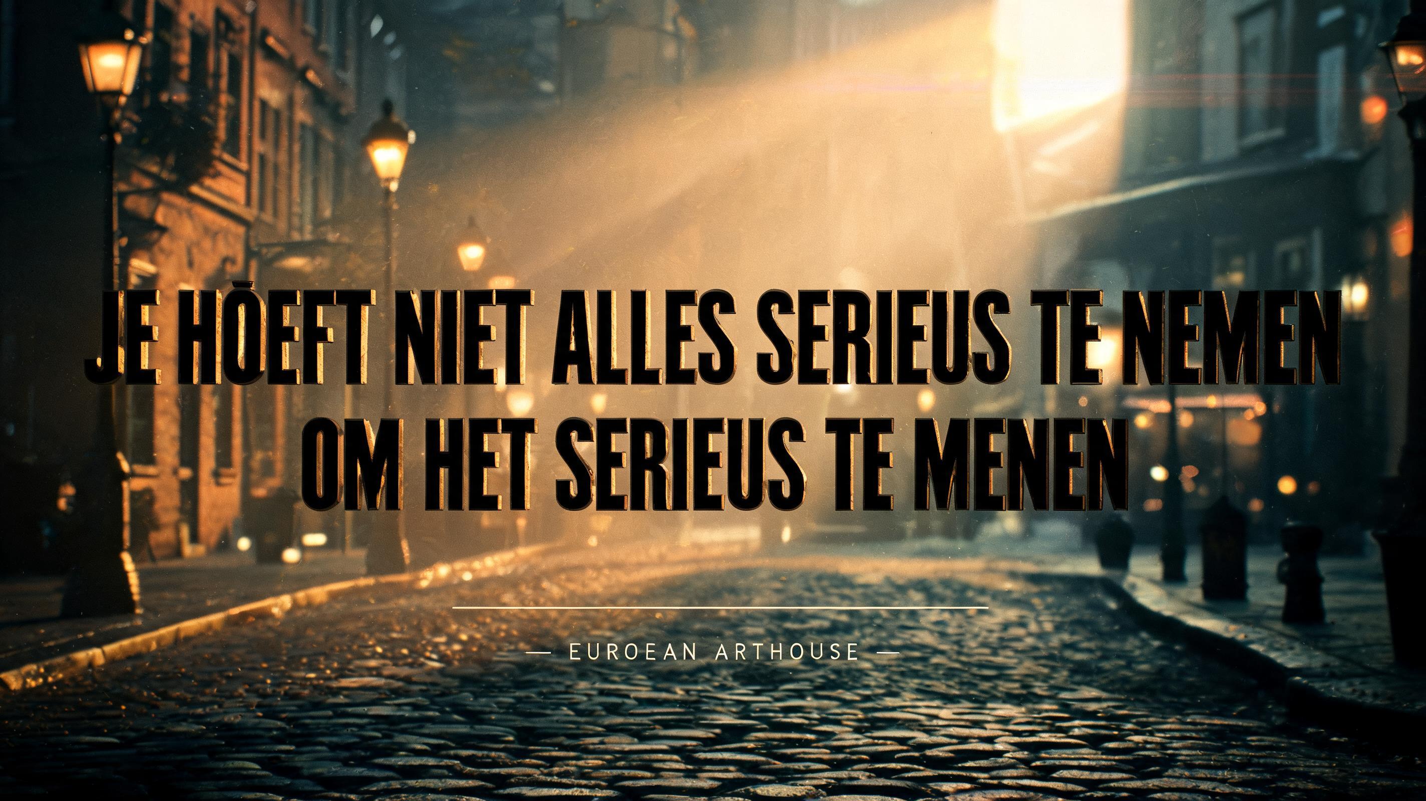
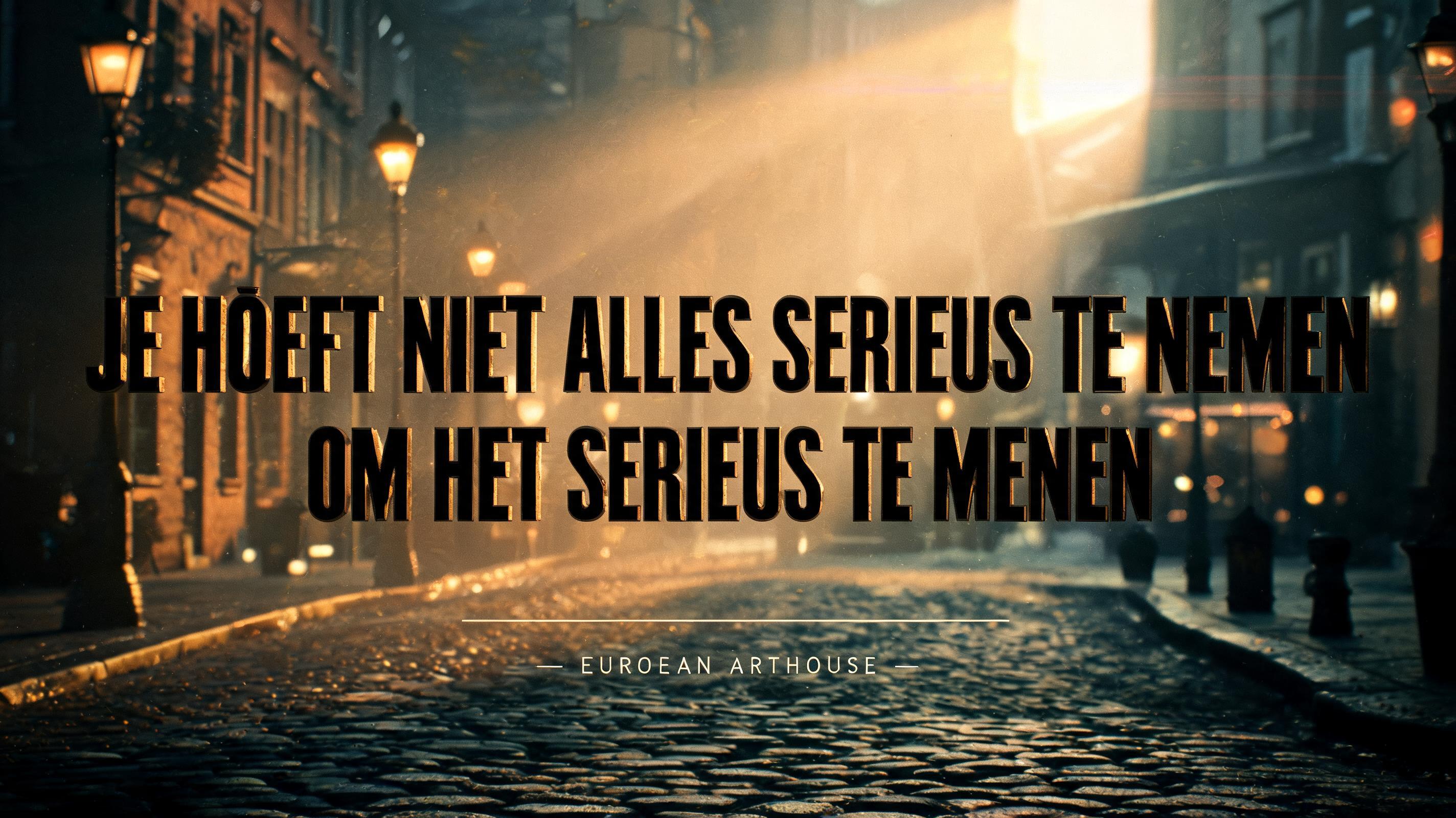
Je hoeft niet alles serieus te nemen om het serieus te menen. - Movie & Film Text Effect

Hollywood-grade movie title typography with professional key art quality. Dominant title letterforms with cinematic dept...


“Je hoeft niet alles serieus te nemen om het serieus te menen.” is a Hollywood-style typography text effect created with FontVibe AI. Hollywood-grade movie title typography. Every word carries the weight of a film poster — cinematic light, depth, and atmosphere. Hollywood-grade movie title typography with professional key art quality. Dominant title letterforms with cinematic depth — clear foreground/background separation with atmospheric haze and volumetric light creating dimensional space. Strong directional key light defining letter surface and form. Subtle film grain texture overlay enhancing photographic authenticity. Deep, rich tonal range with controlled shadow depth. Scene and material vocabulary driven by the text's emotional register — heroic calls for epic scale and warm golden light, dark themes call for cold underlighting and shadow, futuristic calls for clean precision and cool tones. Professional cinematic color grading. High-contrast, photorealistic rendering. Movie title card composition. The phrase JE HOEFT NIET ALLES SERIEUS TE NEMEN OM HET SERIEUS TE MENEN rendered in warm, confident letterforms against a richly atmospheric cinematic backdrop. The environment evokes a late-afternoon European city — cobblestone boulevard glistening after light rain, amber streetlamps beginning to glow, warm golden-hour light slanting low across the frame, catching dust motes and faint atmospheric haze in the air. A shallow depth of field softens the background into painterly bokeh of amber and deep bronze tones. Volumetric light bleeds through a gap between buildings in the distance, casting long directional rays across the scene. The dominant title tier commands clear visual weight, letterspacing generous, each word crisp against the glowing haze. A subtle secondary typographic tier — a thin ruled line or small-caps label — anchors the base of the composition as a quiet counterpoint to the title mass. The overall mood is warm, wry, and intelligent — like a thoughtful European arthouse film that takes its lightness seriously. Teal-to-amber color grade, gentle film grain, soft anamorphic horizontal flare kissing the brightest edge of the frame, shallow vignette deepening corners into rich shadow. Professional cinematic color grading. High-contrast photorealistic rendering.
Generated on Jun 6 · 2848 × 1600 · JPG · Shared by the creator


