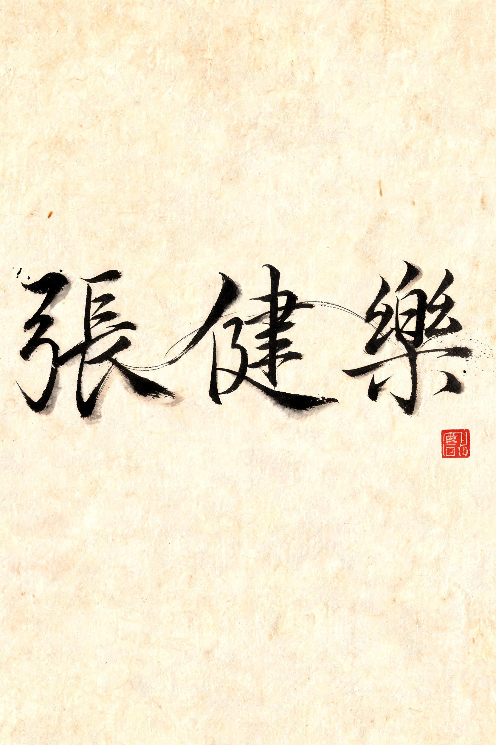
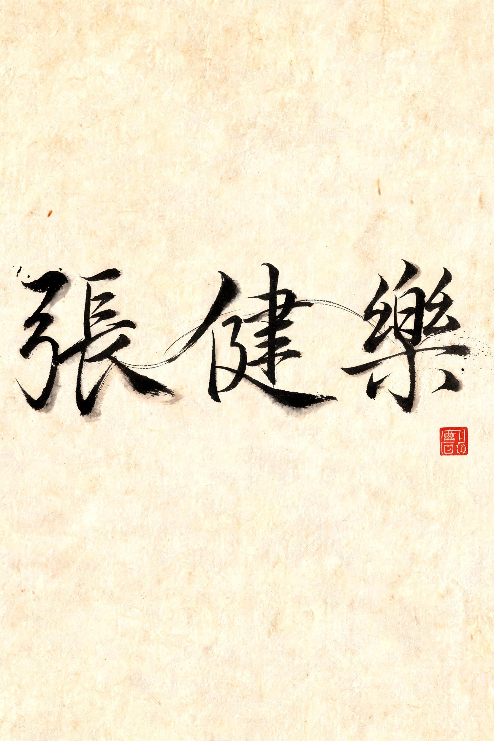
張健樂 - Chinese Ink Brush Text Effect

rendered in Chinese ink brush calligraphy style. Letterforms painted with a fully loaded sumi ink brush — deep black ink...


“張健樂” is a Brush Chinese Ink text effect text effect created with FontVibe AI. Chinese sumi ink brush calligraphy style applied to Latin letterforms. Deep black ink with authentic bristle texture, thick-to-thin stroke variation, and rice paper atmosphere. Perfect for Chinese restaurant branding, martial arts, wellness, and cultural design. rendered in Chinese ink brush calligraphy style. Letterforms painted with a fully loaded sumi ink brush — deep black ink, visible bristle marks along stroke edges, wet ink pooling at stroke starts, feathered dry-brush trailing ends. Authentic ink density variation: thick rich black cores fading to grey at thin passages. Rice paper texture visible behind. Traditional Chinese calligraphy energy — each stroke confident, intentional, irreversible. LETTERFORM PRIORITY: when the chosen font carries its own treatment, that font's letterform shapes take priority and own the letters; this style governs the sumi ink medium, the bristle and ink-density behavior and the rice-paper ground. FALLBACK MATERIAL: if the font carries no material of its own, render the letters as deep black sumi brush strokes with visible bristle marks, wet ink pooling at stroke starts and feathered dry-brush trails on rice paper. COLOR PRIORITY: keep the font's own colors if specified; otherwise rich black ink fading to grey at thin passages. Three-character name 張健樂 rendered in sumi ink on aged xuan paper with a warm ivory-ochre tone. Ink brush strokes carry full wet-to-dry variation — each character opens with a densely loaded, deep black stroke head where ink pools visibly, then tapers through the body into feathered, hair-thin dry-brush tails. Individual bristle filaments separate at stroke endings, leaving translucent gray wisps that bleed softly into the paper fiber grain. The character 張 carries bold horizontal thrust with a sweeping right-falling stroke; 健 builds upward with strong vertical spine and rhythmic horizontal bars; 樂 closes with radiating lower strokes full of expressive release. Ink density shifts organically between the three — some characters darker and heavier, one slightly lighter, mimicking the natural re-loading rhythm of a calligrapher's brush. Micro ink-splatter droplets scatter near the most energetic strokes, evidence of speed and intention. A small vermilion seal stamp impression appears at the lower edge, slightly askew, with faint red ink texture. The xuan paper surface shows subtle pressed-fiber texture visible through the thinner ink passages, creating luminous negative space that breathes around each stroke. High-contrast chiaroscuro between deep black ink cores and the warm pale ground. Photorealistic ink media render, 8k detail.
Generated on Jul 10 · 1664 × 2496 · JPG · Shared by the creator


