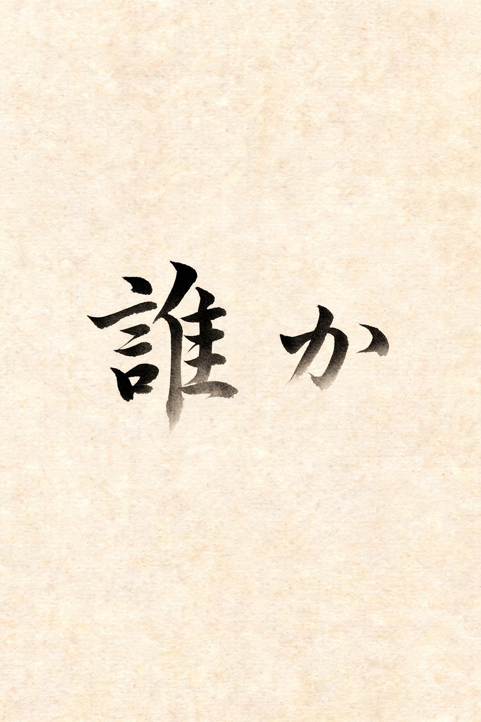
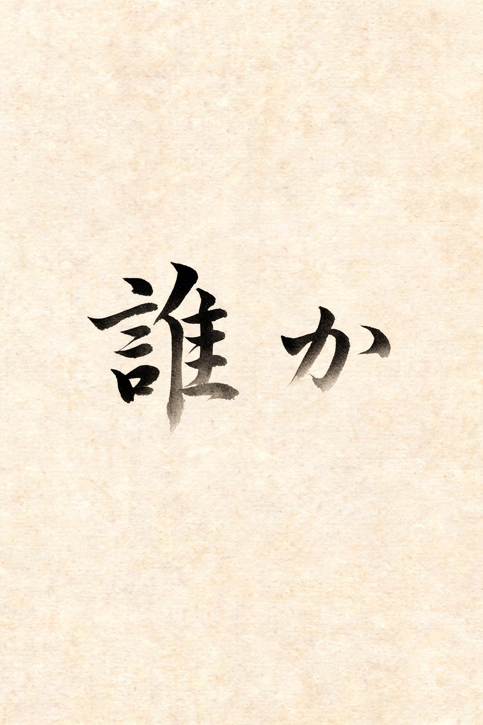
誰か - Japanese Ink Brush Text Effect


Uses BytePlus Seedream 5.0, the model behind this artwork · 15 credits











“誰か” is a Brush Japanese Ink text effect text effect created with FontVibe AI. Japanese Shodo ink brush calligraphy style applied to Latin letterforms. Deep sumi black ink with authentic fude brush energy, controlled single-direction strokes, and washi paper atmosphere. Perfect for Japanese restaurant branding, tattoo design, anime, martial arts, and cultural projects.
Japanese ink brush aesthetic — the visual language of sumi calligraphy on washi paper. INK MEDIUM: sumi pigment in deep black to charcoal range — richest density at mark centers, naturally transitioning outward as ink supply depletes. Fully matte, absorbed into paper surface, producing a tonal range from dense opaque black to transparent grey depending on dilution and brush load. PAPER SURFACE: natural washi — warm cream-white base with visible paper fiber structure giving slight texture. The absorbent surface creates the characteristic soft border quality of East Asian brush work at all mark edges. LIGHT ATMOSPHERE: soft diffuse north-facing studio light — the traditional calligrapher's light source. Even, shadowless, allowing the full tonal range of ink marks to read clearly. Warm cream paper tone contrasts against deep sumi black. AESTHETIC REGISTER: the ma principle — the space between and around marks is as considered as the marks themselves. Compositions have breathing room and deliberate quietness. When no specific material is defined by the font: default environment — deep sumi black marks on warm cream washi paper, soft diffuse overhead light, meditative studio atmosphere. Dos caracteres 誰か en composición íntima sobre washi natural de tono crema cálido, fibras visibles absorbiendo la tinta con suavidad. Trazos ejecutados con carga moderada de sumi — entrada decidida en negro profundo, presión que se alivia hacia los remates hasta disiparse en gris translúcido casi imperceptible. El trazo de harai en か se estira con velocidad contenida, adelgazando hasta desvanecerse en el papel como un suspiro. Cada marca respira dentro del espacio vacío circundante — el principio ma governa la composición, el silencio entre trazos pesa tanto como la tinta misma. Gradación tonal desde negro opaco denso en los arranques hasta gris carbón suave en los cuerpos y gris translúcido en los finales. Bordes de tinta levemente difusos por la absorción capilar de las fibras del washi. Luz difusa uniforme de estudio, sin sombras, que permite leer la escala tonal completa del sumi. Sin sellos, sin ornamentos — solo los dos caracteres suspendidos en la quietud del papel crema.
Generated on July 30, 2026 · 1664 × 2496 · JPEG · BytePlus Seedream 5.0 · Shared by the creator · Free for commercial use (CC BY 4.0)


