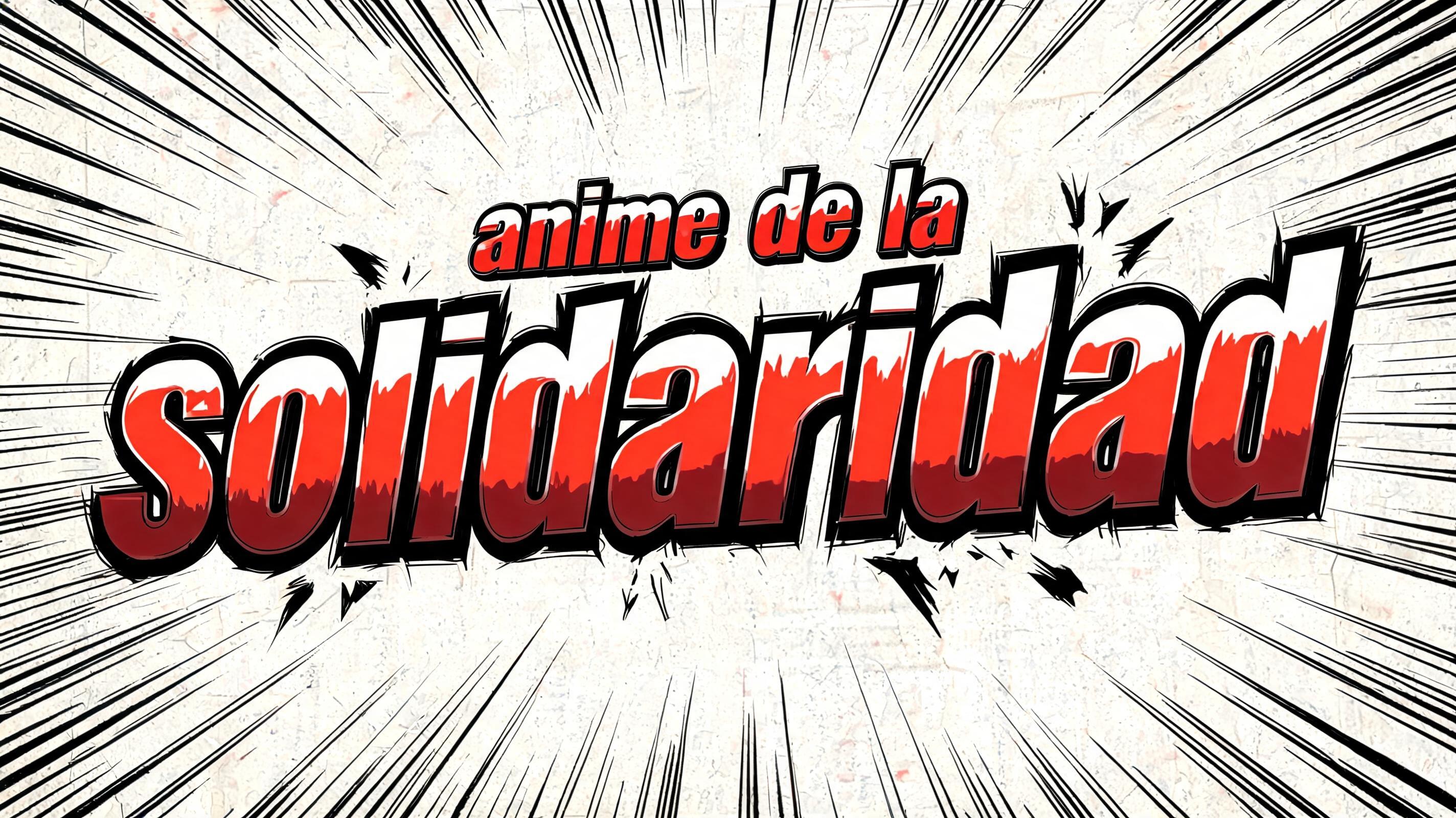
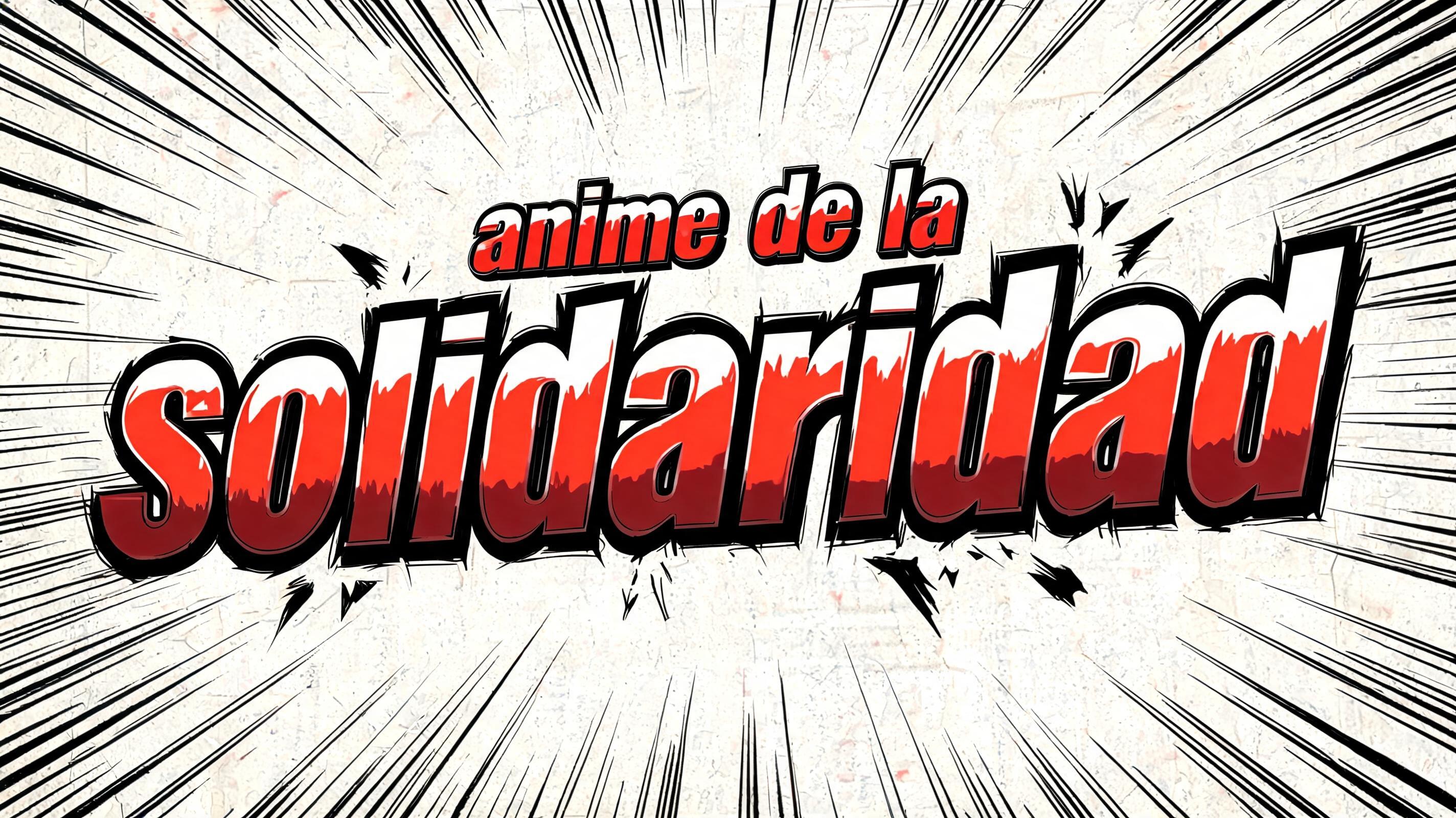
anime de la solidaridad - Anime Text Effect

rendered as Japanese shounen anime title treatment — bold hand-inked manga lettering with authentic cel-shaded visual en...


“anime de la solidaridad” is a Anime text effect text effect created with FontVibe AI. Japanese anime-inspired typography with bold outlines, vibrant sakura pink and sky blue tones, manga speed lines and dynamic composition. rendered as Japanese shounen anime title treatment — bold hand-inked manga lettering with authentic cel-shaded visual energy. Letter construction follows classic Shonen Jump title card standards: thick black ink outline with natural brush-weight variation defining each letter boundary; flat cel-shading fill with three hard-edge zones — bright highlight zone on upper letter face, highly saturated primary color zone at center, deep shadow zone at lower edge; all zone boundaries knife-edge hard, zero gradient blur, pure flat offset-print ink physics. Energy signature: high-contrast color + thick ink outline = letters that look physically printed on manga paper. The typographic language of Dragon Ball, Naruto, One Piece, Demon Slayer, Jujutsu Kaisen title cards — maximum manga kinetic energy, iconic and immediately recognizable as Japanese anime title typography. LETTERFORM PRIORITY: when the chosen font carries its own treatment, that font's letterform shapes take priority and own the letters; this style governs the inked manga outline, the three-zone cel-shading and the kinetic energy. FALLBACK MATERIAL: if the font carries no material of its own, render the letters as bold hand-inked shounen title lettering with a thick black brush outline and hard three-zone cel-shading. COLOR PRIORITY: keep the font's own colors if specified; otherwise a high-saturation primary fill with hard highlight and shadow zones. Título de serie anime shounen — 'anime de la solidaridad' como letrero de apertura de capítulo manga, con jerarquía tipográfica donde 'anime de la' funciona como línea de subtítulo secundaria y 'solidaridad' irrumpe como palabra héroe dominante que llena el ancho del encuadre con presencia monumental. Fondo con ráfagas radiales de líneas de velocidad manga emanando desde el núcleo del título — trazo de tinta negro denso, estilo panel de impacto Shonen Jump. Cada letra: contorno de tinta negra gruesa con variación natural de peso de pincel; relleno cel-shading plano en tres zonas duras — zona de brillo blanco puro en cara superior de letra, zona de color primario saturado al rojo-naranja vibrante en cuerpo central, zona de sombra carmesí oscuro en borde inferior; todas las fronteras de zona corte de navaja, cero desenfoque de gradiente, física de tinta plana de offset puro. Marcas de impacto angulares y destellos de energía dispersos alrededor del conjunto de letras. Calidad de producción Shonen Jump, energía cinética máxima, perfectamente legible como título de anime icónico.
Generated on Aug 5 · 2848 × 1600 · JPG · Shared by the creator


