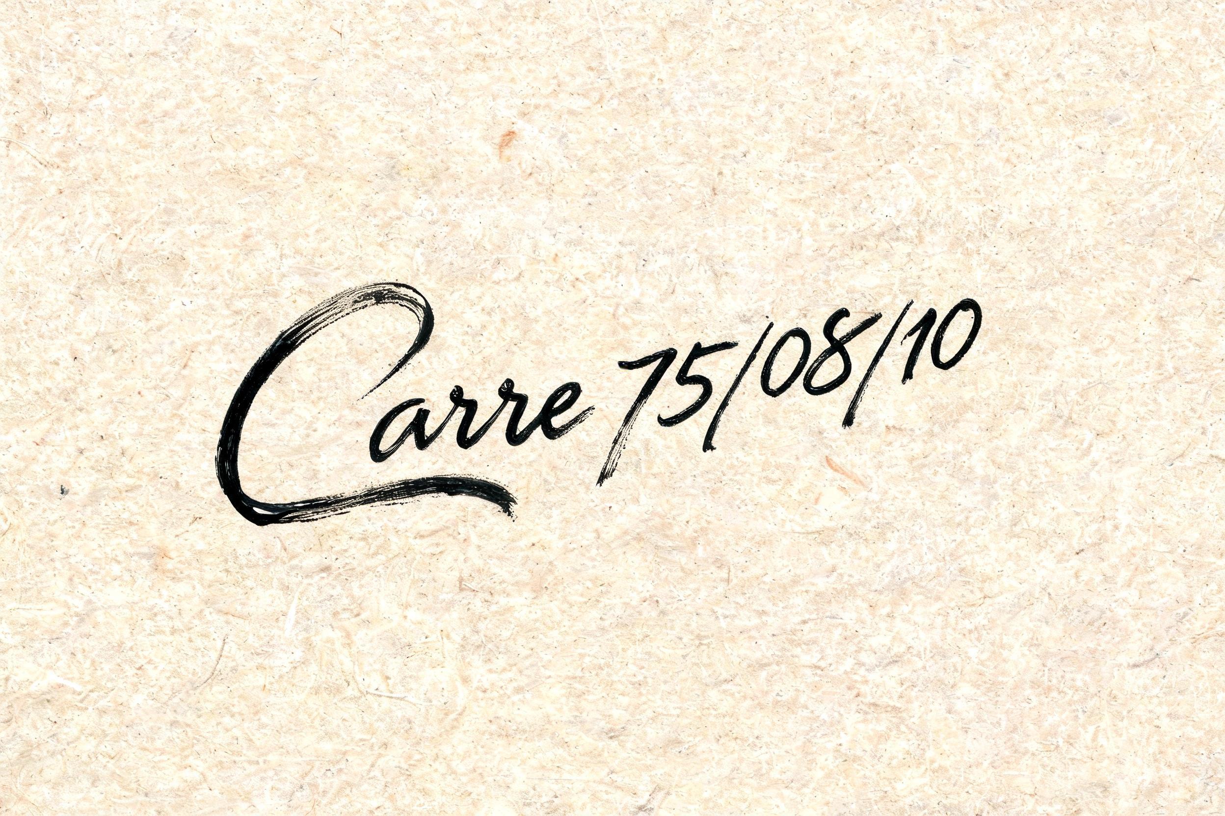
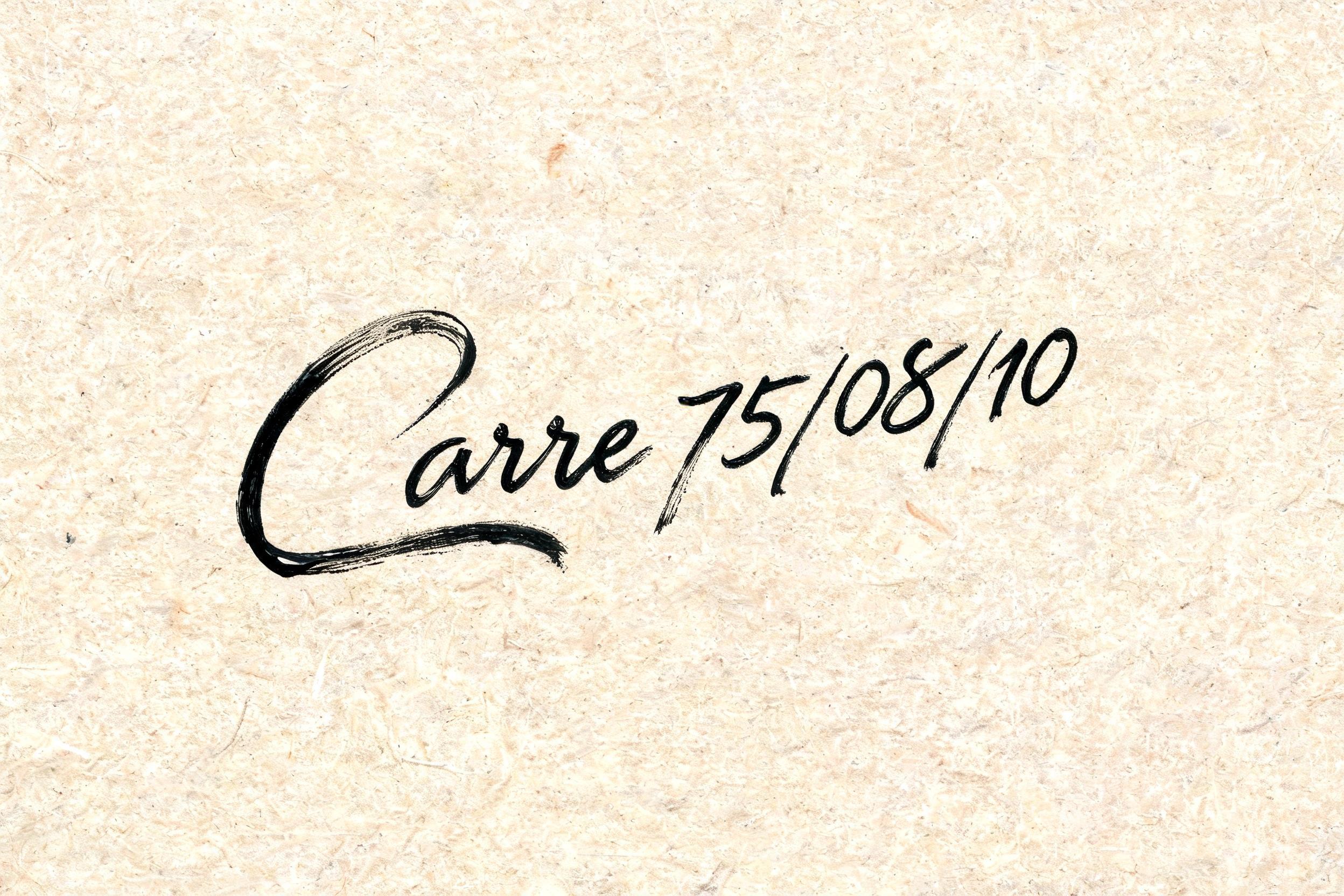
Carre 75/08/10 - Brush Script Text Effect

rendered as expressive Western brush script lettering with fluid connected strokes. Visible bristle texture with authent...


“Carre 75/08/10” is a Brush Stroke text effect text effect created with FontVibe AI. Expressive brush painting, thick ink on paper, East Asian calligraphy feel. rendered as expressive Western brush script lettering with fluid connected strokes. Visible bristle texture with authentic thick-to-thin pressure variation — thick downstrokes, thin upstrokes, just like a loaded calligraphy brush. Ink slightly wet and glistening. Natural ink pooling at stroke starts, feathered dry-brush ending trails. Warm off-black ink on visible surface texture. Hand-crafted artisan energy with real brush imperfection. LETTERFORM PRIORITY: when the chosen font carries its own treatment, that font's letterform shapes take priority and own the letters; this style governs the brush-script medium, the thick-to-thin pressure variation and the ink wetness. FALLBACK MATERIAL: if the font carries no material of its own, render the letters as fluid connected brush-script strokes with thick downstrokes, thin upstrokes, wet pooling at starts and feathered dry-brush trails in warm off-black ink. COLOR PRIORITY: keep the font's own colors if specified; otherwise warm off-black ink on a textured surface. Carre 75/08/10 escrito en letras de pincel caligráfico occidental fluido, con conexiones orgánicas entre trazos. Fondo de papel artesanal con grano visible y tonos marfil cálido, ligeramente envejecido. Tinta en negro carbón profundo con matiz cálido — bajadas gruesas y turgentes, subidas finísimas casi como hilo, mostrando la máxima variación de presión del pincel cargado. Brillo húmedo sobre los trazos más anchos, reflejando una luz lateral suave. Acumulación de tinta en los puntos de conexión entre letras, pequeñas manchas de sangrado en los remates. Trazos de entrada con apertura de cerdas del pincel claramente visible. La barra oblicua y los números heredan la misma fluidez caligráfica — los dígitos se integran con naturalidad en el ritmo del script, con sus propias variaciones grueso-fino. Textura de papel rugosa con fibras superficiales visibles bajo la tinta. Energía artesanal, recién pintado, imperfección auténtica de mano experta.
Generated on Aug 8 · 2496 × 1664 · JPG · Shared by the creator


