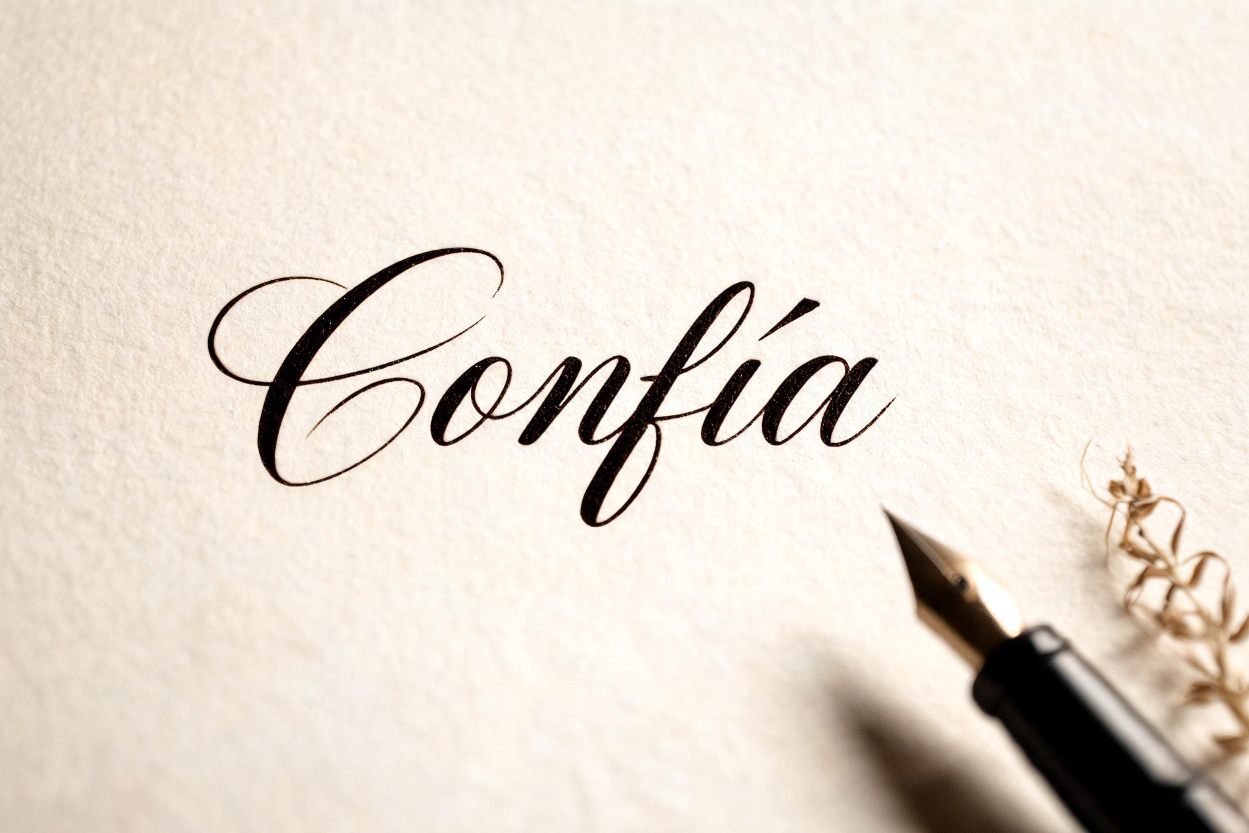
Confía - Cursive Text Effect


Uses BytePlus Seedream 5.0, the model behind this artwork · 15 credits

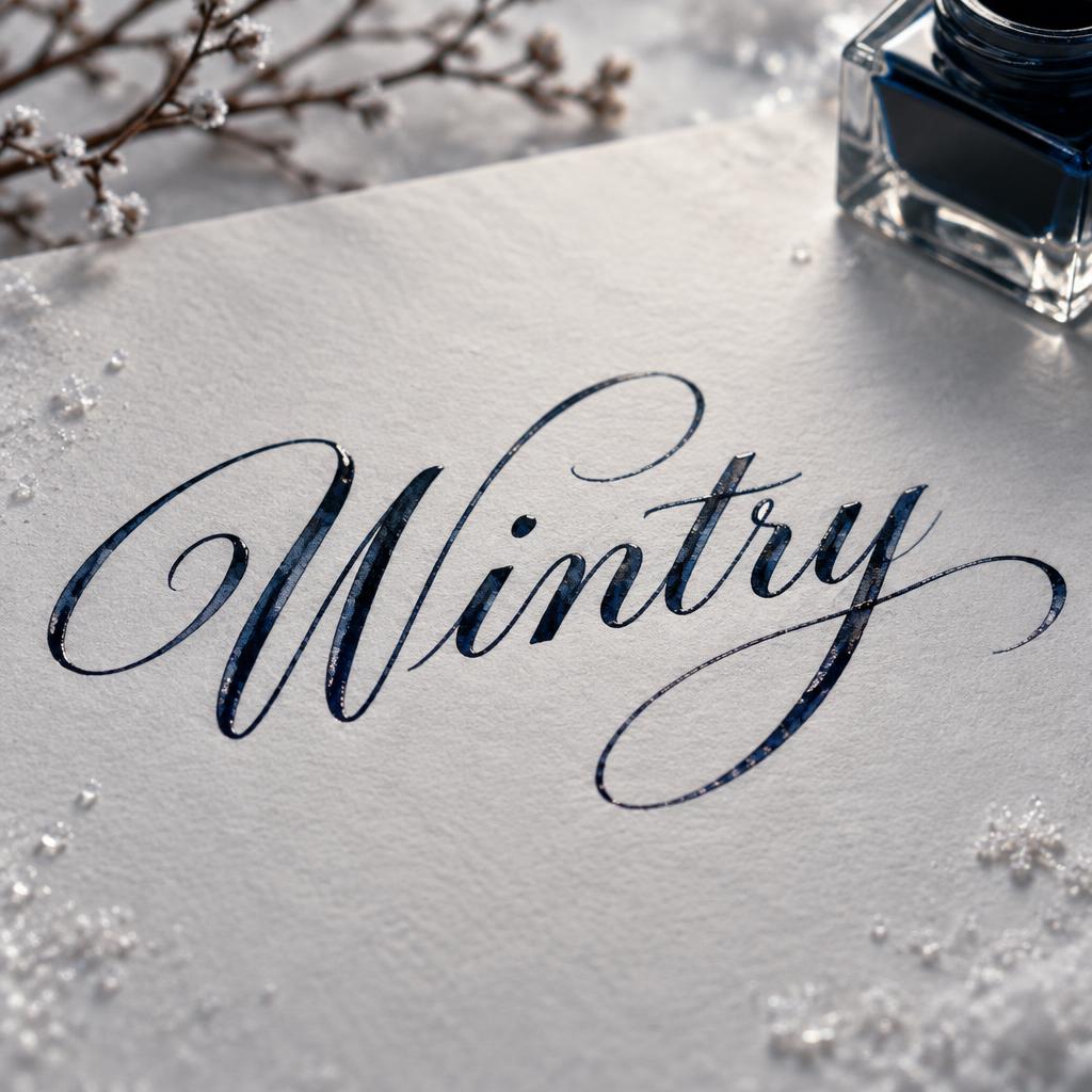
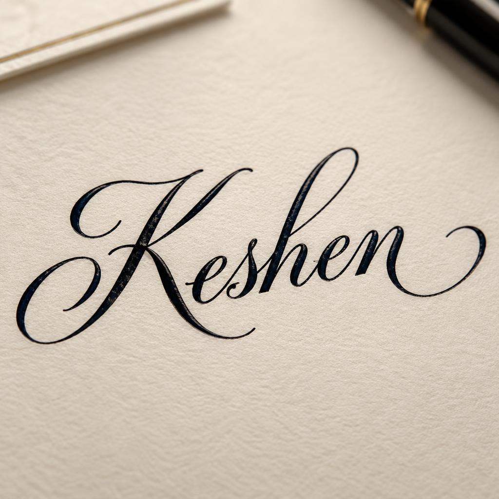
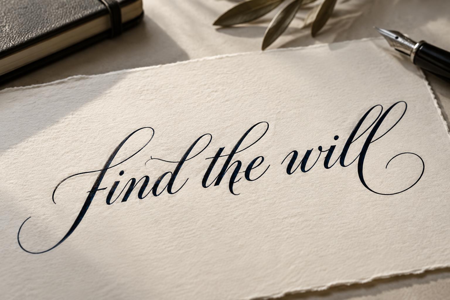

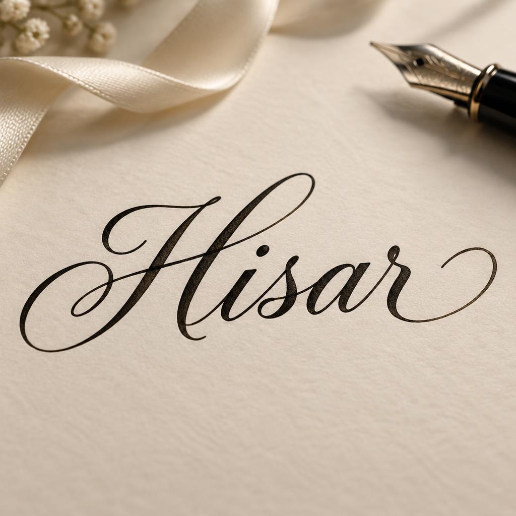
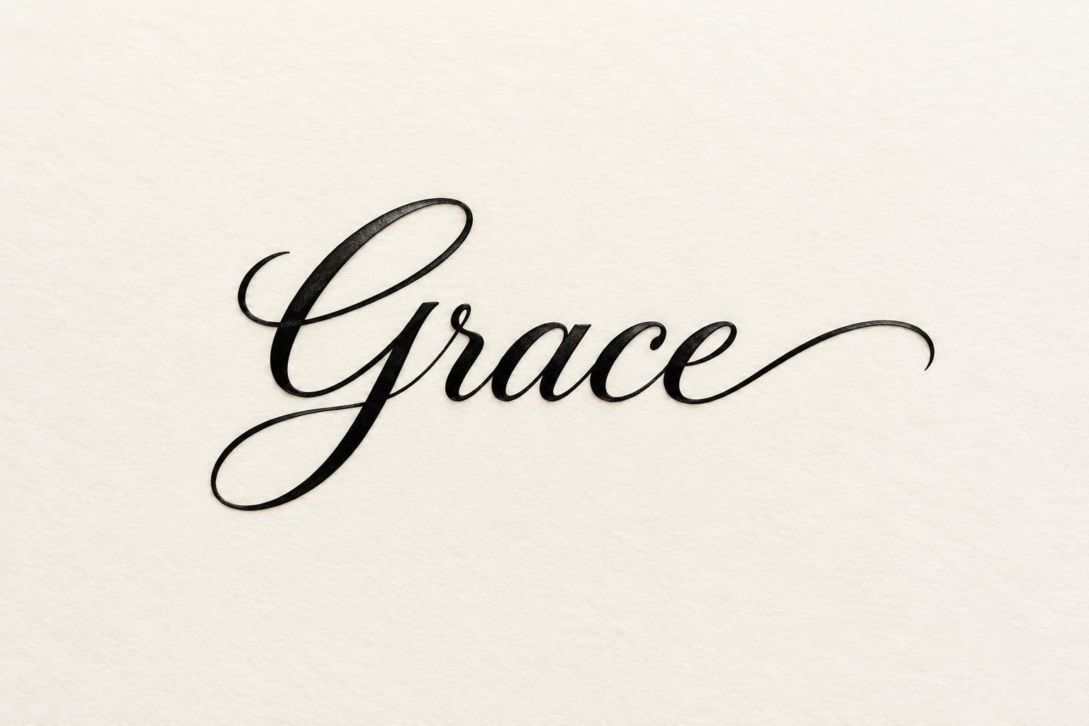
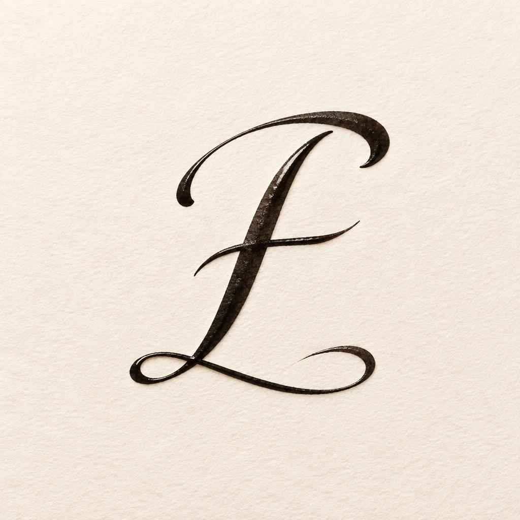
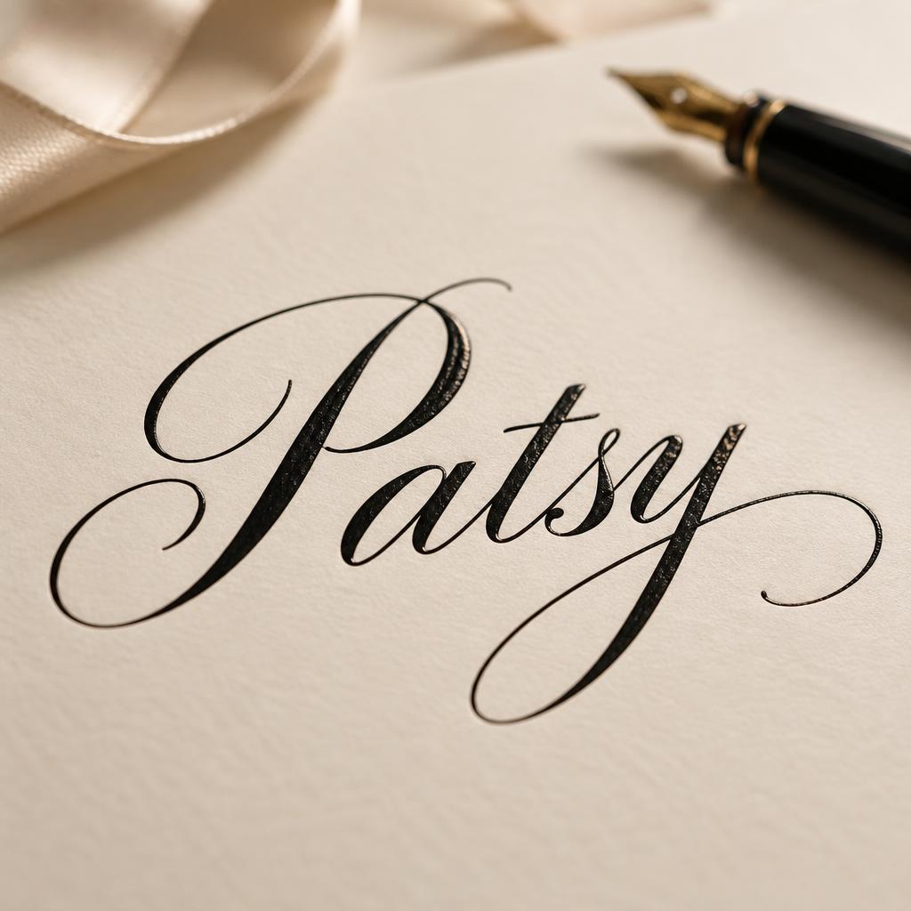
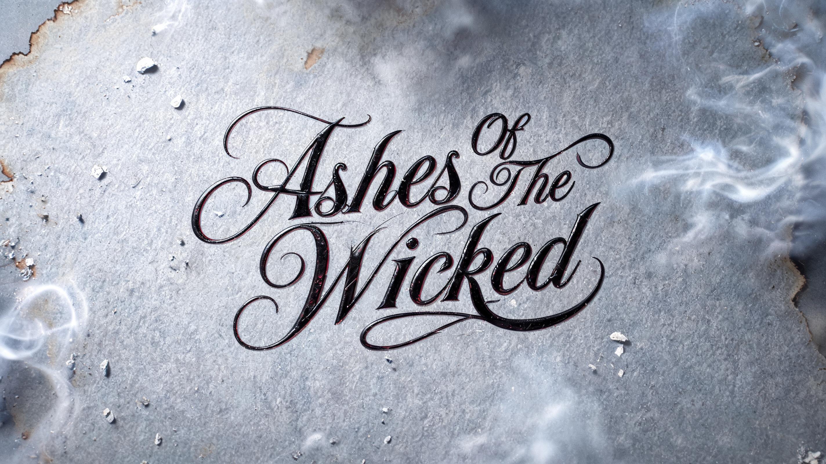
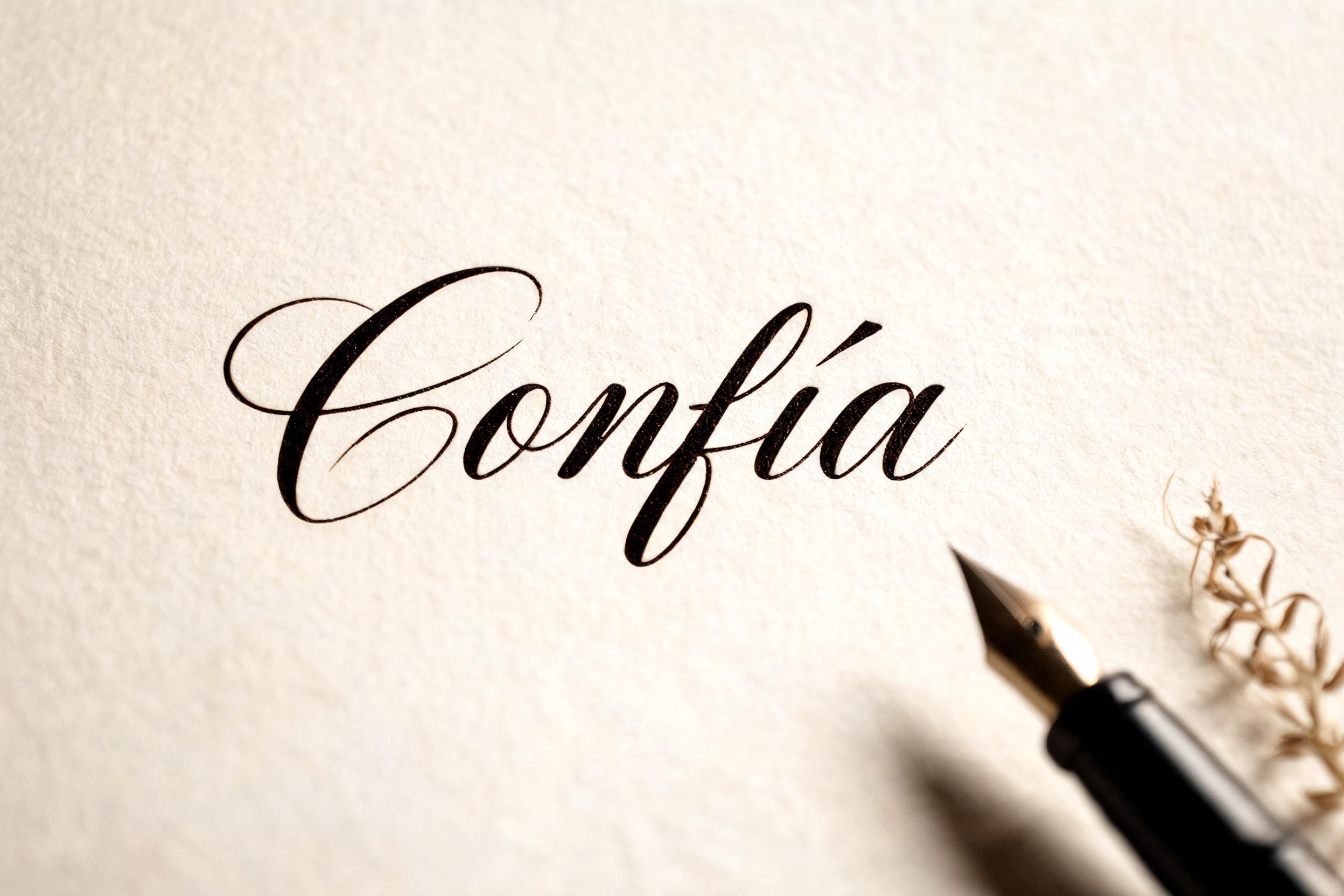
“Confía” is a Cursive text effect text effect created with FontVibe AI. Flowing pen-and-ink cursive: connected letters, looped ascenders and long swash entry and exit strokes, written in black ink on fine white paper with soft raking light.
placed in a soft, refined calligraphy light field — a gentle directional light rakes across the surface from an upper angle, grazing the strokes so their natural ink body and subtle sheen read with depth, while a soft fill keeps shadows intimate rather than harsh. GROUND: a clean elegant art surface — fine hot-press cotton paper, smooth cream card, a soft neutral or a quiet dark editorial ground — with generous negative space so the lettering breathes. ATMOSPHERE: the timeless, romantic feel of masterful pen calligraphy — poised and versatile, at home on a name, a quote, a bio or a card. LETTERFORM PRIORITY: when the chosen font carries its own treatment, that font's letterform shapes and built-in flourishes take priority and own the letters; this style governs only the surrounding light, ground and finish, never the letter shapes. When no specific material is defined by the font: rich flowing ink with a soft natural sheen and a fine wet-edge glisten where strokes catch the light, on the clean paper ground. COLOR: if the font declares its own color keep it; otherwise the ink reads as a deep elegant tone — classic near-black or a soft romantic ink hue — on the light ground. 'Confía' as flowing ink calligraphy, the acute accent rendered with the same natural pen pressure as the letterforms, resting on a sheet of fine hot-press cream cotton paper — the clean fibrous texture of the page reading softly in the background. A slim calligraphy pen with a dark resin barrel rests partially out of focus beside the word, a subtle curl of dried wild grass as a quiet botanical accent. A single raking directional light enters from an upper-left angle, grazing the surface and catching the wet-ink glisten along the heaviest downstrokes, the hairline upstrokes lifting to a near-dry gossamer sheen. The ink reads as a deep warm near-black — just a breath of sepia in its depth — against the pale ivory ground. Generous negative space surrounds the word, letting the open loops and the swash tail of the final letterform breathe without crowding. Soft diffused fill light keeps the shadow side intimate rather than stark. The mood is quiet confidence rendered as a physical act of the pen — certain, warm, unhurried. Shallow depth of field, art-paper grain in crisp focus beneath the letters, soft bokeh beyond the page edge. Clean refined editorial atmosphere.
Generated on August 18, 2026 · 2496 × 1664 · JPEG · BytePlus Seedream 5.0 · Shared by the creator · Free for commercial use (CC BY 4.0)


