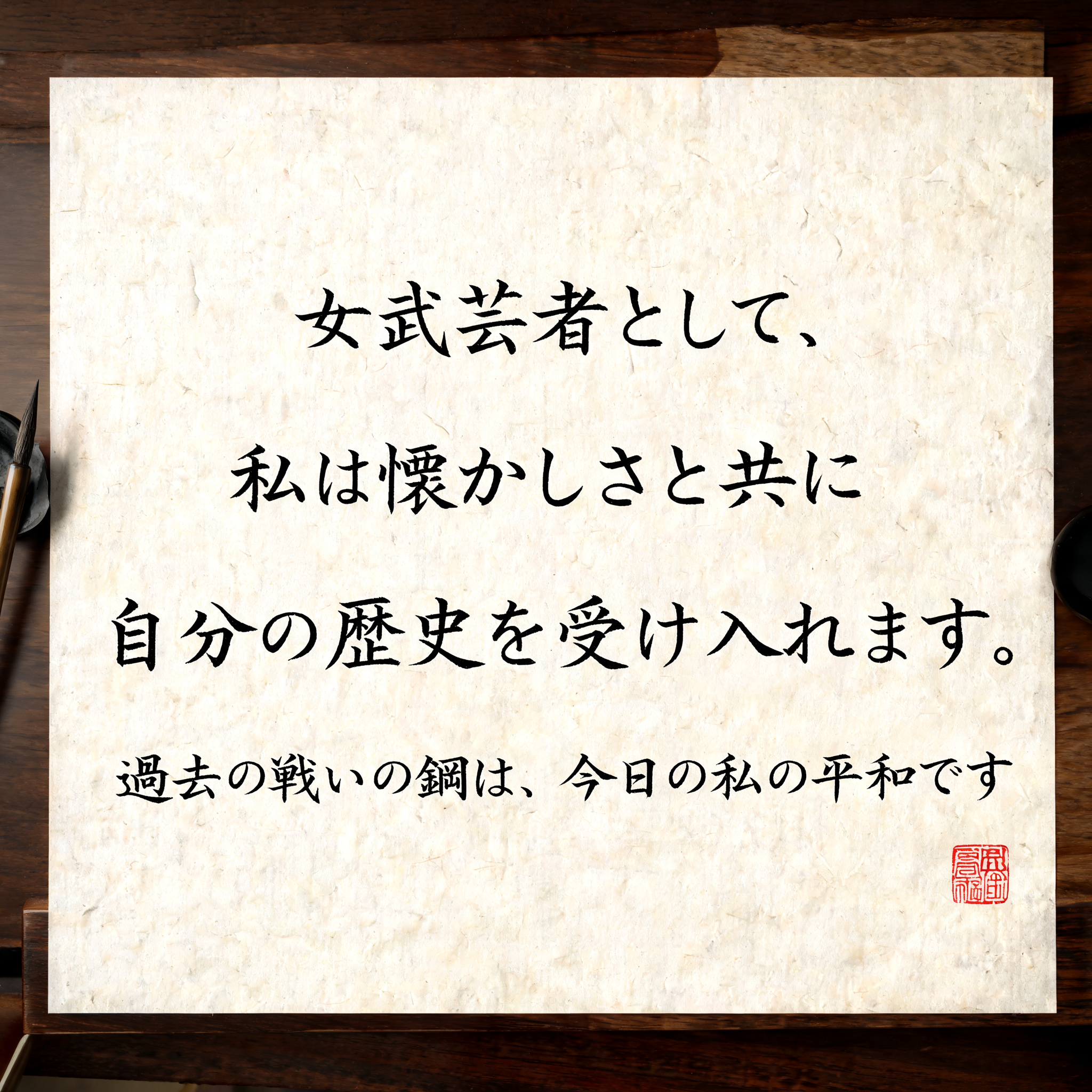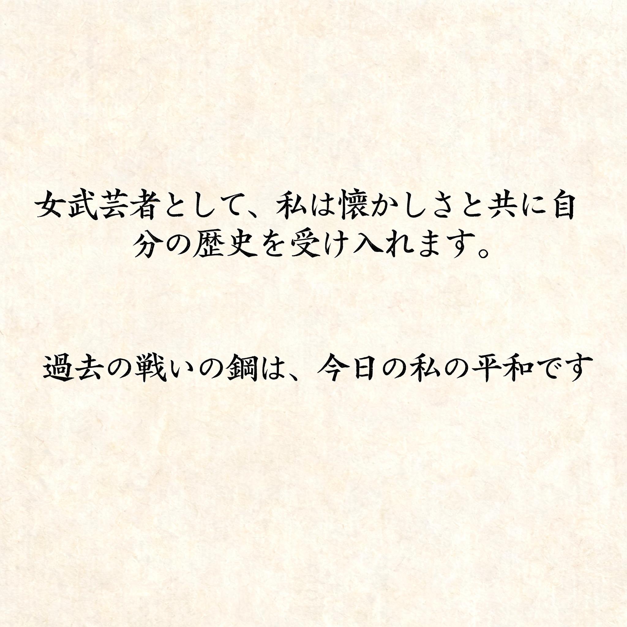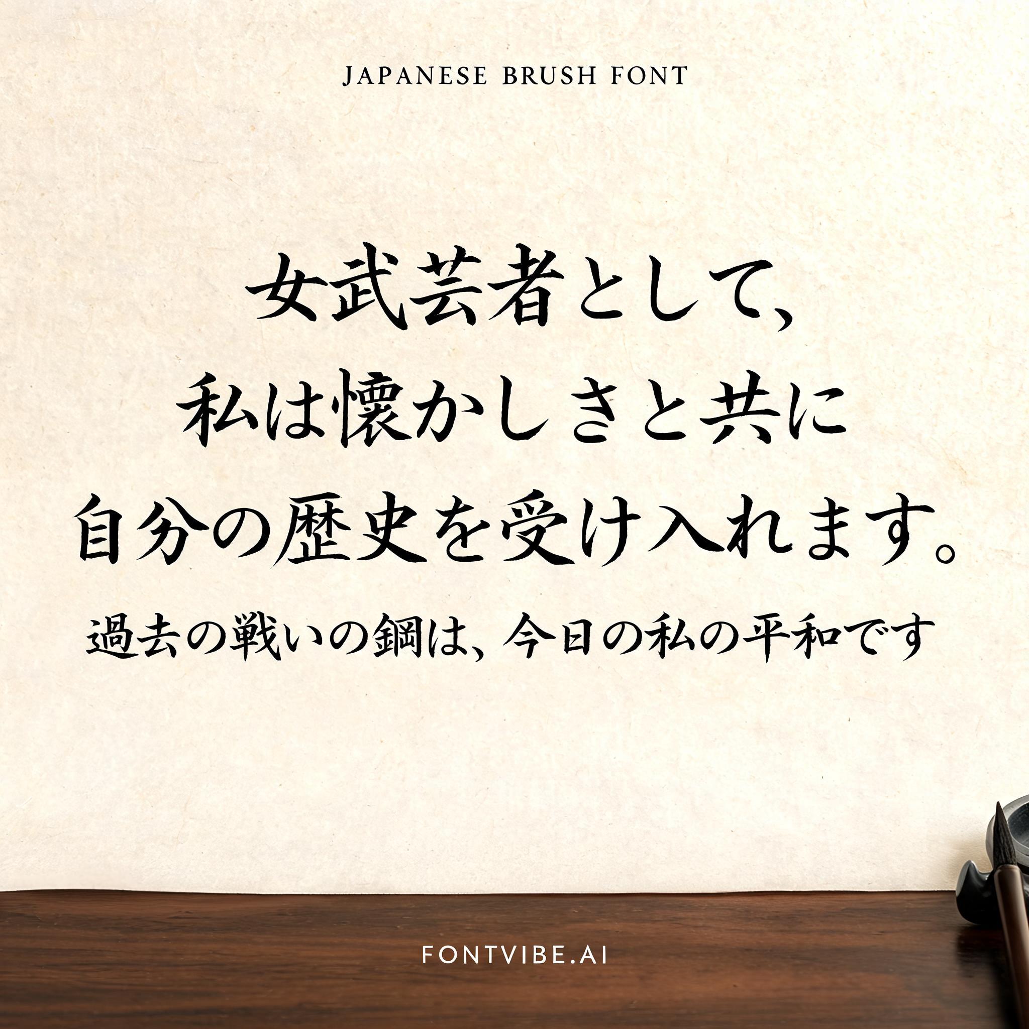
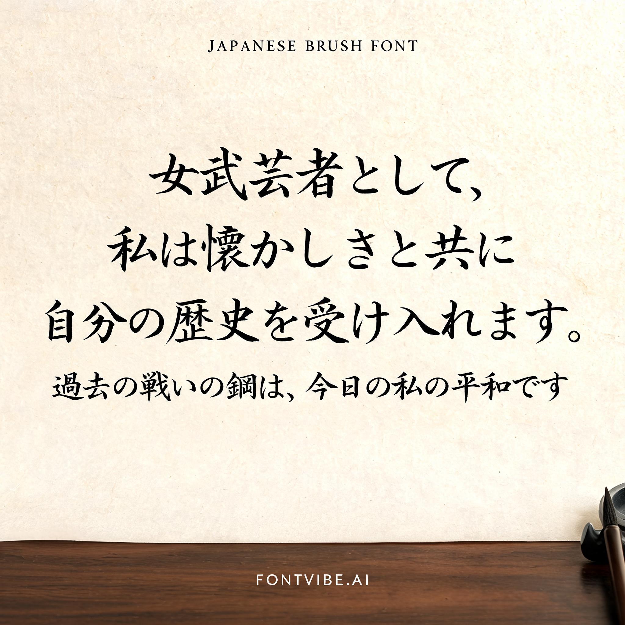
女武芸者として、私は懐かしさと共に自分の歴史を受け入れます。過去の戦いの鋼は、今日の私の平和です - Japanese Ink Brush Text Effect


Uses BytePlus Seedream 5.0, the model behind this artwork · 15 credits











“女武芸者として、私は懐かしさと共に自分の歴史を受け入れます。過去の戦いの鋼は、今日の私の平和です” is a Brush Japanese Ink text effect text effect created with FontVibe AI. Japanese Shodo ink brush calligraphy style applied to Latin letterforms. Deep sumi black ink with authentic fude brush energy, controlled single-direction strokes, and washi paper atmosphere. Perfect for Japanese restaurant branding, tattoo design, anime, martial arts, and cultural projects.
Rendered in Japanese Shodo ink brush style with broad appeal. Letterforms painted with loaded fude brush, deep sumi black ink on warm washi paper texture. Each stroke shows authentic Japanese calligraphy energy — thick decisive downstrokes, expressive brush endings, bristle marks visible in the ink. Generous negative space (ma) surrounds the character. The aesthetic bridges traditional Japanese art with modern Latin typography — elegant, authoritative, unmistakably Japanese. Natural washi paper surface under soft diffused north-facing studio light — warm ivory tone with faint fiber grain visible across the surface, subtle ink absorption halos where brushstrokes meet paper. Quiet calligraphy studio atmosphere: the paper sits on a dark polished wooden table, faint shadow cast by the page edge, a barely-visible ink stone and brush rest at the edge of frame. Top-center: tiny label "JAPANESE BRUSH FONT" at 45% canvas width, hair-thin ink strokes, refined and delicate. Center: dominant sumi ink brush letters at 60% canvas width, perfectly centered, stacked as four lines — "女武芸者として、" / "私は懐かしさと共に" / "自分の歴史を受け入れます。" / "過去の戦いの鋼は、今日の私の平和です" — each stroke loaded with deep black ink, bristle marks visible at stroke edges, confident single-direction pressure; first three lines at equal scale, final line slightly condensed to fit width. Bottom-center: small refined tagline "FONTVIBE.AI" at 20% canvas width, minimal ink weight. Vertical spacing ratio approximately 1:6:1.5. All tiers centered on the same vertical axis. The negative space around the letters breathes — the beauty of ma.
Made for Japanese Font Generator
Generated on August 21, 2026 · 2048 × 2048 · JPEG · BytePlus Seedream 5.0 · Shared by the creator · Free for commercial use (CC BY 4.0)