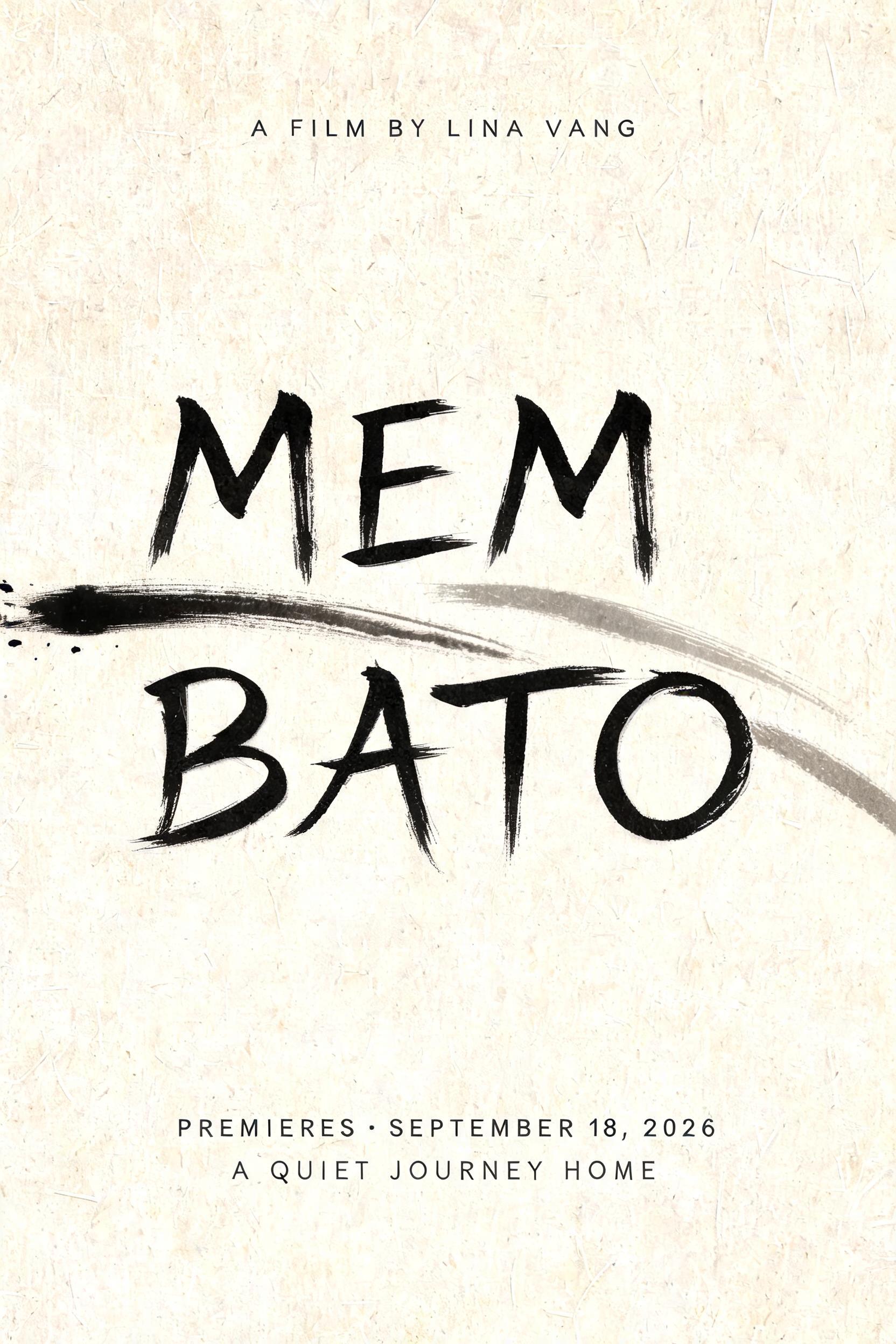
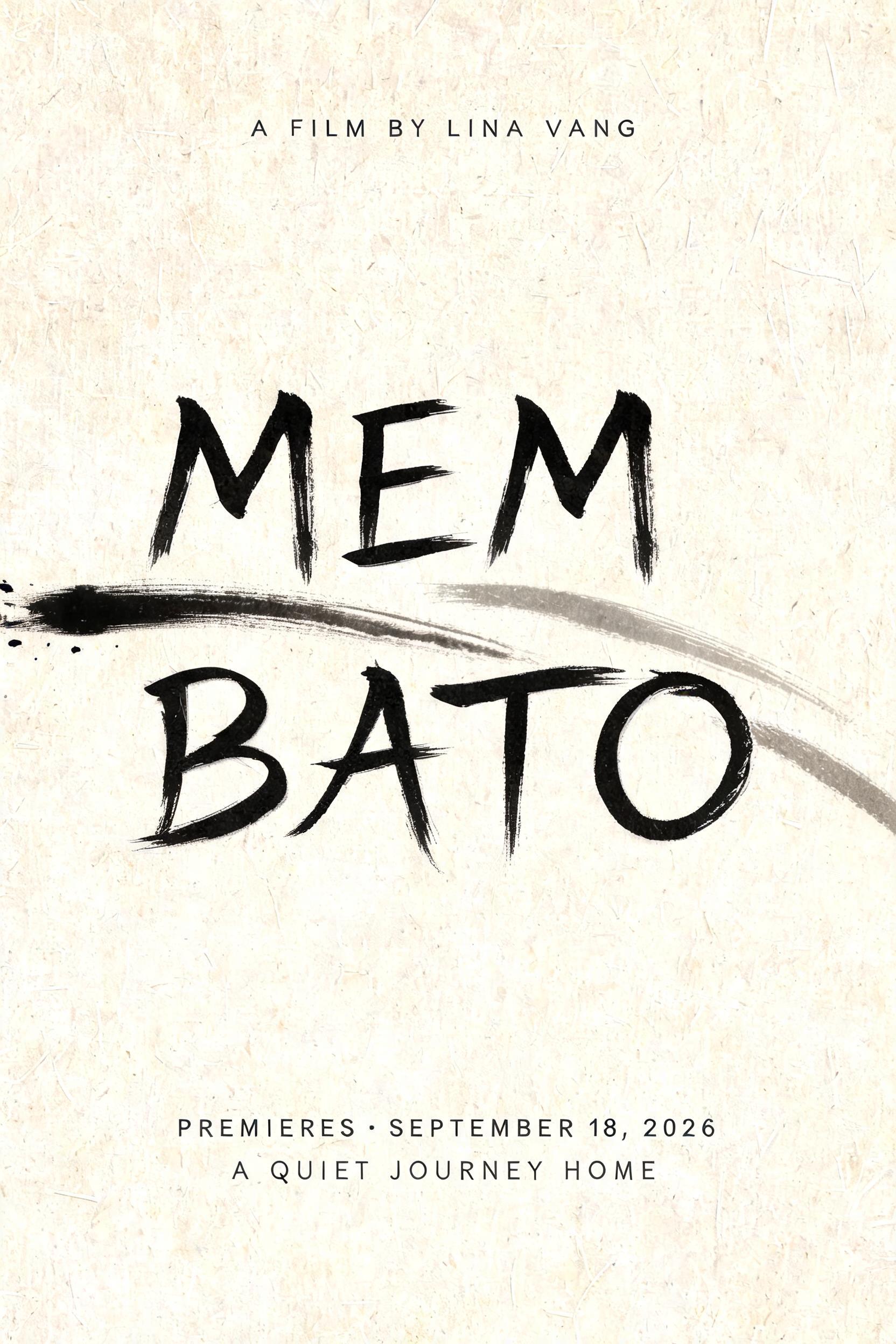
MEM BATO A FILM BY LINA VANG PREMIERES · SEPTEMBER 18, 2026 A QUIET JOURNEY HOME - Japanese Ink Brush Text Effect


Uses BytePlus Seedream 5.0, the model behind this artwork · 15 credits











“MEM BATO A FILM BY LINA VANG PREMIERES · SEPTEMBER 18, 2026 A QUIET JOURNEY HOME” is a Brush Japanese Ink text effect text effect created with FontVibe AI. Japanese Shodo ink brush calligraphy style applied to Latin letterforms. Deep sumi black ink with authentic fude brush energy, controlled single-direction strokes, and washi paper atmosphere. Perfect for Japanese restaurant branding, tattoo design, anime, martial arts, and cultural projects.
Create a finished vertical 2:3 independent film key-art poster on warm cream Japanese washi paper with clearly visible long paper fibers. Use soft diffuse north-facing studio light only, with no cast shadows. The composition follows ma: large calm negative space and only a few decisive marks. At the upper center, set the small text exactly: “A FILM BY LINA VANG” in restrained narrow uppercase charcoal-gray lettering, widely tracked. The central headline, exactly “MEM BATO”, occupies the middle 52% of the canvas across two centered lines: “MEM” then “BATO”. Design every Latin letter as definitive classical Japanese shodo display calligraphy by a master hand: upright harmonious forms, bold 5:1 thick-to-thin stroke contrast, deep absorbed sumi-black cores, gradual loaded-brush entries with compressed pigment, precise deliberate mid-strokes, fine pointed harai pull-away tails and occasional upward hane hooks. Ink is matte and embedded in the paper, transitioning from near-black centers to translucent charcoal-gray at the fading tails; minimal dry-brush texture occurs only at the outermost edges. Keep generous breathing space between letters. No uniform digital black, no glossy ink, no decorative ornaments. Behind and below the headline, add two large abstract horizontal sumi gestures: one decisive near-black downward sweep entering from the left margin, one pale gray thinning tail receding toward the lower right; both absorbed into the washi with soft feathered edges and a few restrained ink droplets only near the initial stroke entry. They must not reduce headline legibility. At the bottom center, set exactly “PREMIERES · SEPTEMBER 18, 2026” in small clean uppercase charcoal-gray lettering with generous tracking. Beneath it, set exactly “A QUIET JOURNEY HOME” in even smaller light-gray uppercase. Museum-grade print composition, flat frontal view, no frame, no people, no objects, no seals, no Japanese characters, no red accents.
Made for Japanese Brush Font
Generated on August 31, 2026 · 1664 × 2496 · JPEG · BytePlus Seedream 5.0 · Shared by the creator · Free for commercial use (CC BY 4.0)


