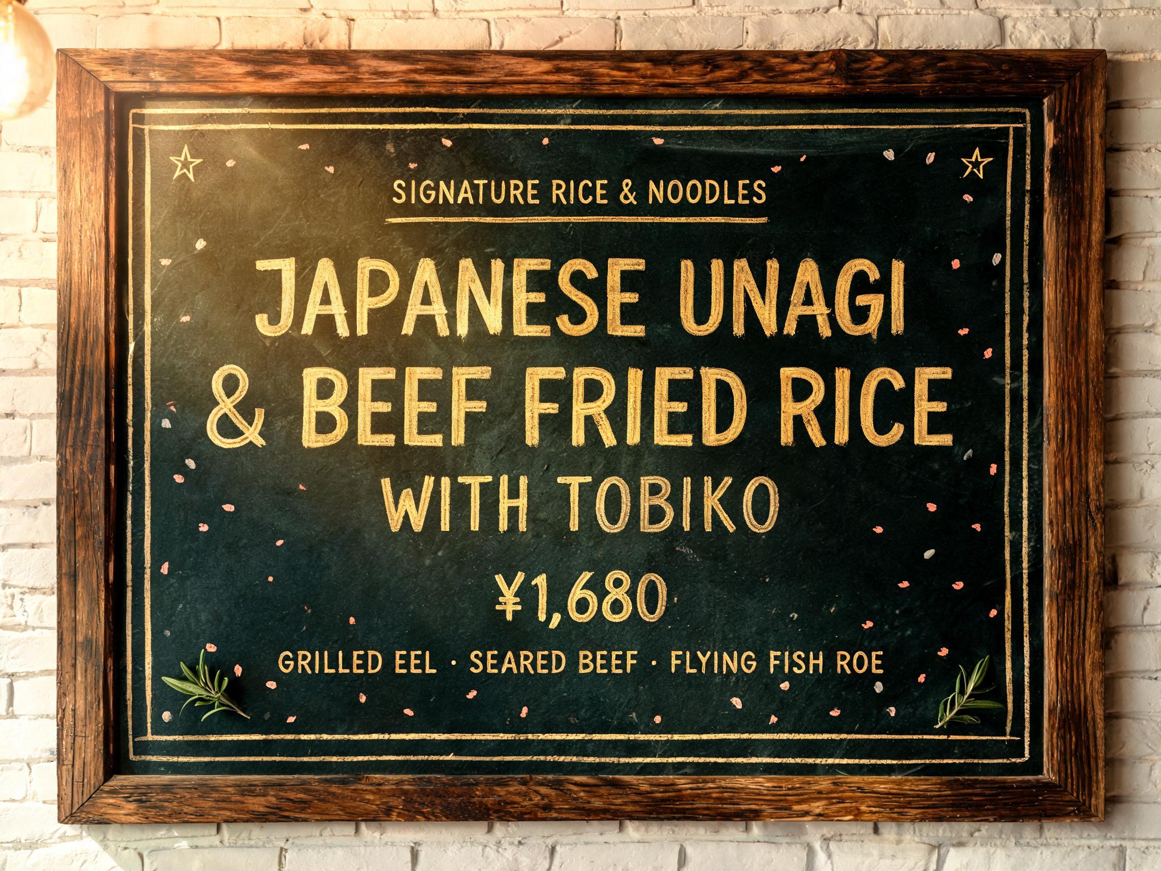
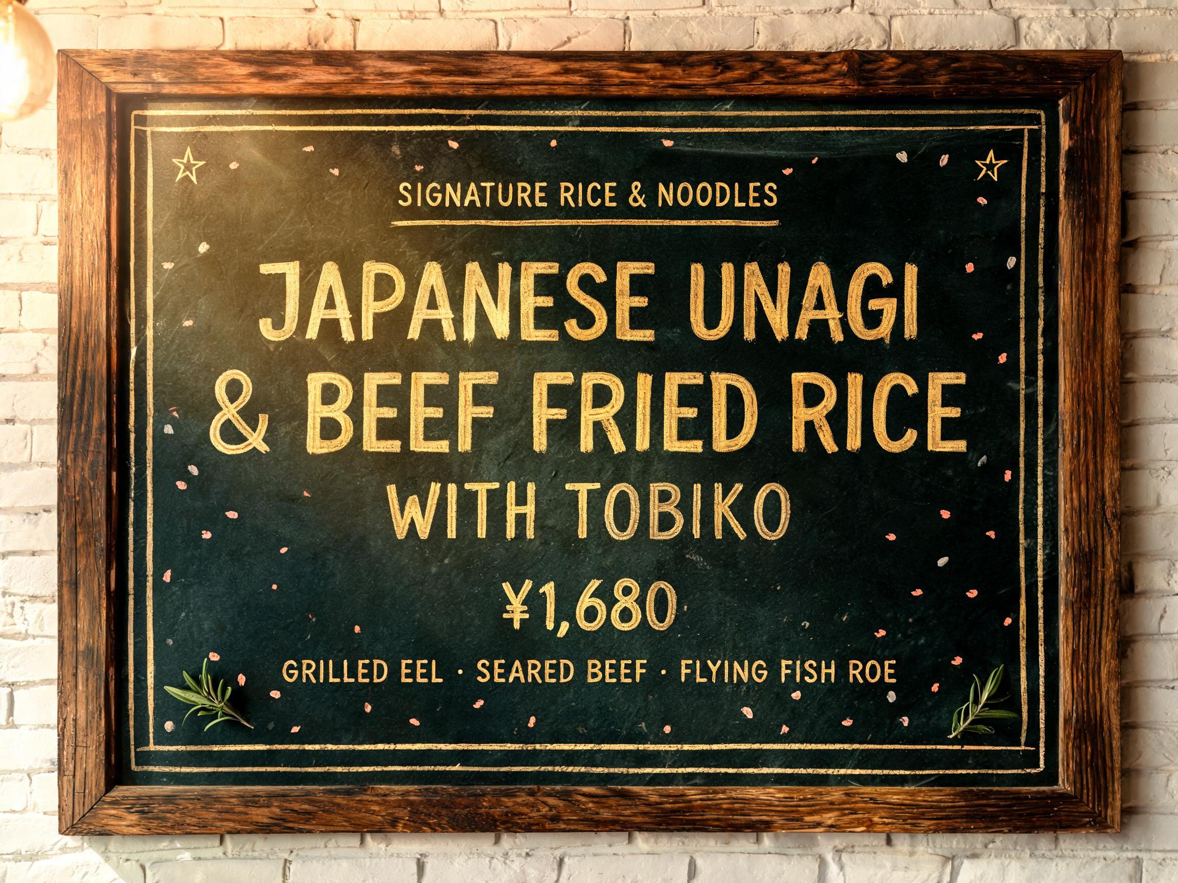
SIGNATURE RICE & NOODLES JAPANESE UNAGI & BEEF FRIED RICE WITH TOBIKO ¥1,680 GRILLED EEL · SEARED BEEF · FLYING FISH ROE - Chalk Text Effect


Uses BytePlus Seedream 5.0, the model behind this artwork · 15 credits


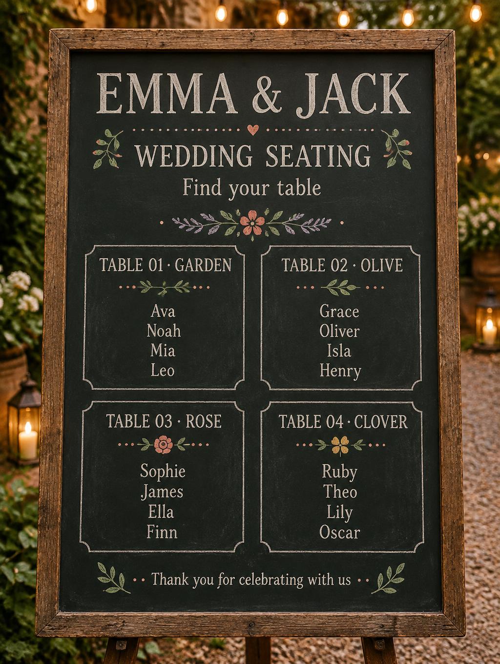
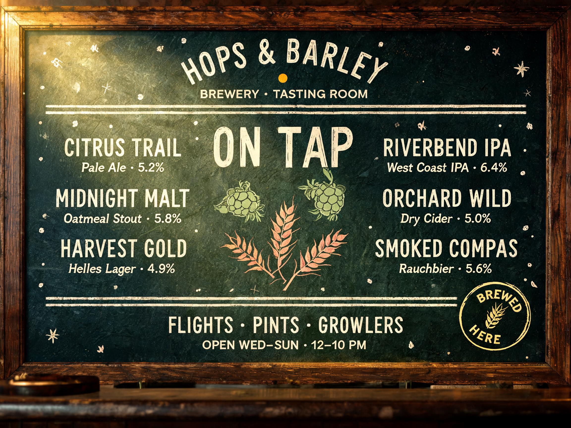


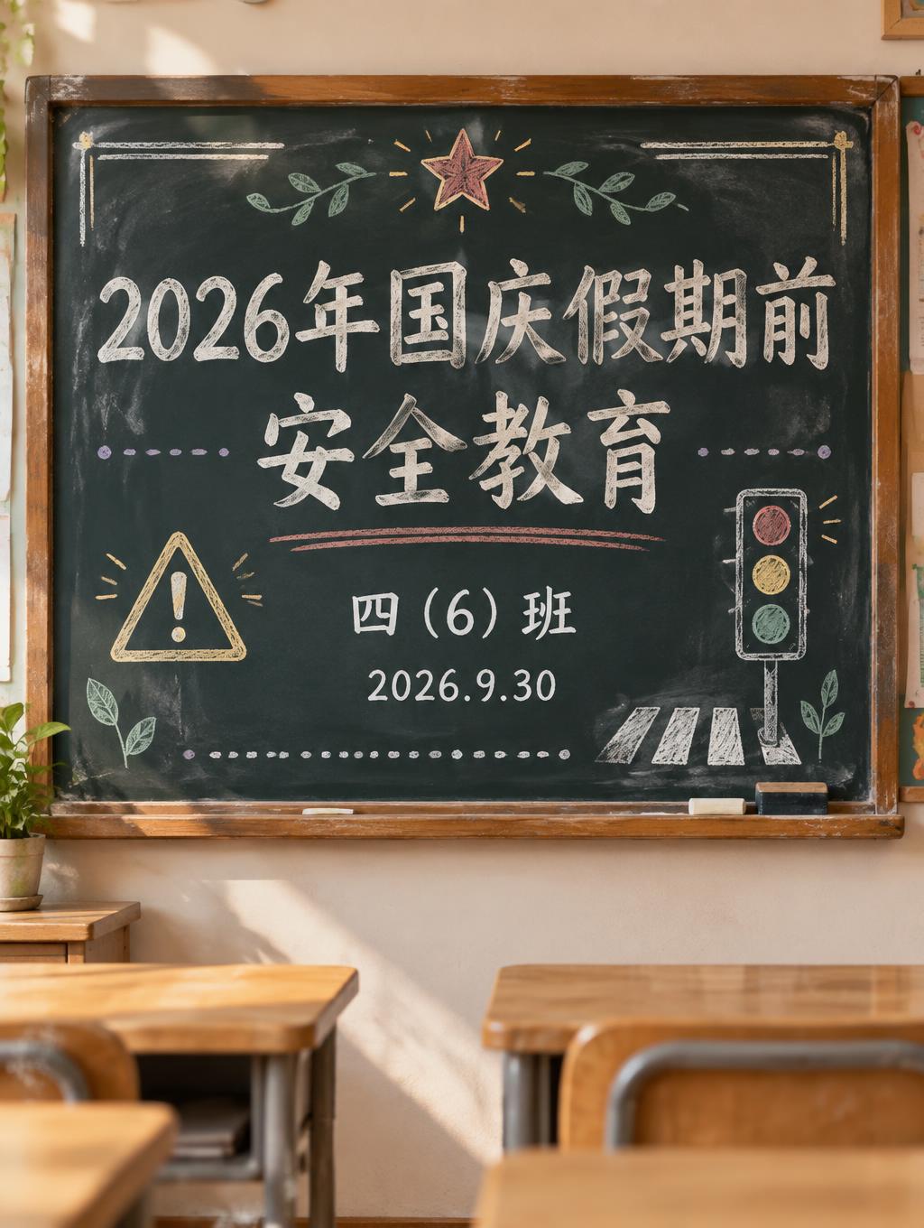
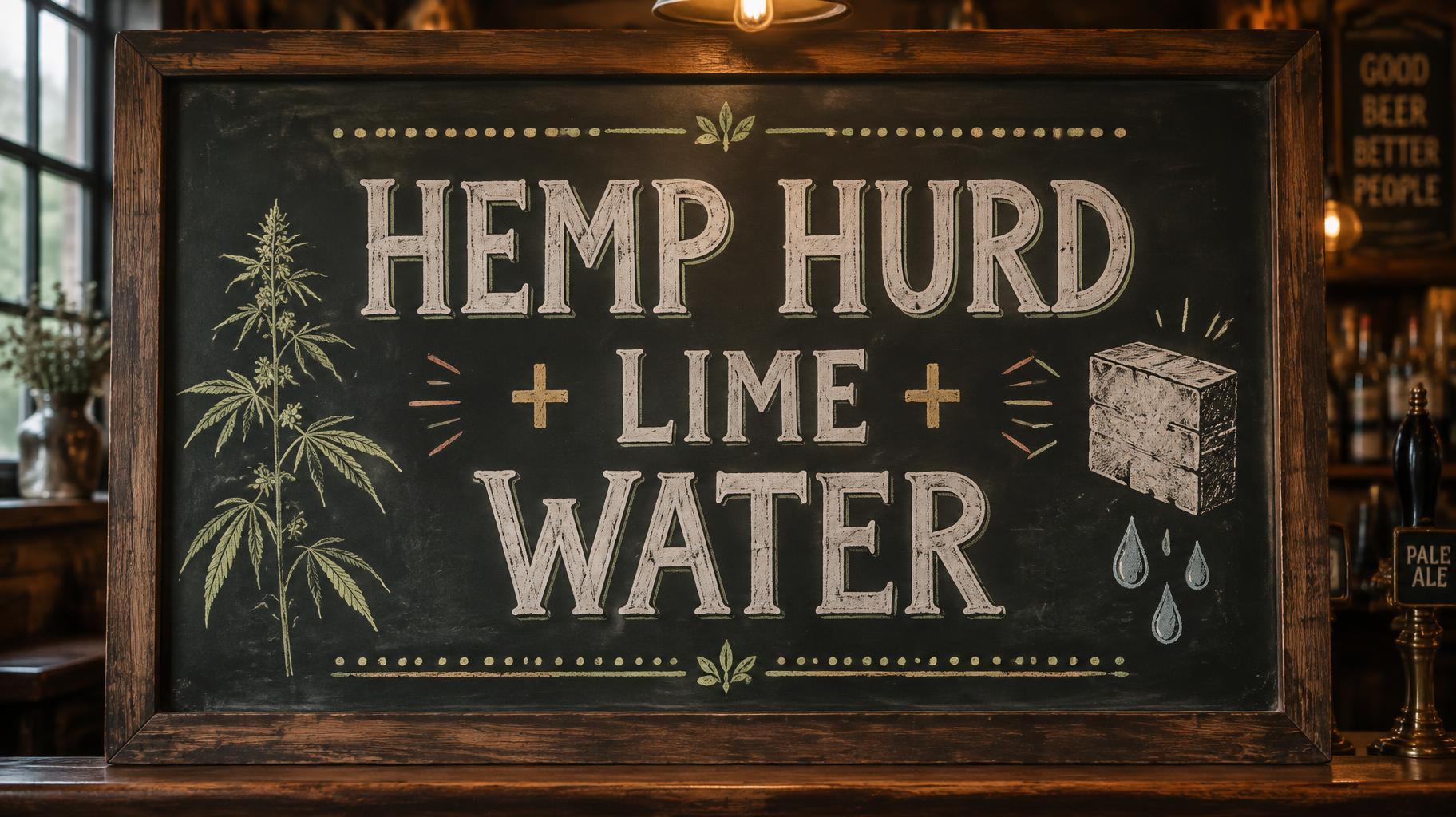



“SIGNATURE RICE & NOODLES JAPANESE UNAGI & BEEF FRIED RICE WITH TOBIKO ¥1,680 GRILLED EEL · SEARED BEEF · FLYING FISH ROE” is a Chalk text effect text effect created with FontVibe AI. Hand-lettered cream chalk on a dark slate board: mixed script and serif lines, flourishes and small doodles, soft chalk-dust edges under warm café lighting.
Create a 4:3 restaurant menu feature board, viewed straight-on. Establish a large deep green-black slate chalkboard with a visibly aged dark walnut wooden frame on all four edges; a narrow strip of softly blurred whitewashed brick is visible beyond the frame. A warm Edison pendant above casts soft amber light downward and slight upper-left raking light, revealing only the board grain and low chalk relief. No people, no food photography, no glossy surfaces. Set exact English text, fully legible and accurately spelled, as tactile hand-chalked lettering. All lettering is golden yellow chalk pigment: dry calcium-sulfate marks, completely matte, irregular pressure-driven stroke modulation, slate-grain skip zones within each stroke, uneven dense and translucent coverage, faint earlier application passes, and a fine dust halo around every edge. Never metallic foil, never shiny gold. Top center, 74% board width, small uppercase hand-lettered line: “SIGNATURE RICE & NOODLES”. Use compact bold upright lettering with a thin hand-drawn divider beneath it. Center, 82% board width across three centered lines, the dominant menu title: “JAPANESE UNAGI” / “& BEEF FRIED RICE” / “WITH TOBIKO”. Make this the largest lettering, bold upright custom chalk capitals; “&” slightly oversized with a loose hand-drawn curve. Maintain generous line spacing and clean reading order. Bottom center: “¥1,680” in medium-scale golden chalk numerals, then a small line beneath: “GRILLED EEL · SEARED BEEF · FLYING FISH ROE”. Use the dark board as active negative space. Frame the typography with a restrained double-rule chalk border in warm ivory-yellow, small four-point stars at upper corners, two tiny sage leaf sprigs near the bottom corners, and sparse soft-coral rice-grain dots. Keep decorative marks secondary and outside the text blocks. Authentic pub-and-brasserie menu-board craft, physically imperfect hand lettering, crisp readable hierarchy, warm amber ambient light, no extra words, no logos, no watermark.
Generated on September 8, 2026 · 2304 × 1728 · JPEG · BytePlus Seedream 5.0 · Shared by the creator · Free for commercial use (CC BY 4.0)


