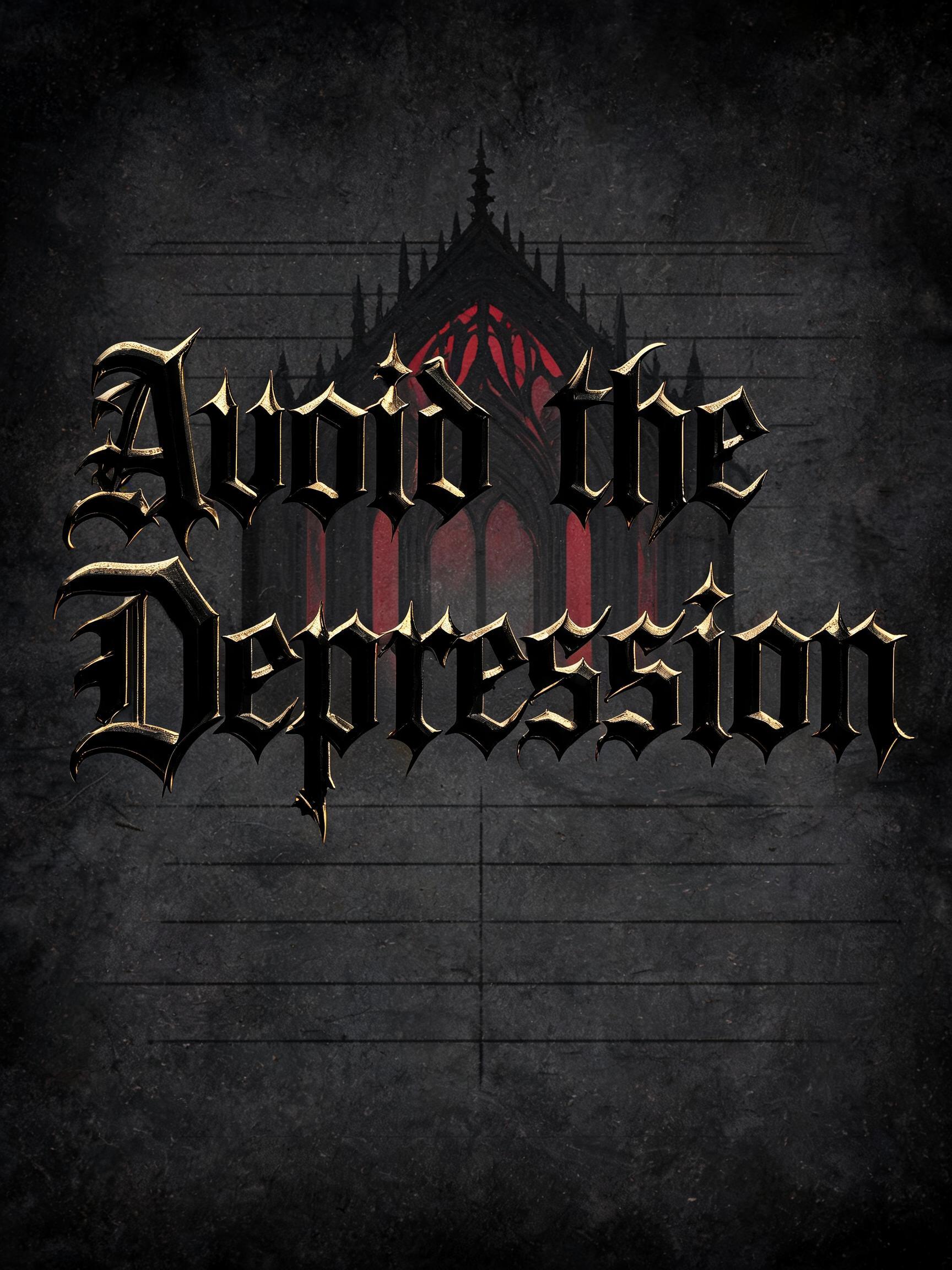
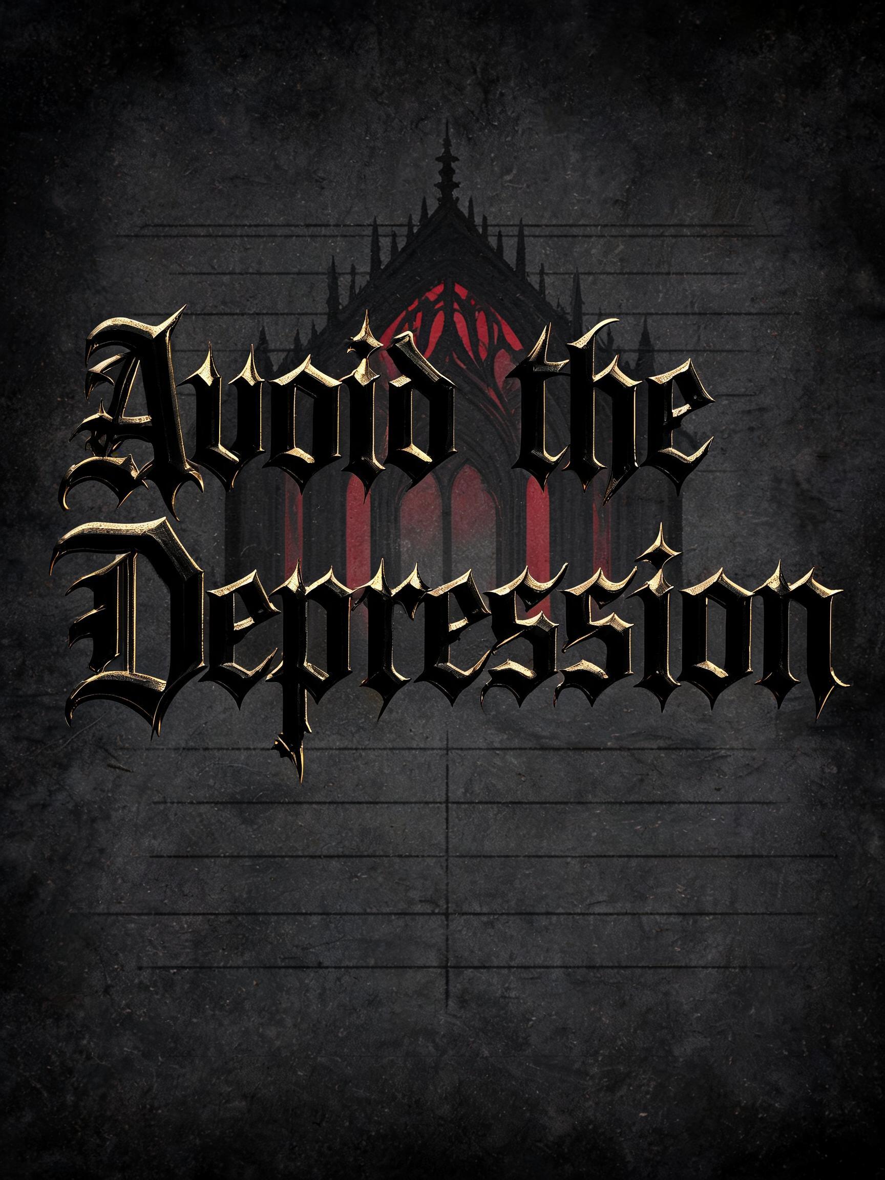
Avoid the Depression - Gothic Font Text Effect


Uses BytePlus Seedream 5.0, the model behind this artwork · 15 credits




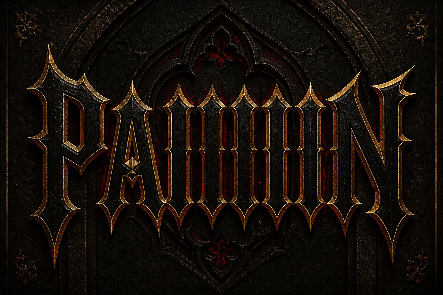


“Avoid the Depression” is a Gothic Font text effect text effect created with FontVibe AI. Precise Textura blackletter: narrow broken strokes, diamond terminals and strong thick-thin contrast, in black ink with gold-touched edges on dark aged parchment.
rendered in precise gothic blackletter letterforms with authentic calligraphic construction — diamond-shaped stroke terminals, strong thick-thin contrast, pointed arch counters. Rich black ink with warm depth on dark parchment or deep charcoal background. Subtle gold ink highlights on serifs and capitals. Medieval scribal precision. No cobwebs, no rust, no atmospheric fog — pure typographic craft. LETTERFORM PRIORITY: when the chosen font carries its own treatment, that font's letterform shapes take priority and own the letters; this style governs the rich ink, the parchment ground and the subtle gold highlights. FALLBACK MATERIAL: if the font carries no material of its own, render the letters as precise gothic blackletter in rich black ink with subtle gold highlights on dark parchment — pure typographic craft, no cobwebs, rust or fog. COLOR PRIORITY: keep the font's own colors if specified; otherwise black ink with warm gold accents. The exact text “Avoid the Depression” rendered as a disciplined typographic composition, with “Depression” carrying the greatest visual mass and “Avoid the” held in restrained secondary scale. Deep iron-black ink fills the letterforms with slight absorbency at the edges, as if pressed into dense charcoal parchment. Fine warm gold ink catches along selected capitals, sharp terminals, and raised ink ridges, creating thin amber glints without changing the dominant black finish. The ground is layered dark parchment: compressed fibrous paper grain, faint abrasion marks, soot-darkened corners, and barely visible ruled manuscript lines fading into the surface. Behind the words, a severe pointed cathedral-arch framework appears as low-relief black-on-black ink, with narrow crimson illumination filtering through its recesses. Use controlled candlelike side light, narrow gold rim reflections, deep occlusion inside counters, and clean high-resolution ink texture. Preserve generous breathing room around the phrase, crisp edges, medieval scribal precision, and a sparse material field with no cobwebs, rust, fog, figures, or decorative clutter.
Made for Black Metal Gothic
Generated on September 11, 2026 · 1728 × 2304 · JPEG · BytePlus Seedream 5.0 · Shared by the creator · Free for commercial use (CC BY 4.0)


