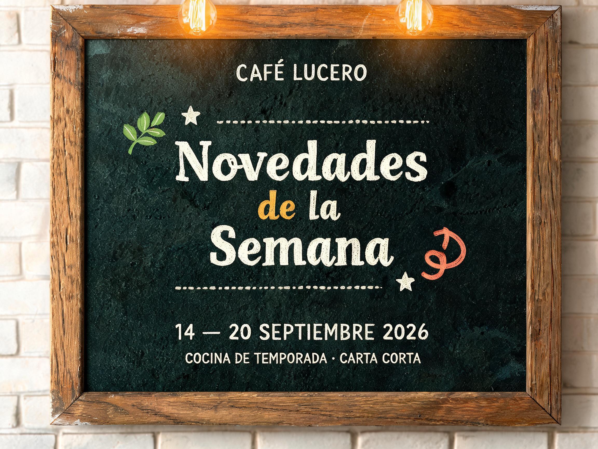
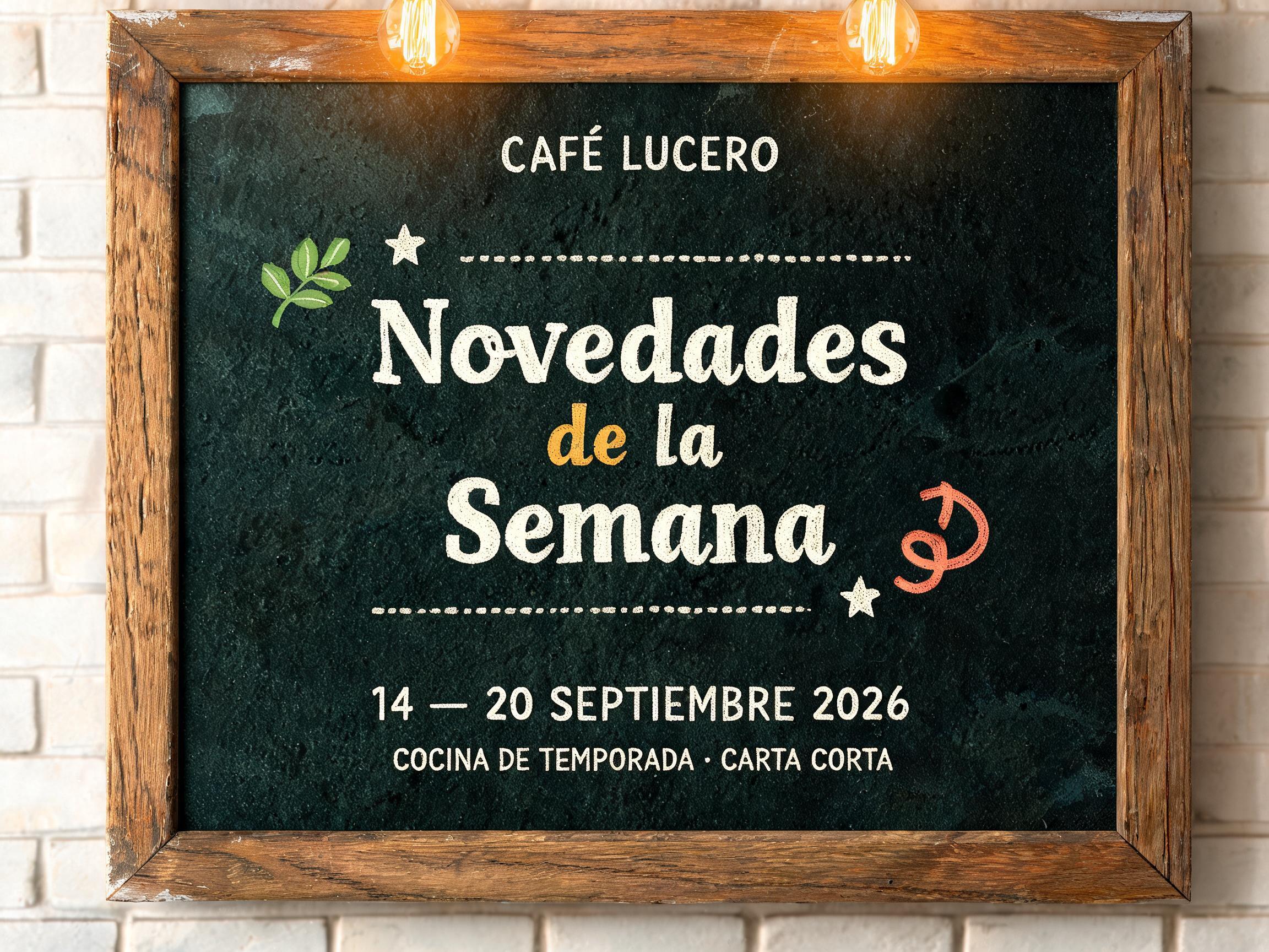
Novedades de la Semana CAFÉ LUCERO 14 — 20 SEPTIEMBRE 2026 COCINA DE TEMPORADA · CARTA CORTA - Chalk Text Effect


Uses BytePlus Seedream 5.0, the model behind this artwork · 15 credits






“Novedades de la Semana CAFÉ LUCERO 14 — 20 SEPTIEMBRE 2026 COCINA DE TEMPORADA · CARTA CORTA” is a Chalk text effect text effect created with FontVibe AI. Hand-lettered cream chalk on a dark slate board: mixed script and serif lines, flourishes and small doodles, soft chalk-dust edges under warm café lighting.
Create a finished 4:3 Spanish weekly-menu header board inside an artisan café. A wide deep green-black slate chalkboard occupies 88% of the canvas, enclosed on all four sides by a worn medium-oak wooden frame with visible grain and rubbed corners. Behind it: a narrow strip of softly defocused whitewashed brick; the top edge includes two warm amber Edison bulbs, their downward light softly grazing the board. Exact rendered Spanish copy, all spelled exactly as quoted: Top center, small uppercase eyebrow at 42% board width: “CAFÉ LUCERO” in warm ivory hand-chalk lettering. Center, dominant three-line headline at 78% board width: “Novedades” / “de la” / “Semana”. Use bold upright hand-lettered chalk construction with organic pressure-swollen strokes, tapered wrist-made entries and exits, close but readable spacing. The letters are dry calcium-sulfate chalk pigment deposited on porous slate: board-microtopography skip zones inside each stroke, dense and translucent pressure zones, faint earlier application passes beneath final marks, 1–2 mm powder halos, absolutely matte with zero gloss. “Novedades” is cream-white; “de la” is dusty warm mustard; “Semana” returns to cream-white. Bottom center, a compact uppercase date line at 52% board width: “14 — 20 SEPTIEMBRE 2026” in ivory chalk. Under it, smaller centered line: “COCINA DE TEMPORADA · CARTA CORTA”. Frame the headline with hand-drawn double rules, dotted dividers, two small five-point stars, a sage leaf sprig at upper left and a soft-coral arrow curling upward at lower right. Keep generous dark-board negative space between tiers. Warm overhead café light, low-intensity amber raking illumination from upper left revealing the slate texture and slight chalk relief; no glossy ink, no neon, no printed type, no people, no food photography. Precise readable typography, authentic hand-drawn menu-board composition.
Generated on September 11, 2026 · 2304 × 1728 · JPEG · BytePlus Seedream 5.0 · Layout: Zones · Shared by the creator · Free for commercial use (CC BY 4.0)


