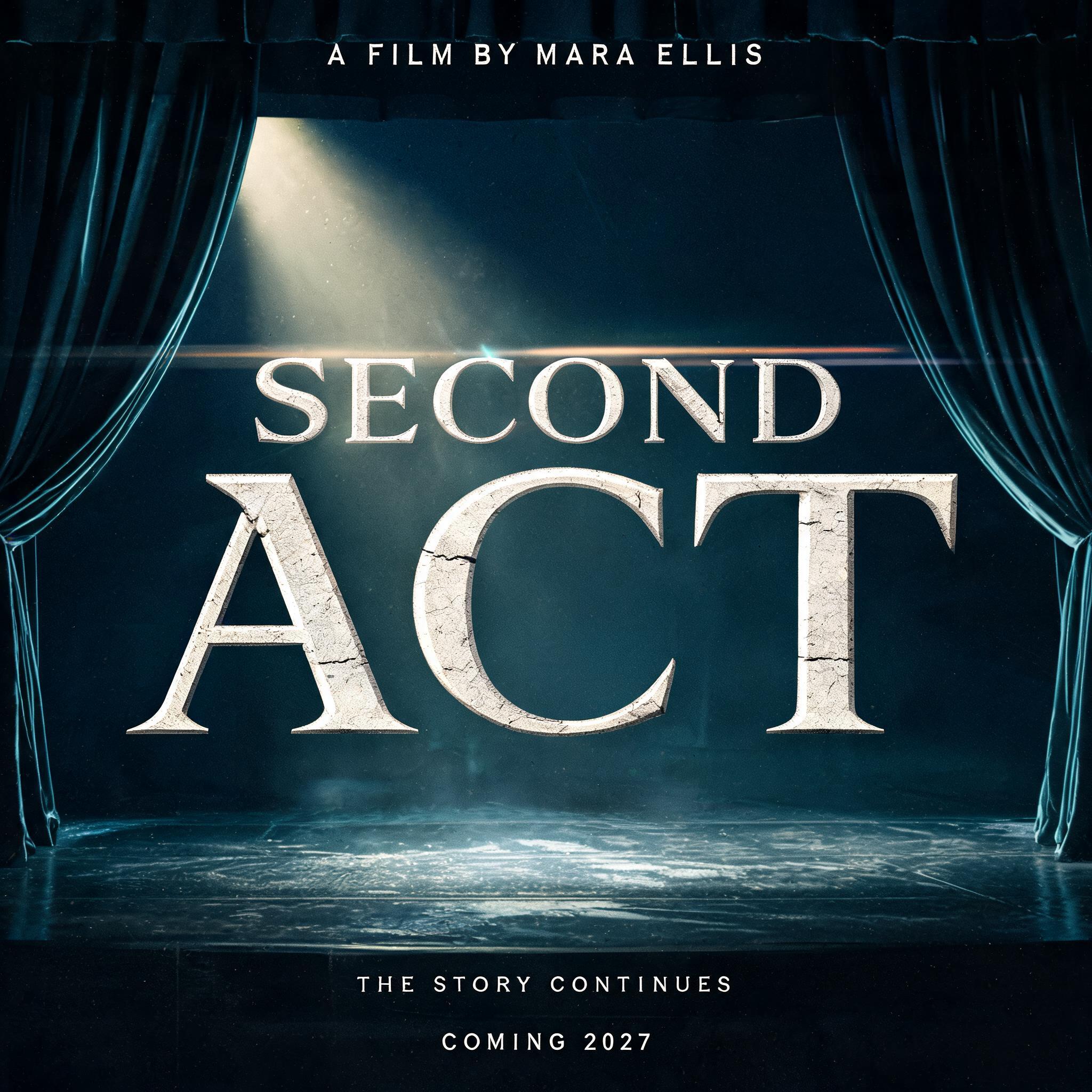
SECOND ACT A FILM BY MARA ELLIS THE STORY CONTINUES COMING 2027 - Movie & Film Text Effect


Uses BytePlus Seedream 5.0, the model behind this artwork · 15 credits




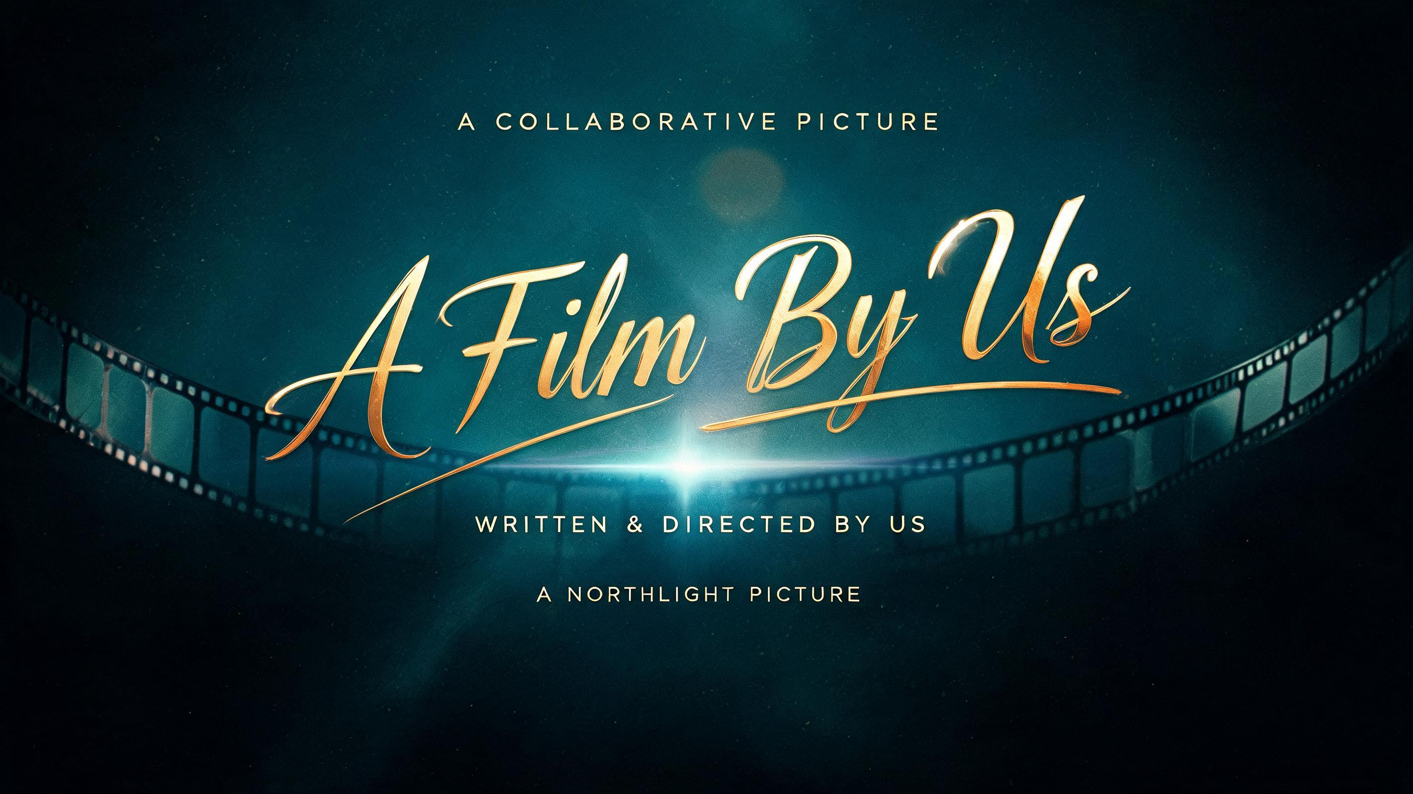
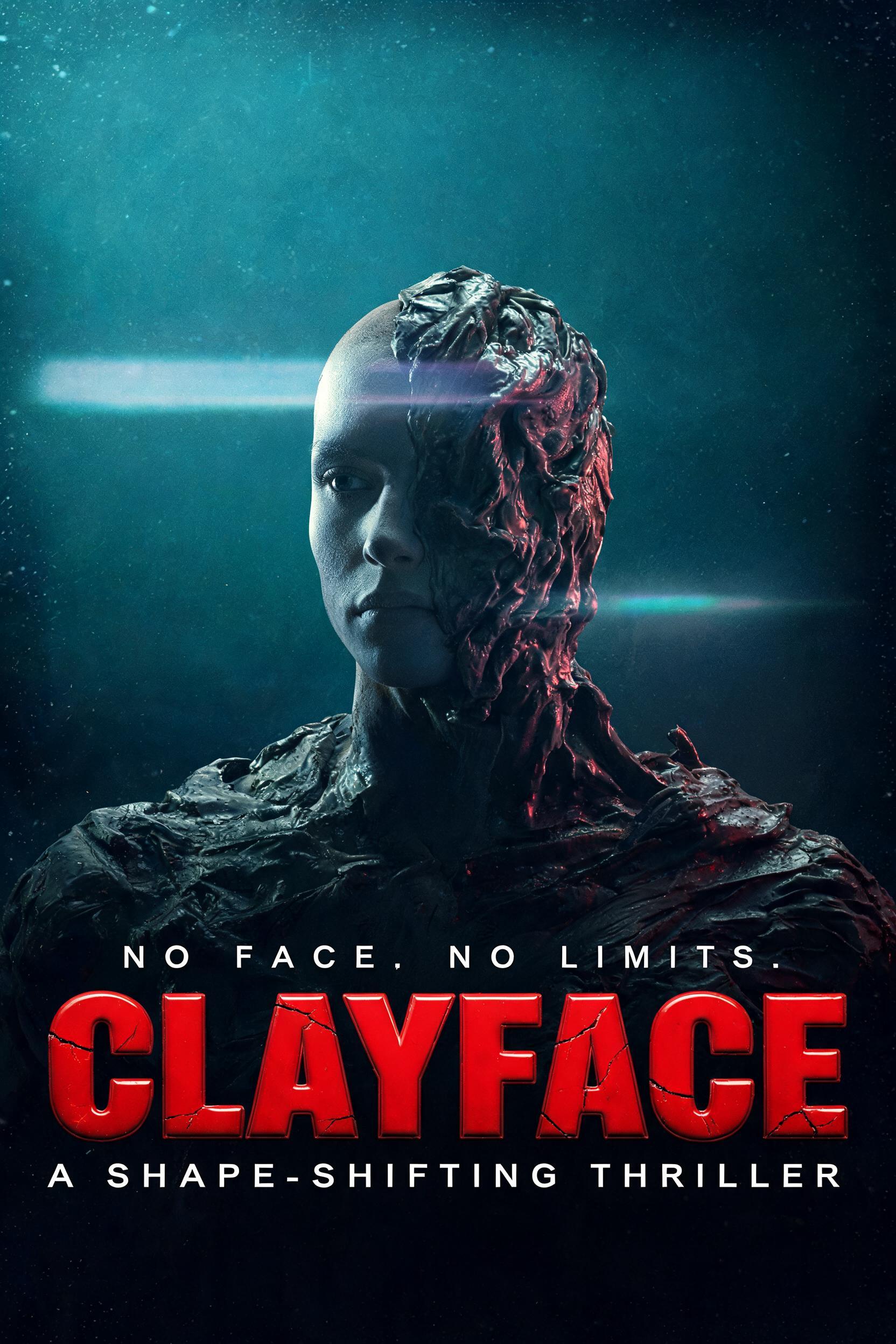

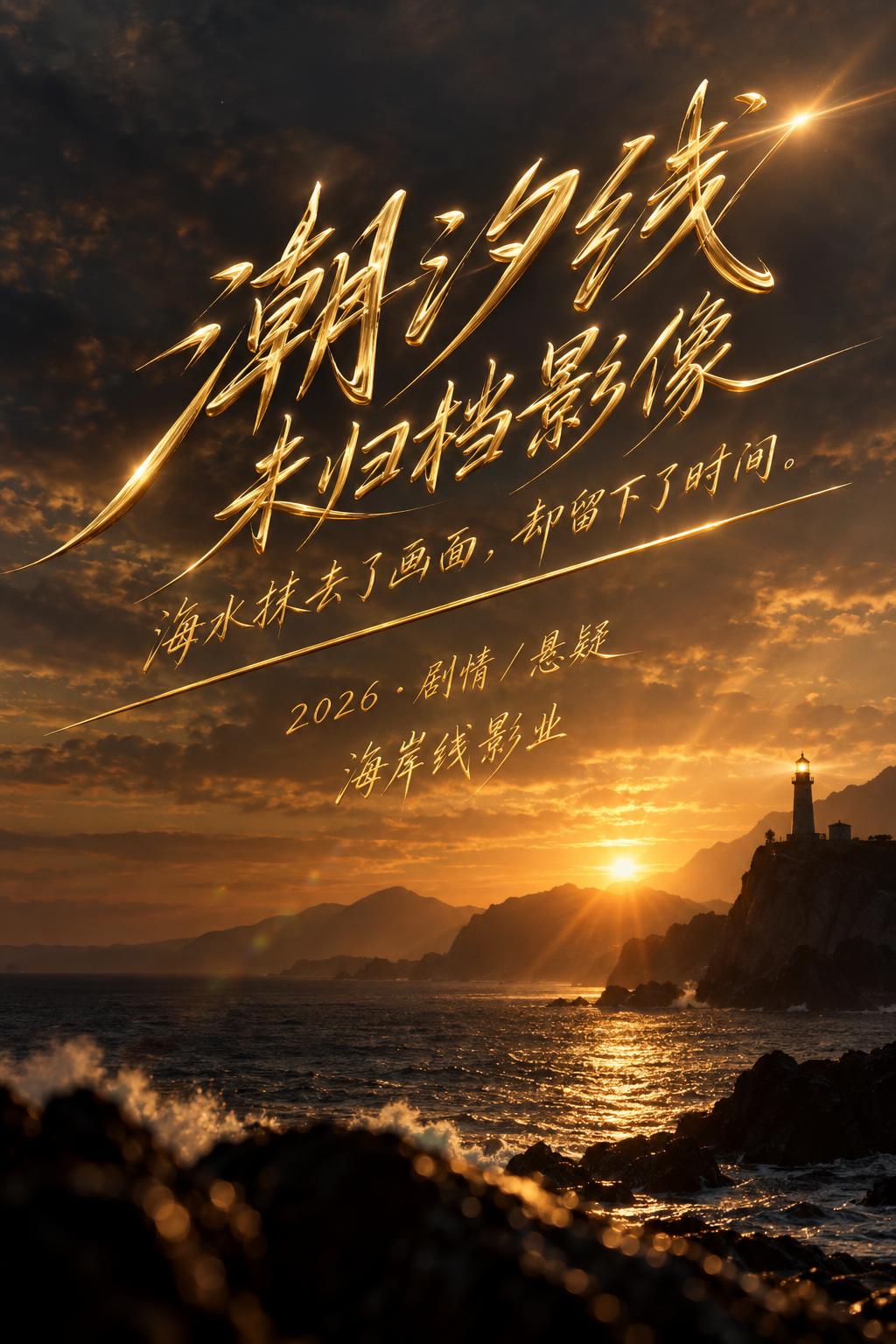
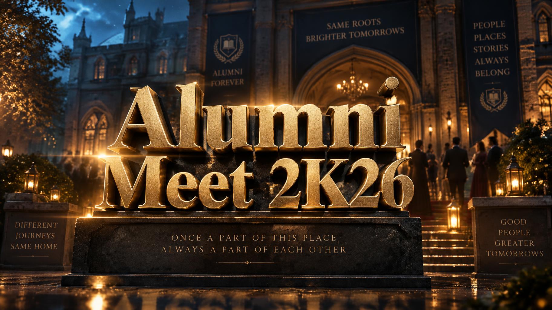



“SECOND ACT A FILM BY MARA ELLIS THE STORY CONTINUES COMING 2027” was created with FontVibe AI — explore more Cinematic text effect. Monumental movie-title capitals in warm gold metal, rim-lit by a low sun with lens flare, floating over a vast mountain landscape at golden hour.
Create a finished square cinematic film-announcement key art poster, not a logo. Exact rendered typography must read: small top eyebrow “A FILM BY MARA ELLIS”; dominant two-line title “SECOND” / “ACT”; beneath it “THE STORY CONTINUES”; bottom release line “COMING 2027”. Use a strict three-territory movie-poster layout. Top 12%: the eyebrow in small, tracked, cool-gray sans capitals. Center 56%: SECOND ACT occupies nearly the full width, centered, with clear separation between the two lines. Build the title as classical Roman square capitals, deeply incised pale limestone, broad M and rhythmically varied character widths, moderate stroke contrast, sharp flared wedge serifs. Each V-cut incision catches the strong raking key light as a bright triangular bevel; dark hard-edged serif shadows fall down-right. The letter faces are weathered with fine chisel marks and hairline mineral fissures, not metallic and not glossy. Make SECOND slightly smaller than ACT, with ACT anchoring the composition. Behind the lettering: a photoreal proscenium stage viewed frontally, black velvet curtains parted at both sides, a narrow empty pool of wet reflective floor at center, and a dense blue-black void beyond the stage. A single warm tungsten follow-spot from upper left cuts through suspended haze and lands across the carved title; cool cyan underlight outlines curtain folds and floor reflections. Add faint dust motes in the beam, controlled teal-to-black cinematic color grading, deep shadow separation, subtle anamorphic horizontal lens flare crossing the title, shallow edge vignette, and fine 35mm film grain. Lower 18%: subtitle in restrained off-white small capitals, then the release line in tiny spaced capitals. Preserve wide clear margins, exact readable spelling, no extra text, no logos, no people.
Made for Film Title Font Generator
Generated on September 15, 2026 · 2048 × 2048 · JPEG · BytePlus Seedream 5.0 · Layout: Poster · Shared by the creator · Free for commercial use (CC BY 4.0)


