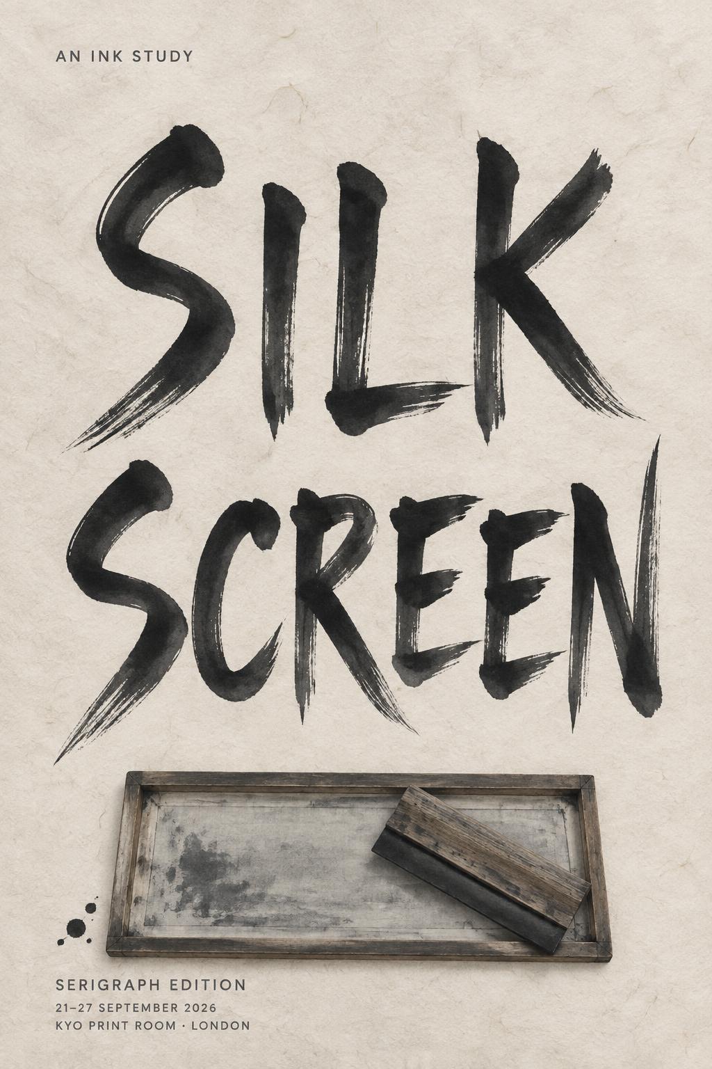
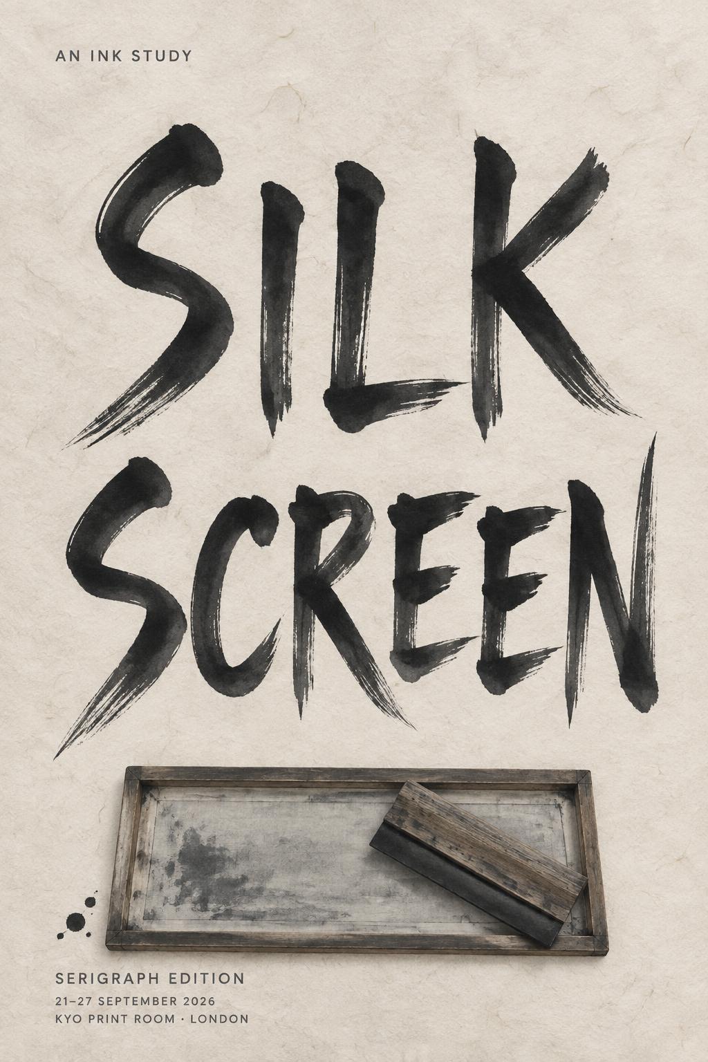
SILK SCREEN AN INK STUDY SERIGRAPH EDITION 21–27 SEPTEMBER 2026 KYO PRINT ROOM · LONDON - Japanese Ink Brush Text Effect


Uses OpenAI GPT-Image-2.5 Sunburst, the model behind this artwork · 15 credits











“SILK SCREEN AN INK STUDY SERIGRAPH EDITION 21–27 SEPTEMBER 2026 KYO PRINT ROOM · LONDON” is a Brush Japanese Ink text effect text effect created with FontVibe AI. Japanese Shodo ink brush calligraphy style applied to Latin letterforms. Deep sumi black ink with authentic fude brush energy, controlled single-direction strokes, and washi paper atmosphere. Perfect for Japanese restaurant branding, tattoo design, anime, martial arts, and cultural projects.
Create a finished tall 2:3 exhibition poster, Japanese sumi-e printmaking composition, not a mockup. Warm cream handmade washi paper with clearly visible long paper fibers and softly uneven deckled tonal texture. Soft diffuse north-facing studio light, no hard shadows. Exact rendered text, preserve spelling and line breaks: small eyebrow at upper left: “AN INK STUDY” main title centered in two lines: “SILK” / “SCREEN” small lower caption: “SERIGRAPH EDITION” small details at bottom: “21–27 SEPTEMBER 2026” small details below: “KYO PRINT ROOM · LONDON” Make “SILK / SCREEN” occupy 56% of the canvas height: tall upright Western capital letters rendered as definitive Japanese shodo brush calligraphy. Refined vertical proportions, generous tracking, 5:1 thick-to-thin modulation. Each stroke has one committed loaded-brush entry, compressed near-black center, controlled charcoal-gray dilution outward, precise tapered harai exits and occasional fine upward hane hooks. The brush marks are fully matte and absorbed into the washi; only the farthest edges show restrained dry-brush grain. Do not use glossy ink, digital outlines, decorative ornaments, uniform black, or hesitant scratchy marks. Place a single rectangular silk-screen frame as the hero prop across the lower 18% of the poster, seen from directly above: thin dark wood rails, translucent pale-gray mesh, one diagonal charcoal ink squeegee resting across it. The title remains unobstructed. A few sparse ink droplets land only near the lower-left corner of the screen frame. Use strong ma: at least 50% quiet paper negative space, with the central title breathing widely around it. Eyebrow and lower details are small clean charcoal-gray sans-serif, sharply legible, left-aligned to the screen frame. Print-poster flatness, tactile paper absorption, restrained palette.
Made for Geisha Font Generator
Generated on September 21, 2026 · 1024 × 1536 · JPEG · OpenAI GPT-Image-2.5 Sunburst · Layout: Zen · Shared by the creator · Free for commercial use (CC BY 4.0)


