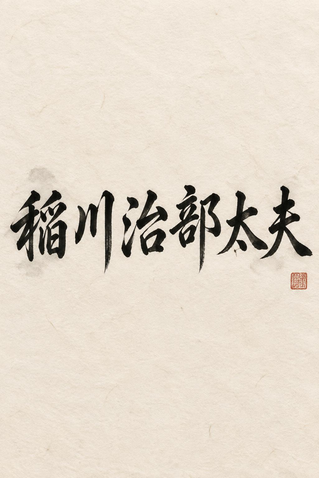
稲川治部太夫 - Japanese Ink Brush Text Effect


Uses OpenAI GPT-Image-2.5 Sunburst, the model behind this artwork · 15 credits











“稲川治部太夫” is a Brush Japanese Ink text effect text effect created with FontVibe AI. Japanese Shodo ink brush calligraphy style applied to Latin letterforms. Deep sumi black ink with authentic fude brush energy, controlled single-direction strokes, and washi paper atmosphere. Perfect for Japanese restaurant branding, tattoo design, anime, martial arts, and cultural projects.
Japanese ink brush aesthetic — the visual language of sumi calligraphy on washi paper. INK MEDIUM: sumi pigment in deep black to charcoal range — richest density at mark centers, naturally transitioning outward as ink supply depletes. Fully matte, absorbed into paper surface, producing a tonal range from dense opaque black to transparent grey depending on dilution and brush load. PAPER SURFACE: natural washi — warm cream-white base with visible paper fiber structure giving slight texture. The absorbent surface creates the characteristic soft border quality of East Asian brush work at all mark edges. LIGHT ATMOSPHERE: soft diffuse north-facing studio light — the traditional calligrapher's light source. Even, shadowless, allowing the full tonal range of ink marks to read clearly. Warm cream paper tone contrasts against deep sumi black. AESTHETIC REGISTER: the ma principle — the space between and around marks is as considered as the marks themselves. Compositions have breathing room and deliberate quietness. When no specific material is defined by the font: default environment — deep sumi black marks on warm cream washi paper, soft diffuse overhead light, meditative studio atmosphere. Render the exact text 「稲川治部太夫」 as the sole hero inscription in deep sumi ink on warm cream handmade washi. The six kanji carry varied brush pressure: dense near-black pooled pigment at decisive stroke entries, broad wet marks with irregular bristle edges, then dry-brush drag and translucent charcoal-gray pull-away tails where the ink supply thins. Ink is fully matte and absorbed into the paper, with restrained feathering along visible long paper fibers, tiny capillary blooms, and occasional pinprick ink flecks near forceful turns. Preserve generous untouched washi around the inscription, allowing the cream surface, fibrous grain, deckled tonal variation, and quiet blank paper to remain clearly visible. Add a faint diluted gray ink wash behind selected strokes, so subtle it never competes with the characters. A small square vermilion cinnabar seal may appear as a secondary mark, stamped with slightly broken edges and dry pigment texture. Soft diffuse north-facing studio illumination, shadowless and even, reveals every ink-density transition and paper fiber without gloss. No frames, no ornamental patterns, no gold, no digital effects, no decorative illustration; only calligraphic ink, paper, and controlled empty space.
Made for Shodo Font
Generated on September 23, 2026 · 1024 × 1536 · JPEG · OpenAI GPT-Image-2.5 Sunburst · Shared by the creator · Free for commercial use (CC BY 4.0)


