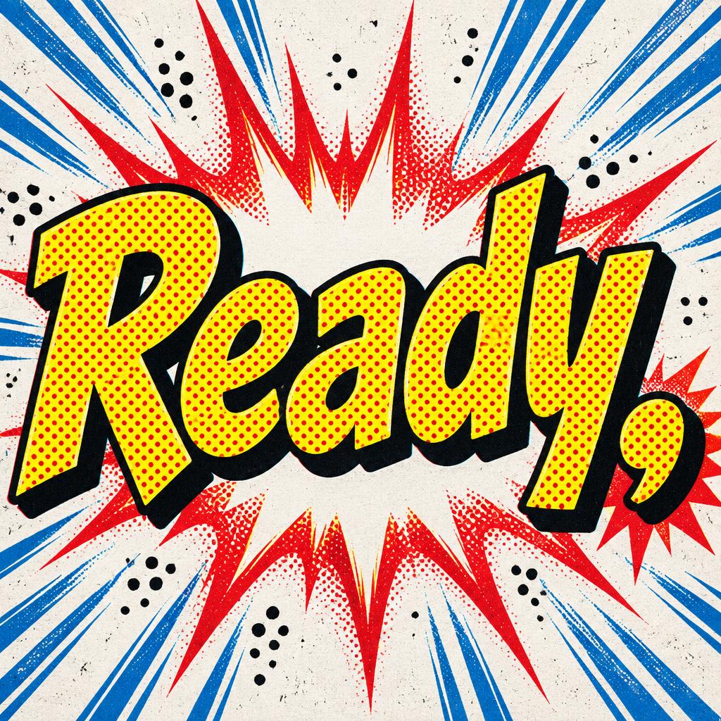
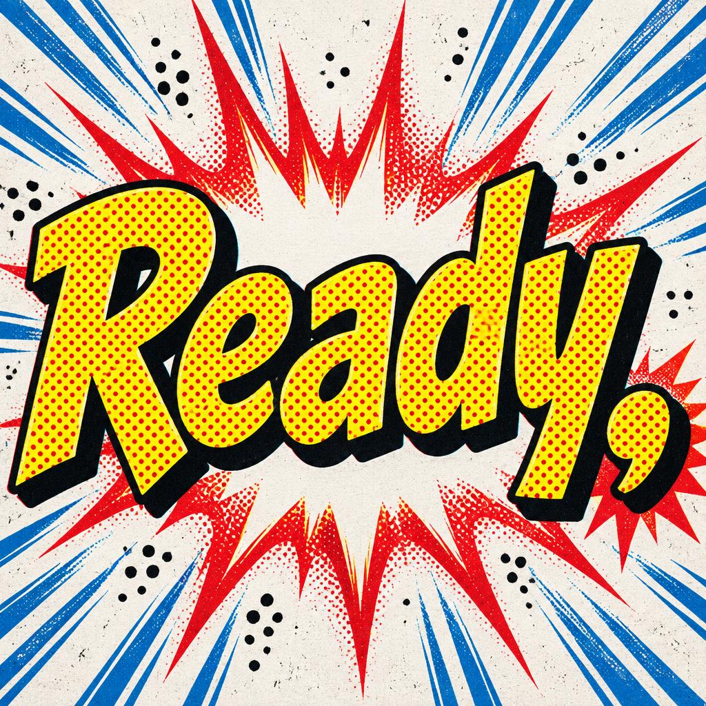
Ready, - Comic Book Text Effect


Uses OpenAI GPT-Image-2.5 Sunburst, the model behind this artwork · 15 credits




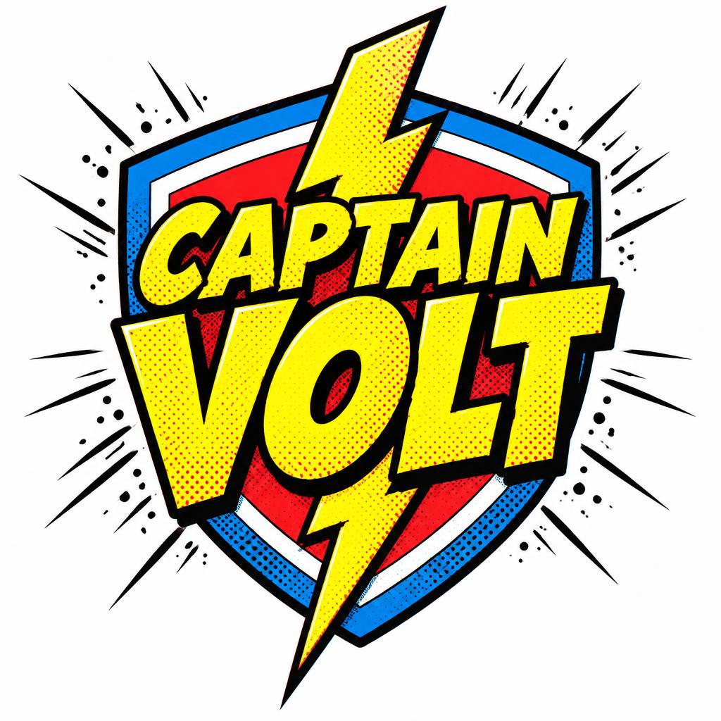
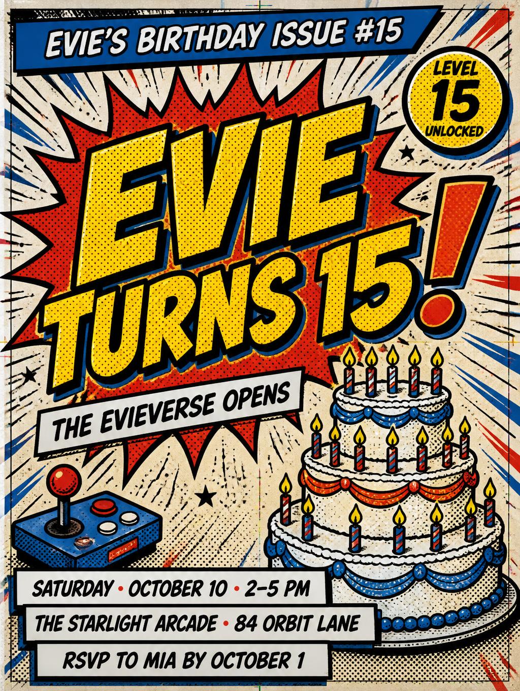
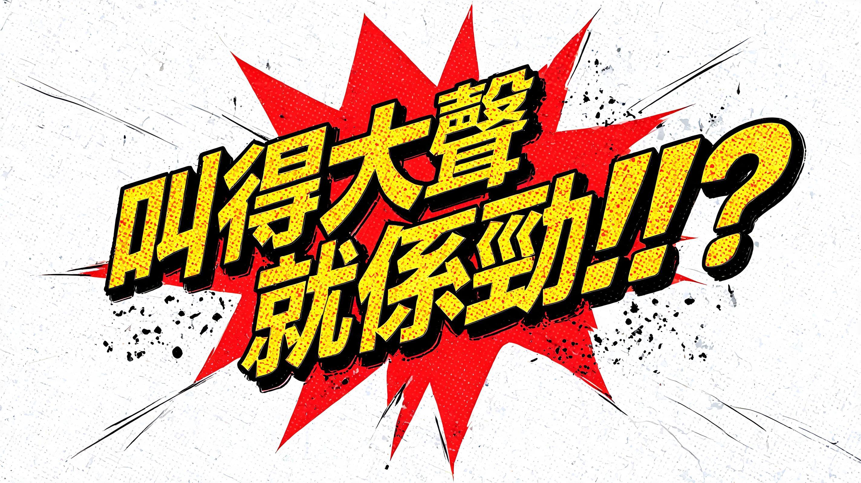


“Ready,” is a Comic Book text effect text effect created with FontVibe AI. Bold comic book action typography with halftone dots, speed lines, pow/bam burst effects and classic superhero lettering style.
Bold black ink outline tracing every letterform edge — a clean, hard border between 2 and 6 pixels thick, ensuring every letter reads as a distinct graphic element against any background. Ben-Day halftone dot screen underlying all color areas: regular circular ink dots on white paper substrate, creating the characteristic optically-mixed color of classic four-color printing. Color palette operating at maximum primary contrast: action yellow, impact red, force blue, knockout white — the exact pigments of Silver Age comic printing, saturated to their loudest value. Ink energy in the environment: diagonal speed lines radiating from behind letterforms, faint Kirby Krackle energy dots scattered in the shadows, halftone dots diffusing into white at the edges of color areas. The letters exist as graphic symbols pressed onto the page — flat, bold, and a pure statement of graphic force. When no specific material is defined by the font: default environment — action yellow fill on each letterform, thick black outline border, Ben-Day halftone dot pattern overlay at 40% across color areas, white knockout background with speed-line radiating marks. Classic Silver Age comic-book readiness cue — render the exact text “Ready,” as the dominant graphic statement, with action-yellow color fields, a clean heavy black ink contour around every letter edge, and a 40% Ben-Day halftone dot screen visible across the fill. Ferrari-red explosive burst shapes and force-blue diagonal speed lines radiate through the white knockout paper ground, stopping sharply at ink boundaries. Add small black Kirby Krackle clusters in the surrounding negative space, offset cyan and red print-registration shadows at selected edges, and faint paper grain with tiny imperfect ink specks. Use hard flat four-color process printing, saturated primary pigments, crisp vector-like separations, and a screen-printed comic panel finish. The comma is oversized enough to read as a deliberate pause mark, carrying a small red impact flare and black shadow. Preserve broad white breathing areas between the energy marks so the word remains immediately legible. No extra words, no logos, no characters, no speech bubbles.
Generated on September 30, 2026 · 1024 × 1024 · JPEG · OpenAI GPT-Image-2.5 Sunburst · Shared by the creator · Free for commercial use (CC BY 4.0)


