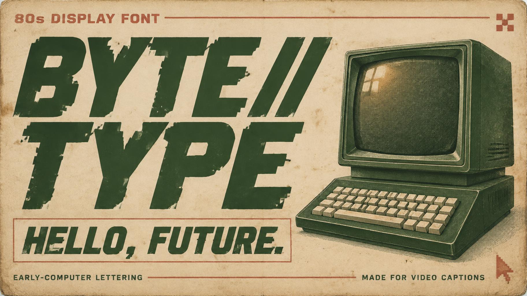
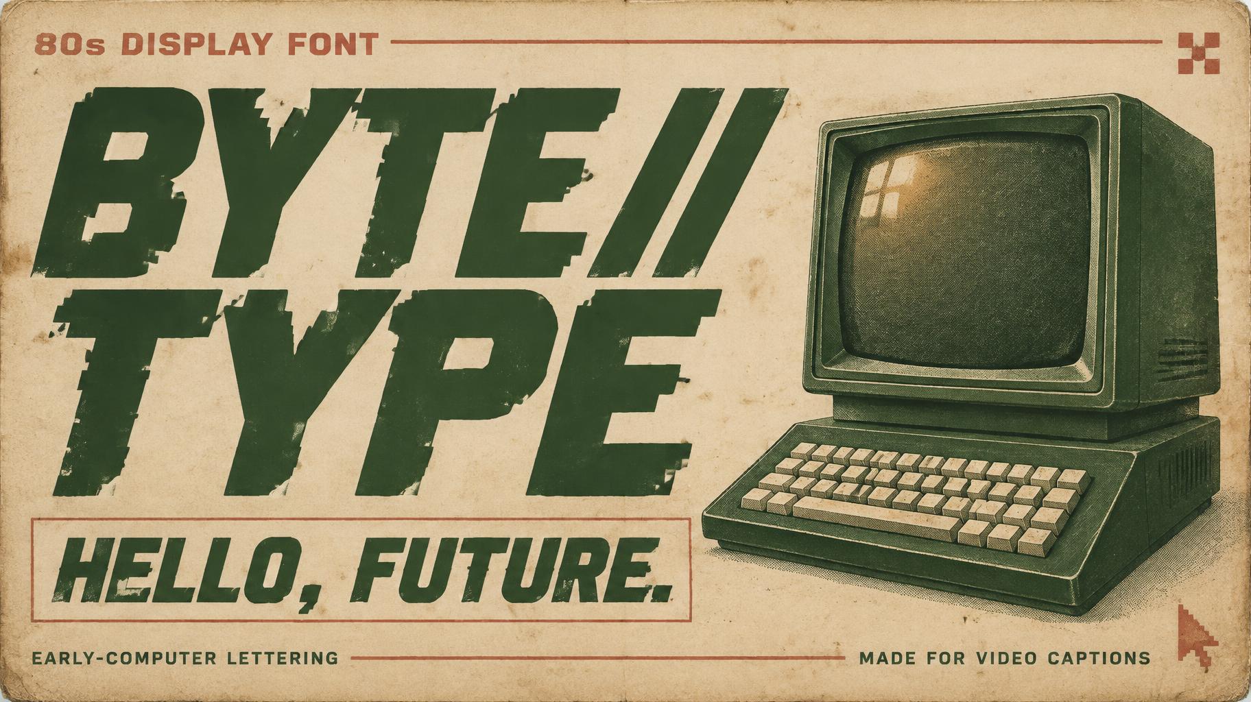
BYTE//TYPE 80s DISPLAY FONT HELLO, FUTURE. EARLY-COMPUTER LETTERING MADE FOR VIDEO CAPTIONS - Vintage Text Effect


Uses OpenAI GPT-Image-2.5 Sunburst, the model behind this artwork · 15 credits
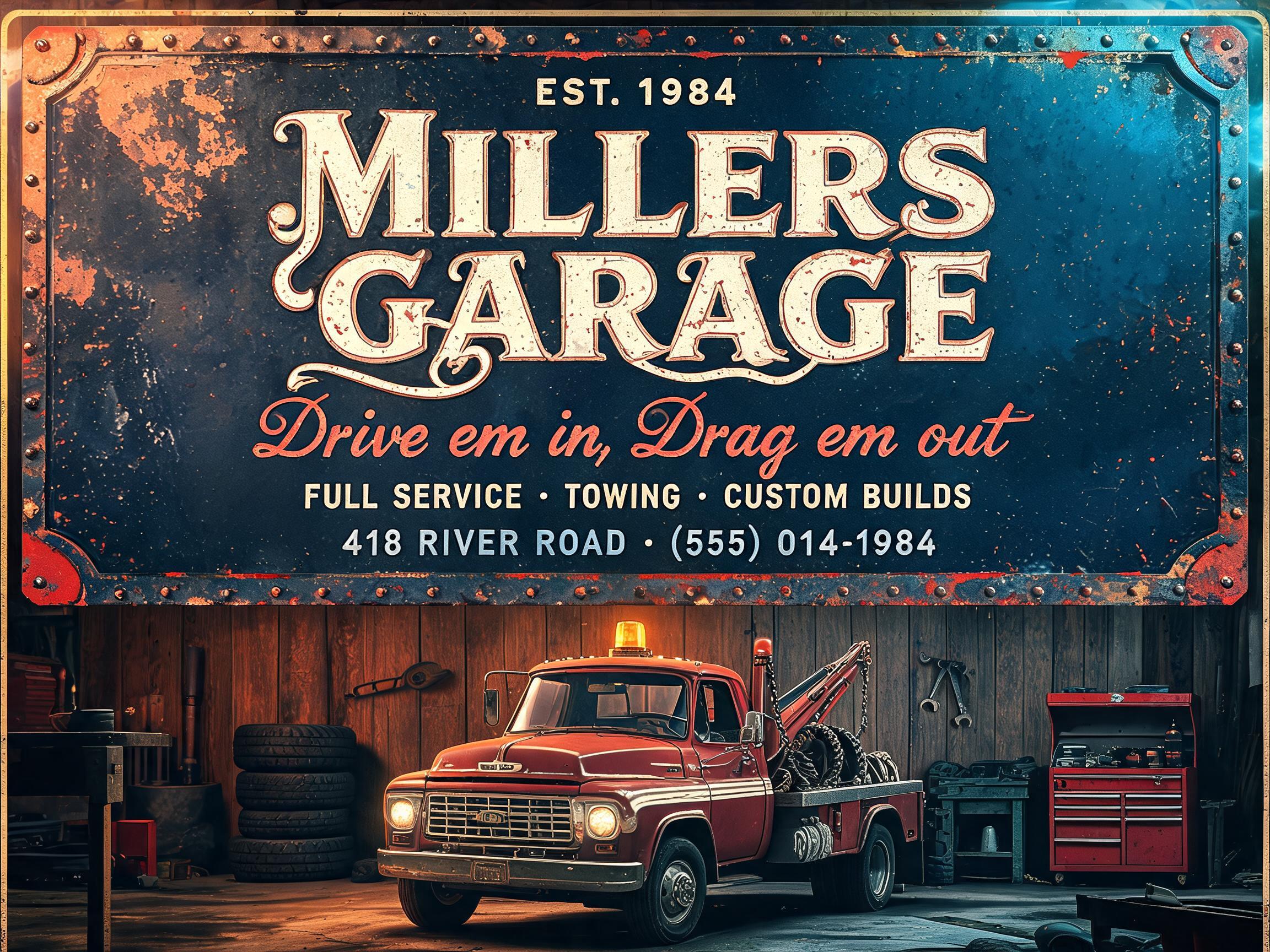
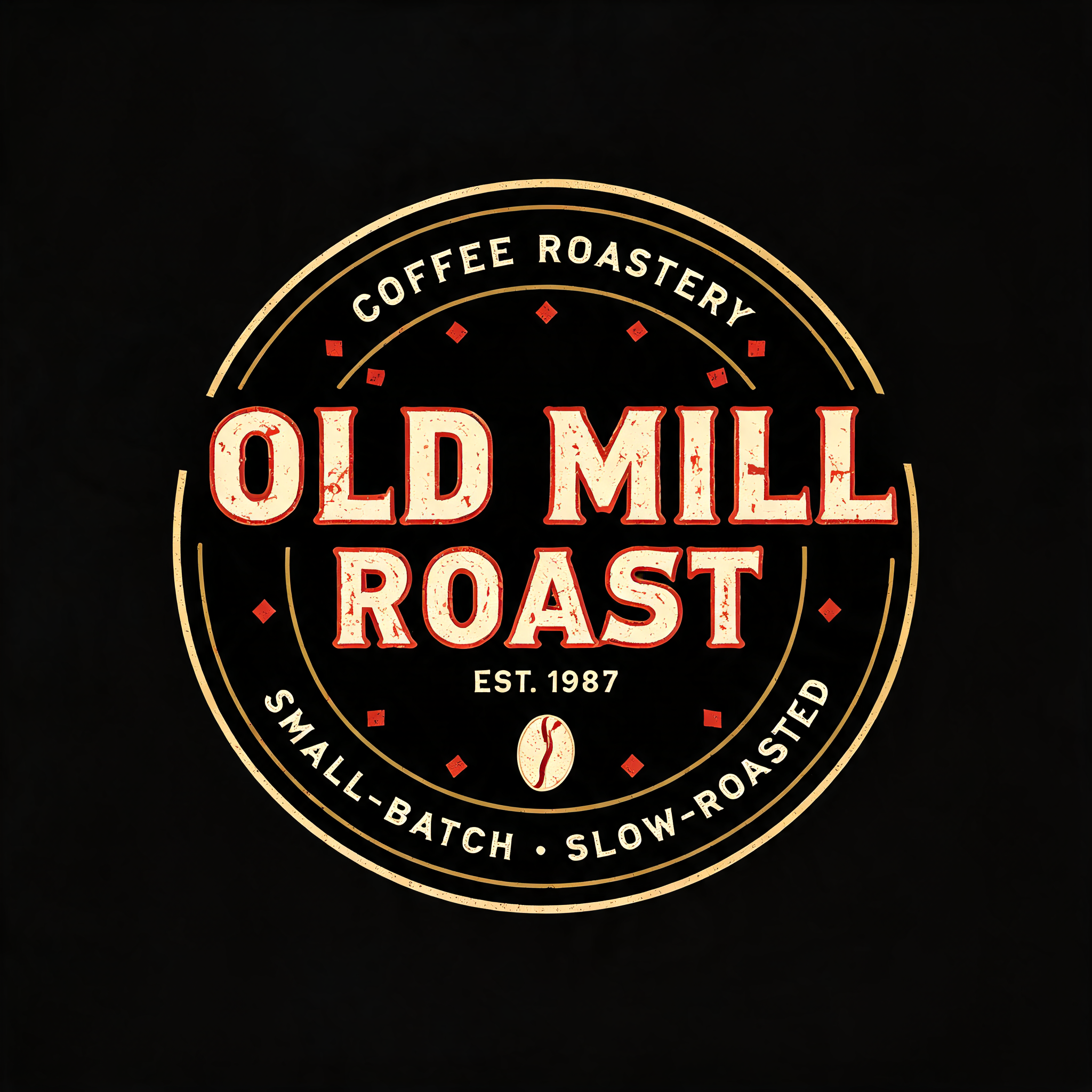
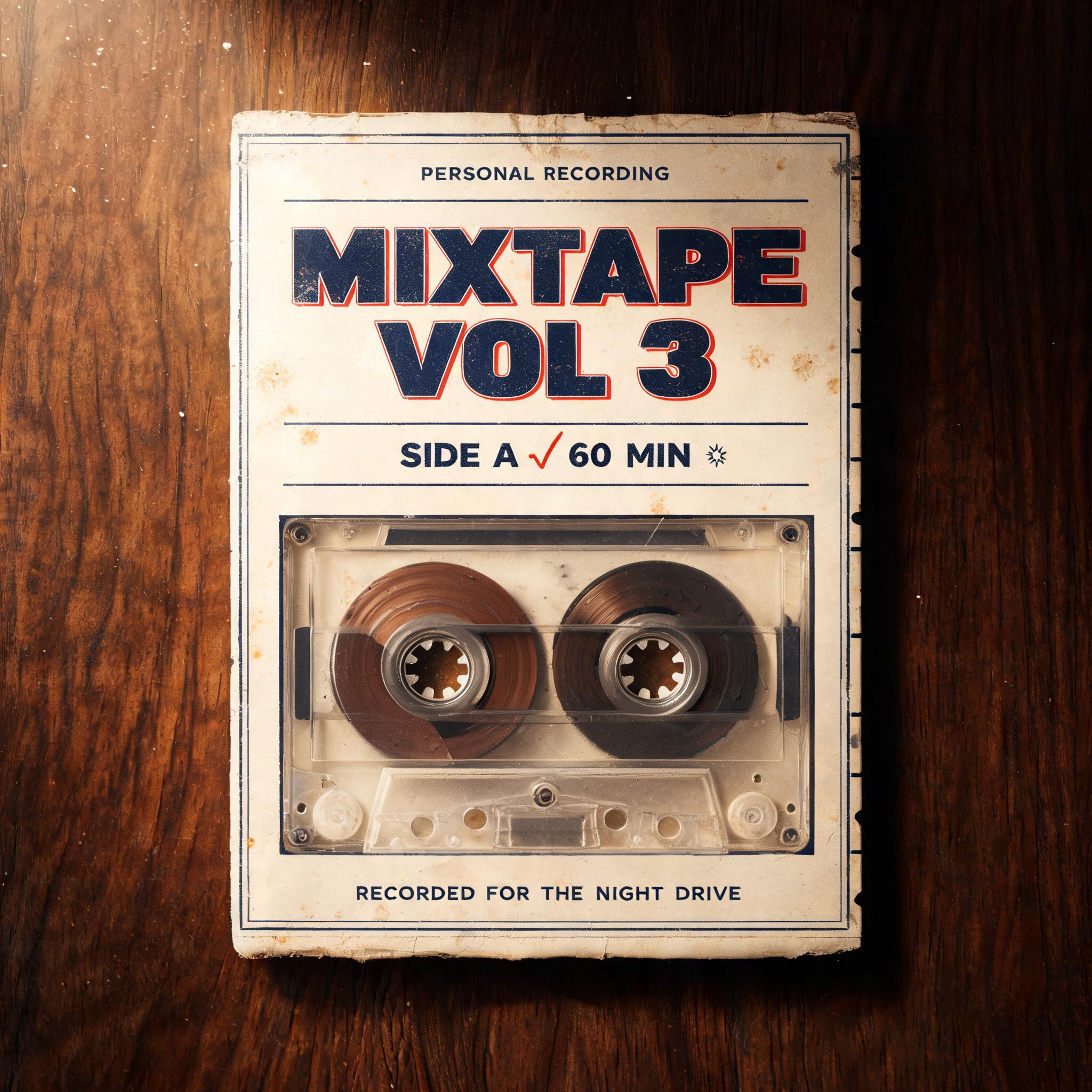
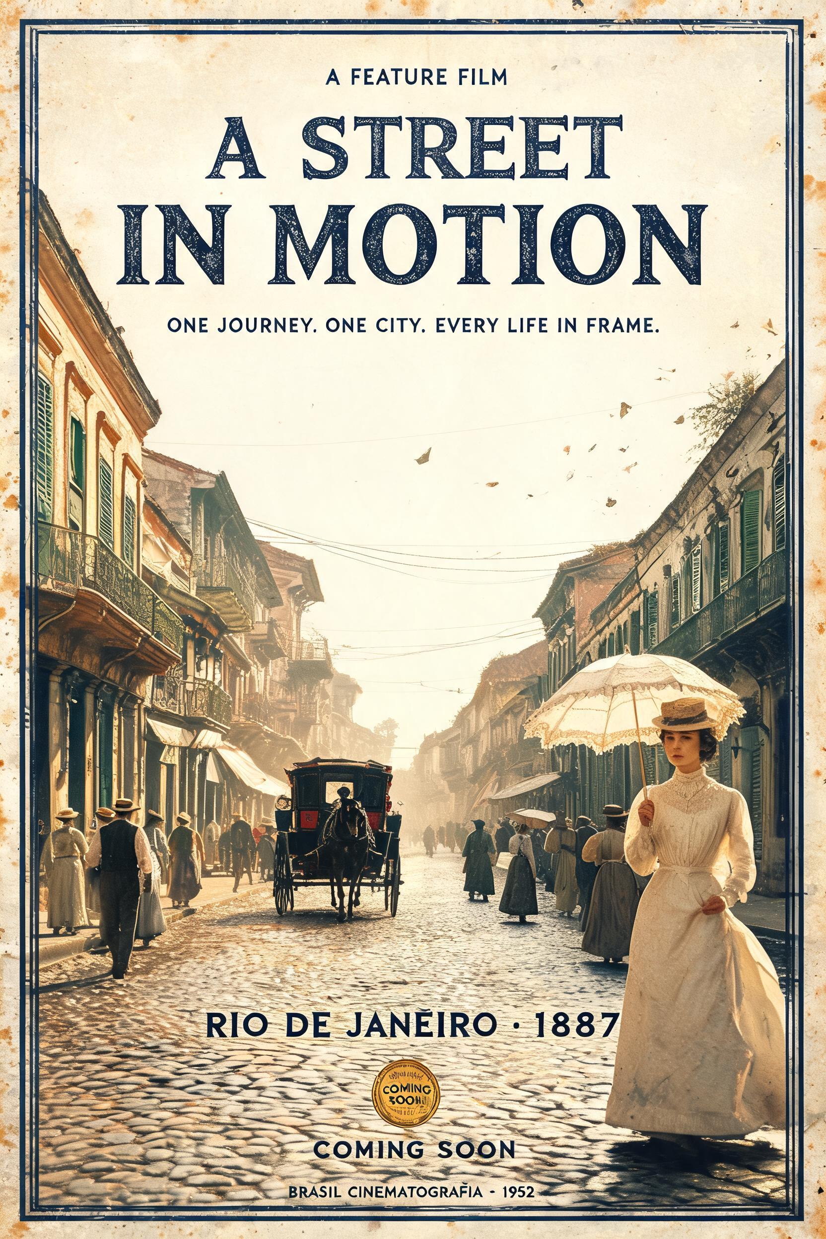

“BYTE//TYPE 80s DISPLAY FONT HELLO, FUTURE. EARLY-COMPUTER LETTERING MADE FOR VIDEO CAPTIONS” is a Vintage text effect text effect created with FontVibe AI. Serif capitals letterpress-bitten into cream cotton card with slightly broken ink, set on an old press bed among scattered metal type.
Create a finished 16:9 horizontal type-specimen card that presents a new 1980s-inspired display font for video captions. Print it like a warm, time-worn vintage artifact: aged cream cotton paper, forest-green faded letterpress ink with a shallow impression, gentle foxing and grain, muted amber illumination, restrained faded-red details. The font is the hero: draw “BYTE//TYPE” in broad, confident, slightly forward-leaning display capitals, generous open counters and dramatic diagonal terminal cuts. Build a few corners and stroke ends from restrained stepped pixel geometry, suggesting early computer graphics without turning the letters into a rigid monospaced bitmap. Preserve clean, readable word shapes. Use the same custom lettering for the sample caption “HELLO, FUTURE.”, printed in forest-green ink on a cream caption strip. Composition: two clear territories in a balanced 16:9 split. On the left, reserve roughly 60% of the canvas for typography: small top label “80s DISPLAY FONT”, an oversized “BYTE//TYPE” across the upper and middle area, then a wide caption strip carrying “HELLO, FUTURE.” near the bottom. Place “EARLY-COMPUTER LETTERING” and “MADE FOR VIDEO CAPTIONS” as small, crisp supporting lines along the lower edge. On the right, show a compact, unbranded vintage CRT computer and keyboard as a carefully drawn printed illustration, with blank keys and no extra lettering; use a dark forest-green casing, cream highlights and muted amber glass reflections. Keep the computer secondary to the type. Use thin faded-red rules and a small geometric cursor-like mark as accents, not extra text. Strong contrast, generous margins, precise hierarchy, slight ink wear that never breaks legibility, tactile paper detail, no neon, no modern interface elements, no logos, no additional words or characters.
Made for 80s Font Generator
Generated on September 30, 2026 · 1824 × 1024 · JPEG · OpenAI GPT-Image-2.5 Sunburst · Layout: Split · Shared by the creator · Free for commercial use (CC BY 4.0)


