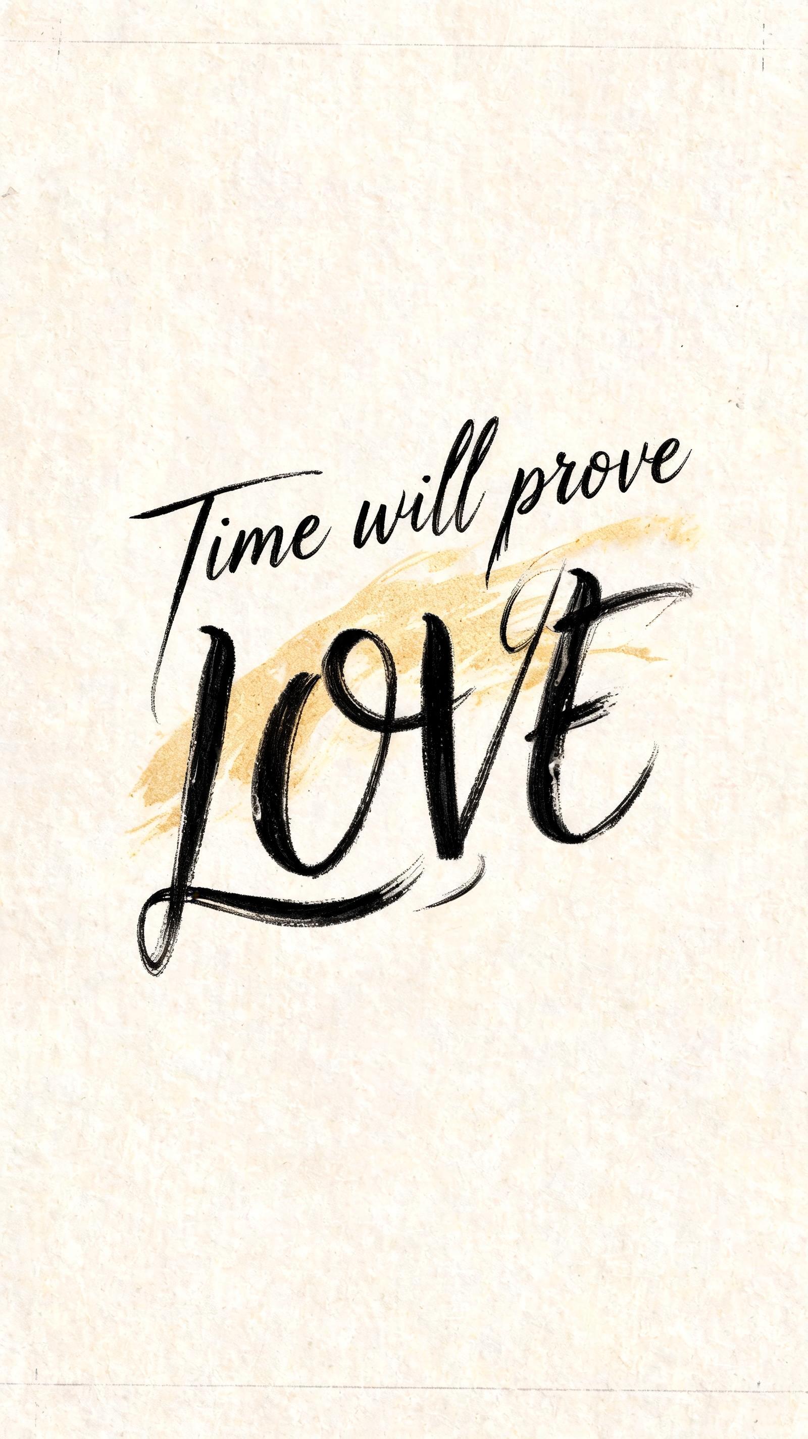
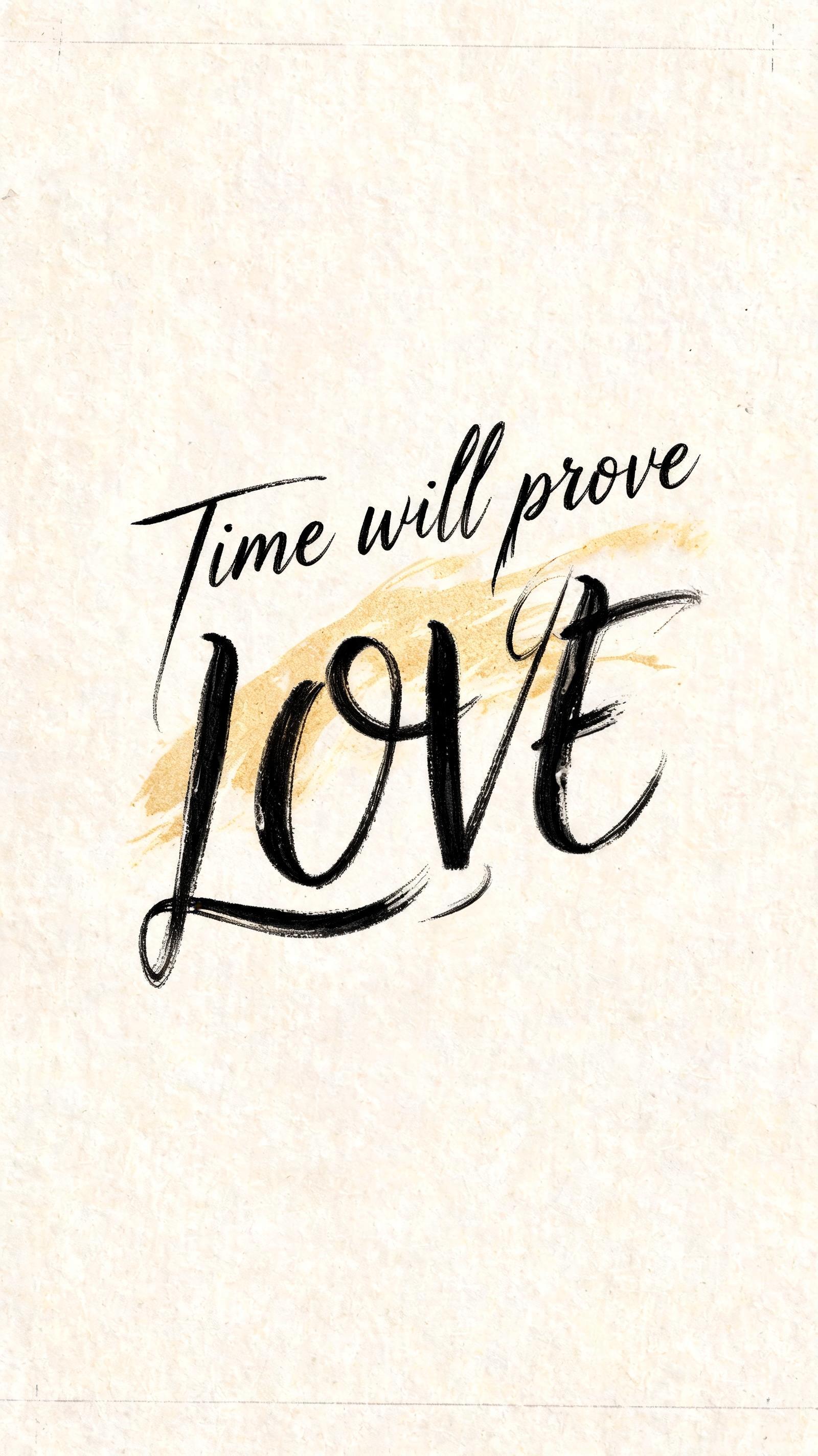
Time will prove LOVE - Brush Script Text Effect


Uses BytePlus Seedream 5.0, the model behind this artwork · 15 credits




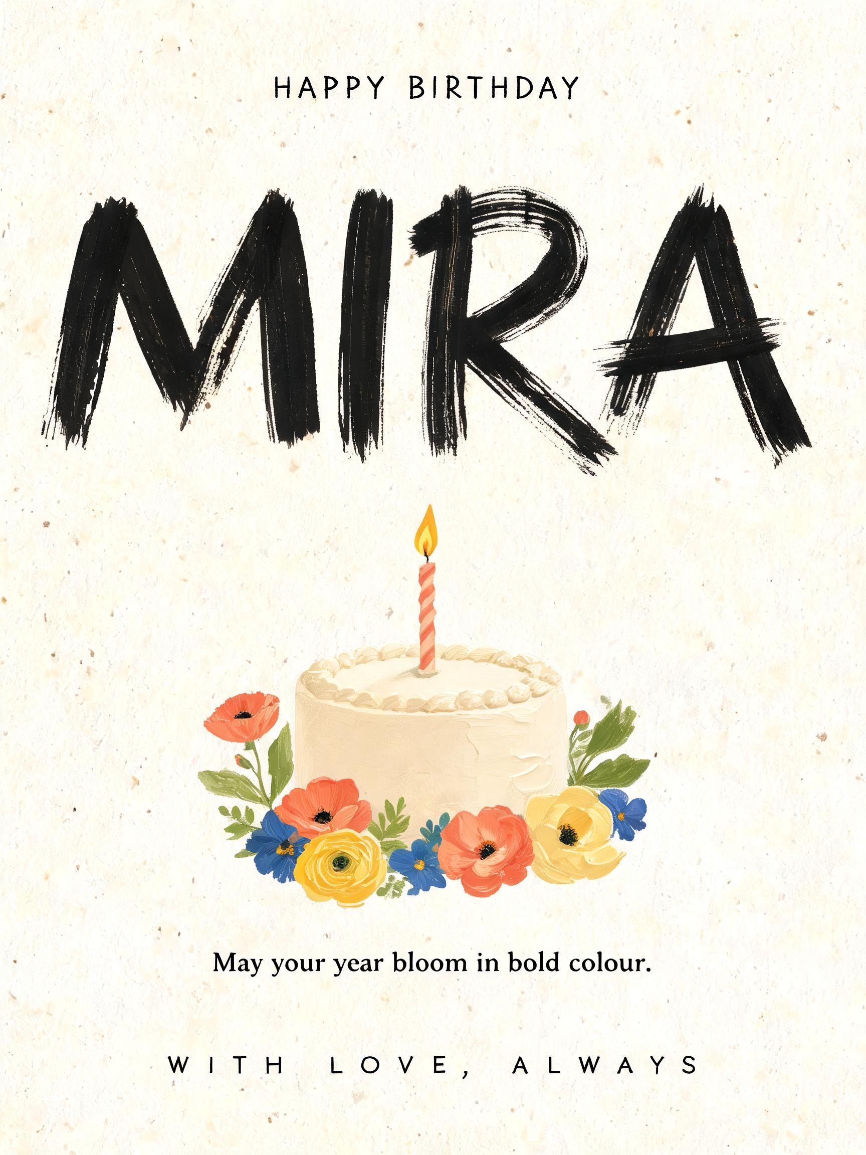


“Time will prove LOVE” is a Brush Stroke text effect text effect created with FontVibe AI. Western brush script with connected letters: thick pressure downstrokes, hairline upstrokes, visible bristle streaks and dry-brush trails in warm off-black ink on textured paper.
rendered as expressive Western brush script lettering with fluid connected strokes. Visible bristle texture with authentic thick-to-thin pressure variation — thick downstrokes, thin upstrokes, just like a loaded calligraphy brush. Ink slightly wet and glistening. Natural ink pooling at stroke starts, feathered dry-brush ending trails. Warm off-black ink on visible surface texture. Hand-crafted artisan energy with real brush imperfection. Brush Lettering — calligraphy-grade discipline applied to brush script form. Maximum thick-to-thin ratio, each letterform flowing naturally into the next without pause. The lettering reads as the work of someone who has trained for years. Render the exact text “Time will prove LOVE” as the sole visual centerpiece, with “LOVE” carrying clear scale dominance and heavier visual presence while the preceding words create a measured lead-in. Use freshly painted warm off-black ink over tactile warm ivory cotton paper, its fibers, faint deckled grain, and tiny absorbent pores visible beneath the strokes. Build dramatic brush pressure throughout: dense swollen downstrokes, razor-fine lifting upstrokes, wet ink pooling where strokes join, subtle bristle separations at turns, and feathered dry-brush release at the final terminals. A narrow grazing light catches a restrained glossy sheen across the thickest ink passages, while the paper remains softly matte. Introduce a restrained antique-gold wash behind selected stroke sweeps, like translucent diluted pigment absorbed into the paper, with no metallic lettering and no competing ornament. The word “LOVE” receives the deepest ink density and the most luminous wet highlights, suggesting endurance through material contrast rather than decorative effects. Leave generous untouched paper around the lettering; add only a few near-invisible graphite guide marks and pale ink specks at the outer edges, preserving a hand-painted studio sheet with disciplined, practiced brush control.
Generated on October 5, 2026 · 1600 × 2848 · JPEG · BytePlus Seedream 5.0 · Shared by the creator · Free for commercial use (CC BY 4.0)