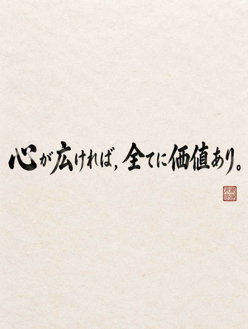
心が広ければ,全てに価値あり。 - Japanese Ink Brush Text Effect


Uses OpenAI GPT-Image-2.5 Sunburst, the model behind this artwork · 15 credits











“心が広ければ,全てに価値あり。” is a Brush Japanese Ink text effect text effect created with FontVibe AI. Japanese Shodo ink brush calligraphy style applied to Latin letterforms. Deep sumi black ink with authentic fude brush energy, controlled single-direction strokes, and washi paper atmosphere. Perfect for Japanese restaurant branding, tattoo design, anime, martial arts, and cultural projects.
Japanese ink brush aesthetic — the visual language of sumi calligraphy on washi paper. INK MEDIUM: sumi pigment in deep black to charcoal range — richest density at mark centers, naturally transitioning outward as ink supply depletes. Fully matte, absorbed into paper surface, producing a tonal range from dense opaque black to transparent grey depending on dilution and brush load. PAPER SURFACE: natural washi — warm cream-white base with visible paper fiber structure giving slight texture. The absorbent surface creates the characteristic soft border quality of East Asian brush work at all mark edges. LIGHT ATMOSPHERE: soft diffuse north-facing studio light — the traditional calligrapher's light source. Even, shadowless, allowing the full tonal range of ink marks to read clearly. Warm cream paper tone contrasts against deep sumi black. AESTHETIC REGISTER: the ma principle — the space between and around marks is as considered as the marks themselves. Compositions have breathing room and deliberate quietness. When no specific material is defined by the font: default environment — deep sumi black marks on warm cream washi paper, soft diffuse overhead light, meditative studio atmosphere. Japanese sumi ink calligraphy rendering the exact text “心が広ければ,全てに価値あり。” on warm cream-white handmade washi paper. The character sequence carries a deliberate pressure rhythm: heavily loaded near-black brush entries, broad saturated pools at directional turns, dry-brush breaks where individual horsehair strands separate, and long pull-away strokes thinning through charcoal gray into translucent diluted ink. Pigment is fully matte and visibly absorbed into the paper, with softly feathered edges following the irregular cellulose fibers; no glossy coating, no digital sheen. The punctuation is rendered with restrained ink weight, preserving the exact Japanese full-width comma and final period. Expansive untouched paper surrounds the writing, with quiet intervals of bare fiber texture between ink marks. A faint pale-gray ink wash lingers behind selected strokes like diluted water brushed into the sheet, kept sparse and low contrast. One small vermilion cinnabar hanko seal appears as a secondary accent, its square edges slightly imperfect from stamped pigment. Soft diffuse north-facing studio light reveals paper grain and tonal gradation without cast shadows. Restrained traditional shodo studio presentation, no decorative border, no objects, no additional words.
Made for Sosho Font Generator
Generated on October 5, 2026 · 1024 × 1360 · JPEG · OpenAI GPT-Image-2.5 Sunburst · Shared by the creator · Free for commercial use (CC BY 4.0)


