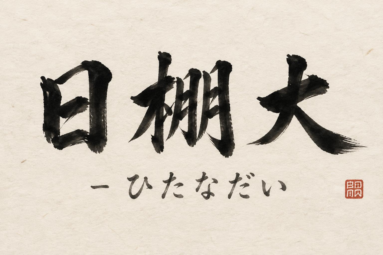
日棚大 - ひたなだい - Japanese Ink Brush Text Effect


Uses OpenAI GPT-Image-2.5 Sunburst, the model behind this artwork · 15 credits











“日棚大 - ひたなだい” was created with FontVibe AI — explore more Brush Japanese Ink text effect. Japanese Shodo ink brush calligraphy style applied to Latin letterforms. Deep sumi black ink with authentic fude brush energy, controlled single-direction strokes, and washi paper atmosphere. Perfect for Japanese restaurant branding, tattoo design, anime, martial arts, and cultural projects.
Japanese ink brush aesthetic — the visual language of sumi calligraphy on washi paper. INK MEDIUM: sumi pigment in deep black to charcoal range — richest density at mark centers, naturally transitioning outward as ink supply depletes. Fully matte, absorbed into paper surface, producing a tonal range from dense opaque black to transparent grey depending on dilution and brush load. PAPER SURFACE: natural washi — warm cream-white base with visible paper fiber structure giving slight texture. The absorbent surface creates the characteristic soft border quality of East Asian brush work at all mark edges. LIGHT ATMOSPHERE: soft diffuse north-facing studio light — the traditional calligrapher's light source. Even, shadowless, allowing the full tonal range of ink marks to read clearly. Warm cream paper tone contrasts against deep sumi black. AESTHETIC REGISTER: the ma principle — the space between and around marks is as considered as the marks themselves. Compositions have breathing room and deliberate quietness. When no specific material is defined by the font: default environment — deep sumi black marks on warm cream washi paper, soft diffuse overhead light, meditative studio atmosphere. Japanese ink brush composition rendering the exact text “日棚大 - ひたなだい” on warm cream-white handmade washi paper. The kanji carry the visual weight in dense, fully matte sumi pigment: black cores pooling at brush entry points, charcoal transitions through the stroke bodies, and pale smoky-gray dry-brush pull-offs where pigment runs low. Each mark shows decisive pressure changes, feathered bristle separation, slight absorbent bleeding into visible long paper fibers, and irregular soft paper-edge diffusion. Preserve substantial open washi around the ink forms, with no ornamental frame or decorative pattern. The hiragana and hyphen appear as a restrained secondary reading layer in diluted gray sumi, lighter in pigment load and scale, with fine brush texture rather than printed precision. Add only a few microscopic ink droplets near forceful stroke starts; no heavy splatter field. The paper has subtle deckled-fiber grain, tiny natural flecks, and faint tonal variation from warm ivory to pale beige. Soft diffuse north-facing studio light reveals the paper texture evenly with no cast shadow, gloss, metallic finish, or digital glow. Deep black, charcoal gray, warm cream, and a single small vermilion hanko-style seal impression as the only accent color.
Made for Japanese Text Generator
Generated on October 9, 2026 · 1536 × 1024 · JPEG · OpenAI GPT-Image-2.5 Sunburst · Shared by the creator · Free for commercial use (CC BY 4.0)


