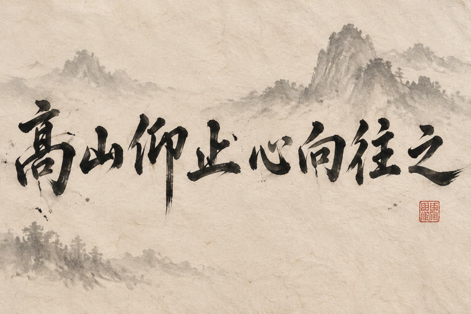
高山仰止心向往之 - Chinese Ink Brush Text Effect


Uses OpenAI GPT-Image-2.5 Sunburst, the model behind this artwork · 15 credits
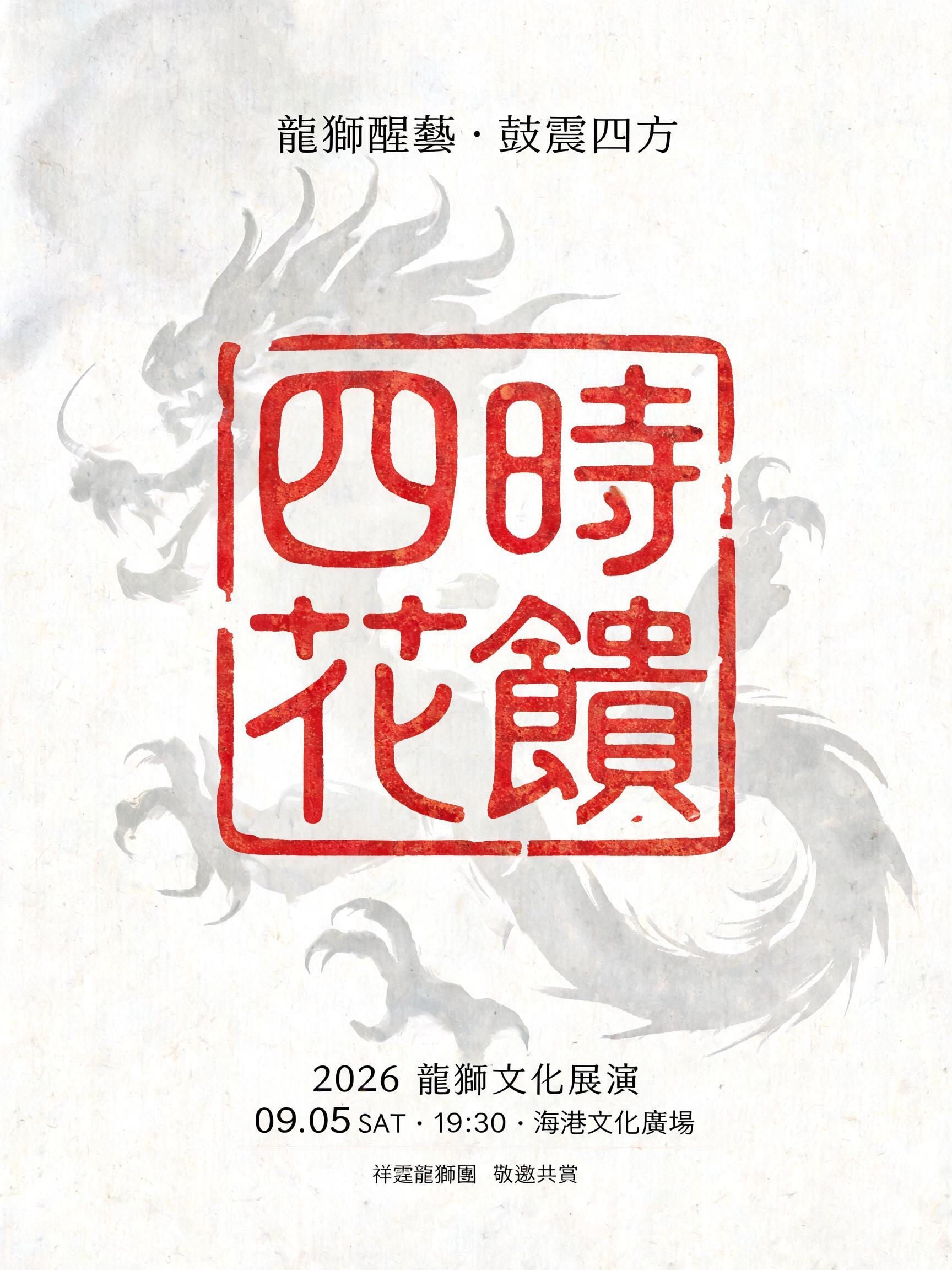
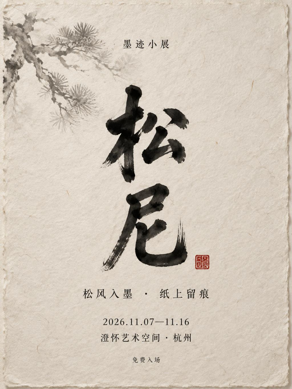
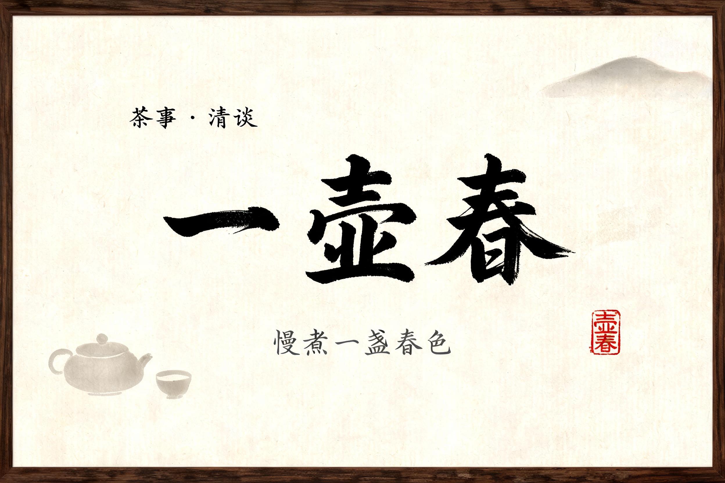


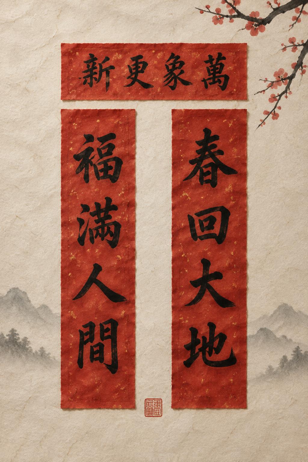
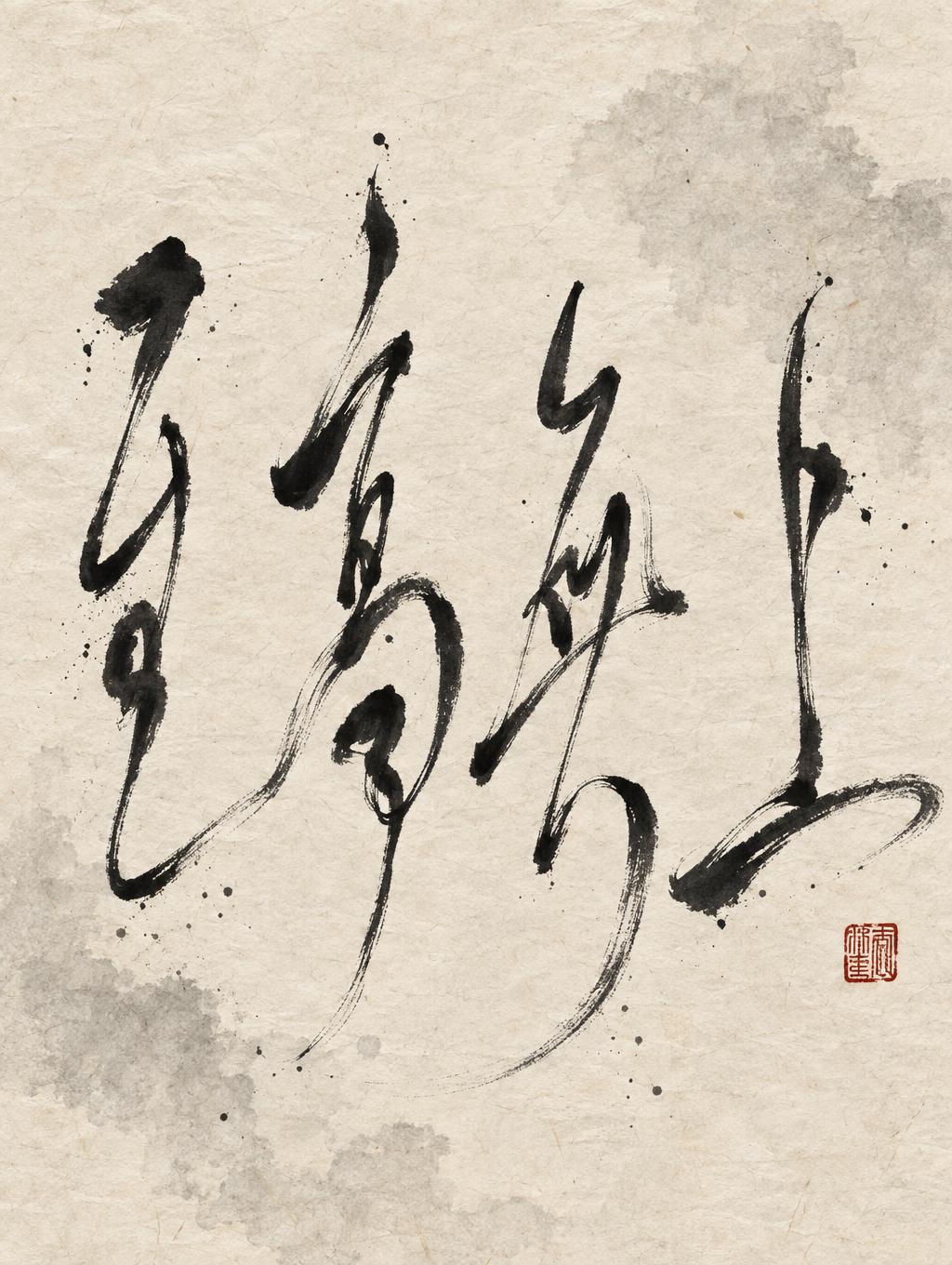
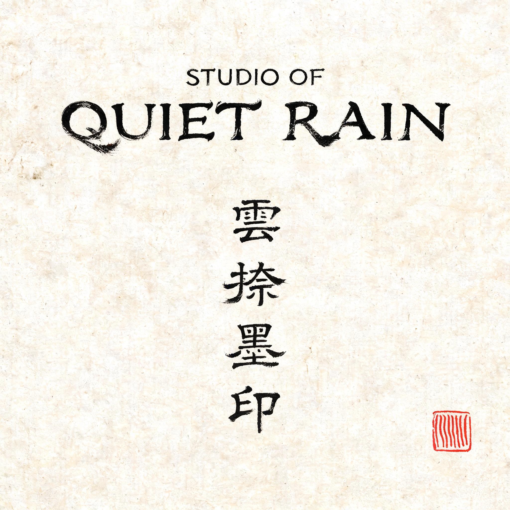

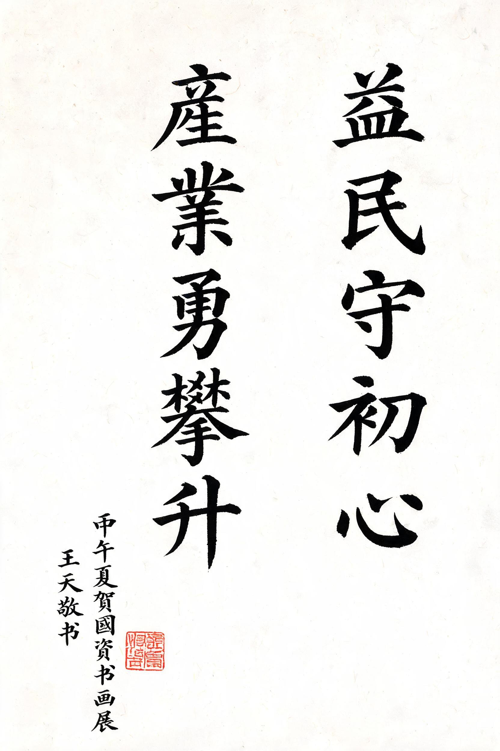
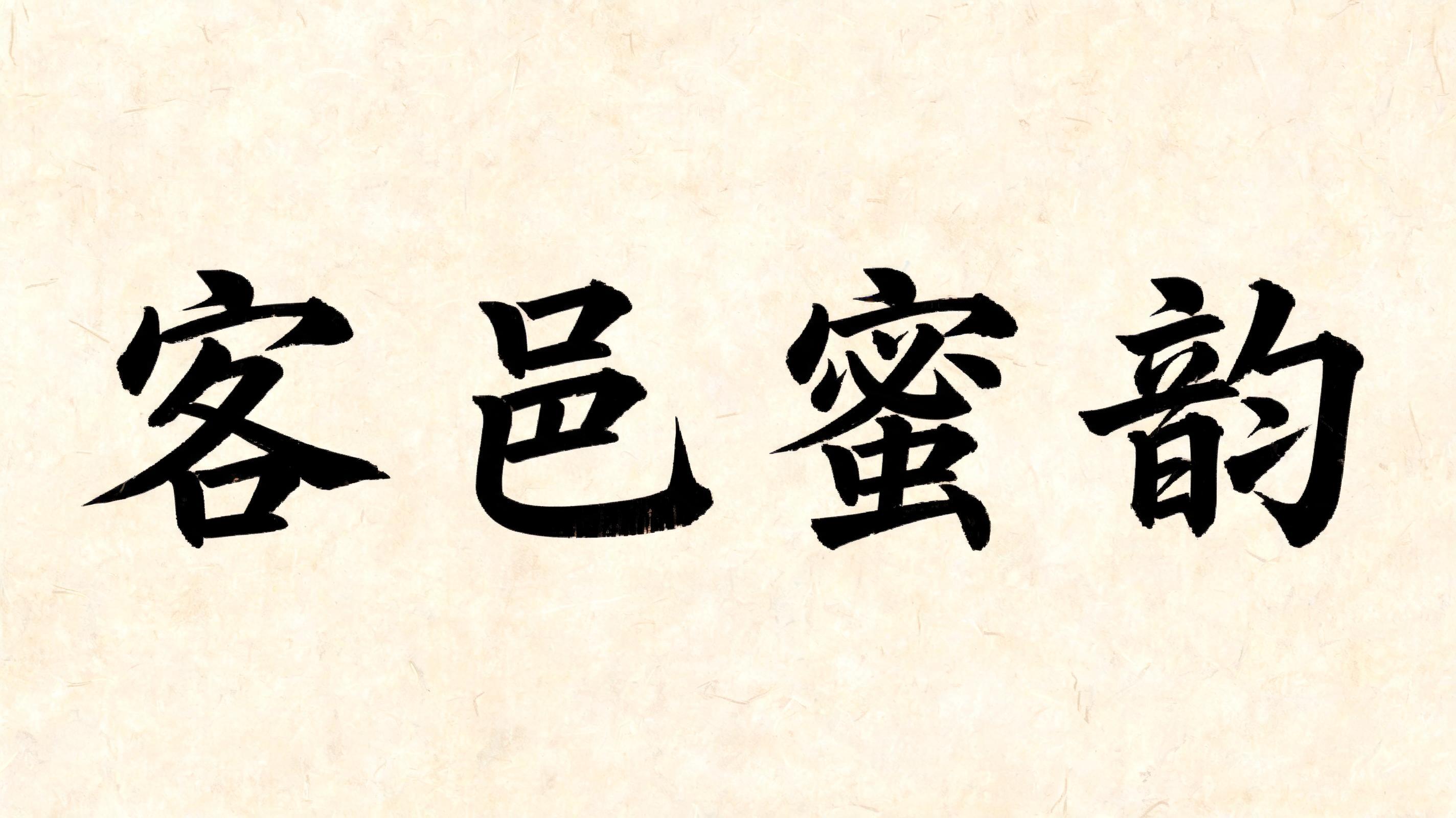

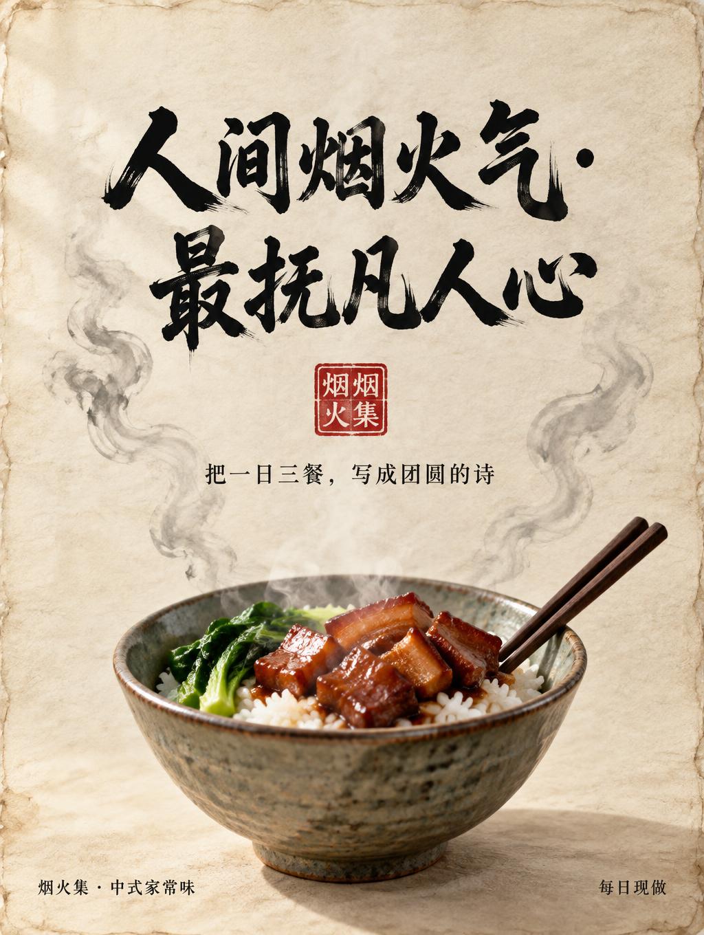
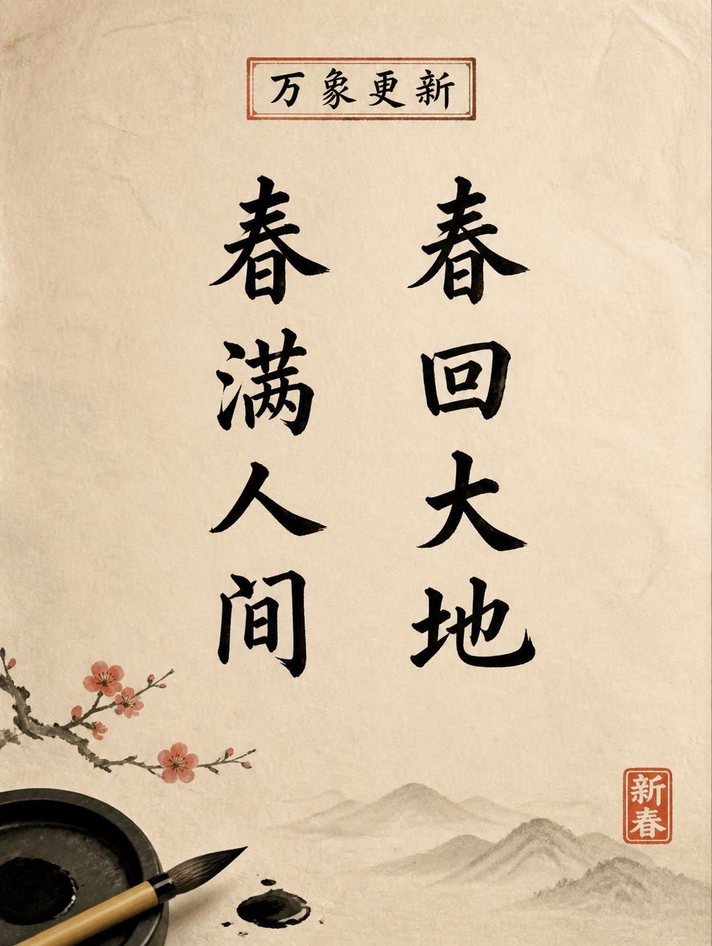
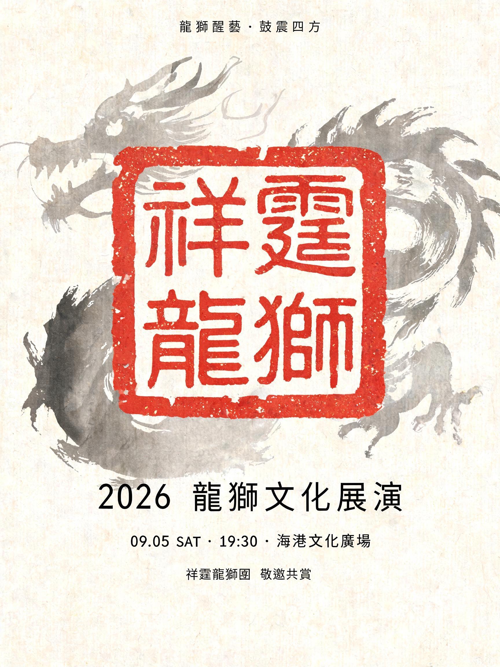


“高山仰止心向往之” was created with FontVibe AI — explore more Brush Chinese Ink text effect. Chinese sumi ink brush calligraphy style applied to Latin letterforms. Deep black ink with authentic bristle texture, thick-to-thin stroke variation, and rice paper atmosphere. Perfect for Chinese restaurant branding, martial arts, wellness, and cultural design.
rendered in Chinese ink brush calligraphy style. Letterforms painted with a fully loaded sumi ink brush — deep black ink, visible bristle marks along stroke edges, wet ink pooling at stroke starts, feathered dry-brush trailing ends. Authentic ink density variation: thick rich black cores fading to grey at thin passages. Rice paper texture visible behind. Traditional Chinese calligraphy energy — each stroke confident, intentional, irreversible. LETTERFORM PRIORITY: when the chosen font carries its own treatment, that font's letterform shapes take priority and own the letters; this style governs the sumi ink medium, the bristle and ink-density behavior and the rice-paper ground. FALLBACK MATERIAL: if the font carries no material of its own, render the letters as deep black sumi brush strokes with visible bristle marks, wet ink pooling at stroke starts and feathered dry-brush trails on rice paper. COLOR PRIORITY: keep the font's own colors if specified; otherwise rich black ink fading to grey at thin passages. Rendered in Chinese ink brush calligraphy on raw warm-ivory xuan paper, carrying the exact text “高山仰止心向往之”. Deep carbon-black sumi ink forms a dominant continuous calligraphic statement, with saturated wet pools at the first pressure points of major strokes and granular dry-brush separation at lifted endings. Each stroke reveals individual brush filaments, irregular feathered edges, translucent smoky-gray passages, and tiny capillary bleeds where ink enters the paper fibers. The paper grain remains visible through thin ink layers and in broad unpainted negative space. A restrained pale-gray ink-wash suggestion of distant mountain ridges dissolves into the paper behind the lettering, built from diluted mineral-black washes with softened watermarks, never competing with the text. Sparse micro-splatter dots appear only near the most forceful directional gestures. A small square vermilion cinnabar seal impression, slightly uneven and absorbed into the paper, acts as a traditional accent without adding readable words. Soft raking daylight reveals paper fibers, ink sheen in the darkest deposits, and subtle buckling from moisture. Museum-quality scanned ink texture, authentic hand-painted brush behavior, no digital-clean edges, no uniform black fill, no additional readable text.
Made for Chinese Calligraphy Font
Generated on October 11, 2026 · 1536 × 1024 · JPEG · OpenAI GPT-Image-2.5 Sunburst · Shared by the creator · Free for commercial use (CC BY 4.0)


