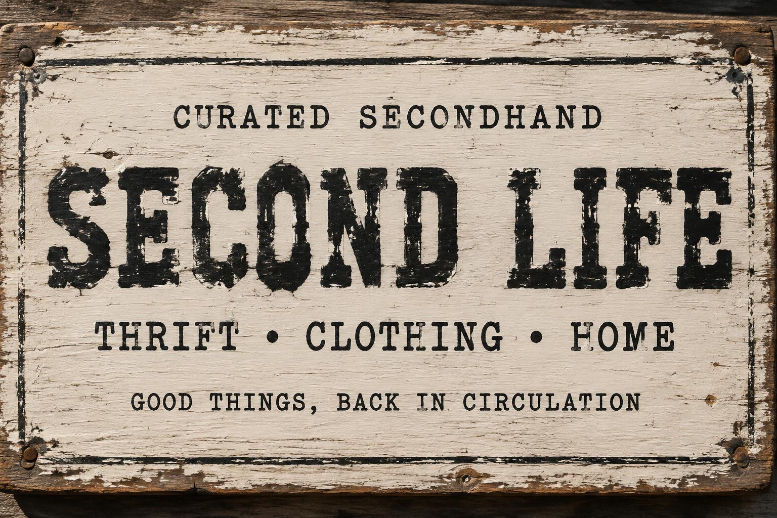
SECOND LIFE CURATED SECONDHAND THRIFT • CLOTHING • HOME GOOD THINGS, BACK IN CIRCULATION - Dry Brush Text Effect


Uses OpenAI GPT-Image-2.5 Sunburst, the model behind this artwork · 15 credits

“SECOND LIFE CURATED SECONDHAND THRIFT • CLOTHING • HOME GOOD THINGS, BACK IN CIRCULATION” was created with FontVibe AI — explore more Brush Dry text effect. Raw dry brush and paint brush lettering with heavy texture, bristle spread, and imperfect grain. Bold paint-loaded strokes, grungy distressed edges, and authentic hand-painted energy. Perfect for streetwear, music branding, sports, packaging, and any project needing raw tactile power.
Create a finished, landscape 3:2 thrift-shop storefront sign, shown nearly straight-on so every line reads clearly. The sign is a broad, reclaimed timber board with a faded warm-cream painted face, worn brown wood visible at chipped corners, and shallow scratches and grain. The sign itself fills most of the frame; keep the background unobtrusive and the lettering dominant. Set the exact copy, with no extra words: headline “SECOND LIFE”; small eyebrow “CURATED SECONDHAND”; supporting line “THRIFT • CLOTHING • HOME”; bottom line “GOOD THINGS, BACK IN CIRCULATION”. Arrange in clear tiers: eyebrow centered near the top, “SECOND LIFE” large and centered across the middle, category line below it, and the final line small but readable near the bottom. Use a custom monospaced typewriter display construction for the headline: heavy blocky letterforms, flat slab-serif terminals, consistent character widths, slightly imperfect baseline, and subtly uneven spacing. Apply the chosen dry-brush treatment to all lettering: thick off-black pigment, visible individual bristle tracks along stroke edges, dense paint buildup at stroke centers, thin skipped passages revealing the cream board, rough torn edges, and small ink-starved gaps. Preserve typewriter-like ink-density variation and slight mechanical impression irregularity within the brush texture. Supporting lines use smaller, sturdy typewriter lettering with restrained wear for sign-distance legibility. Add only a few restrained hand-painted border marks and corner scuffs; keep the wording unobstructed. High-contrast natural daylight grazing the board from upper left reveals wood grain, paint ridges and bristle marks. Tactile, physically weathered materials, crisp readable copy, no smooth letter fills, no gradients, no extra signage, no people.
Made for Distressed Font Generator
Generated on October 13, 2026 · 1536 × 1024 · JPEG · OpenAI GPT-Image-2.5 Sunburst · Layout: Storefront Sign Tiers · Shared by the creator · Free for commercial use (CC BY 4.0)


