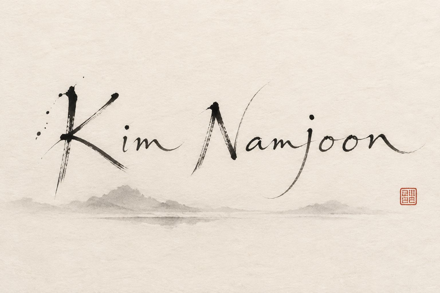
Kim Namjoon - Japanese Ink Brush Text Effect


Uses OpenAI GPT-Image-2.5 Sunburst, the model behind this artwork · 15 credits











“Kim Namjoon” was created with FontVibe AI — explore more Brush Japanese Ink text effect. Japanese Shodo ink brush calligraphy style applied to Latin letterforms. Deep sumi black ink with authentic fude brush energy, controlled single-direction strokes, and washi paper atmosphere. Perfect for Japanese restaurant branding, tattoo design, anime, martial arts, and cultural projects.
Japanese ink brush aesthetic — the visual language of sumi calligraphy on washi paper. INK MEDIUM: sumi pigment in deep black to charcoal range — richest density at mark centers, naturally transitioning outward as ink supply depletes. Fully matte, absorbed into paper surface, producing a tonal range from dense opaque black to transparent grey depending on dilution and brush load. PAPER SURFACE: natural washi — warm cream-white base with visible paper fiber structure giving slight texture. The absorbent surface creates the characteristic soft border quality of East Asian brush work at all mark edges. LIGHT ATMOSPHERE: soft diffuse north-facing studio light — the traditional calligrapher's light source. Even, shadowless, allowing the full tonal range of ink marks to read clearly. Warm cream paper tone contrasts against deep sumi black. AESTHETIC REGISTER: the ma principle — the space between and around marks is as considered as the marks themselves. Compositions have breathing room and deliberate quietness. When no specific material is defined by the font: default environment — deep sumi black marks on warm cream washi paper, soft diffuse overhead light, meditative studio atmosphere. Kim Namjoon arranged as a calm, spacious horizontal name composition across warm cream-white washi paper. The primary text is formed in deep sumi ink, with decisive dark beginnings and elegant pressure-led movement through every mark. Ink pools to near-black at the strongest entries, then opens into charcoal and translucent smoke-gray where the brush lifts, leaving dry-brush grain and softly feathered absorption along visible paper fibers. Keep the name dominant, centered slightly above the vertical midpoint, with generous unmarked paper surrounding it in the spirit of ma. A few restrained ink flecks sit near the forceful initial gestures only, never decorative or scattered. Beneath the name, a faint diluted gray wash suggests a quiet horizon of breath and reflection, so subtle it nearly dissolves into the paper. One small vermilion square hanko seal rests low at the far right, balancing the composition without competing with the text. Soft diffuse overhead studio light reveals the matte ink, warm fiber texture, and full tonal gradation. Meditative, intelligent, grounded, and quietly powerful Japanese calligraphy atmosphere.
Made for Sumi-e Ink Font
Generated on October 23, 2026 · 1536 × 1024 · JPEG · OpenAI GPT-Image-2.5 Sunburst · Shared by the creator · Free for commercial use (CC BY 4.0)



