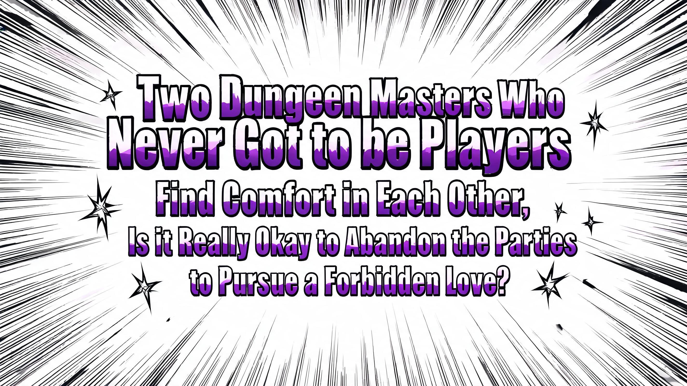
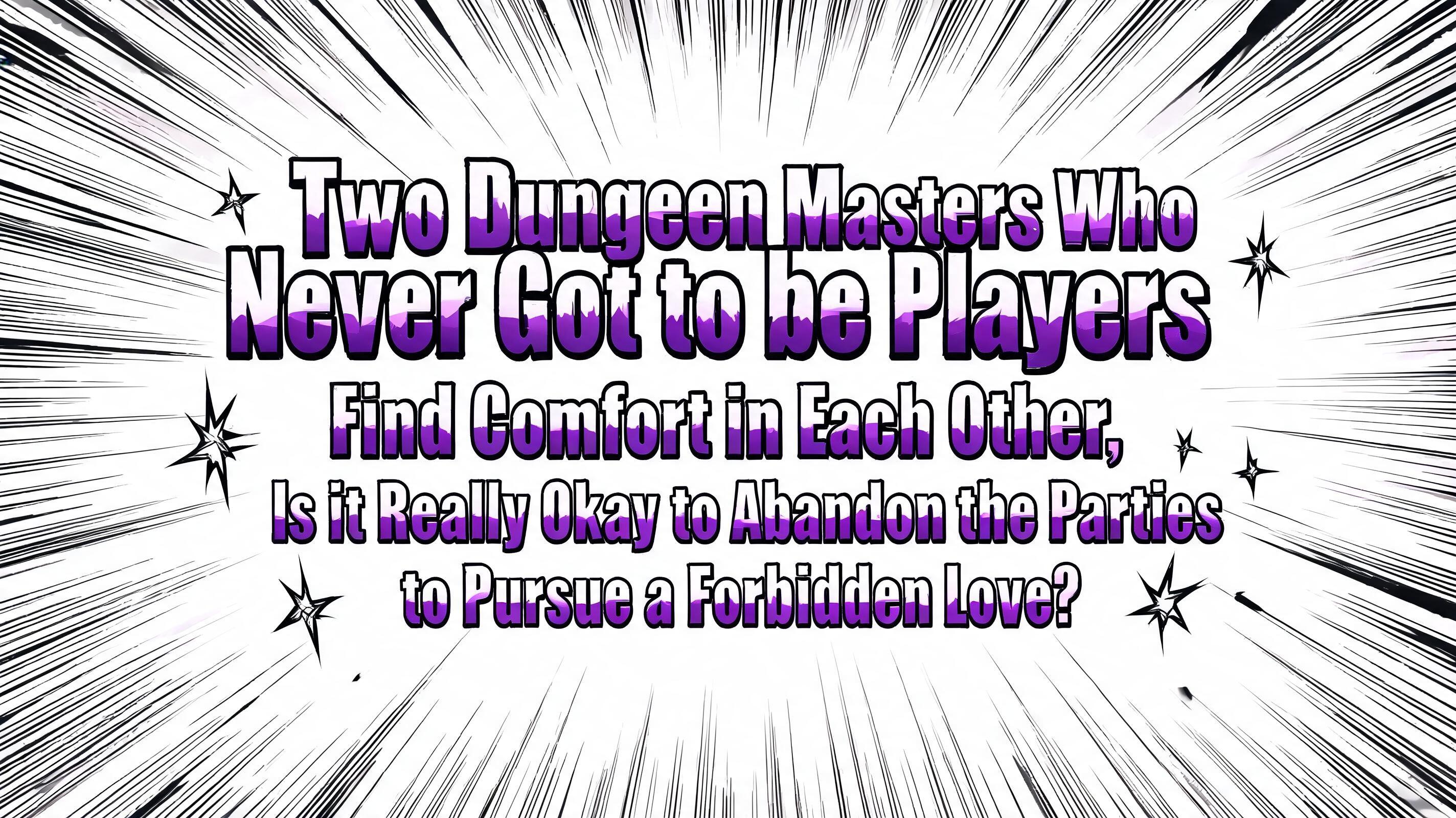
Two Dungeon Masters Who Never Got to be Players Find Comfort in Each Other, Is it Really Okay to Abandon the Parties to Pursue a Forbidden Love? - Anime Text Effect


Uses BytePlus Seedream 5.0, the model behind this artwork · 15 credits





“Two Dungeon Masters Who Never Got to be Players Find Comfort in Each Other, Is it Really Okay to Abandon the Parties to Pursue a Forbidden Love?” is a Anime text effect text effect created with FontVibe AI. Shounen manga title lettering: heavy hand-inked black outlines, flat cel shading split into hard highlight and shadow bands, slanted dynamic letters on white with radiating speed lines.
rendered as Japanese shounen anime title treatment — bold hand-inked manga lettering with authentic cel-shaded visual energy. Letter construction follows classic Shonen Jump title card standards: thick black ink outline with natural brush-weight variation defining each letter boundary; flat cel-shading fill with three hard-edge zones — bright highlight zone on upper letter face, highly saturated primary color zone at center, deep shadow zone at lower edge; all zone boundaries knife-edge hard, zero gradient blur, pure flat offset-print ink physics. Energy signature: high-contrast color + thick ink outline = letters that look physically printed on manga paper. The typographic language of Dragon Ball, Naruto, One Piece, Demon Slayer, Jujutsu Kaisen title cards — maximum manga kinetic energy, iconic and immediately recognizable as Japanese anime title typography. Two Dungeon Masters Who Never Got to be Players Find Comfort in Each Other, Is it Really Okay to Abandon the Parties to Pursue a Forbidden Love? as ultra-bold Japanese manga title letterforms, stacked as a centered multi-line title block — "Two Dungeon Masters Who Never Got to be Players" / "Find Comfort in Each Other," / "Is it Really Okay to Abandon the Parties" / "to Pursue a Forbidden Love?" — scaled to fill 78% frame width in 16:9, with the first line largest as the primary title, subsequent lines stepping down slightly in scale for hierarchy. Pure white background with dense radial speed lines exploding from behind the letter cluster — classic manga chapter title impact panel. Each letter: thick black ink outline with natural brush-weight variation; flat cel-shaded three-zone fill — bright white highlight zone upper 30%, deep purple primary fill center 50%, near-black shadow zone lower 20%; all zone boundaries knife-edge hard, zero gradient blur. Sharp star-burst impact marks scattered around letters. Maximum manga print energy — perfect manga font for series titles and chapter cards.
Made for Manga Font Generator
Generated on July 30, 2026 · 2848 × 1600 · JPEG · BytePlus Seedream 5.0 · Shared by the creator · Free for commercial use (CC BY 4.0)


