
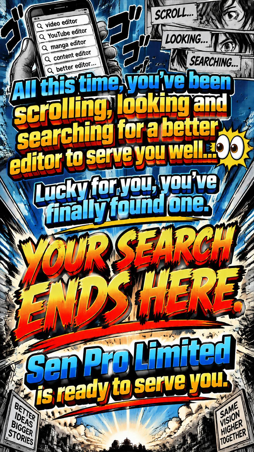
All this time, you’ve been scrolling, looking and searching for a better editor to serve you well… 👀 Lucky for you, you’ve finally found one. Your search ends here. Sen Pro Limited is ready to serve you. - Anime Text Effect


Uses OpenAI GPT-Image-2.5 Sunburst, the model behind this artwork · 15 credits






“All this time, you’ve been scrolling, looking and searching for a better editor to serve you well… 👀 Lucky for you, you’ve finally found one. Your search ends here. Sen Pro Limited is ready to serve you.” is a Anime text effect text effect created with FontVibe AI. Shounen manga title lettering: heavy hand-inked black outlines, flat cel shading split into hard highlight and shadow bands, slanted dynamic letters on white with radiating speed lines.
rendered as Japanese shounen anime title treatment — bold hand-inked manga lettering with authentic cel-shaded visual energy. Letter construction follows classic Shonen Jump title card standards: thick black ink outline with natural brush-weight variation defining each letter boundary; flat cel-shading fill with three hard-edge zones — bright highlight zone on upper letter face, highly saturated primary color zone at center, deep shadow zone at lower edge; all zone boundaries knife-edge hard, zero gradient blur, pure flat offset-print ink physics. Energy signature: high-contrast color + thick ink outline = letters that look physically printed on manga paper. The typographic language of Dragon Ball, Naruto, One Piece, Demon Slayer, Jujutsu Kaisen title cards — maximum manga kinetic energy, iconic and immediately recognizable as Japanese anime title typography. LETTERFORM PRIORITY: when the chosen font carries its own treatment, that font's letterform shapes take priority and own the letters; this style governs the inked manga outline, the three-zone cel-shading and the kinetic energy. FALLBACK MATERIAL: if the font carries no material of its own, render the letters as bold hand-inked shounen title lettering with a thick black brush outline and hard three-zone cel-shading. COLOR PRIORITY: keep the font's own colors if specified; otherwise a high-saturation primary fill with hard highlight and shadow zones. Japanese shounen anime service-announcement title card using the exact text: “All this time, you’ve been scrolling, looking and searching for a better editor to serve you well… 👀\nLucky for you, you’ve finally found one.\nYour search ends here.\nSen Pro Limited is ready to serve you.” Establish clear hierarchy: the opening sentence appears as a scrolling-search narrative, “Your search ends here.” receives the largest impact emphasis, and “Sen Pro Limited is ready to serve you.” reads as the decisive service signature. Render every text element with thick black hand-inked contours, irregular brush-weight edges, offset-print texture, and three sharply divided cel-shading zones: white upper highlights, saturated electric blue and hot orange midtone fields, deep navy and crimson lower shadows. Use knife-cut boundaries only, no soft gradients. Surround the lettering with manga speed lines, torn halftone dot fields, angular black impact bursts, tiny ink flecks, and comic-panel fragments suggesting rapid phone-screen scrolling. Include the 👀 emoji as two glossy anime eyes with white specular dots, black ink contouring, and a compact starburst accent. Background: deep midnight blue paper grain, cyan radial energy rays, orange collision marks, and pale cream manga-page flashes. High-contrast shounen chapter-title rendering, crisp vector-like cel shading, clean readable copy, dense social-media promo energy, 8k print-detail finish.
Made for Anime Text Generator
Generated on September 21, 2026 · 1024 × 1824 · JPEG · OpenAI GPT-Image-2.5 Sunburst · Shared by the creator · Free for commercial use (CC BY 4.0)


