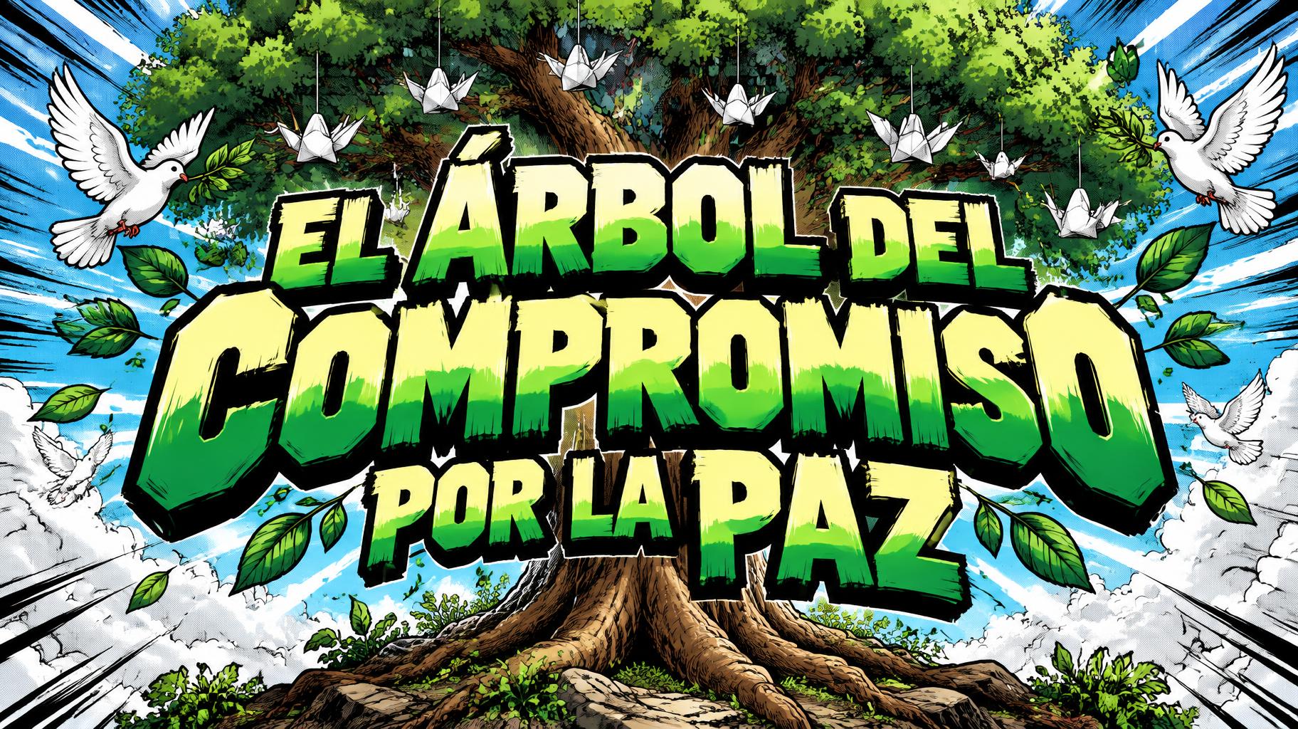
EL ÁRBOL DEL COMPROMISO POR LA PAZ - Anime Text Effect


Uses OpenAI GPT-Image-2.5 Sunburst, the model behind this artwork · 15 credits



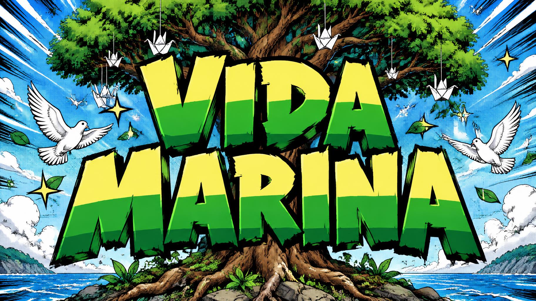

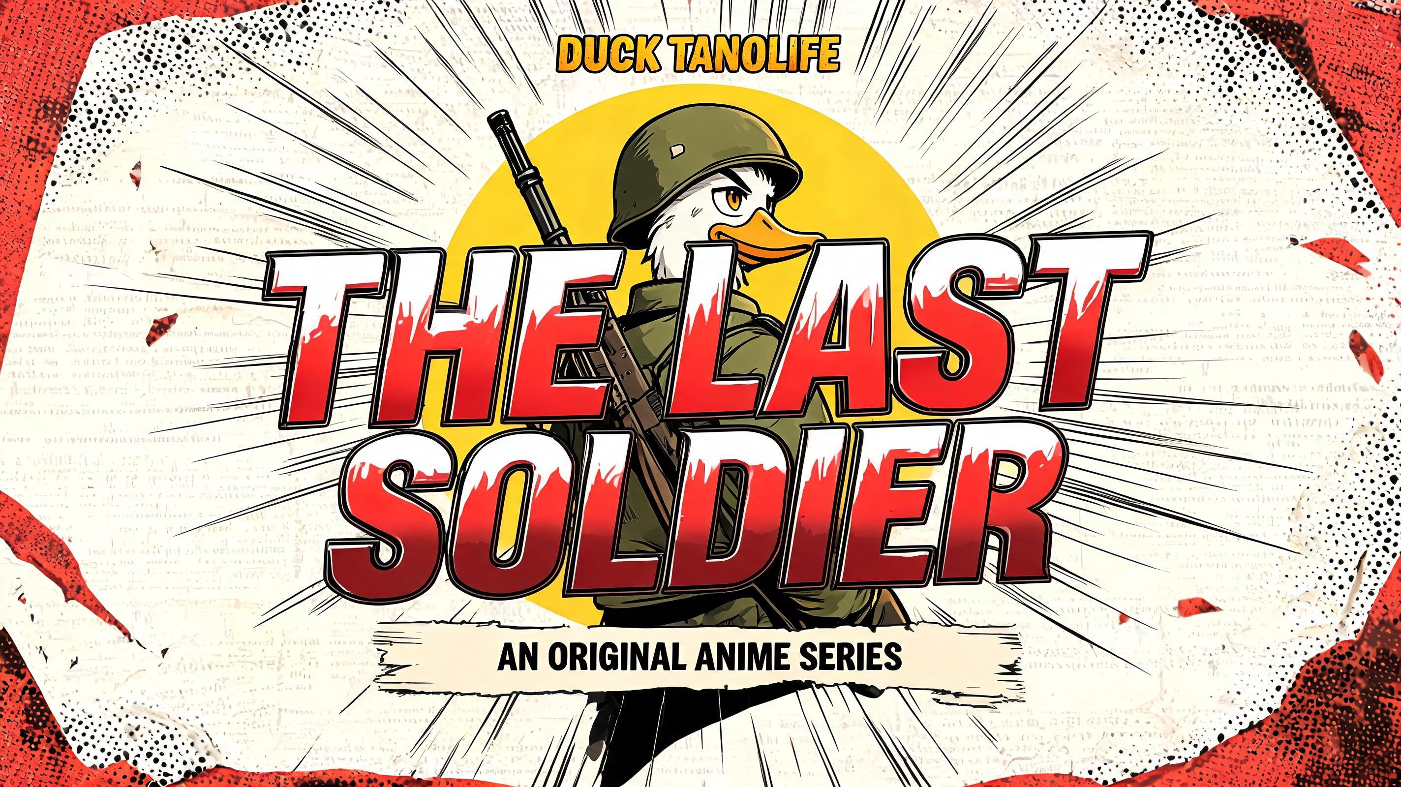
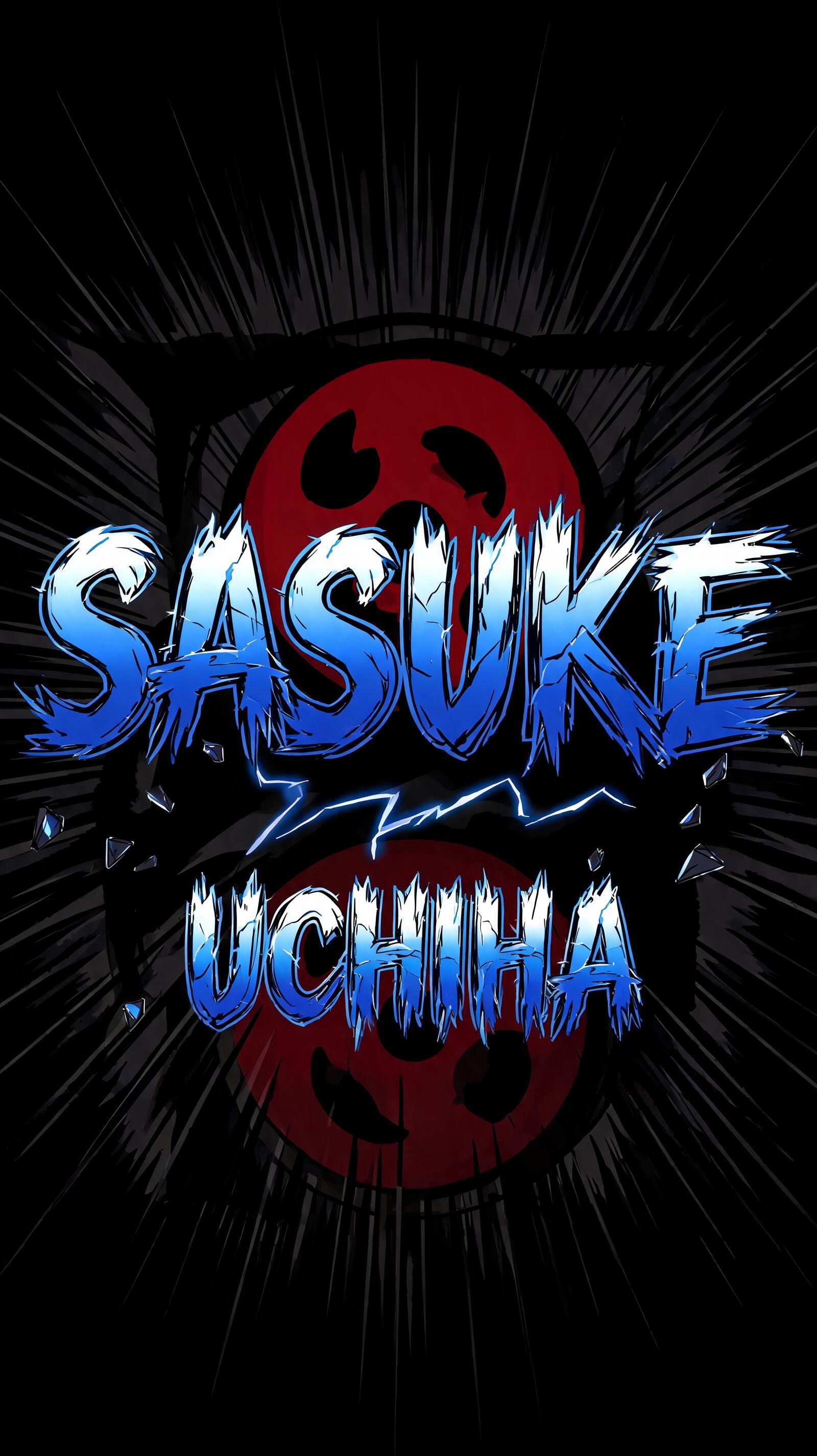
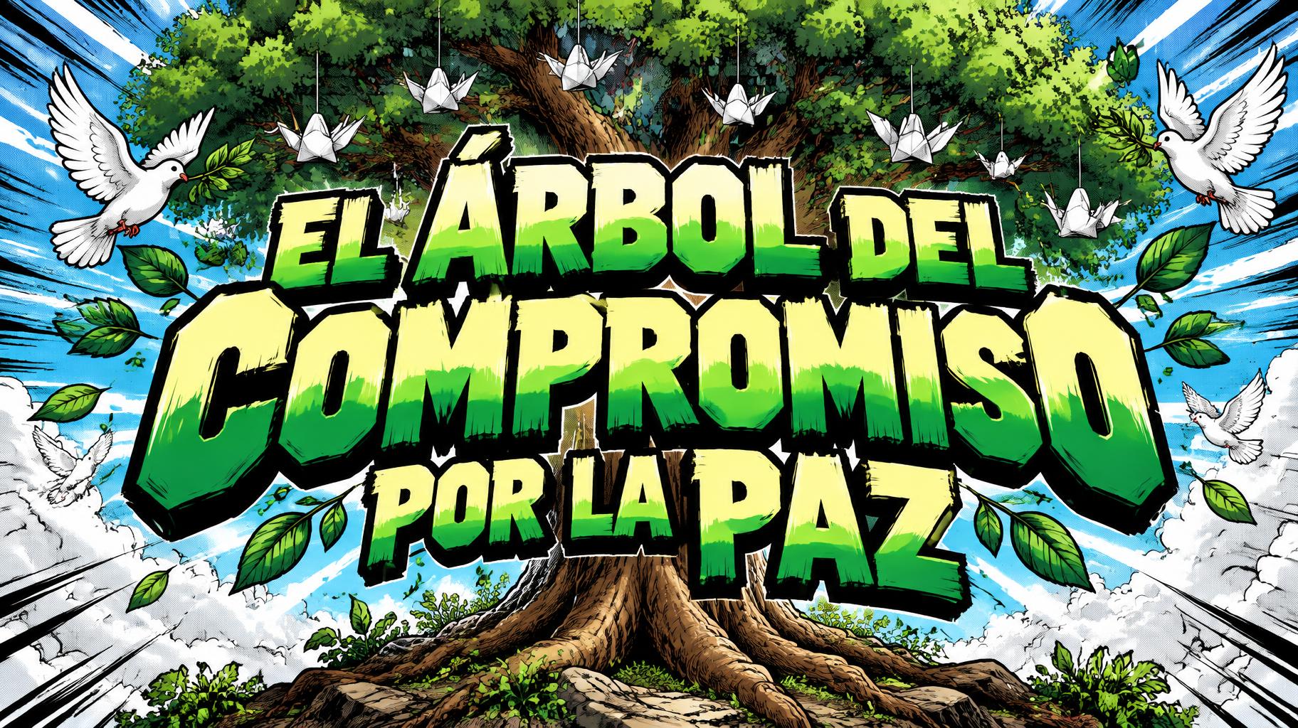
“EL ÁRBOL DEL COMPROMISO POR LA PAZ” is a Anime text effect text effect created with FontVibe AI. Shounen manga title lettering: heavy hand-inked black outlines, flat cel shading split into hard highlight and shadow bands, slanted dynamic letters on white with radiating speed lines.
rendered as Japanese shounen anime title treatment — bold hand-inked manga lettering with authentic cel-shaded visual energy. Letter construction follows classic Shonen Jump title card standards: thick black ink outline with natural brush-weight variation defining each letter boundary; flat cel-shading fill with three hard-edge zones — bright highlight zone on upper letter face, highly saturated primary color zone at center, deep shadow zone at lower edge; all zone boundaries knife-edge hard, zero gradient blur, pure flat offset-print ink physics. Energy signature: high-contrast color + thick ink outline = letters that look physically printed on manga paper. The typographic language of Dragon Ball, Naruto, One Piece, Demon Slayer, Jujutsu Kaisen title cards — maximum manga kinetic energy, iconic and immediately recognizable as Japanese anime title typography. LETTERFORM PRIORITY: when the chosen font carries its own treatment, that font's letterform shapes take priority and own the letters; this style governs the inked manga outline, the three-zone cel-shading and the kinetic energy. FALLBACK MATERIAL: if the font carries no material of its own, render the letters as bold hand-inked shounen title lettering with a thick black brush outline and hard three-zone cel-shading. COLOR PRIORITY: keep the font's own colors if specified; otherwise a high-saturation primary fill with hard highlight and shadow zones. Japanese shounen anime chapter-title treatment for the exact Spanish text “EL ÁRBOL DEL COMPROMISO POR LA PAZ”. The complete phrase is rendered as the dominant title, with clear multi-line hierarchy and generous separation between word groups so every accented character remains legible. Thick black hand-inked contour lines surround every letter, with irregular brush-pressure edges, tiny ink flecks, and hard cel-shaded color planes: pale sun-yellow highlight faces, saturated leaf-green midtone faces, and deep emerald lower shadow planes, all divided by razor-sharp boundaries with no gradients. A large illustrated tree rises behind and around the title: broad green canopy built from flat angular leaves, dark brown trunk, exposed roots, and small paper-crane shapes caught in the branches. White doves, olive leaves, and small five-point starbursts orbit through dense manga speed lines. The background is a clean sky-blue halftone field with radial white impact rays, offset-print dot texture, black comic-panel bursts, and scattered ink impact marks. Bright upper lighting creates crisp white highlight cuts on the lettering and foliage; deep black shadow accents anchor the composition. High-resolution anime title-card artwork, flat screen-print ink physics, sharp edges, no photorealism, no extra words, no misspelled text.
Made for Anime Font Generator
Generated on September 22, 2026 · 1824 × 1024 · JPEG · OpenAI GPT-Image-2.5 Sunburst · Shared by the creator · Free for commercial use (CC BY 4.0)


