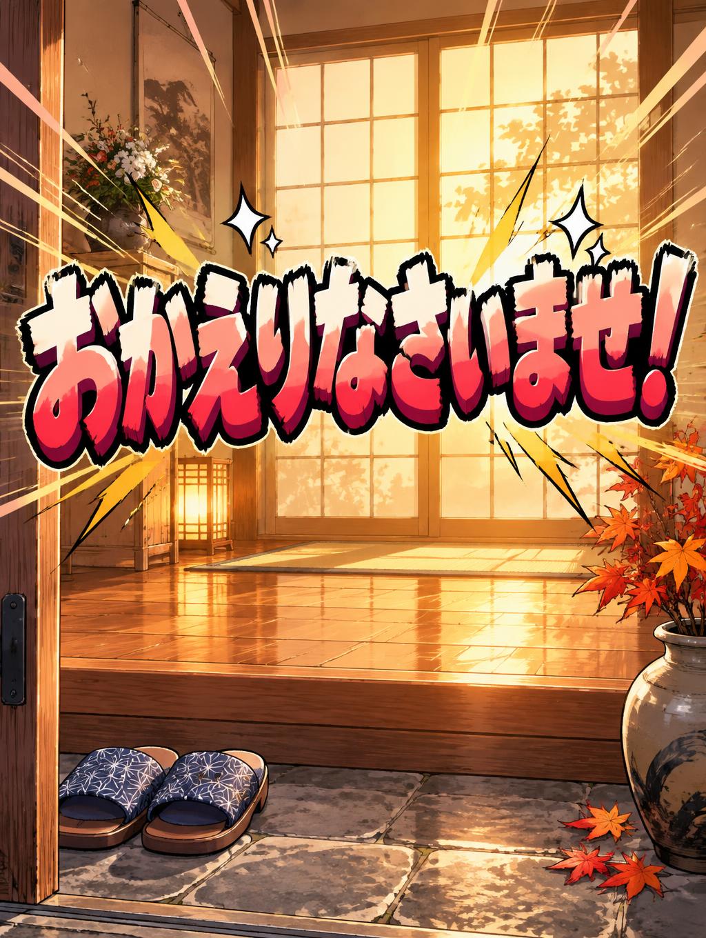
おかえりなさいませ! - Anime Text Effect


Uses OpenAI GPT-Image-2.5 Sunburst, the model behind this artwork · 15 credits

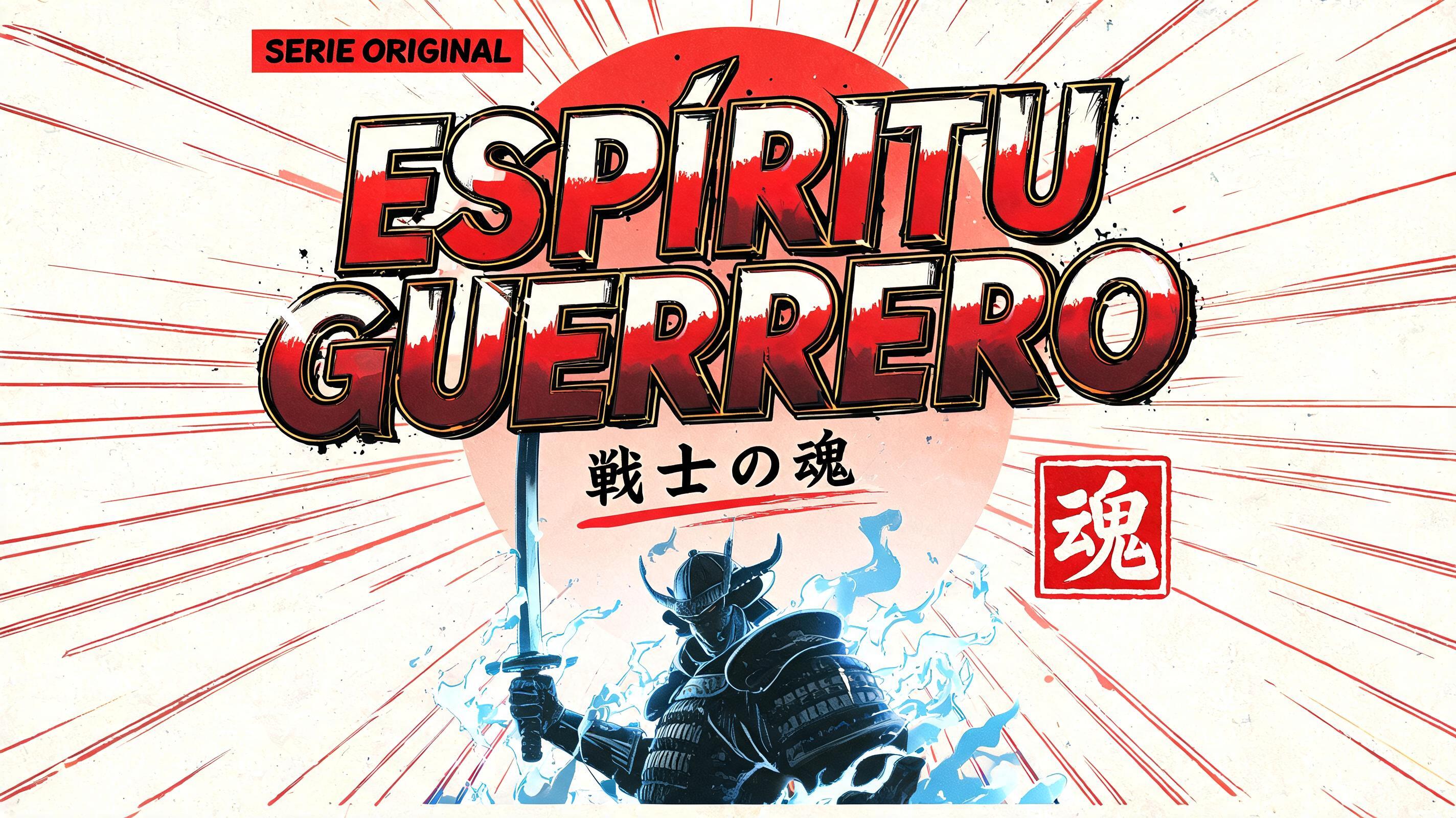

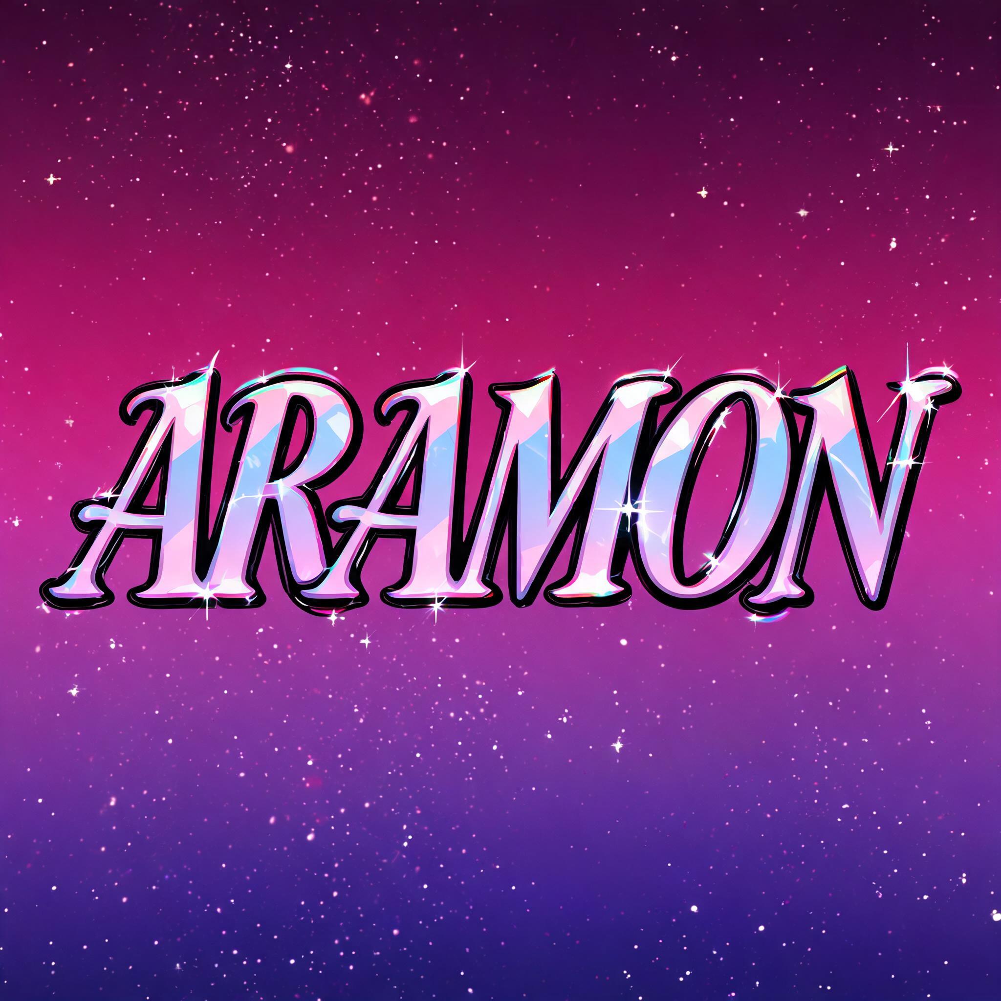

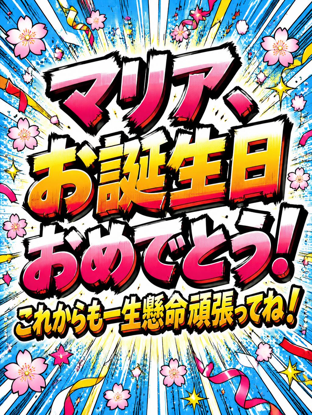
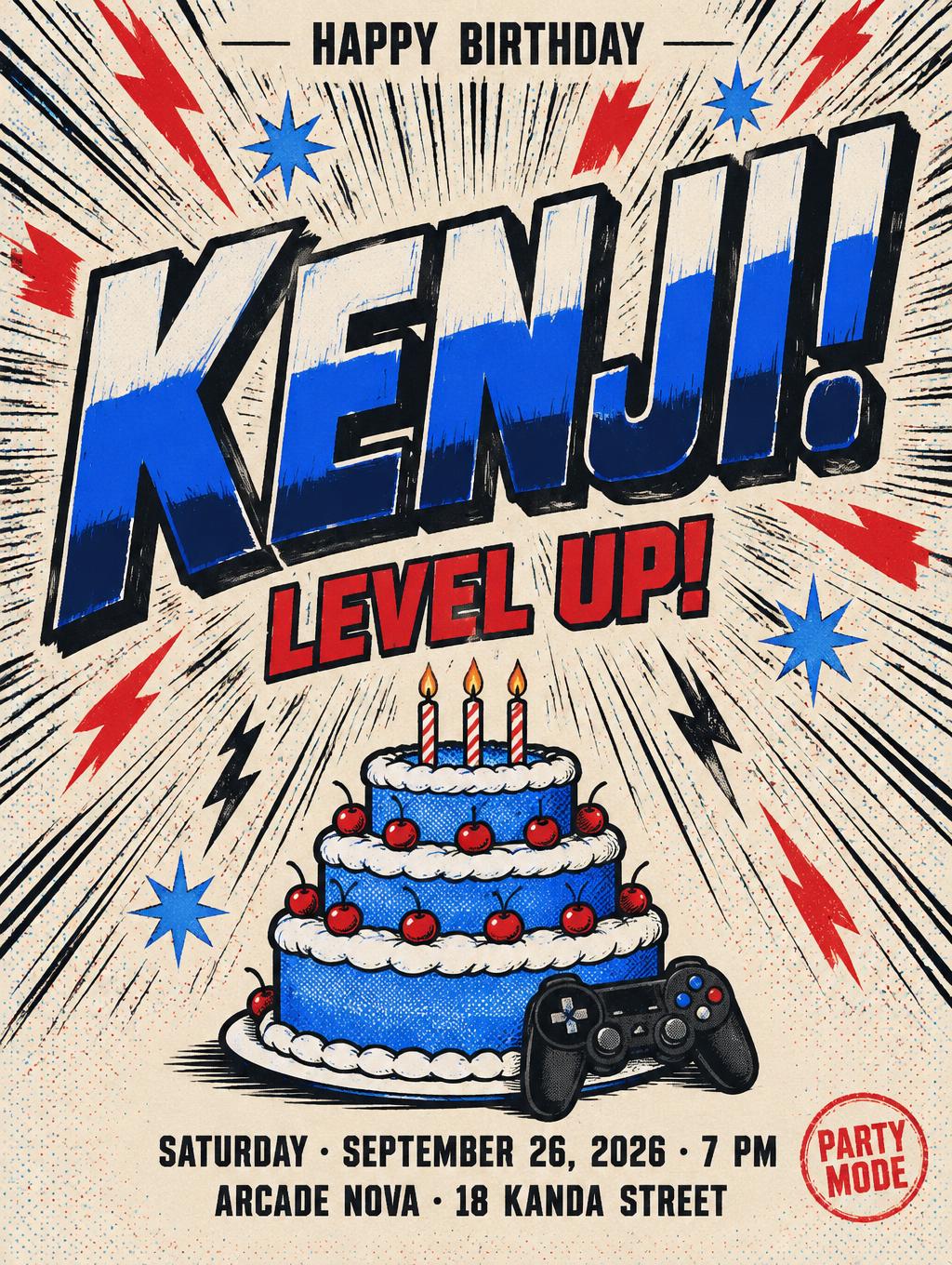

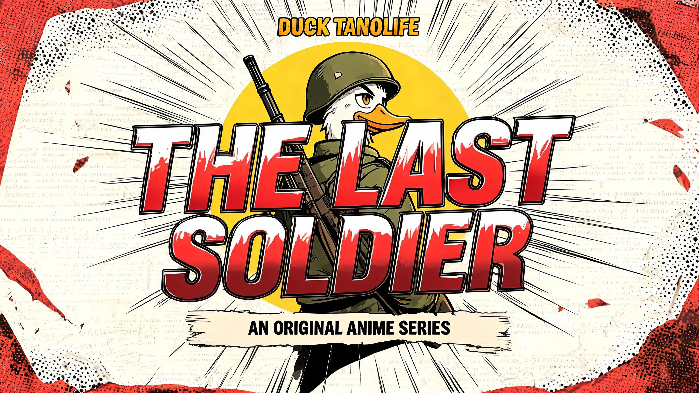
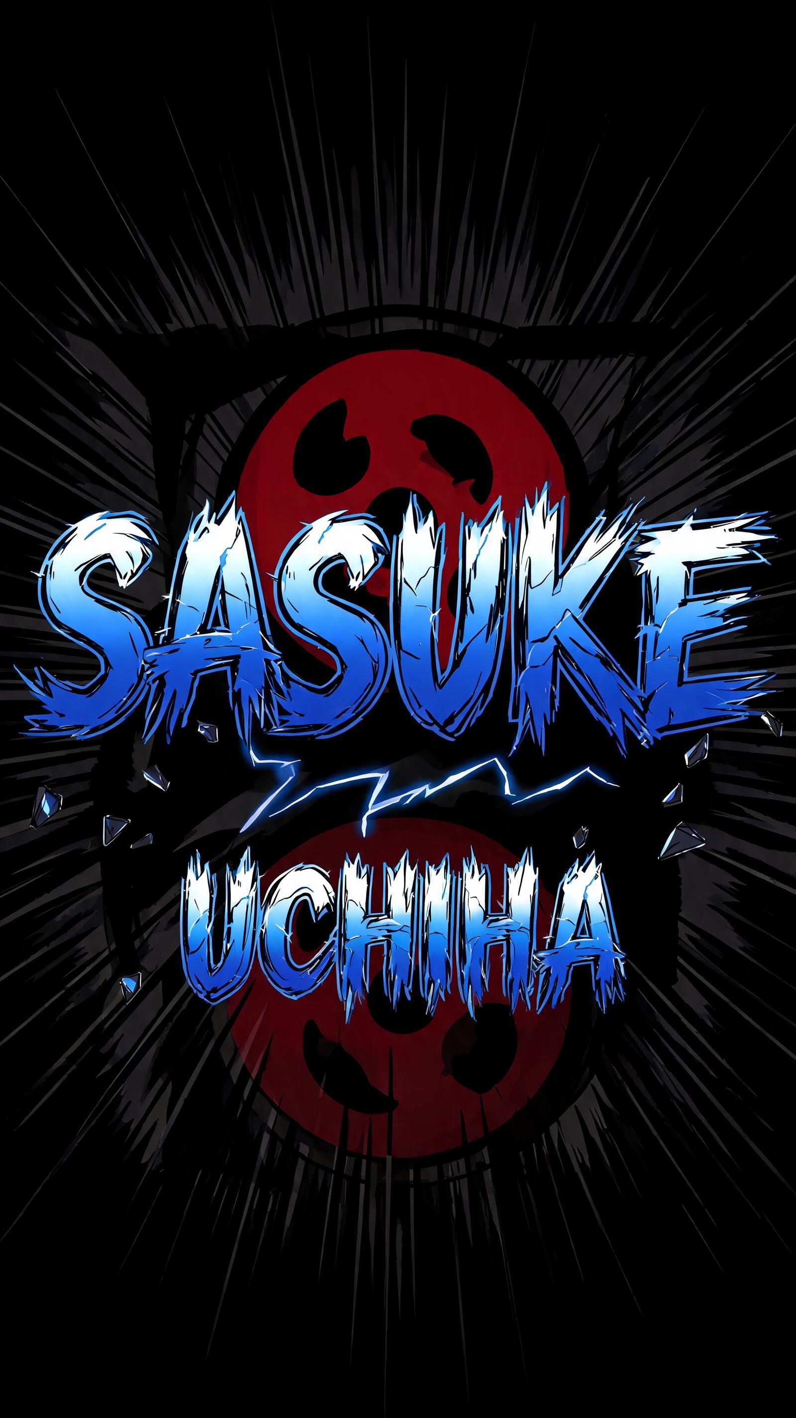
“おかえりなさいませ!” is a Anime text effect text effect created with FontVibe AI. Shounen manga title lettering: heavy hand-inked black outlines, flat cel shading split into hard highlight and shadow bands, slanted dynamic letters on white with radiating speed lines.
rendered as Japanese shounen anime title treatment — bold hand-inked manga lettering with authentic cel-shaded visual energy. Letter construction follows classic Shonen Jump title card standards: thick black ink outline with natural brush-weight variation defining each letter boundary; flat cel-shading fill with three hard-edge zones — bright highlight zone on upper letter face, highly saturated primary color zone at center, deep shadow zone at lower edge; all zone boundaries knife-edge hard, zero gradient blur, pure flat offset-print ink physics. Energy signature: high-contrast color + thick ink outline = letters that look physically printed on manga paper. The typographic language of Dragon Ball, Naruto, One Piece, Demon Slayer, Jujutsu Kaisen title cards — maximum manga kinetic energy, iconic and immediately recognizable as Japanese anime title typography. LETTERFORM PRIORITY: when the chosen font carries its own treatment, that font's letterform shapes take priority and own the letters; this style governs the inked manga outline, the three-zone cel-shading and the kinetic energy. FALLBACK MATERIAL: if the font carries no material of its own, render the letters as bold hand-inked shounen title lettering with a thick black brush outline and hard three-zone cel-shading. COLOR PRIORITY: keep the font's own colors if specified; otherwise a high-saturation primary fill with hard highlight and shadow zones. Render the exact Japanese text “おかえりなさいませ!” as a welcoming shounen-anime title card, with the phrase carrying dominant visual weight and a gentle hospitality rhythm. Build every character with a thick black hand-inked outline, irregular brush-pressure edges, and flat three-zone cel shading: pale cream highlight planes across upper strokes, saturated coral-pink midtone faces, and deep vermilion shadow planes along lower stroke edges. Keep all color boundaries razor-sharp, printed-ink flat, with no airbrushed gradients. Add small white sparkle chips, crisp inked starbursts, and curved manga impact marks around the character cluster. Behind the lettering, depict a warmly lit traditional entryway: honey-colored wooden floorboards, a softly glowing paper shoji screen, a pair of neatly placed slippers, and a low ceramic vase with a few autumn maple leaves. Use cel-shaded background planes with clean dark linework, restrained detail, and a bright amber doorway glow radiating through the scene. Include fine radial manga speed lines in faded peach and gold, converging behind the text without obscuring readability. The overall image should resemble a polished anime episode welcome-card illustration, with opaque offset-print ink texture, crisp black contours, high saturation, hard-edged highlights, and clean negative space around the Japanese lettering. No English text, no extra words, no watermark.
Made for Anime Font Generator
Generated on September 24, 2026 · 1024 × 1360 · JPEG · OpenAI GPT-Image-2.5 Sunburst · Shared by the creator · Free for commercial use (CC BY 4.0)


